Small Cafe Design
Over the past five years, there has been a trend globally towards small cafes and coffee shops. We think this is a great trend as small locally-owned coffee shops tend to have a great feeling about them and it is nice to support small local businesses.
We find that our products tend to get used a lot in small cafe interiors and this is something that we enjoy seeing. I love walking into a well-thought-out small cafe for a coffee which has sparked an interest in small cafe design.
As our products have been going into small coffee shops we get asked questions about what products to use where and how best to design a small cafe interior so I have put down a few of our favorite ideas for small coffee shop design below.
Tips for Small Cafe Design:
-
Less is More
This is a very general concept that should be applied to all aspects of design, but it is especially so when you are talking about small cafe design. The interior of a small cafe is by nature, small. Therefore you can not fit as much stuff in as if you were designing a big cafe and you have to make the most of the space.
-
Minimal Exterior Signage
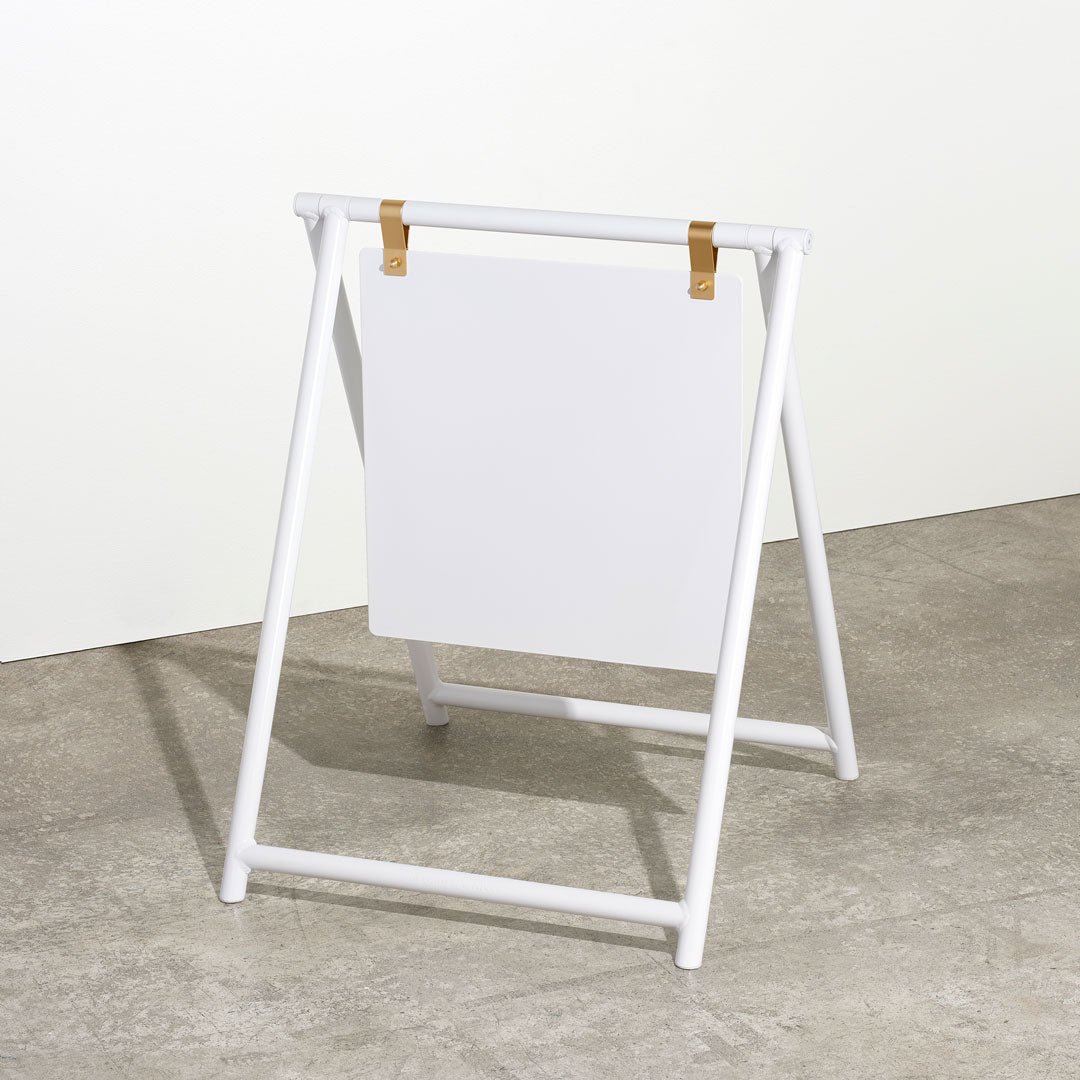
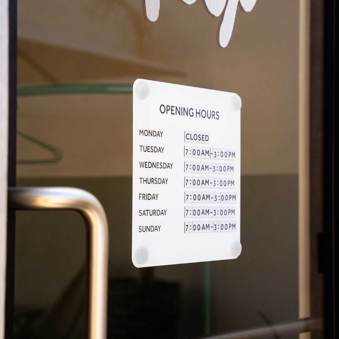
If you look at the way signage is going globally amongst small boutique businesses, it is towards minimalism and it especially applies to the design of a small coffee shop. Although I personally think that even big cafes should apply design principles as if they were designing a small coffee shop and keep signage very small and minimal. Happy Bones does a great example of minimal signage with a basic A-frame sign and small branding on the window.

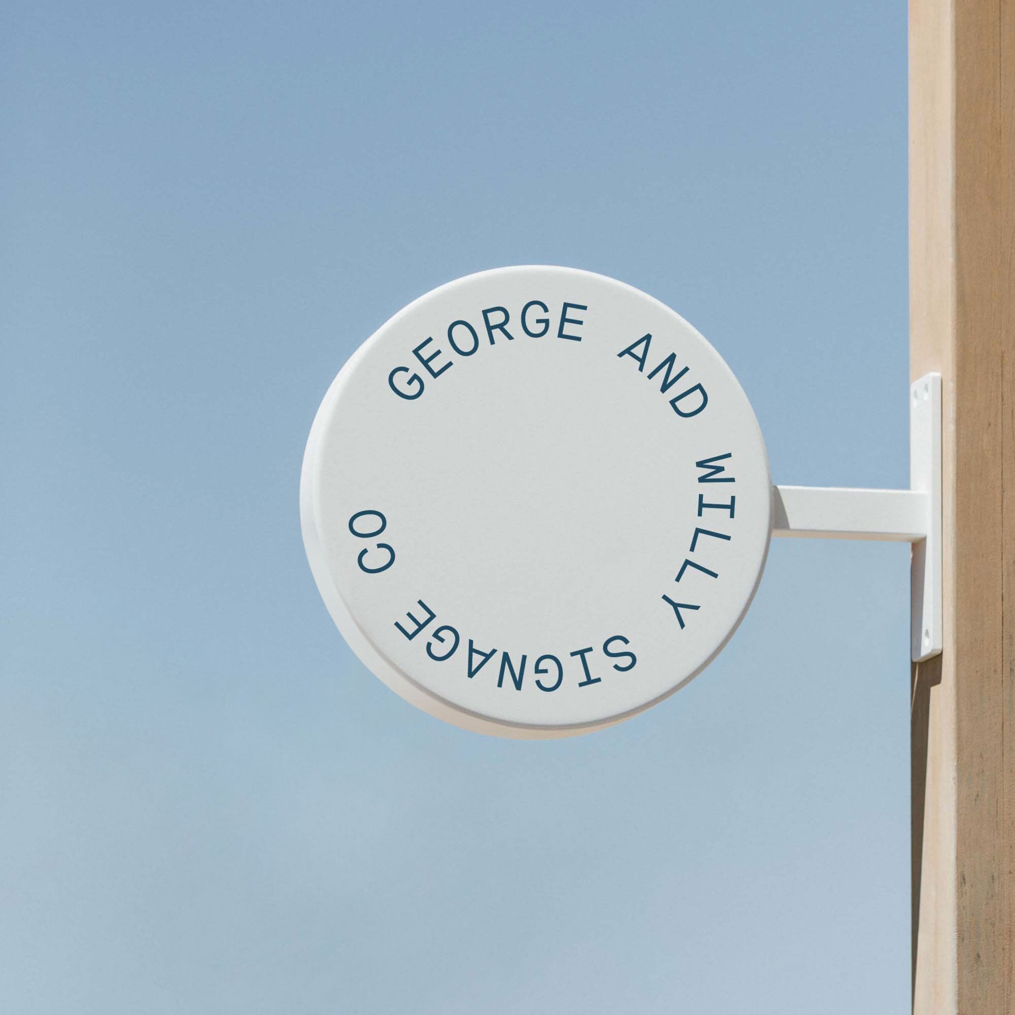
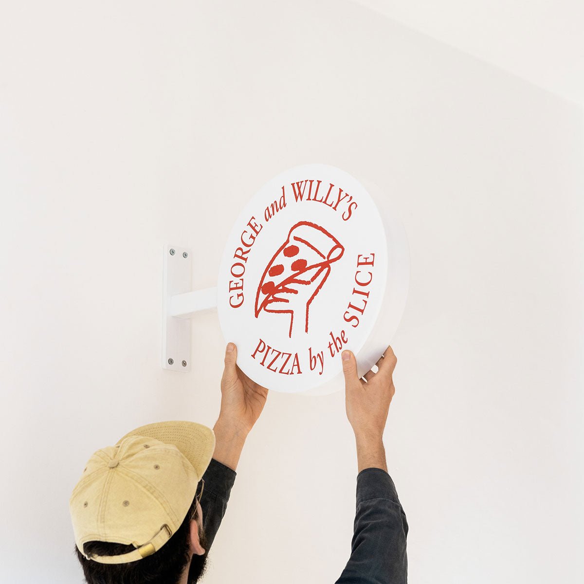
The Round Shop Sign in use at Post Coffee
-
Minimal Interior Signage
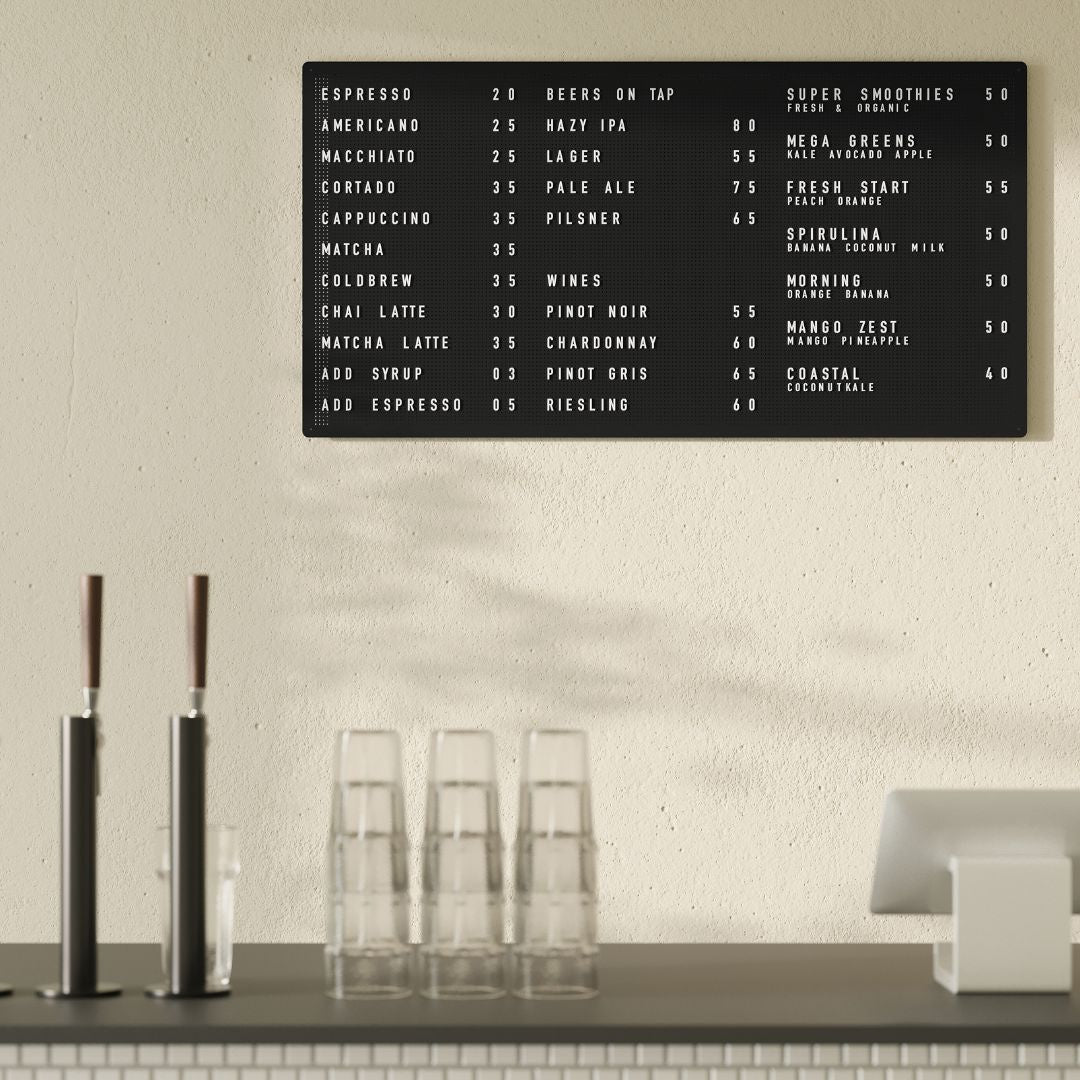
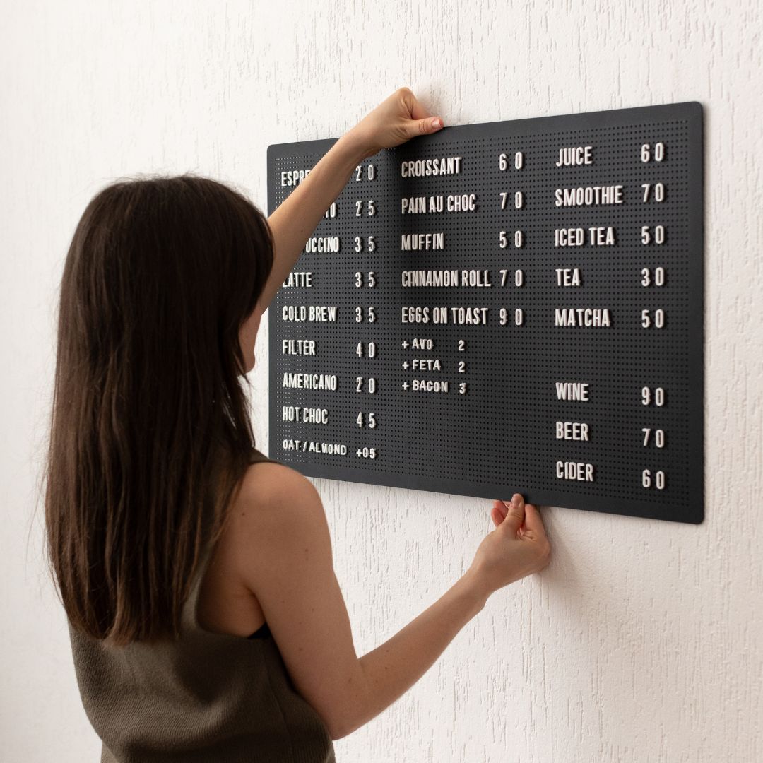
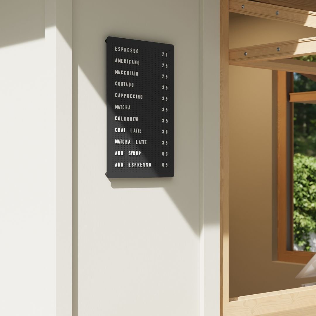
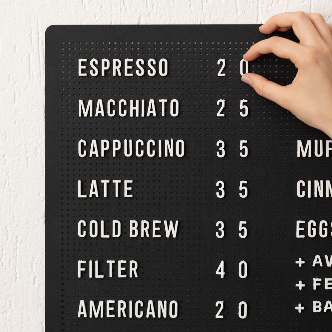
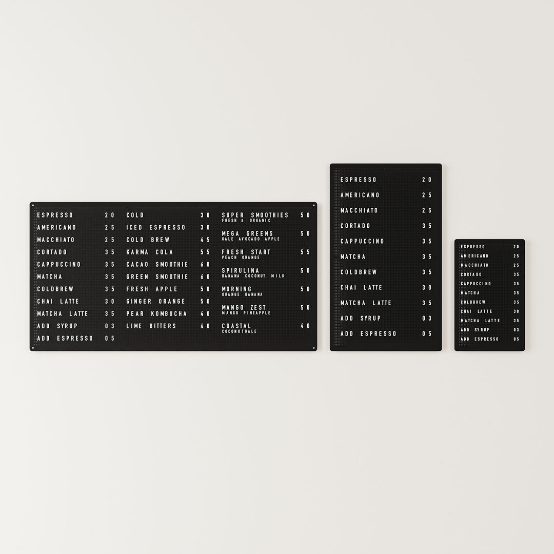
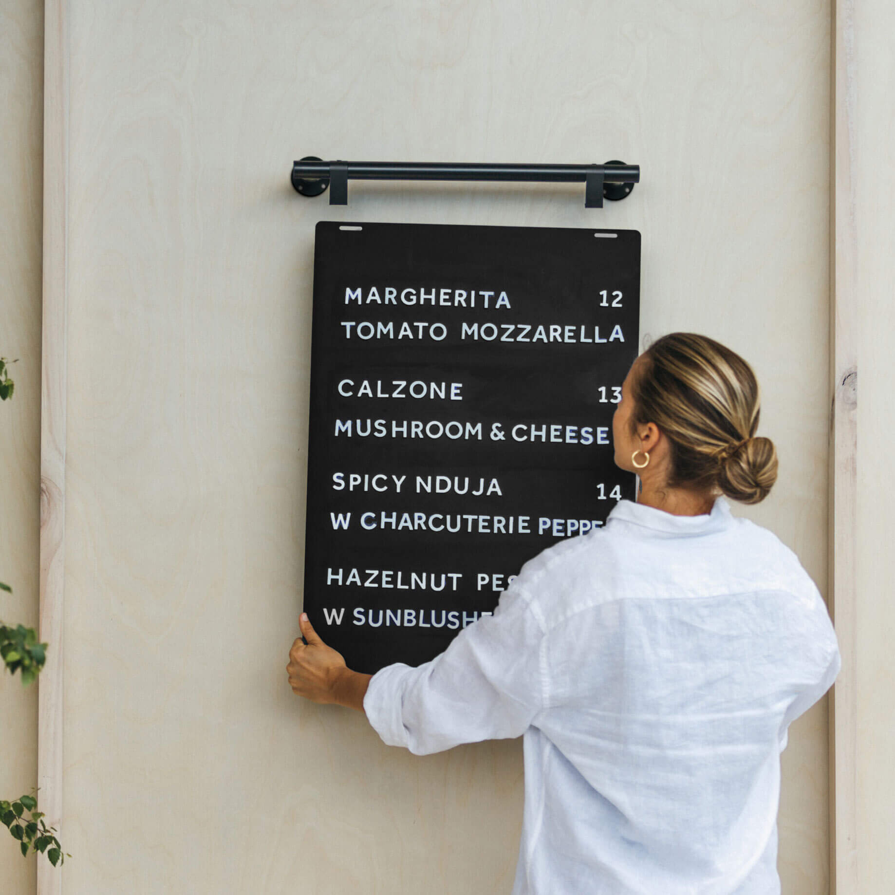
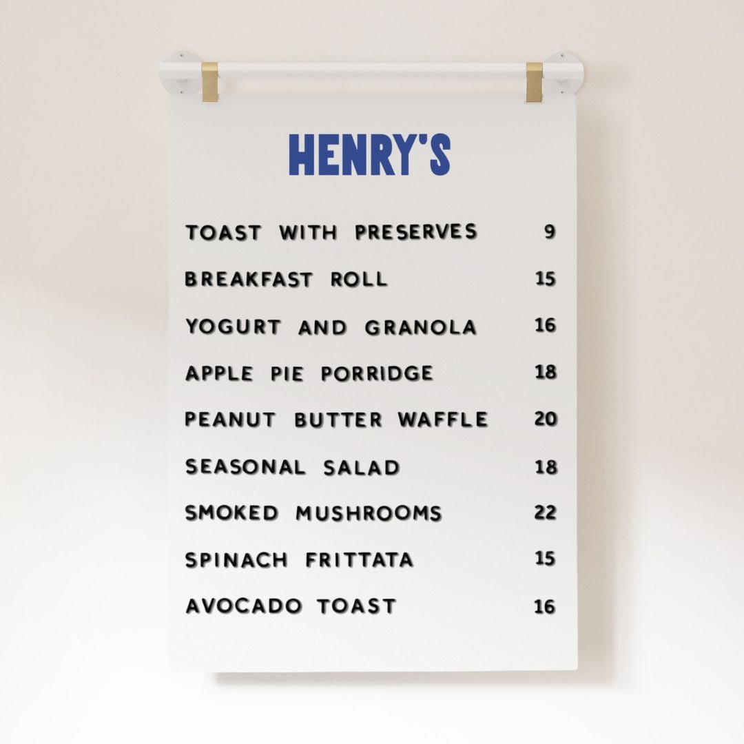
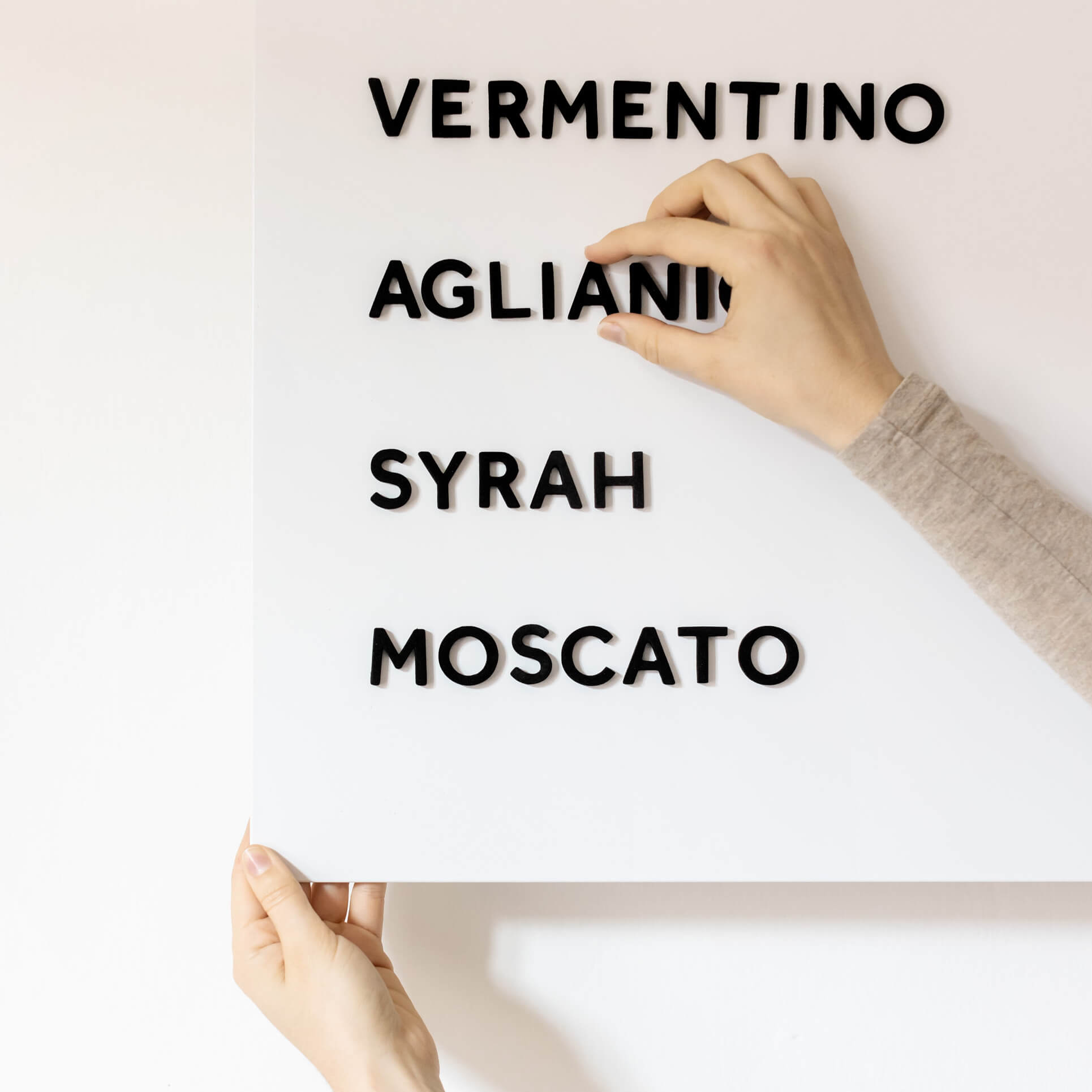
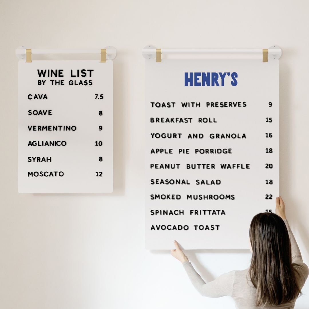
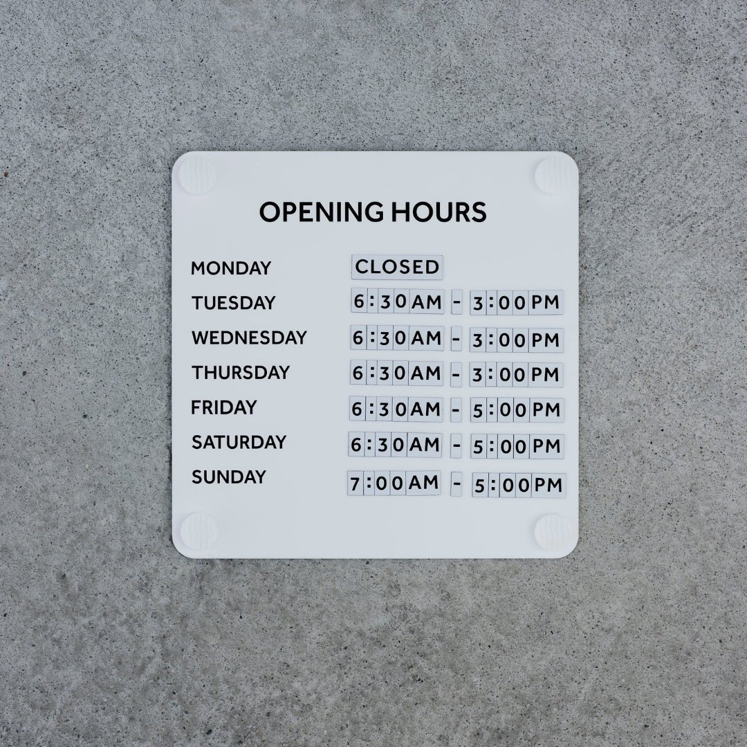
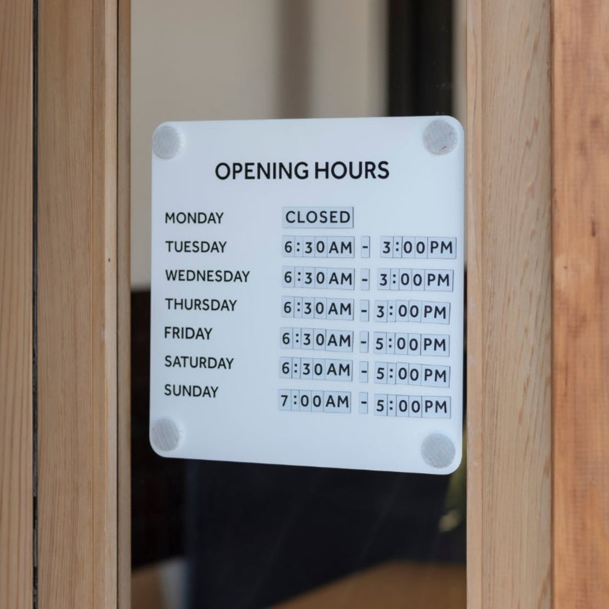
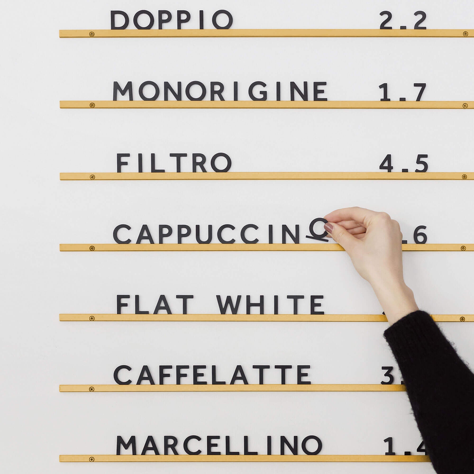
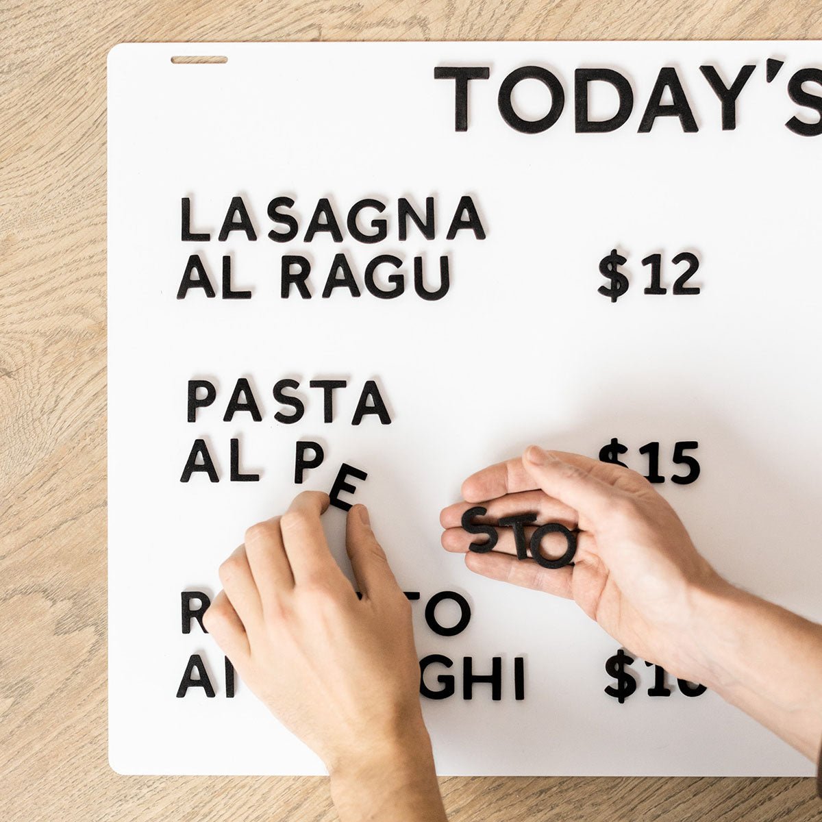
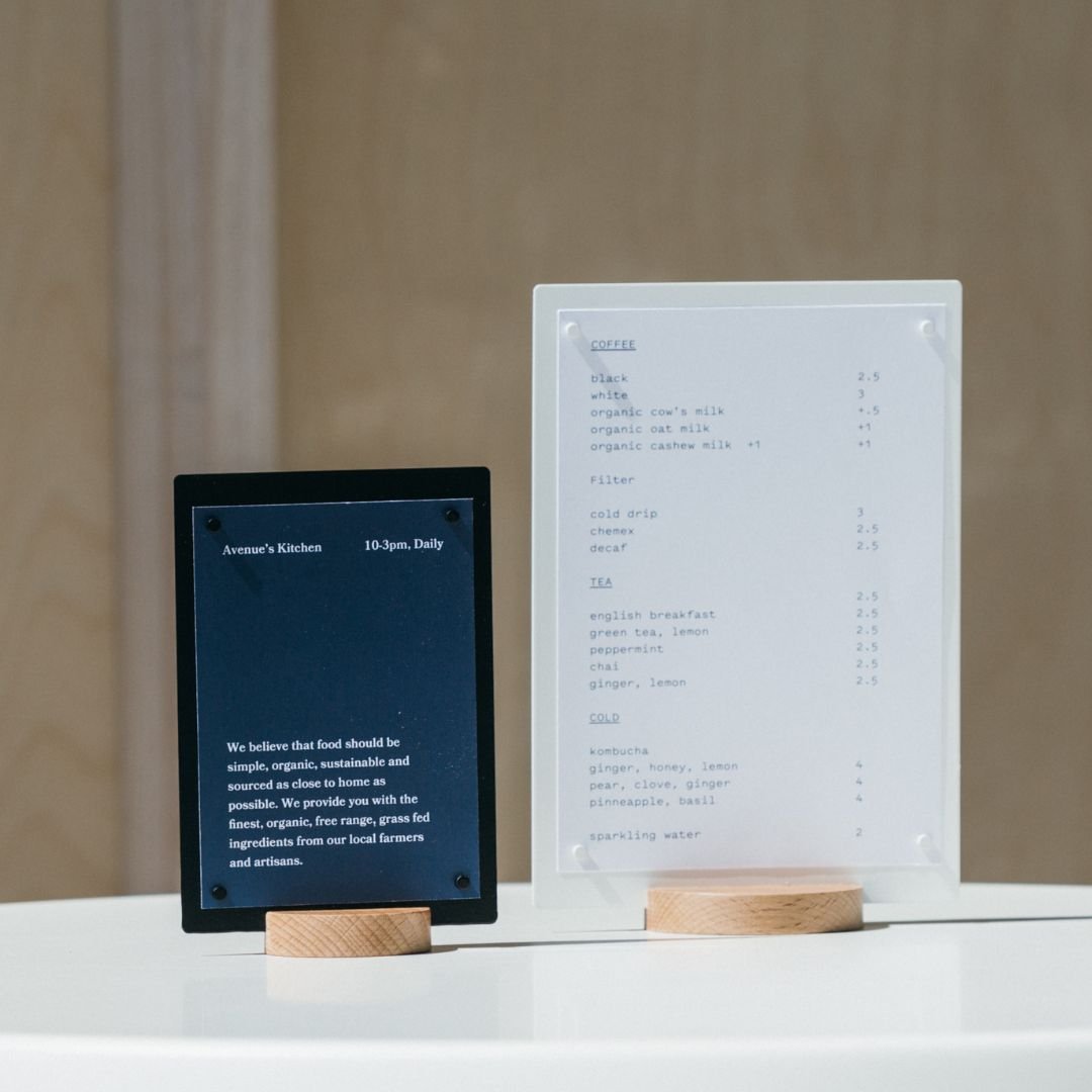
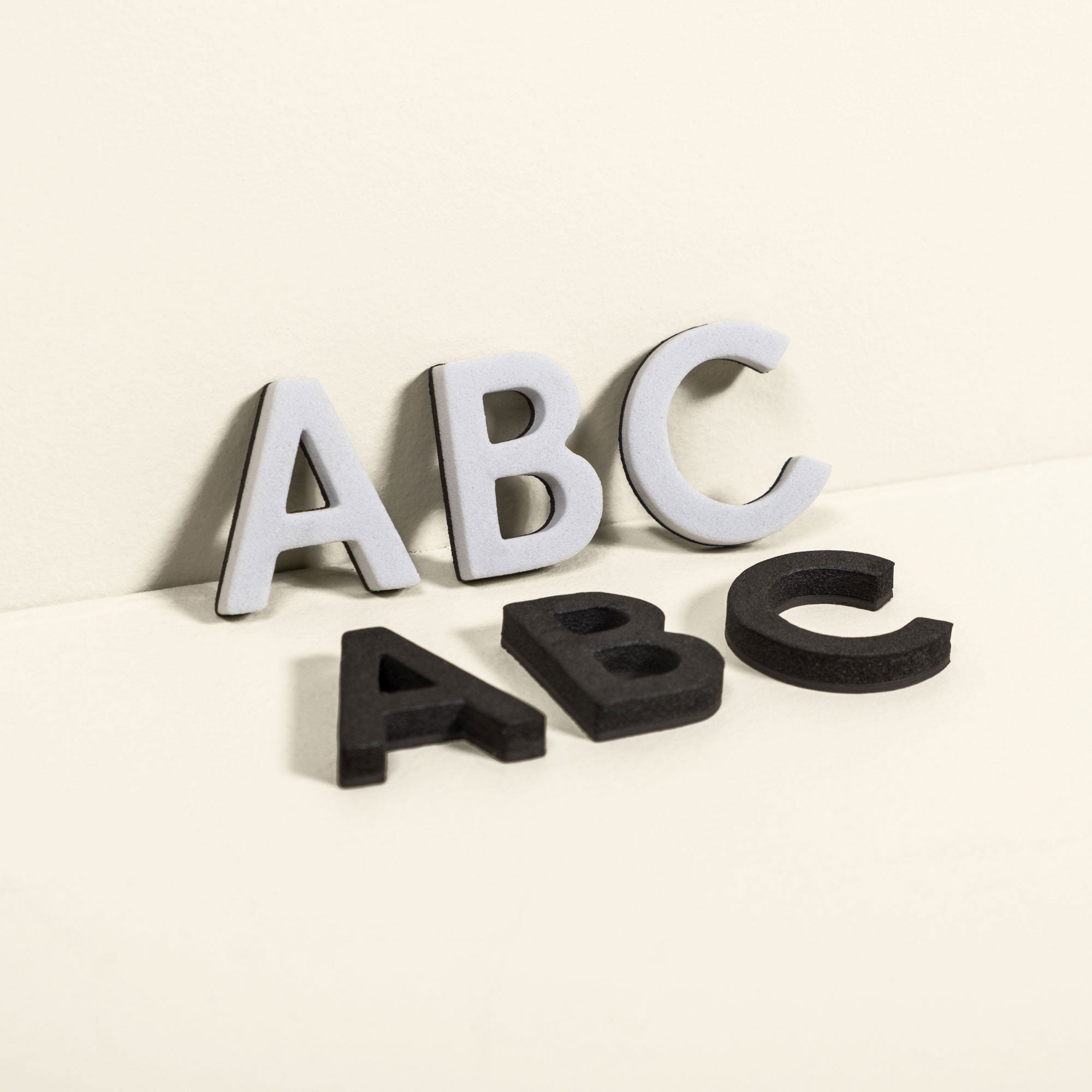
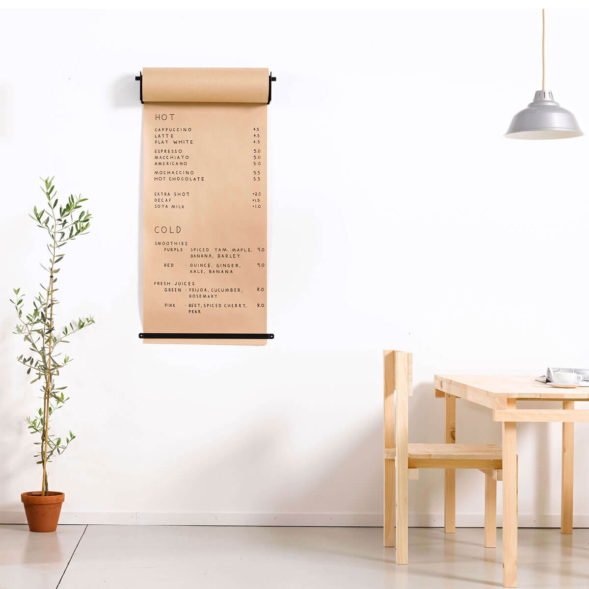
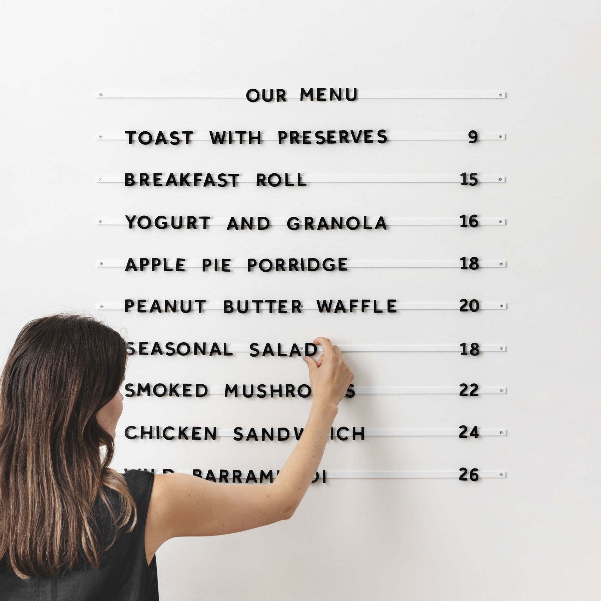
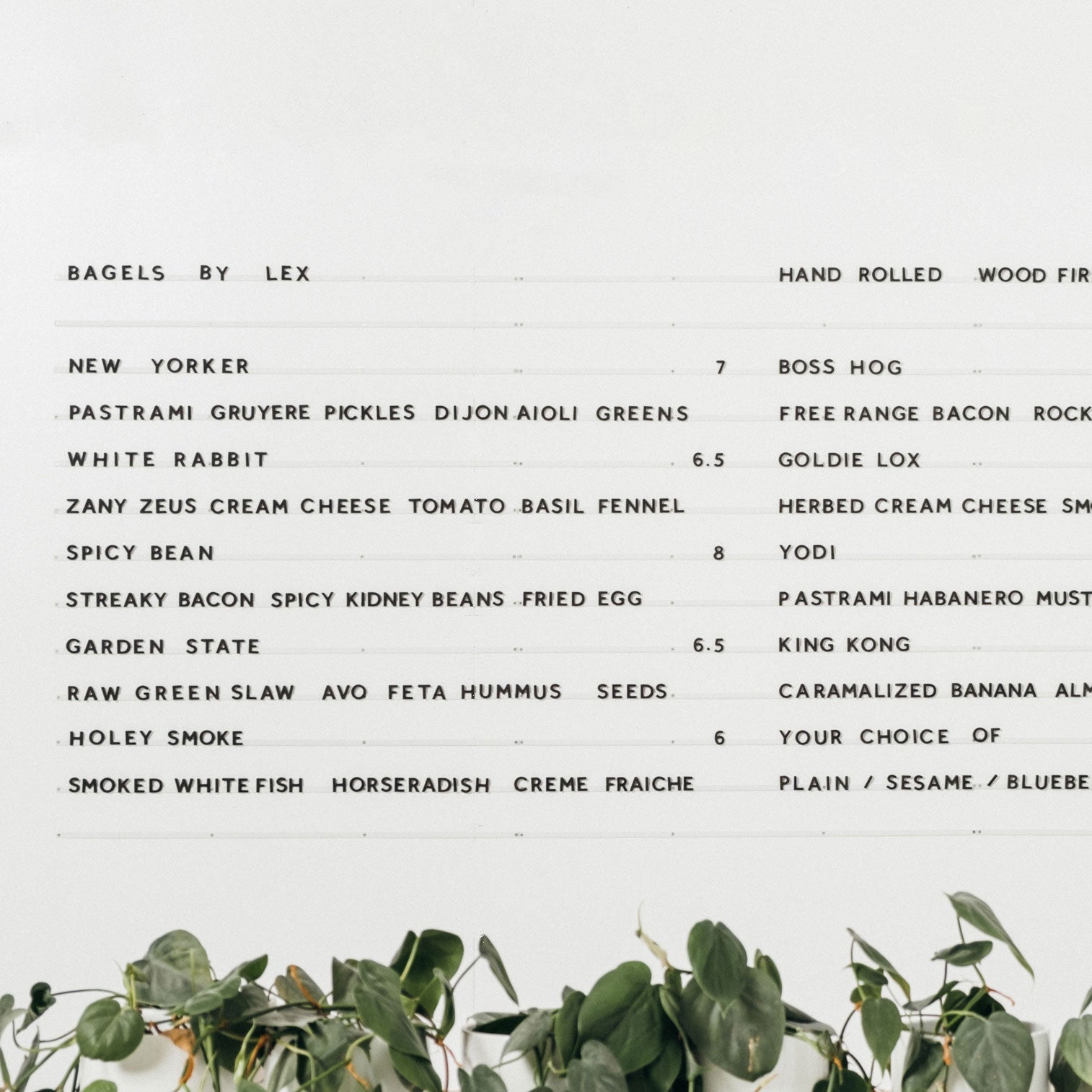
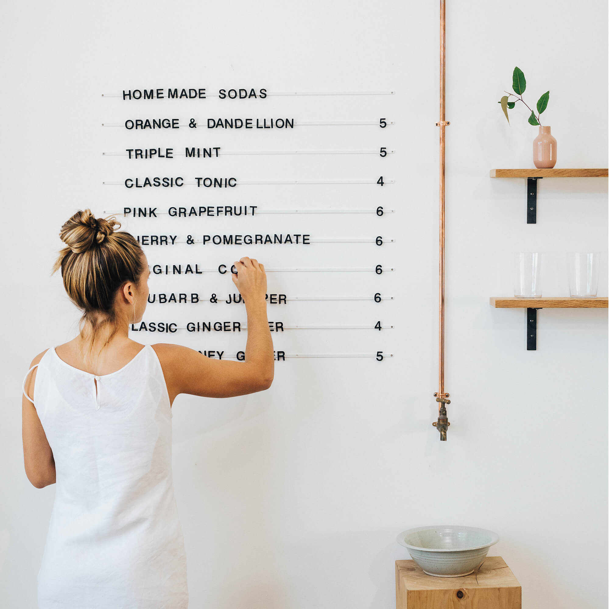
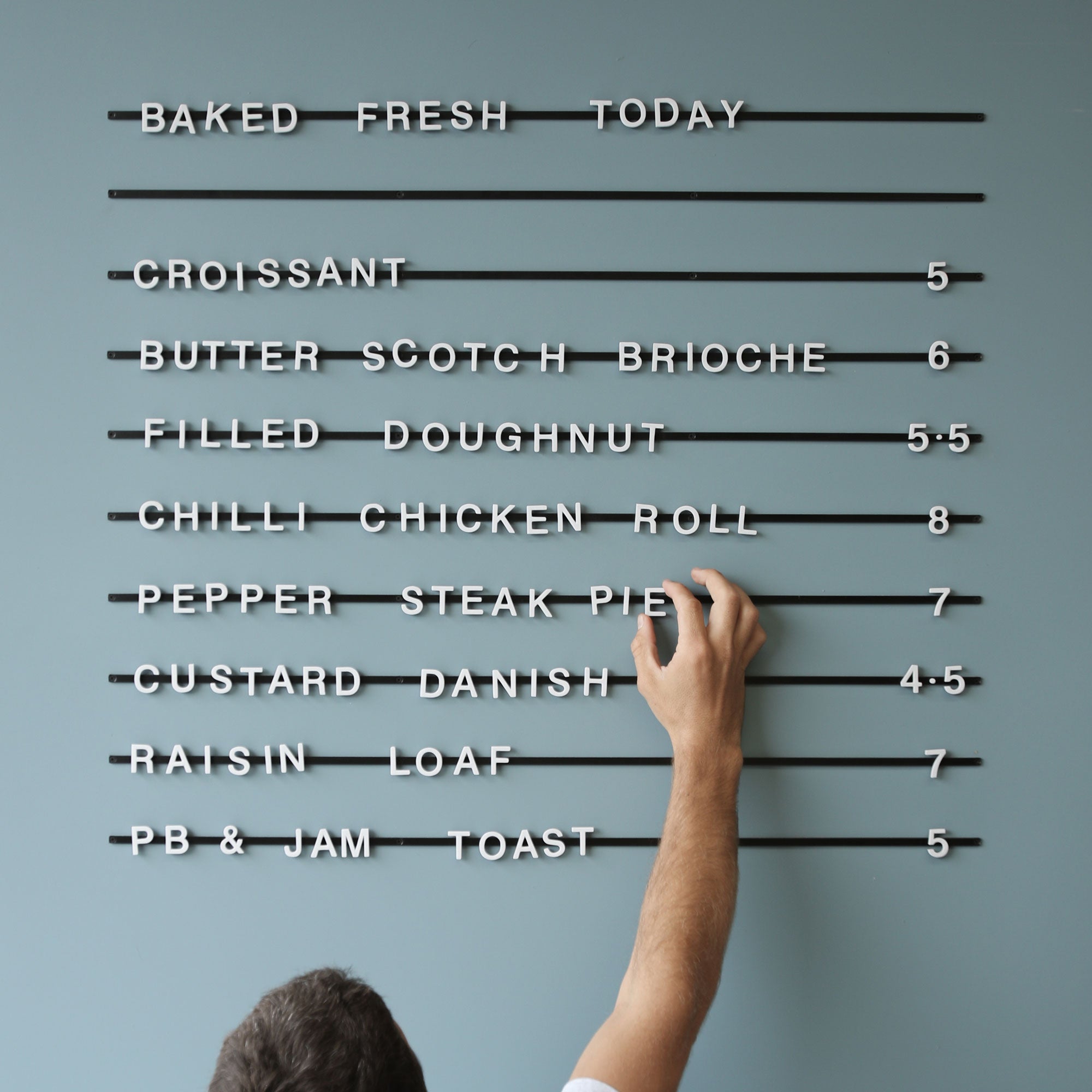
Following on from the same trend above, keep it simple with the small cafe interior too and keep the signage simple, clean, and to the bare minimum of what is necessary. Our park display has some good images in the product of displaying messages in a simple format, however, this could also be achieved on a basic chalkboard or decal.

The Park Letter Board is a great product to use for minimal interior signage
-
A Window Customers Can Order Through
One of my favorite things that people do with small coffee shop design has to do with utilizing the space and one of the best ways I think to design a small cafe interior actually relates to the exterior. This idea is to have a window in the wall next to the till or barista where people can order from outside. One of my favorite small cafes down the road has this and it has a public bench seat on the roadside, so you order your coffee through the window then sit outside and wait for it. I am not sure exactly why, but I really enjoy this and think it has some sort of nostalgic/ novel value that you are ordering through a window.

A Coffee Window at About Life, Tokyo
-
White Space
Although this depends on what type of vibe you are going for with your small cafe interior, I think that in any small cafe design, one of the things you are trying to do is to make the space feel bigger than it is and not crammed. This can be done using colors as white is known for making spaces seem bigger and black making cafe and other interiors seem smaller then it goes without saying that keeping some white space is a good idea.
-
Using a Mirror
You will see this trick used in lots of small cafe interiors and for that matter, lots of small retail stores and small spaces in general. It is to use a big mirror along one wall which gives the feeling of looking out a window due to the reflection and is a bit of an illusion but genuinely does make space feel bigger. This is not necessarily groundbreaking but it is still worth thinking about for small coffee shop design.
-
Focus on the Details
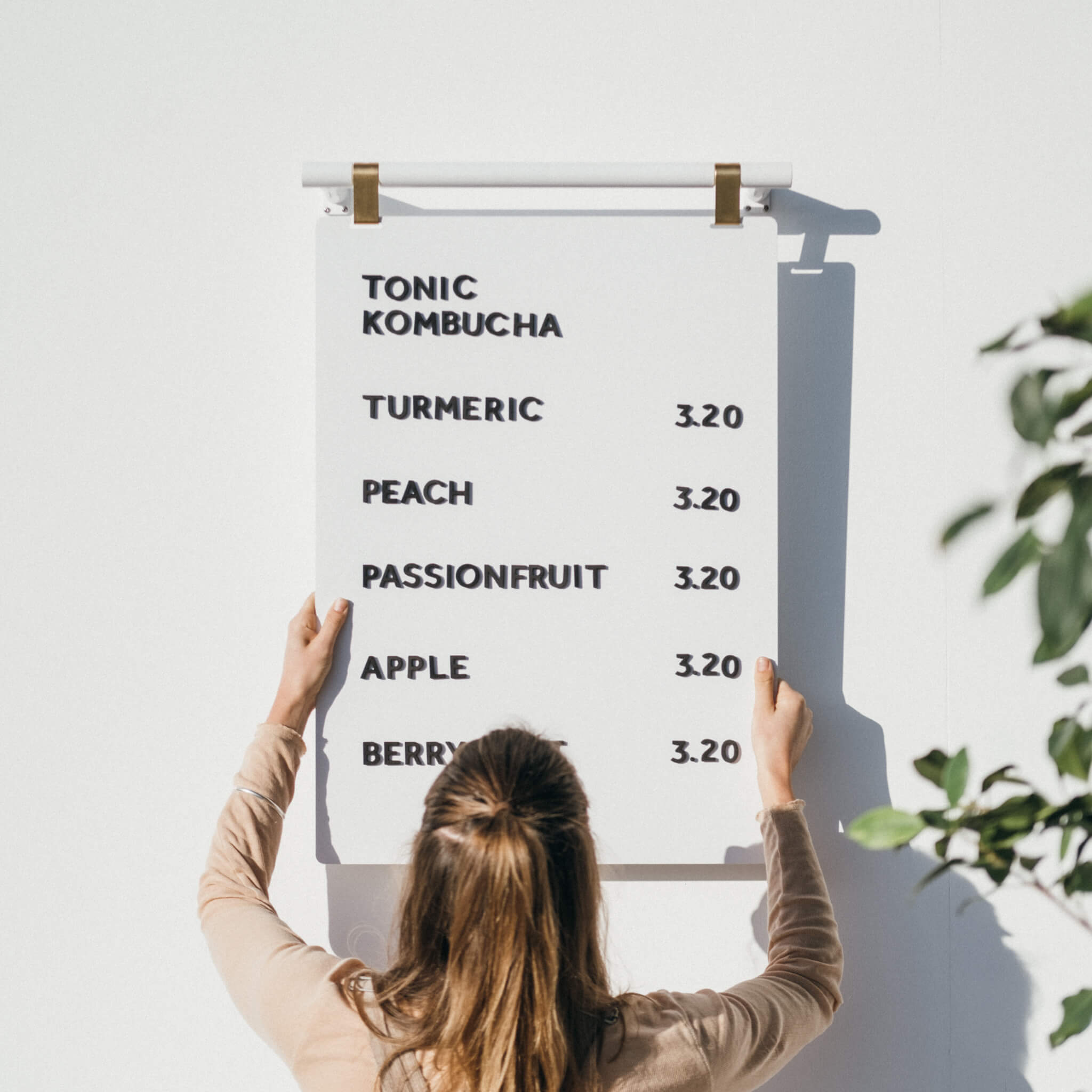
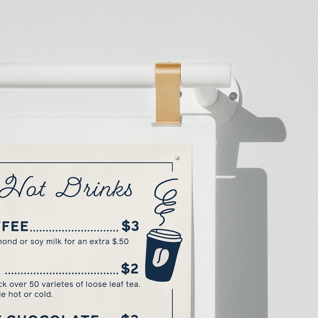
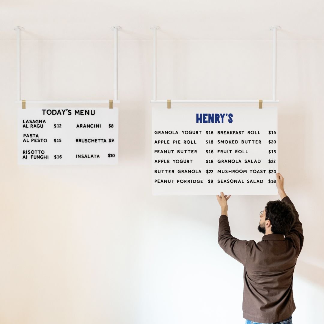
With small cafe design, you are going to have fewer details to make an impression on your customers so the ones you have you will need to make count. For example, you are only going to have a coffee menu, not a coffee, and a food menu, so you really need to make the coffee menu stand out. You are only going to have one entranceway, not two, so you will need to make it stand out.

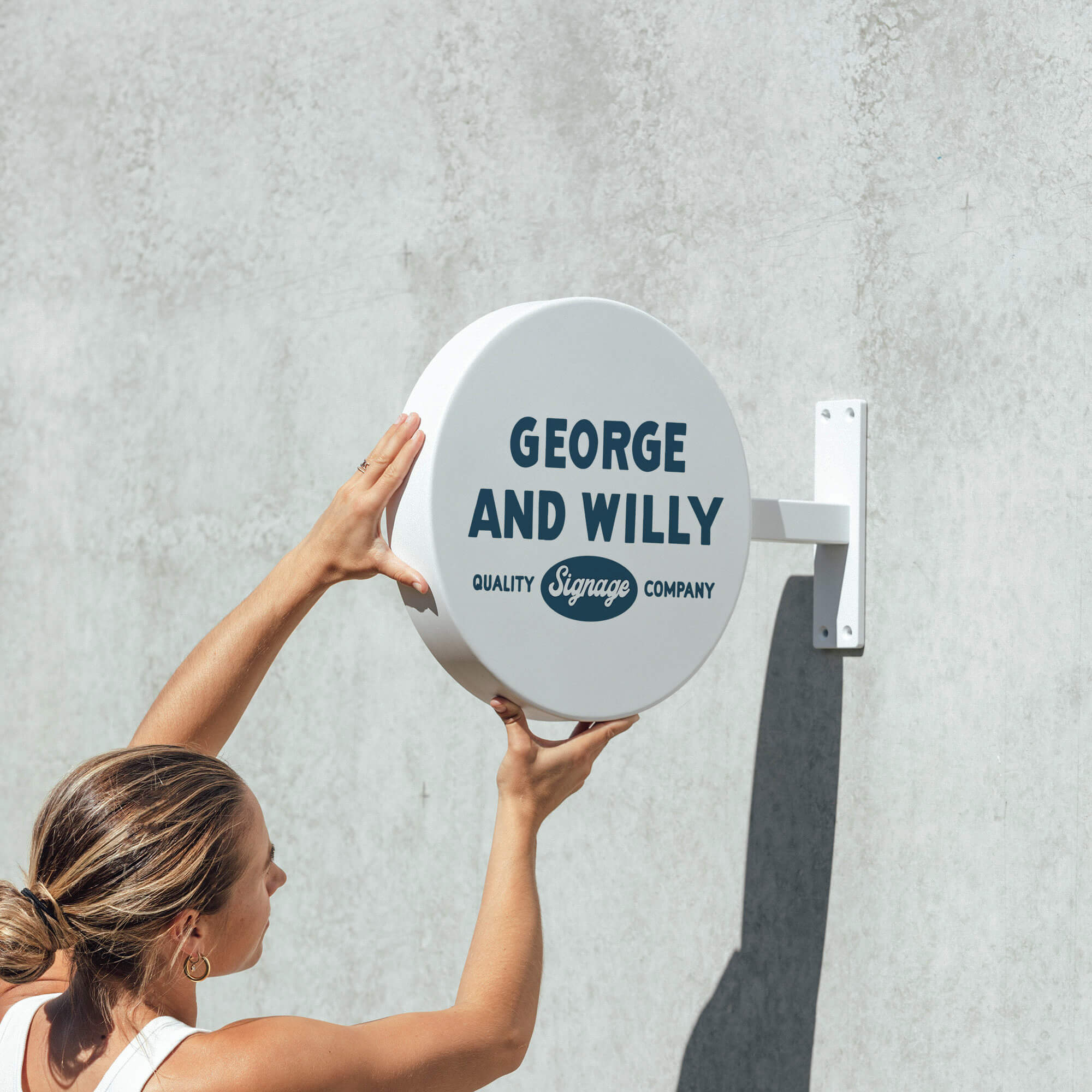
The Blade Sign is a great small sign for adding little signage details
-
The Coffee and the People
I can go on and on about small cafe design, small cafe interiors and what you should do, but at the end of the day, one of the key aspects of small cafe design is the people who are running the small cafe on the day to day and the quality of the coffee being served. No matter how good your small cafe interior is, if the people are not nice and the coffee is no good, then people are not going to come back. I know for me personally that I would rather go to a coffee shop with an average interior but great coffee and great people than the other way around.
A thought I had whilst writing that is related to this point:
It was in a coffee shop called 'Zombie Runner' in Palo Alto, California and it was actually a running shoe shop that sold coffee, so the 'small cafe design' for this small cafe was actually massive signage for a running shoe shop, and the coffee shop was full of running shoes. It was the best known local spot for coffee and it turned out that the guy who owned the shoe shop was passionate about coffee and had spent a lot of time learning and making the best coffees around, then he started selling them out of his running shoe shop. That proves my point that small cafe design is not as important as the coffee and people, although I would still prefer to order my coffee from a cafe than a shoe shop.

Zombie Runner, the best coffee I have ever had.
In conclusion, the basics of small coffee shop design are the same as designing any space but just pronounced due to the small size of keeping it simple. Thank you for reading, I hope you found a few interesting points and good luck if you are making a small coffee shop!
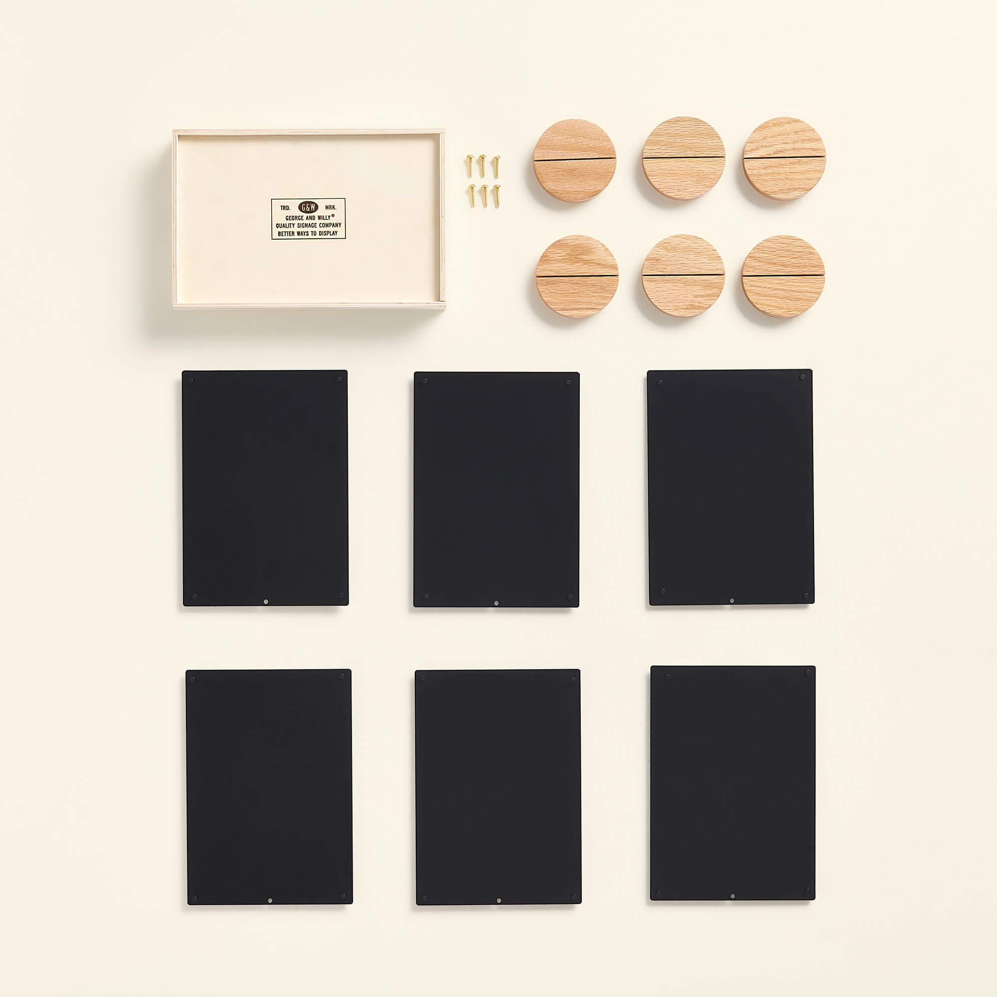
George & Willy make a range of products that can be used in small cafes. We have the Scout Letter Board, The Wooden Tabletop Sign, the Circle Sign, and the Chalk Sandwich Board for example. To shop the entire range click here.
To read about coffee shop layouts, click here


