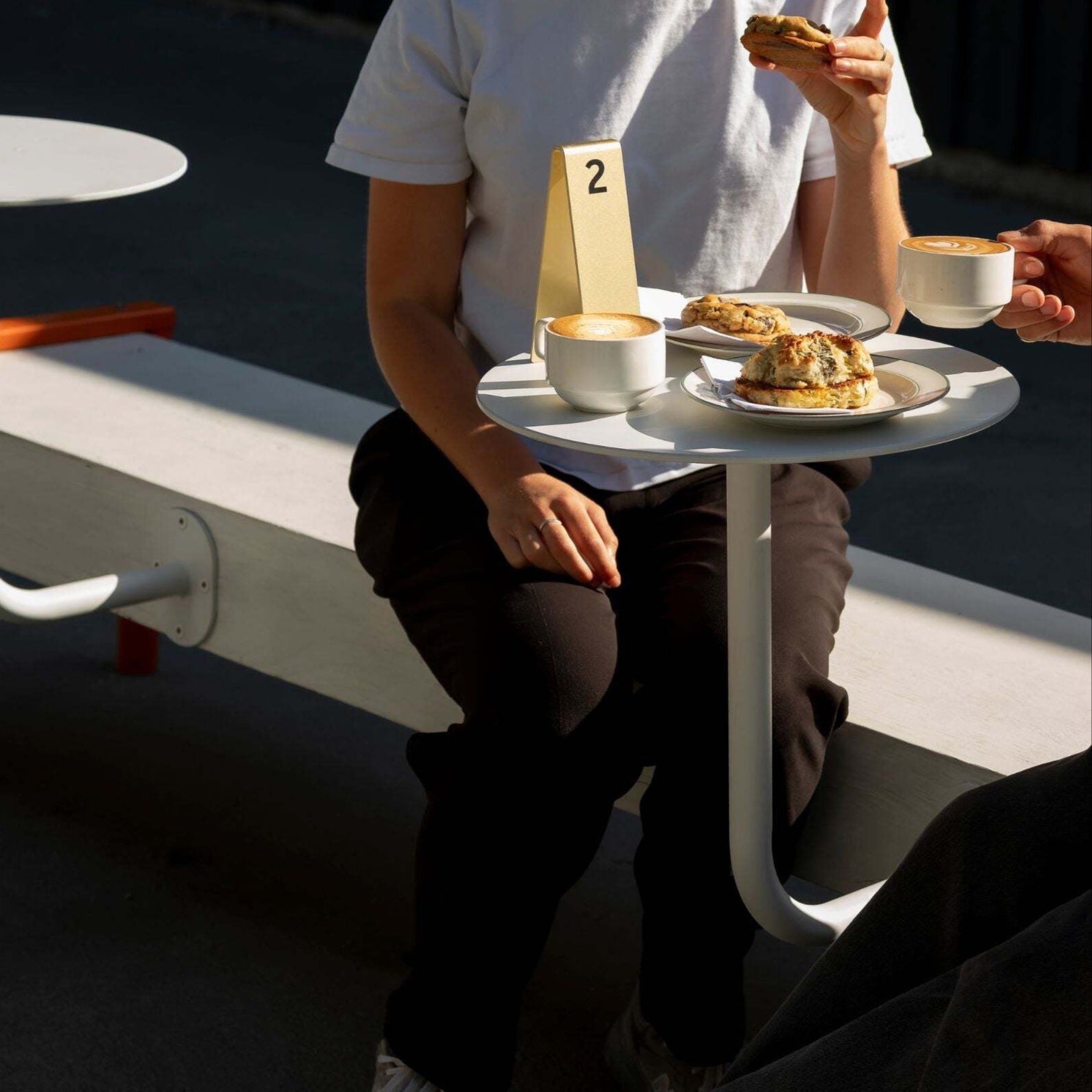
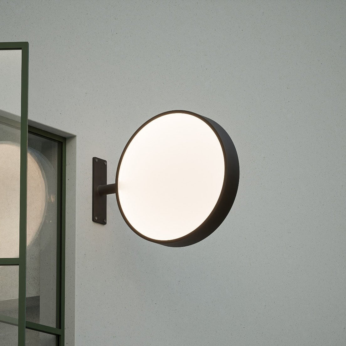
There are many facets to consider for your cafe design but at the end of the day it all boils down to one key aspect. Humans. You are designing for humans. It seems simple but can often be overlooked.
Human-Centered Design
A key creative approach often used in industrial and product design is human-centered Design. Human-centered design is all about building a deep empathy with the people you’re designing for and this can easily be applied to your cafe design. When comes to your cafe design, you're designing it for your customer. Put yourself in their shoes and live the experience of them coming to your cafe. Break it down into the complete journey. Step by step. Where have they come from, where are they going, why have they chosen your cafe, what are they wanting to get. Really put yourself in their position and empathize. Are they just passing by and want a quick coffee on the go or are they wanting a complete sit-down meal? These considerations should inform all aspects of your cafe design.
Do things in a considered, individual way
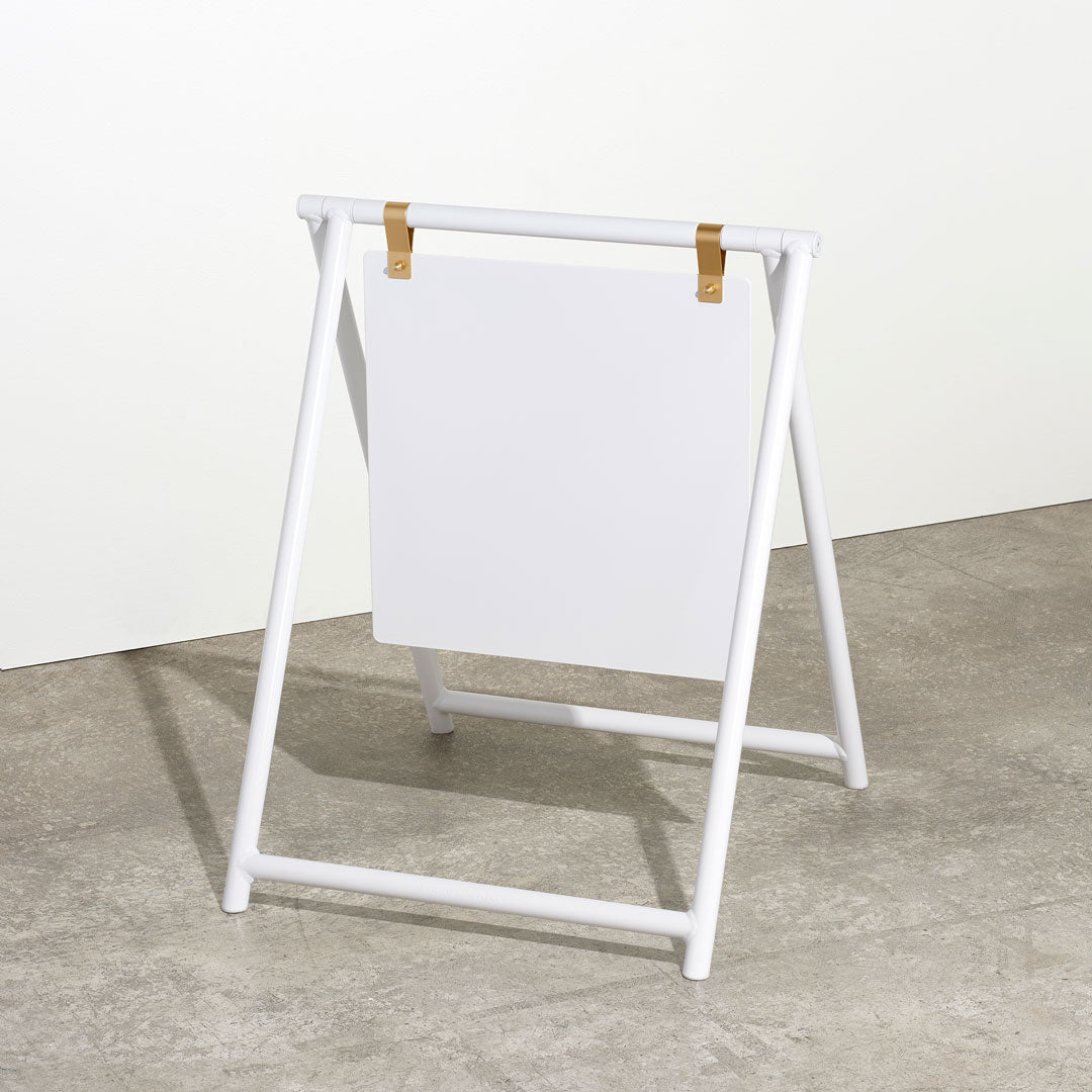
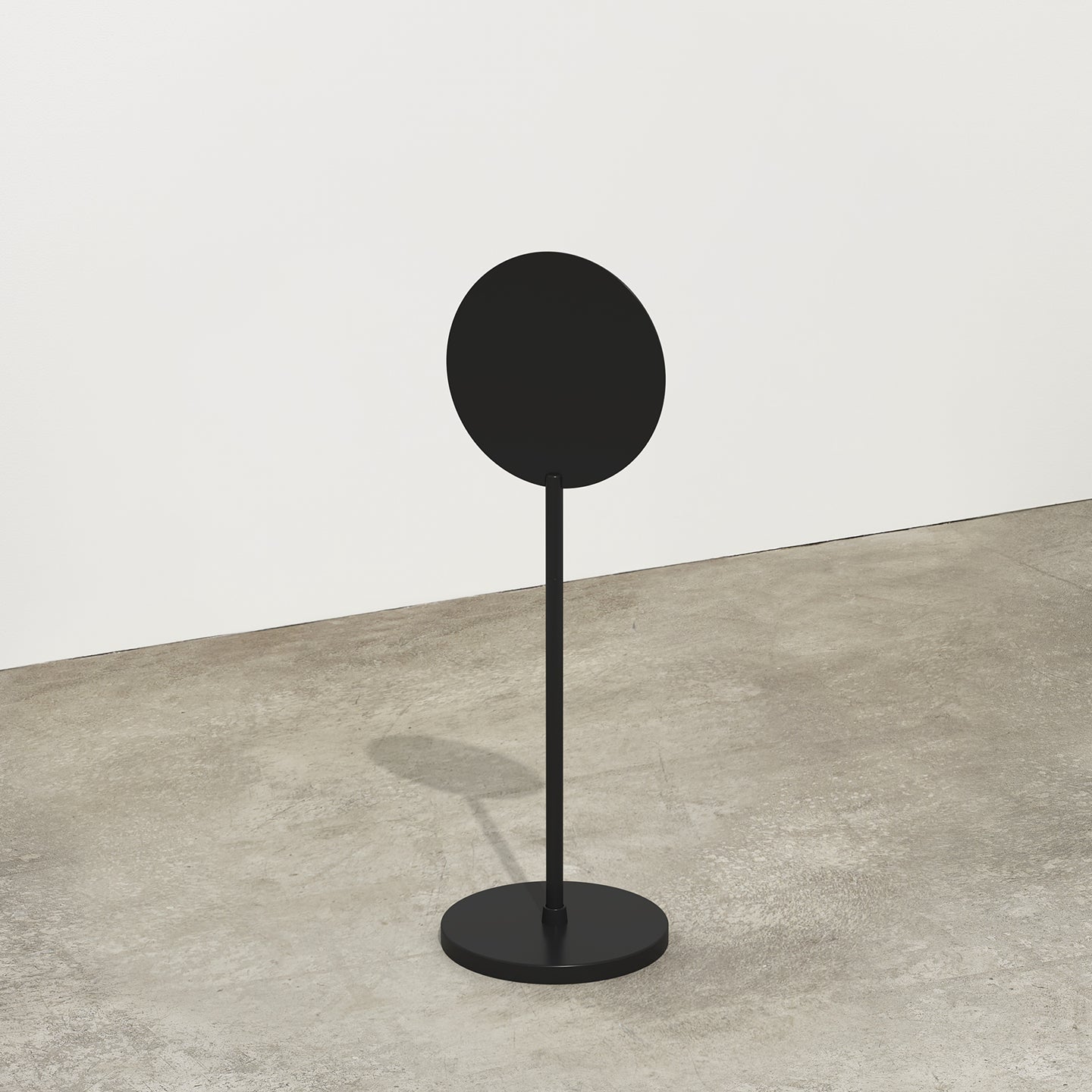
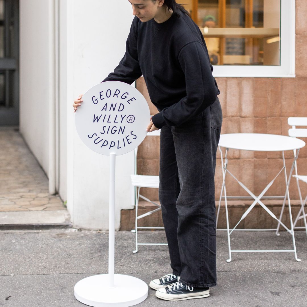
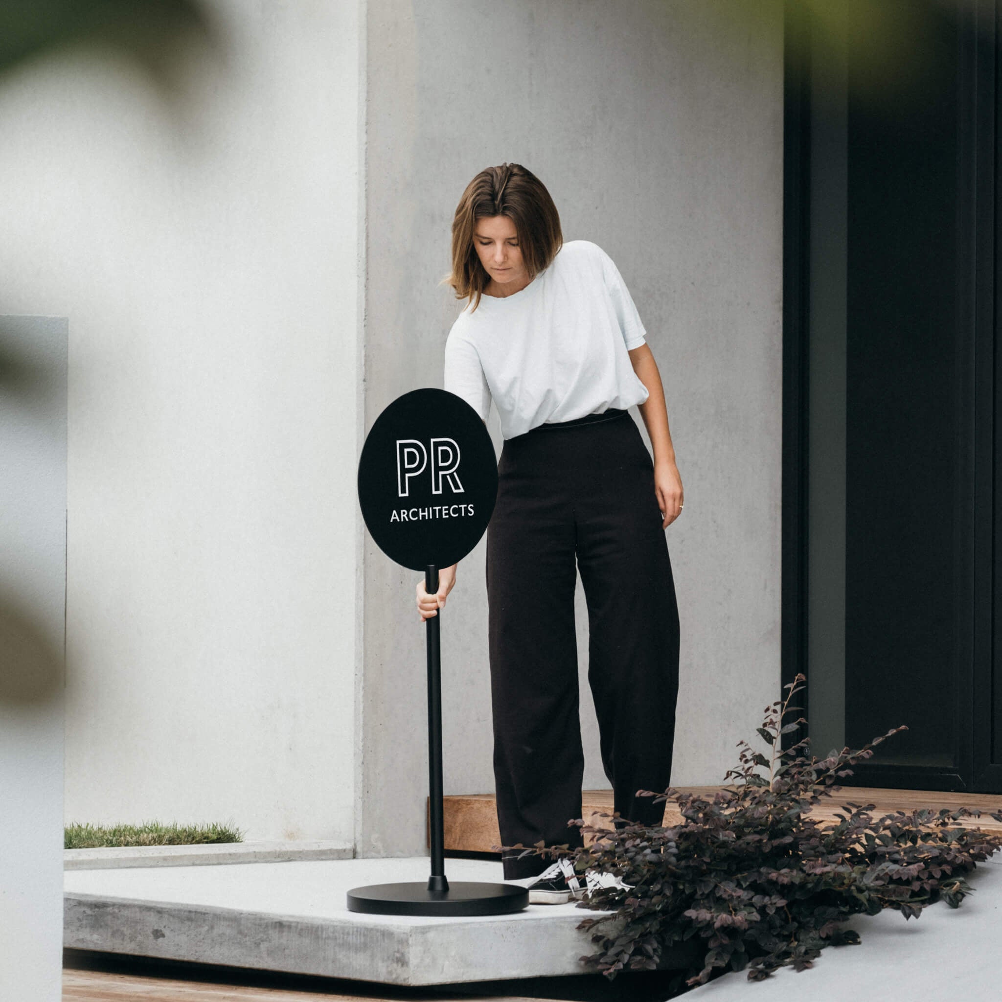
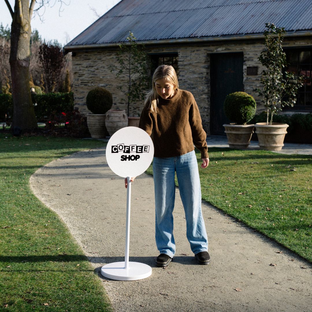
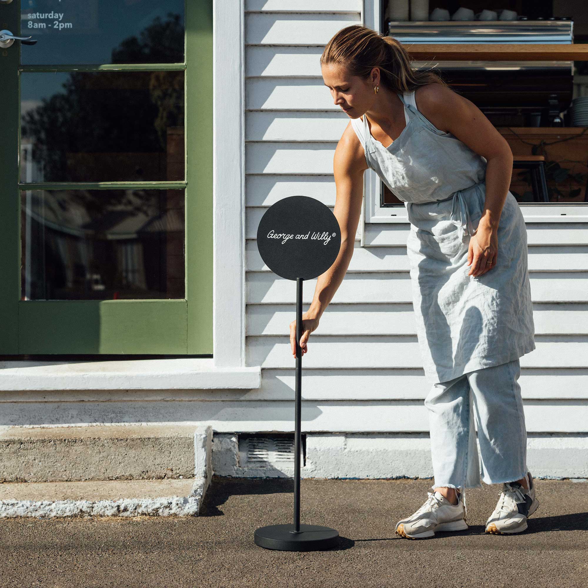
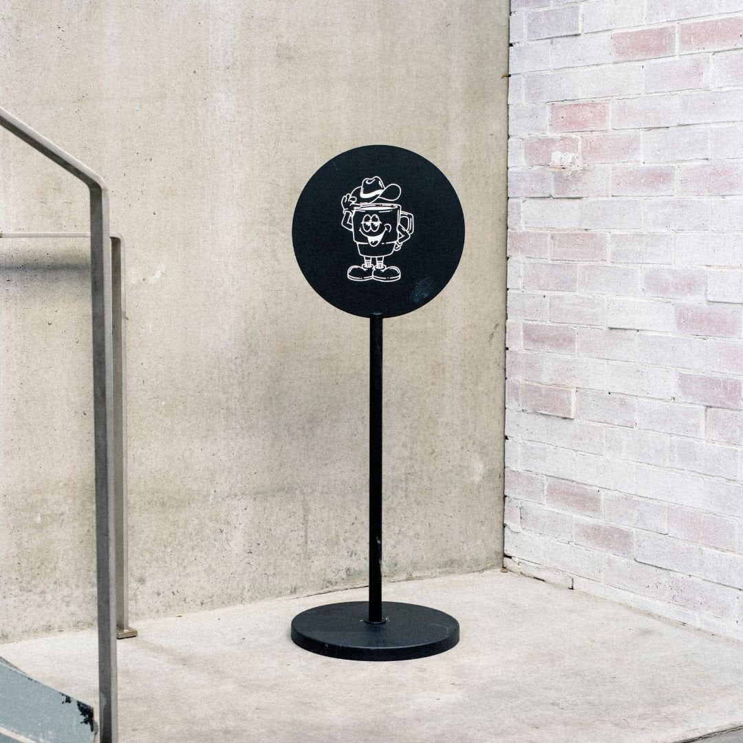
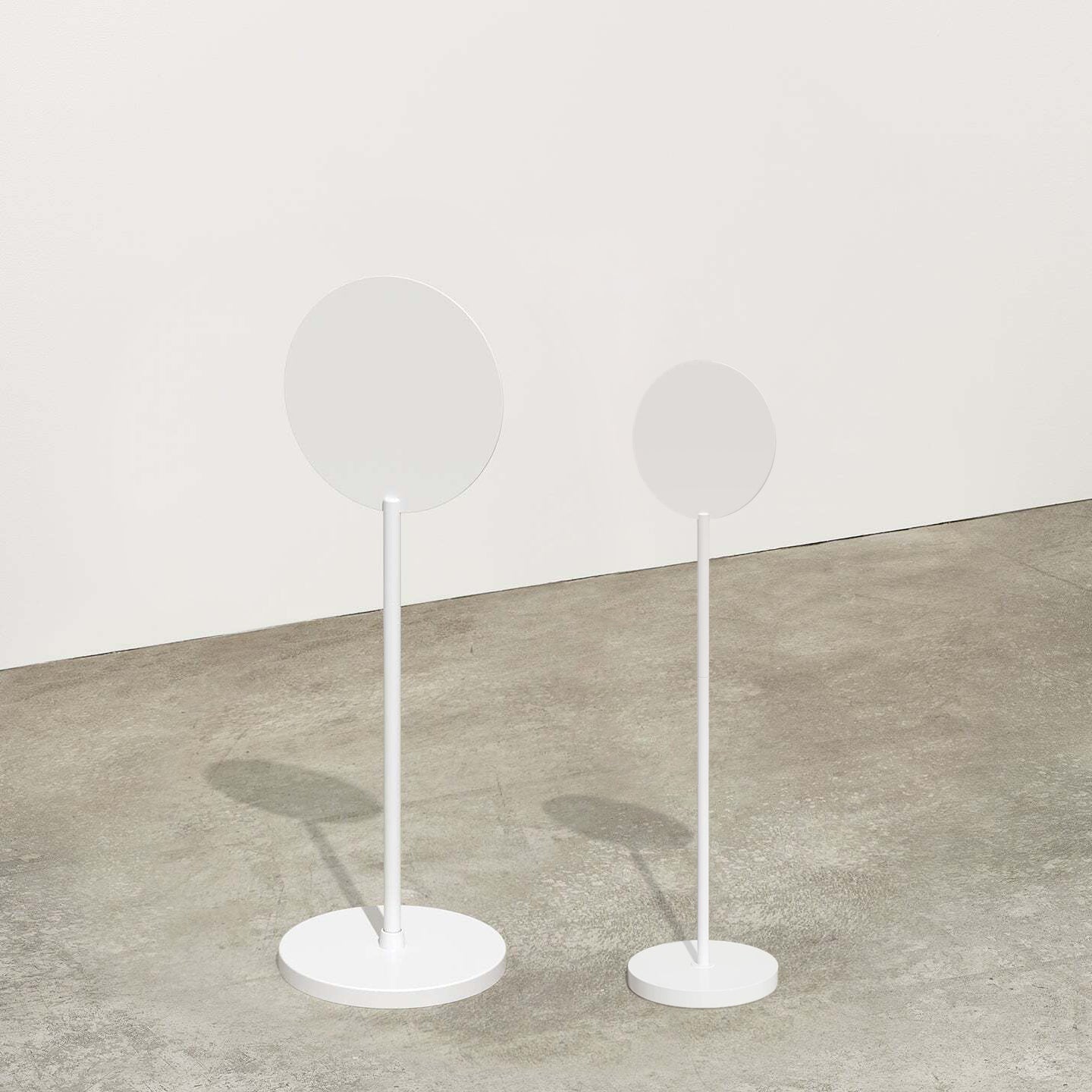
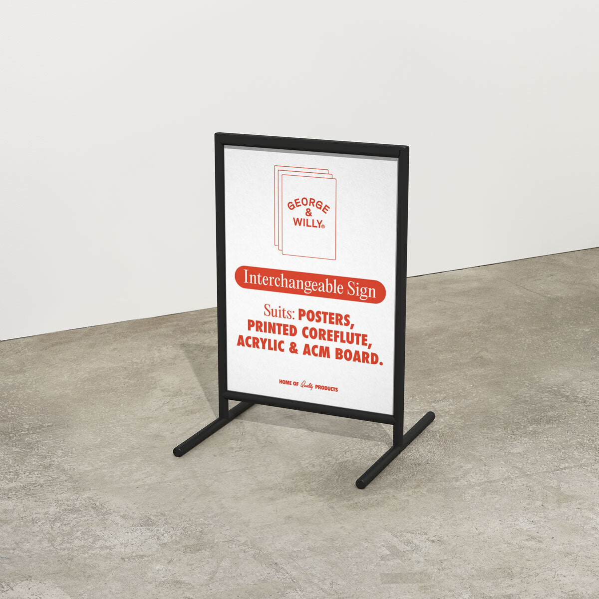
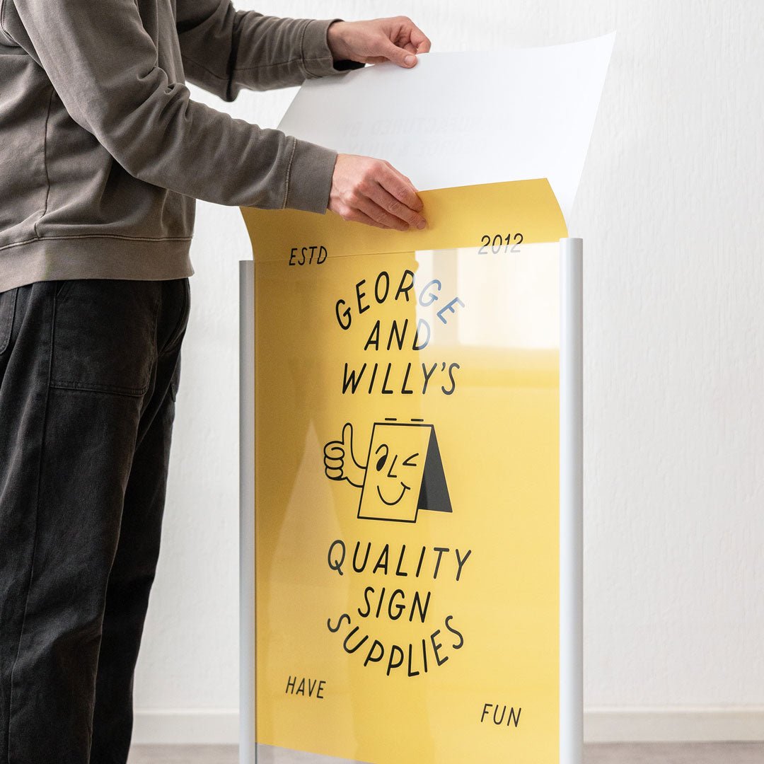
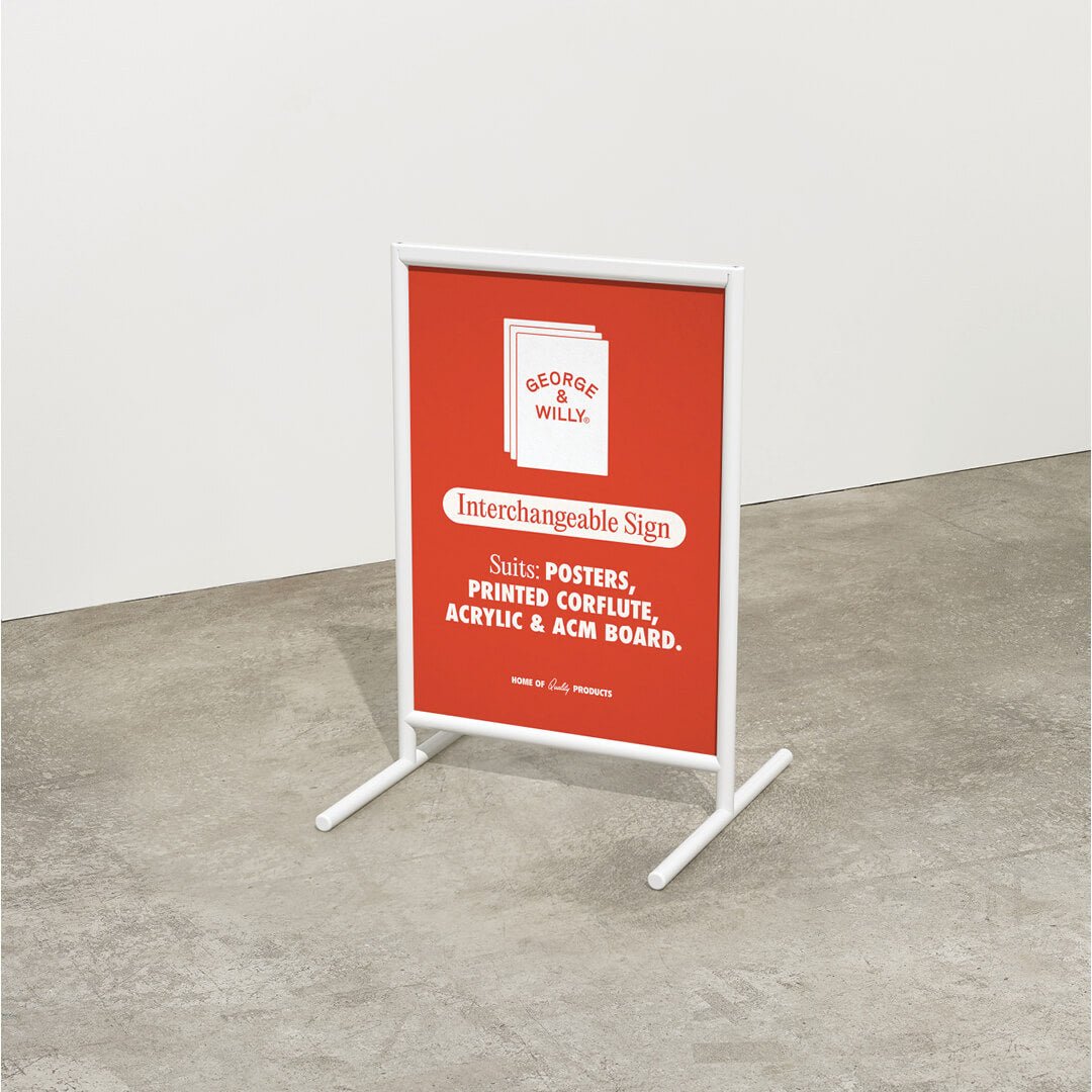
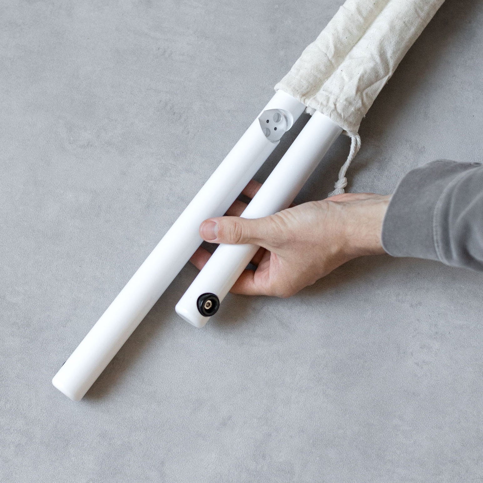
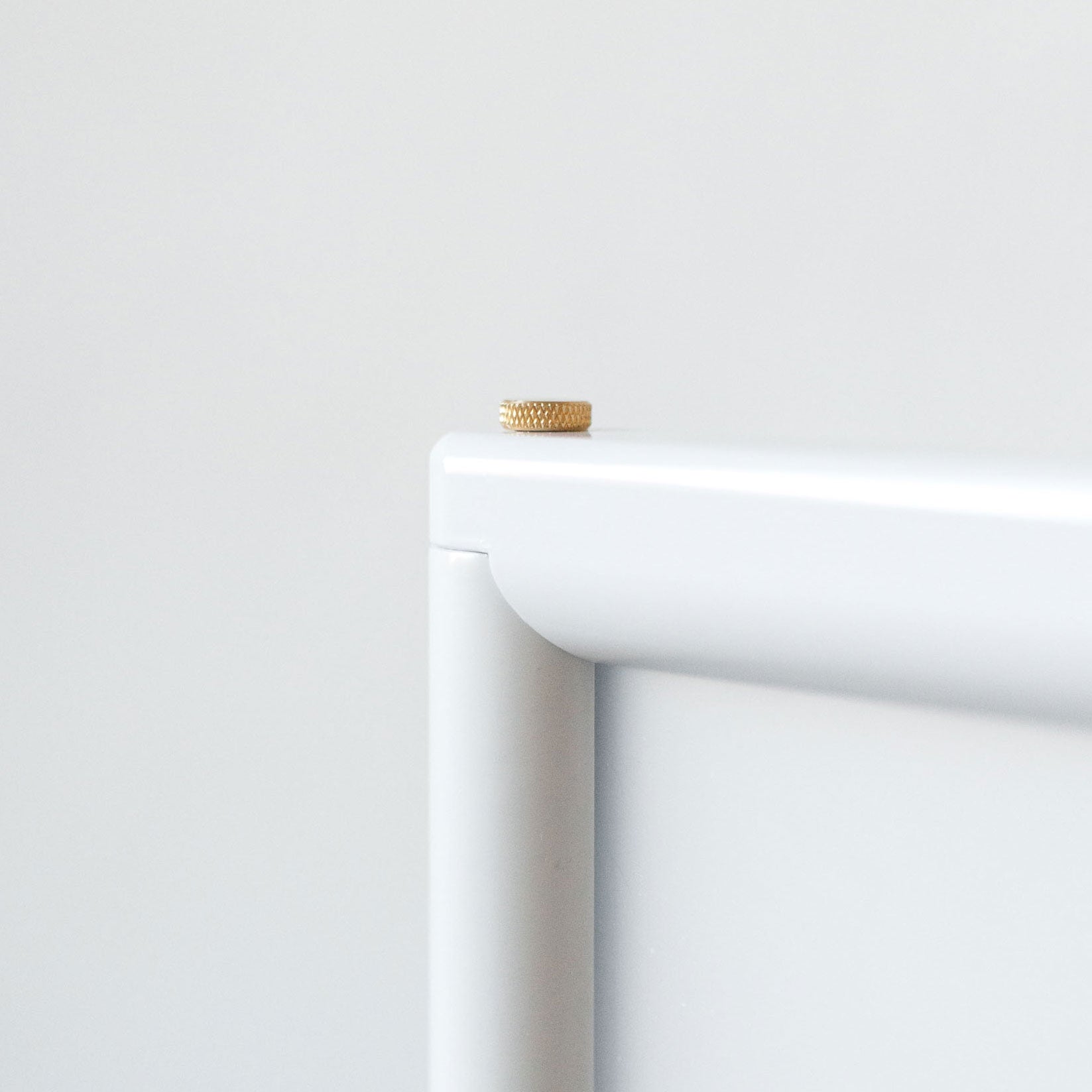
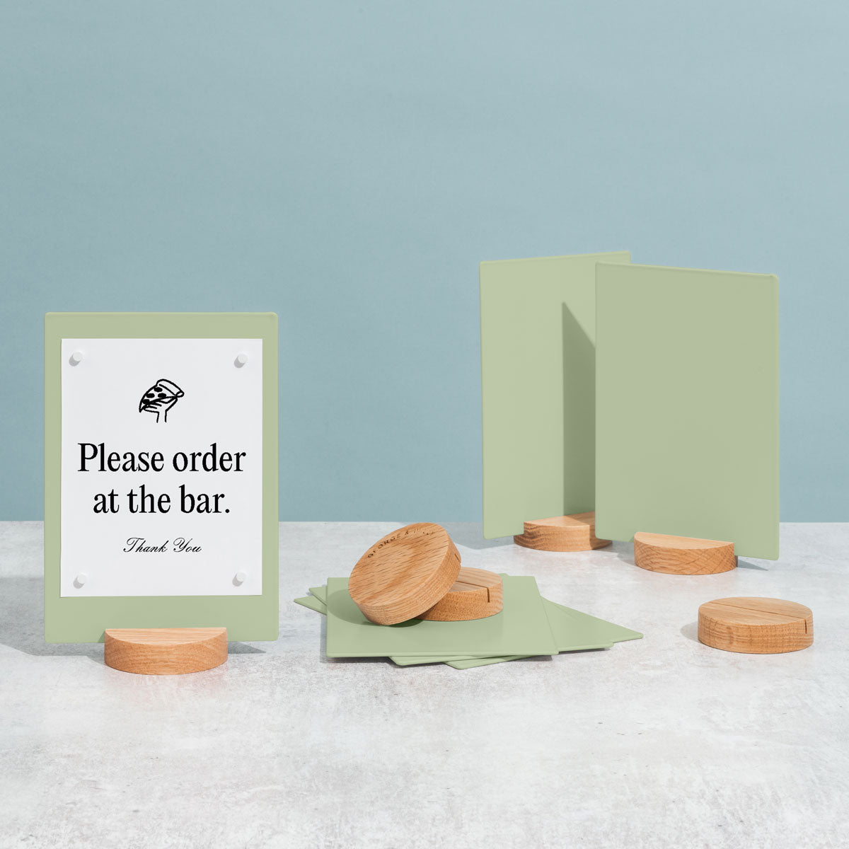
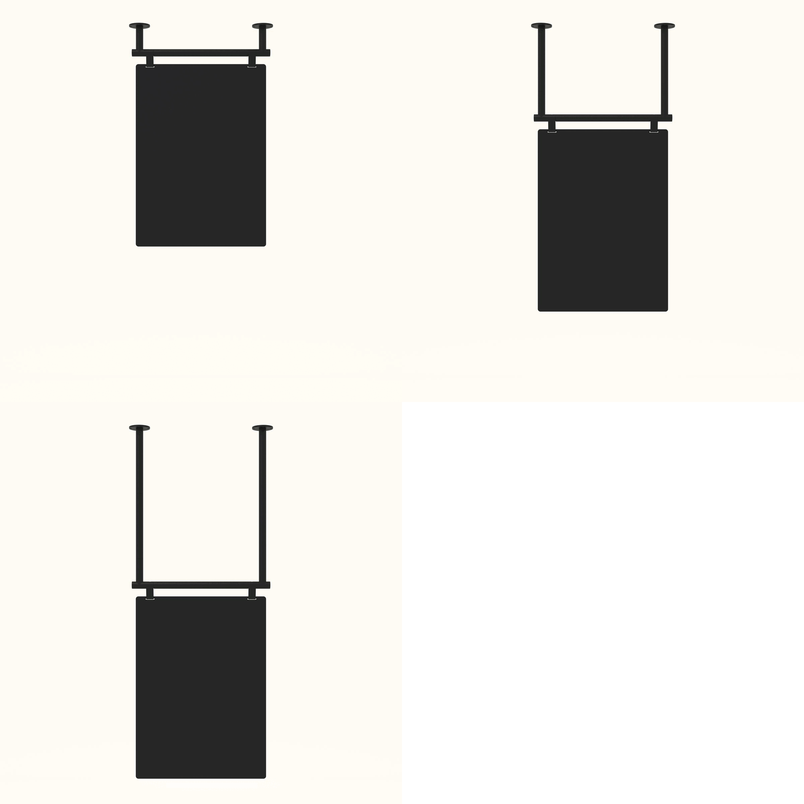
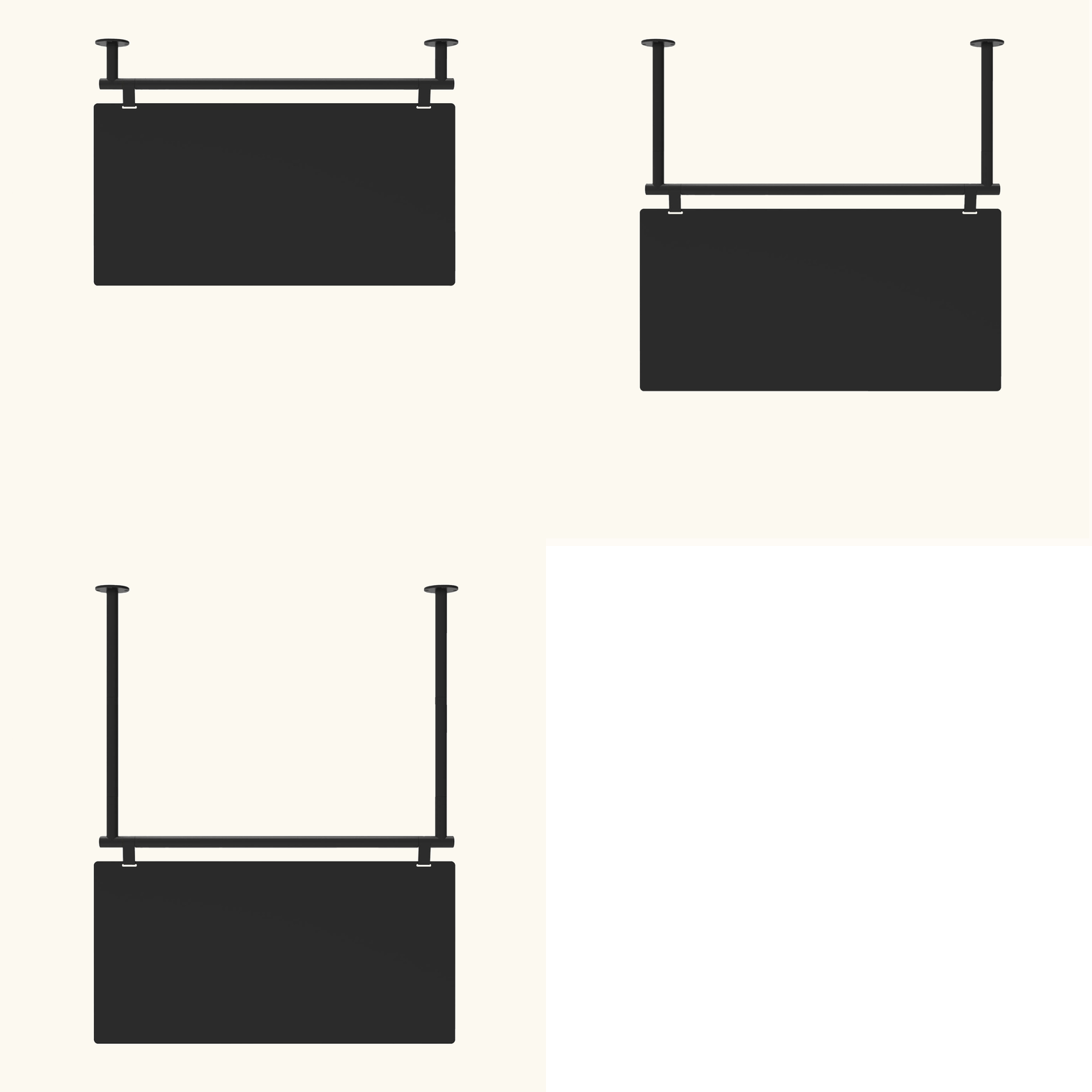
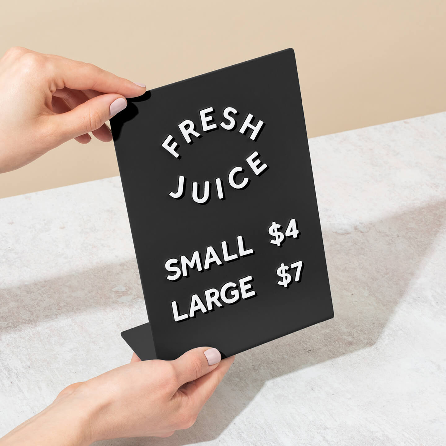
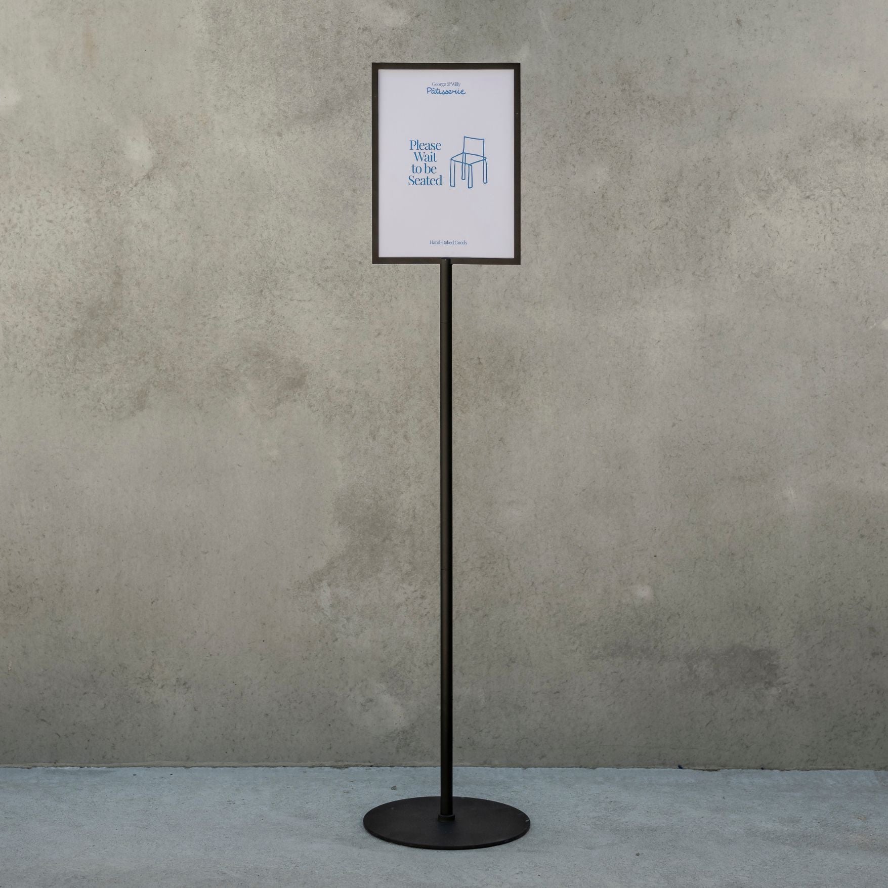
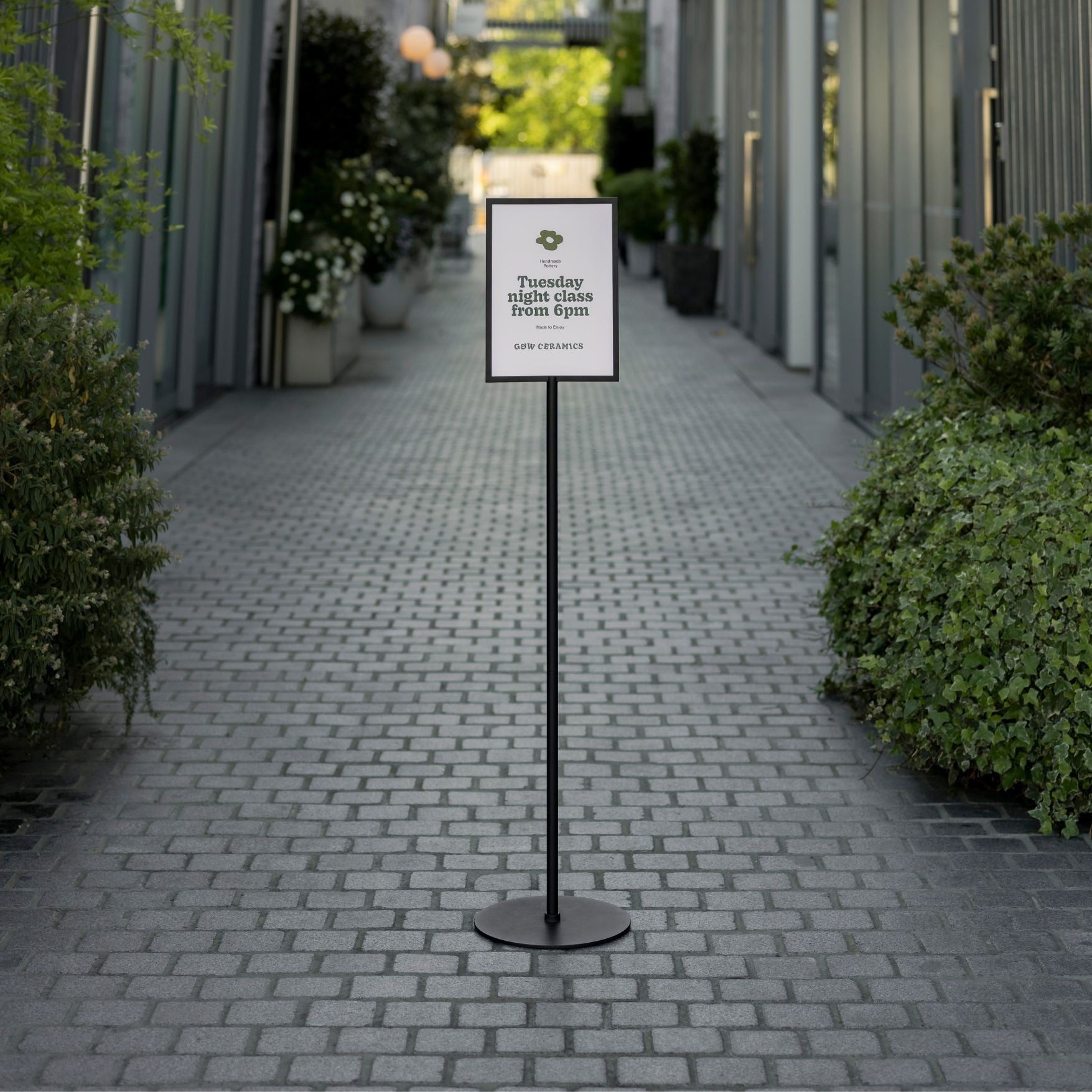
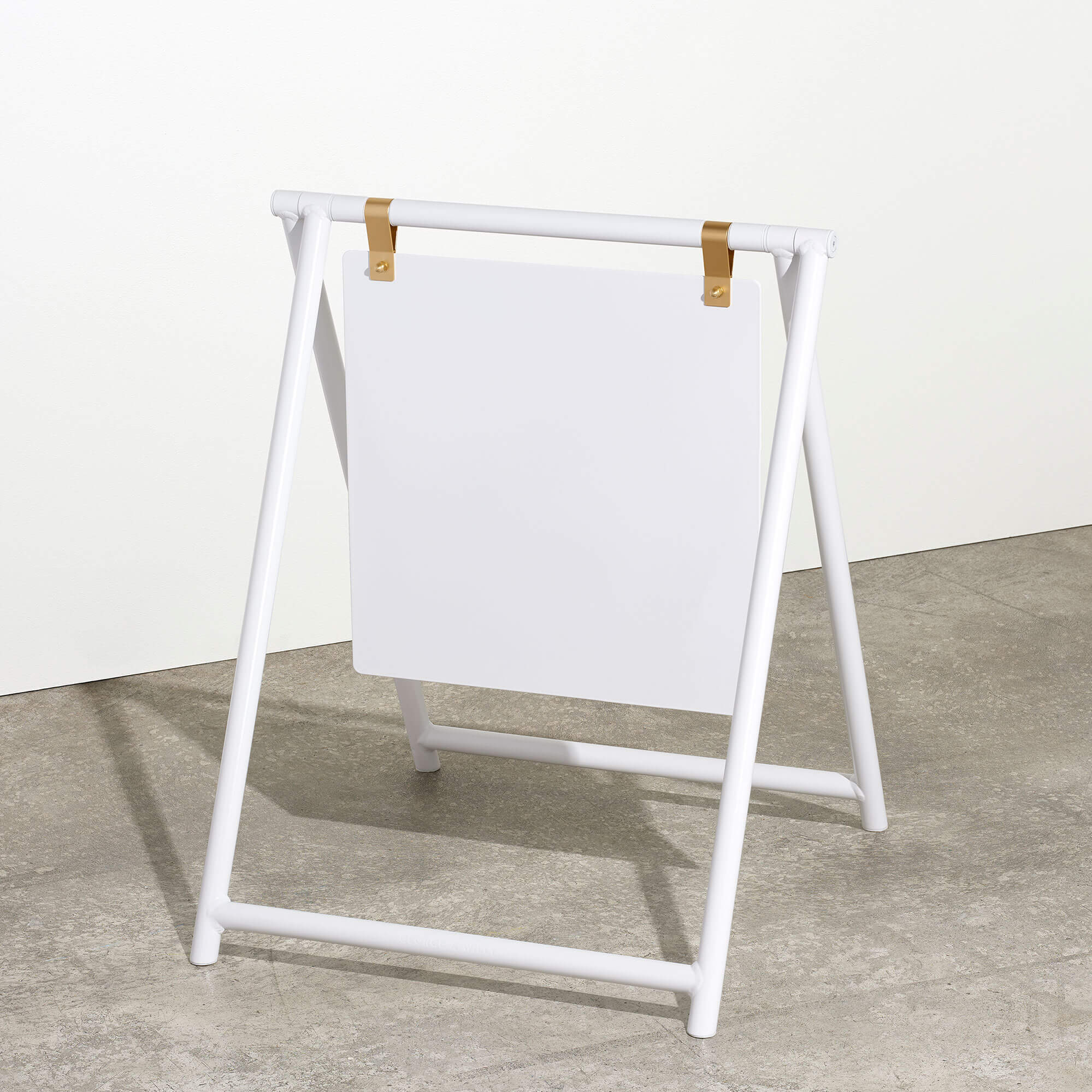
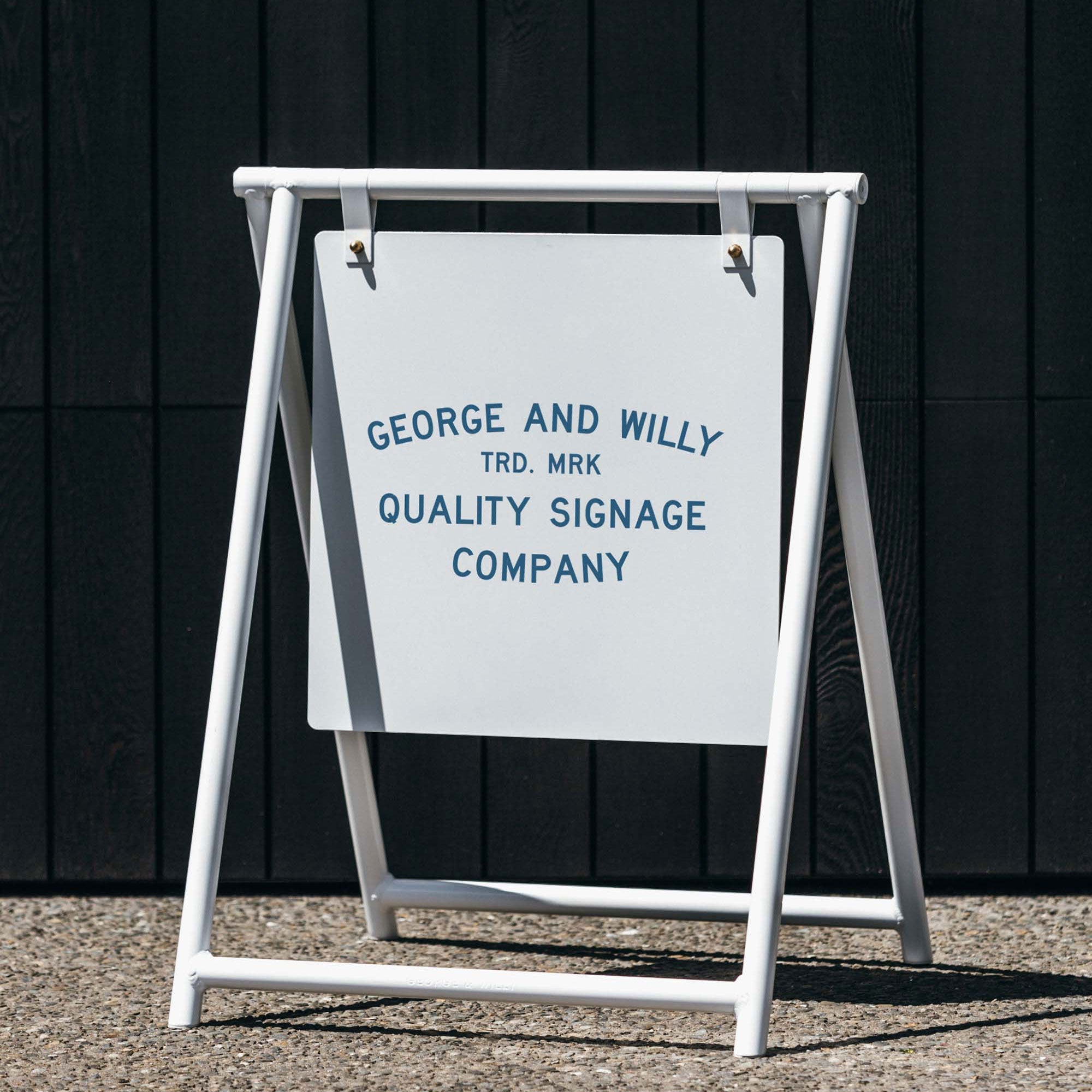
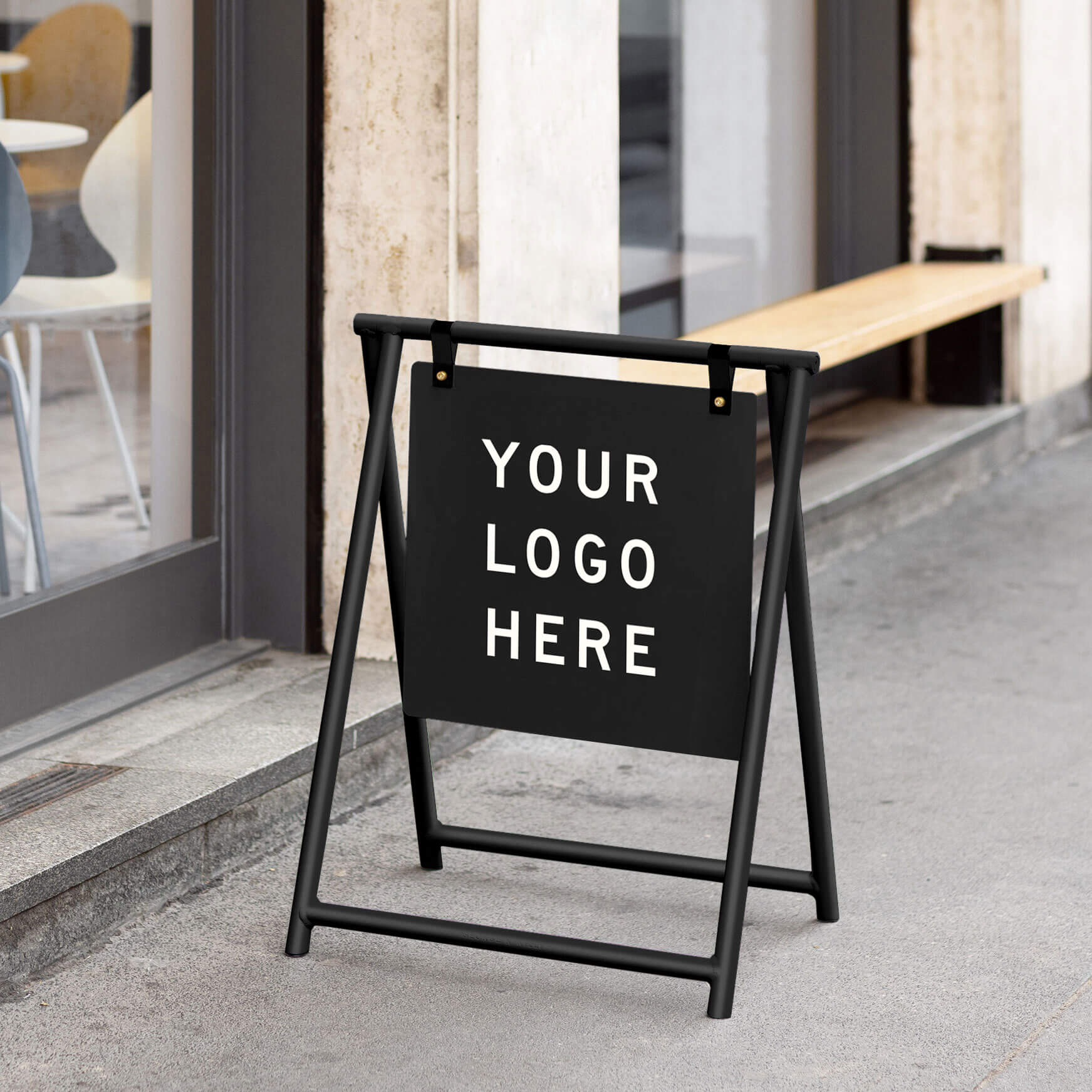
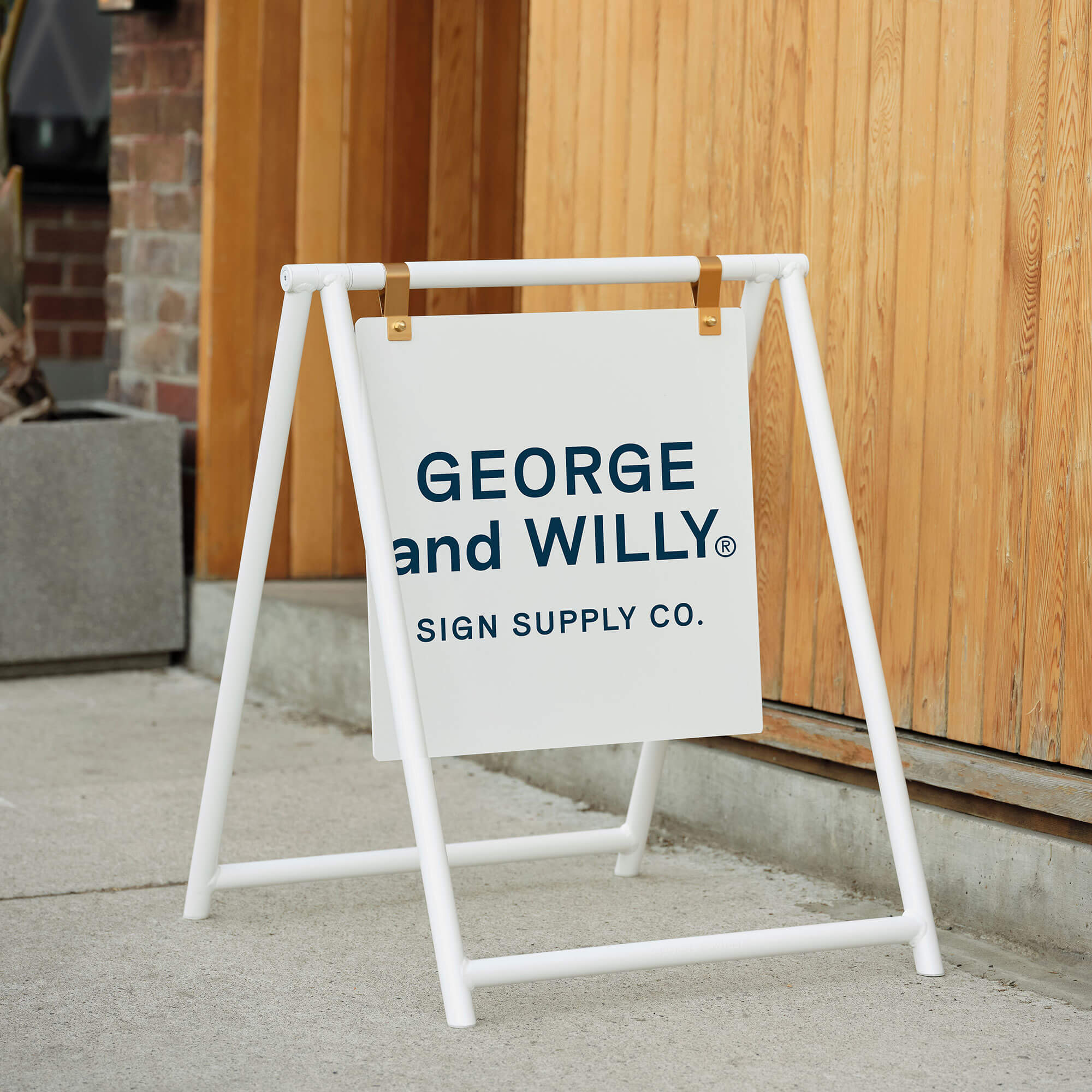
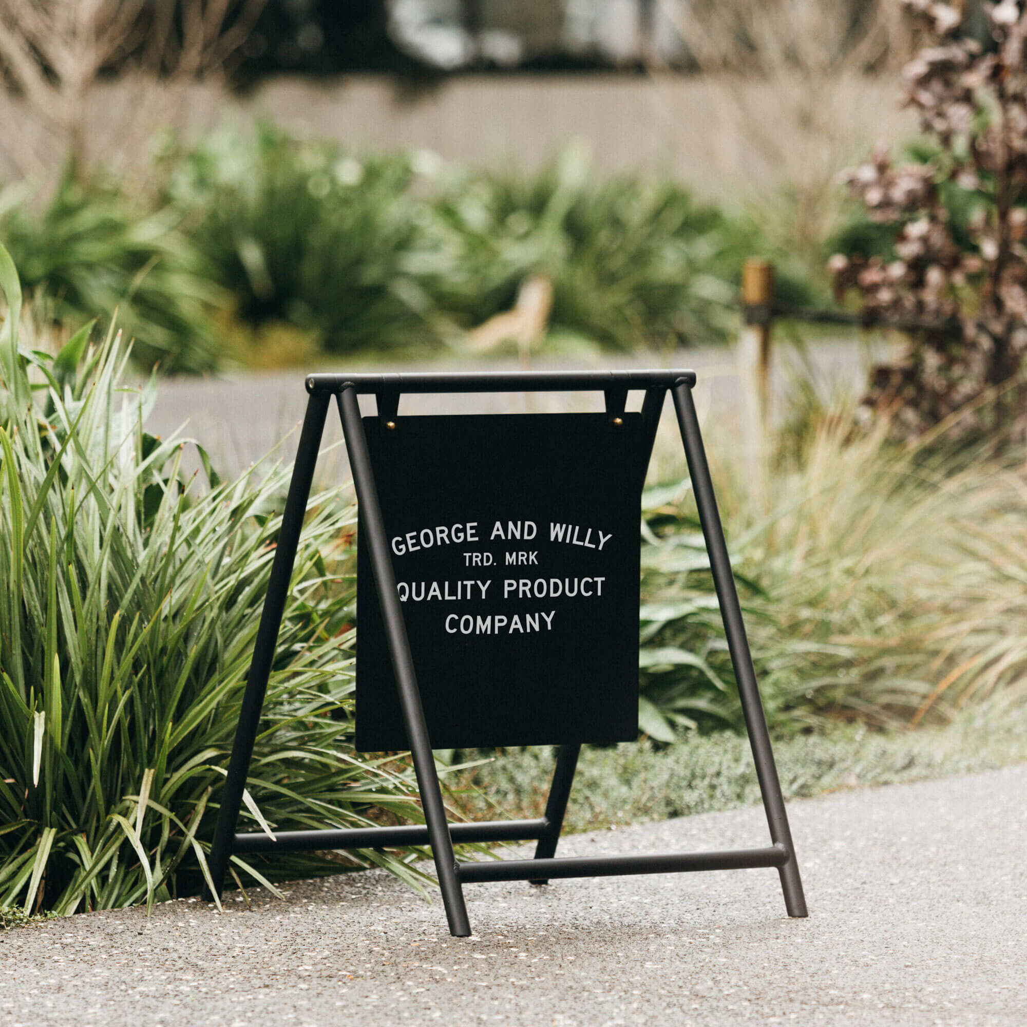
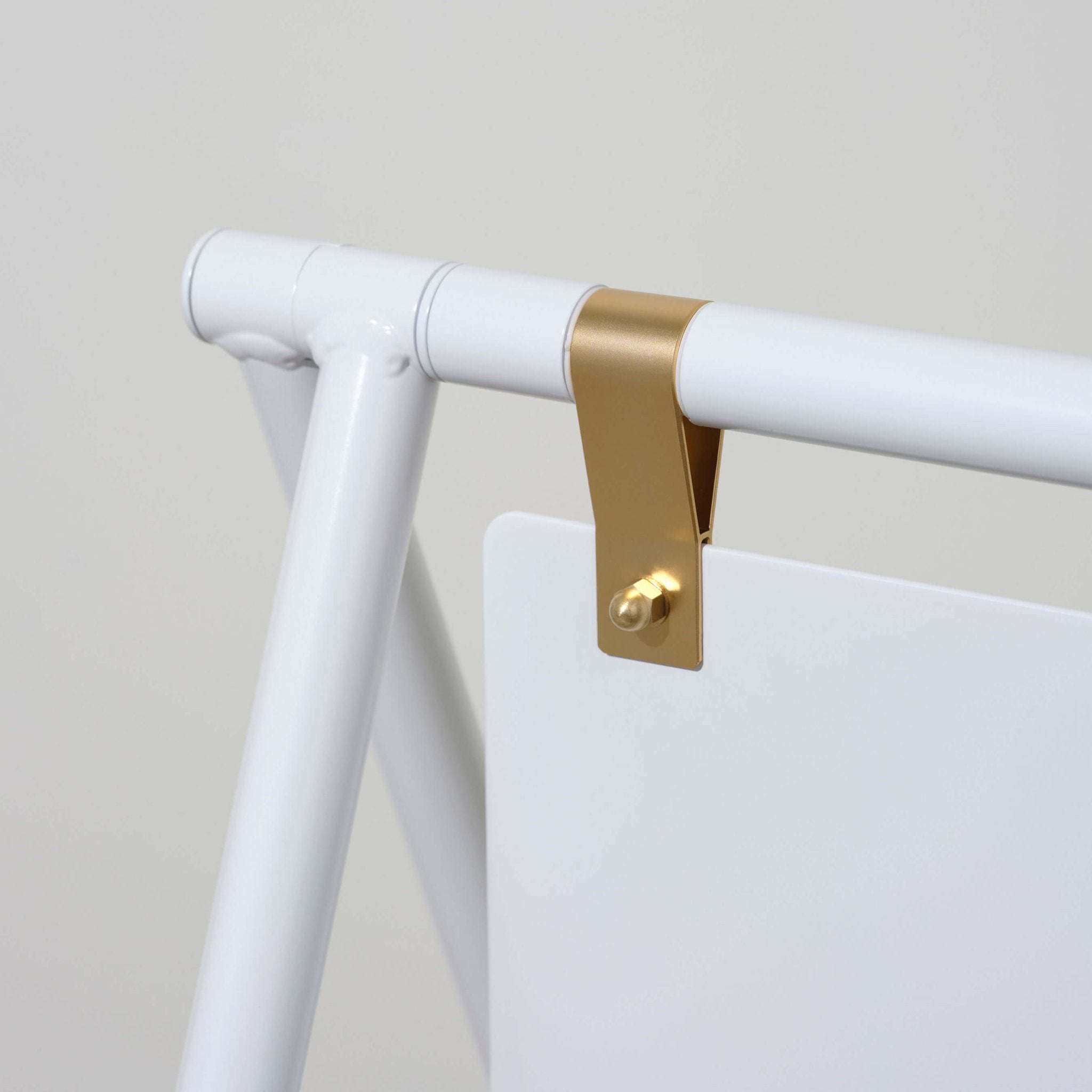
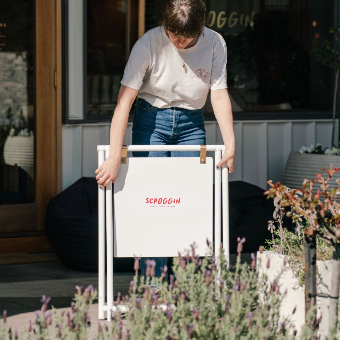
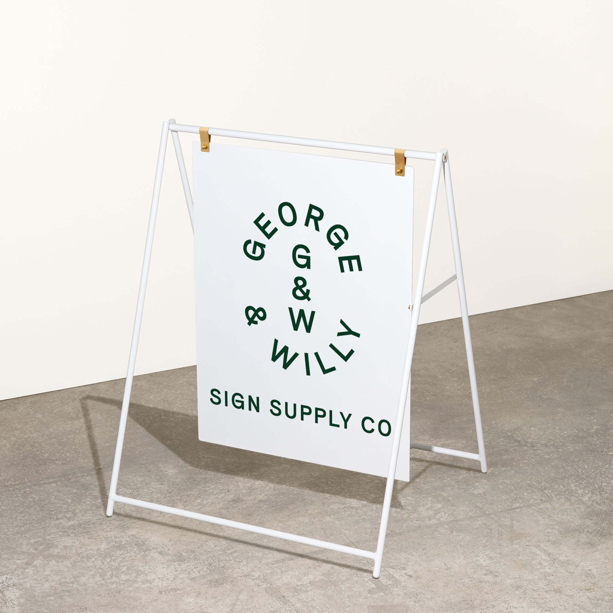
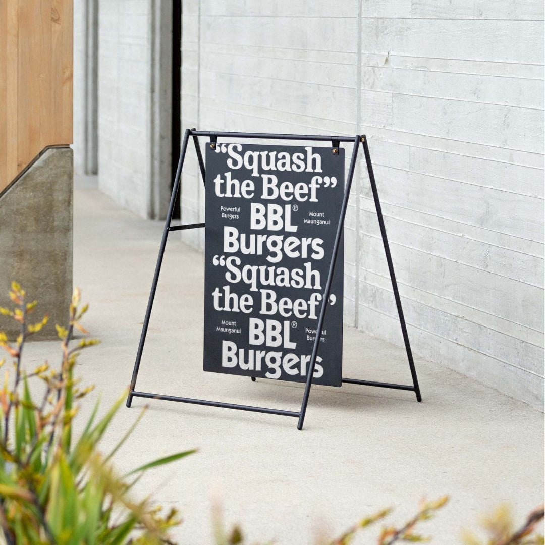
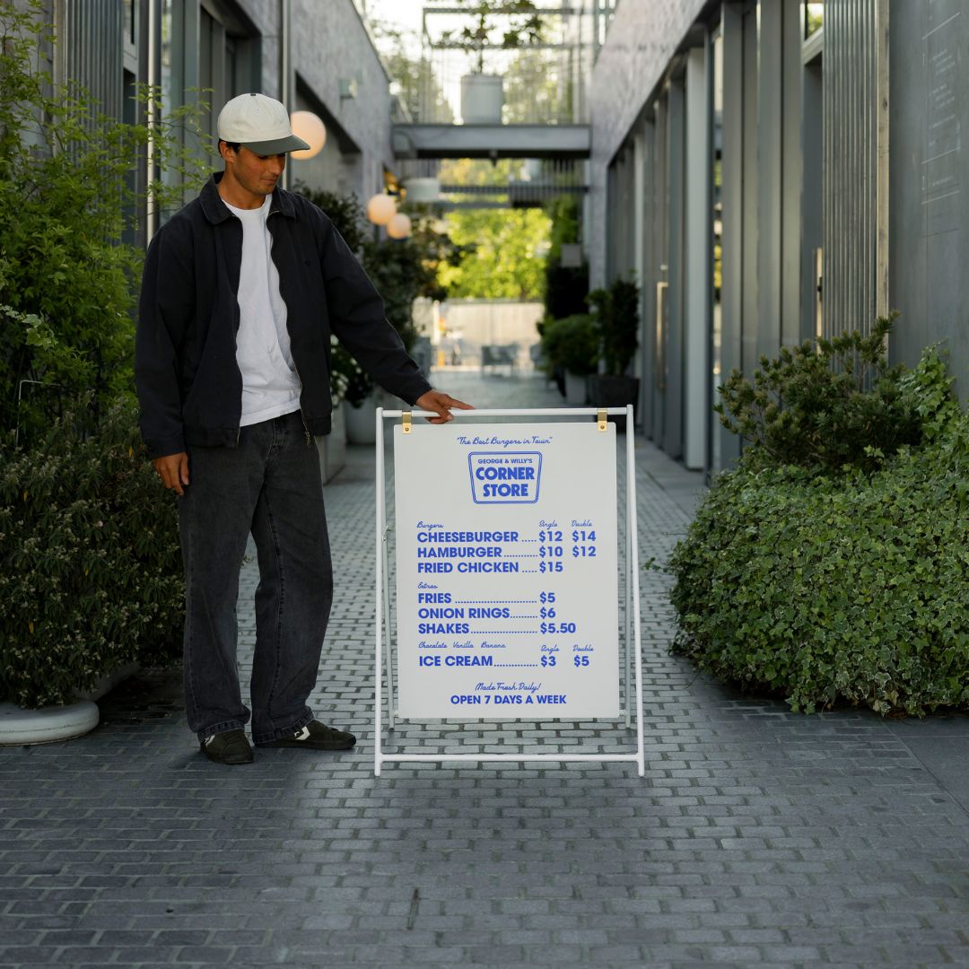
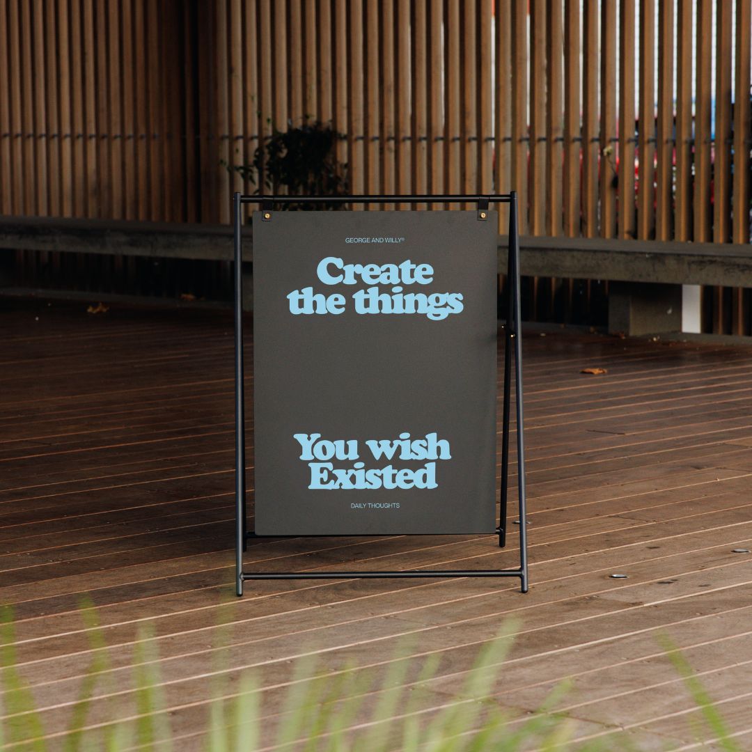
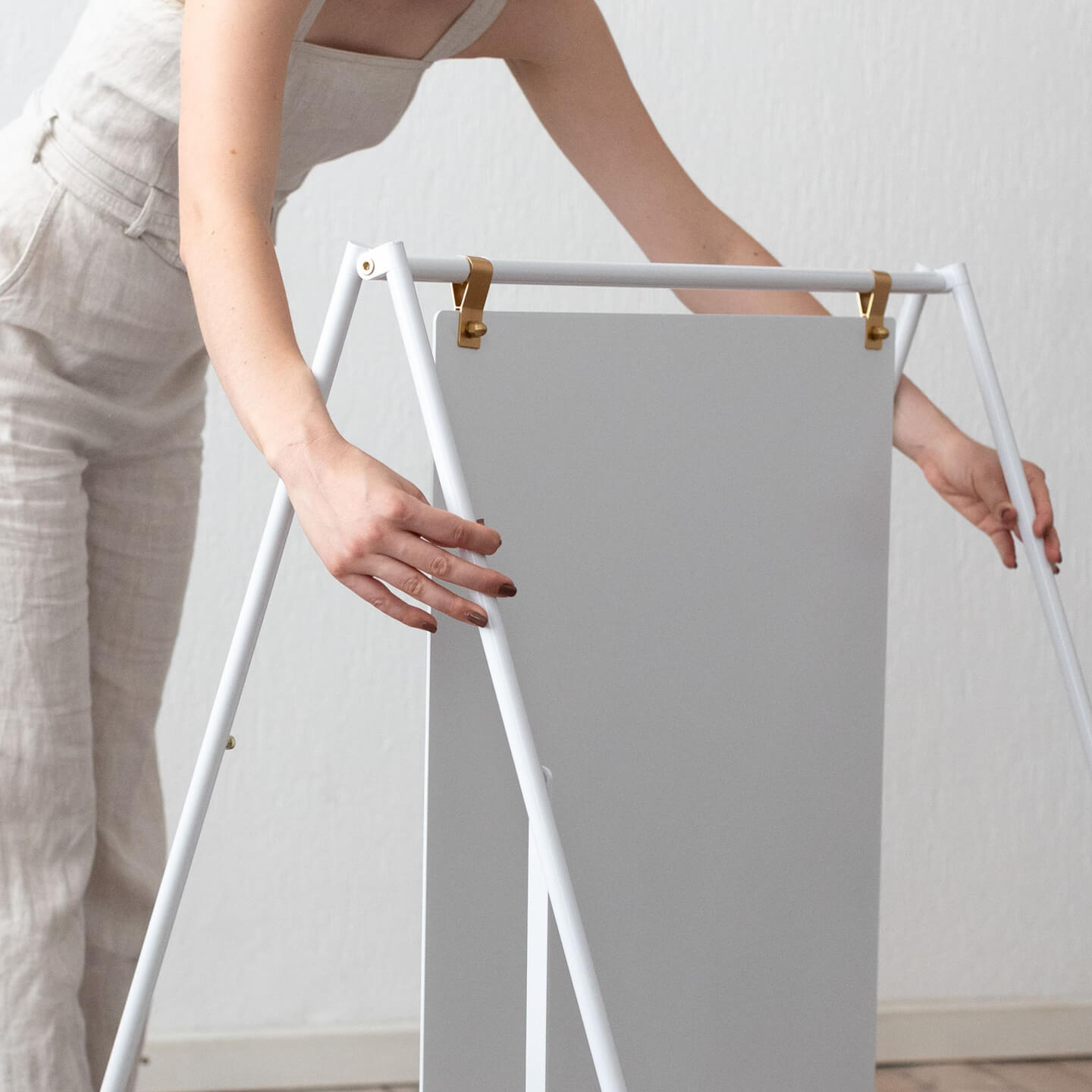
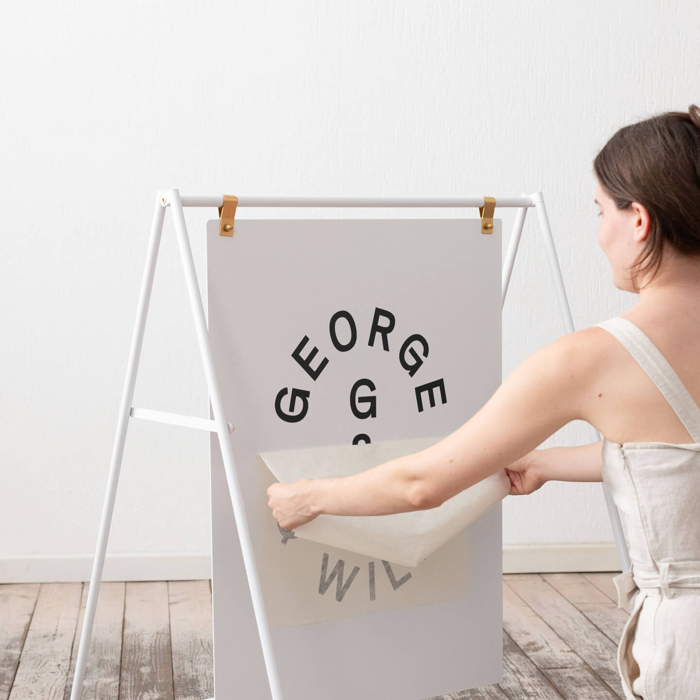
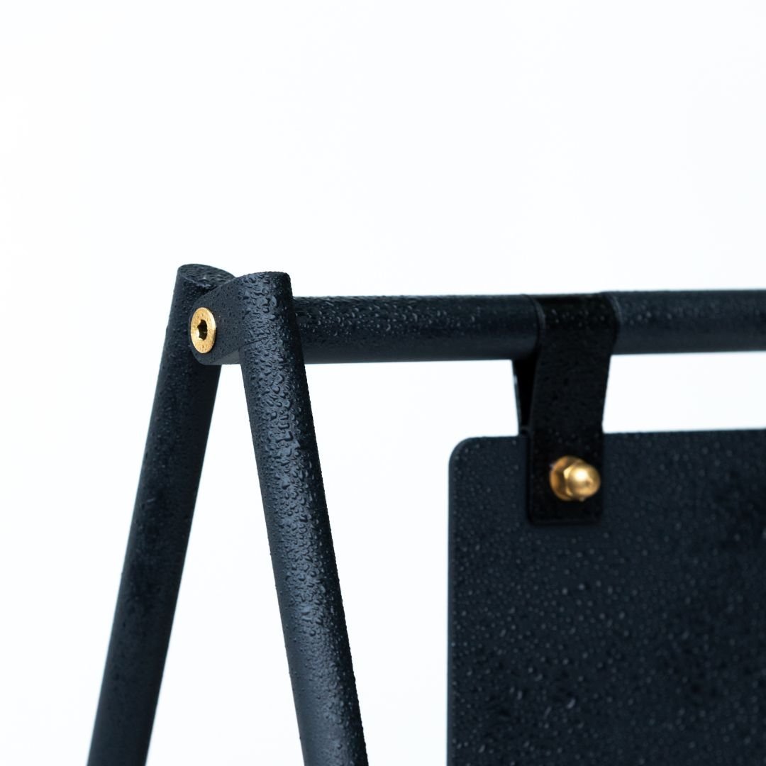
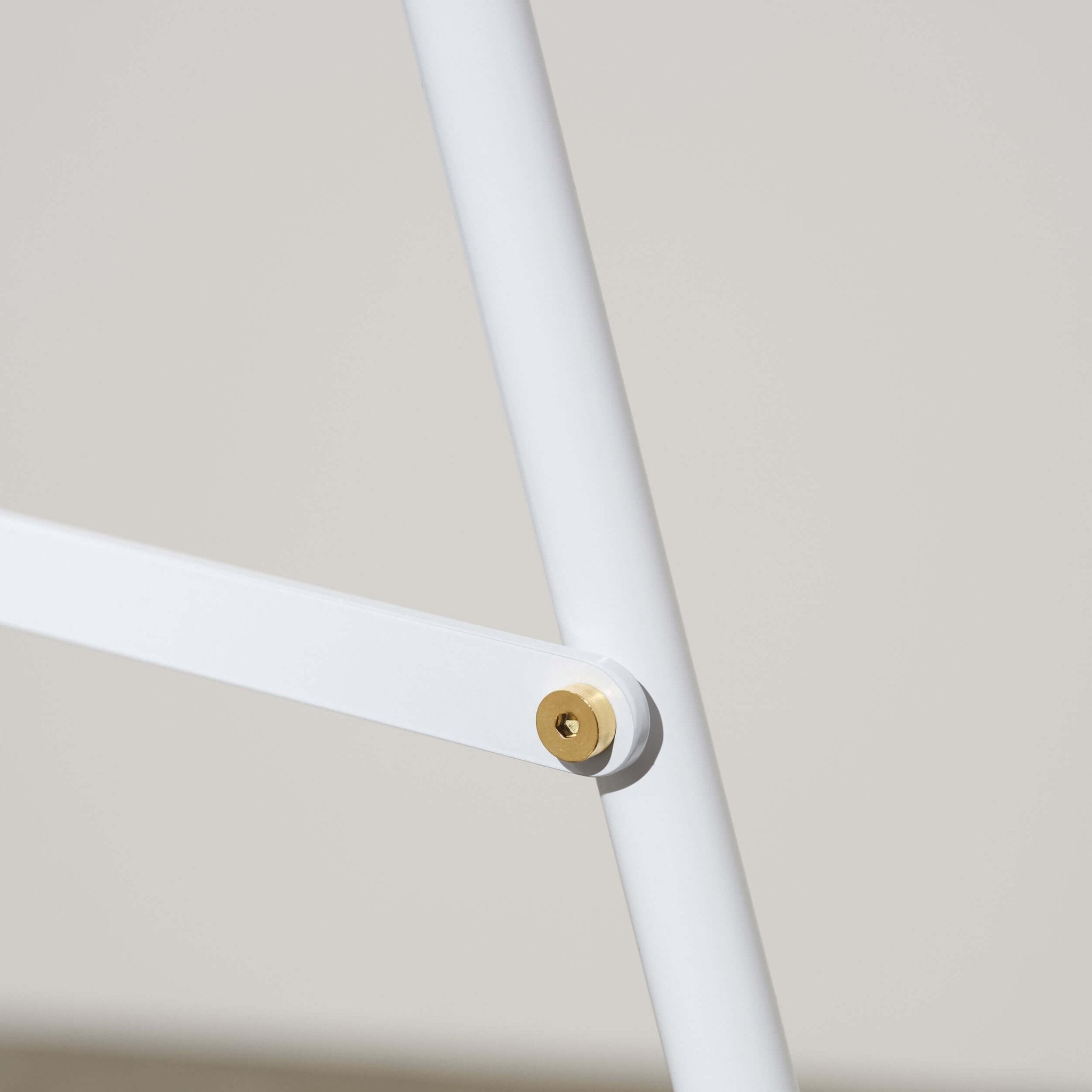
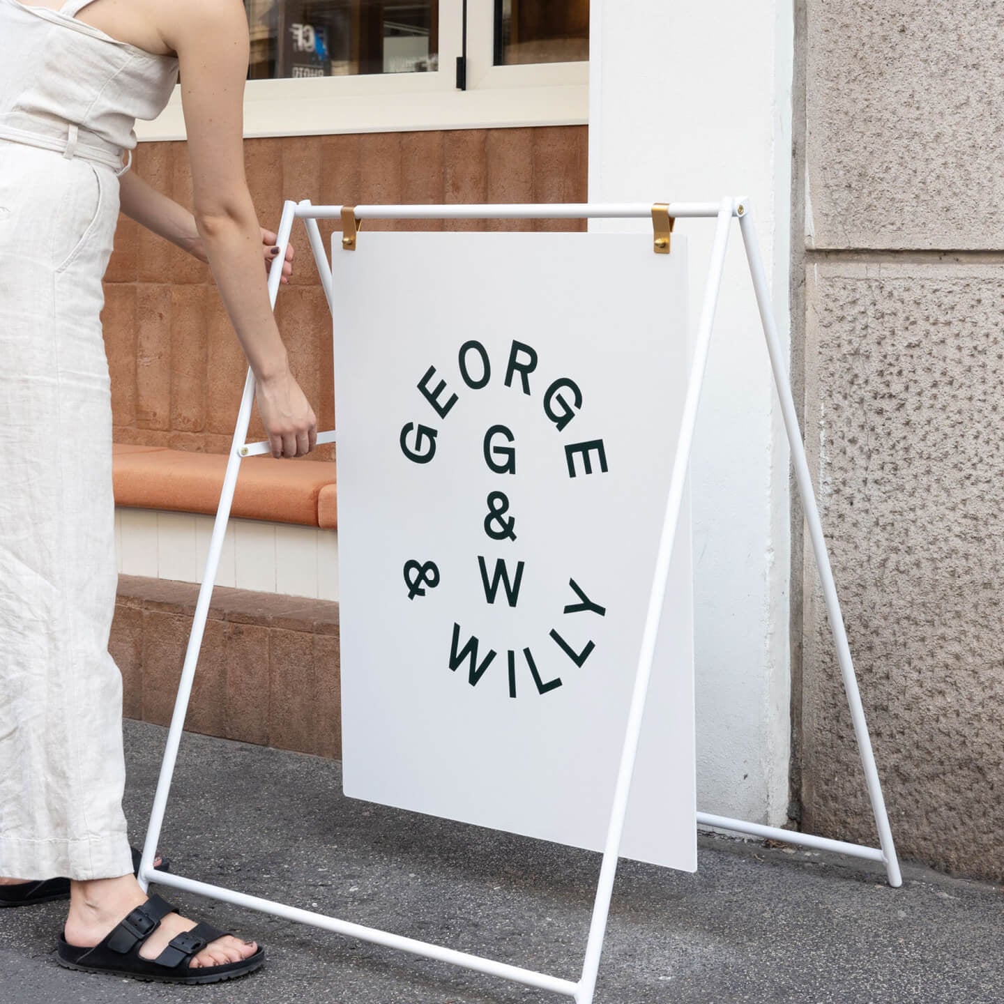
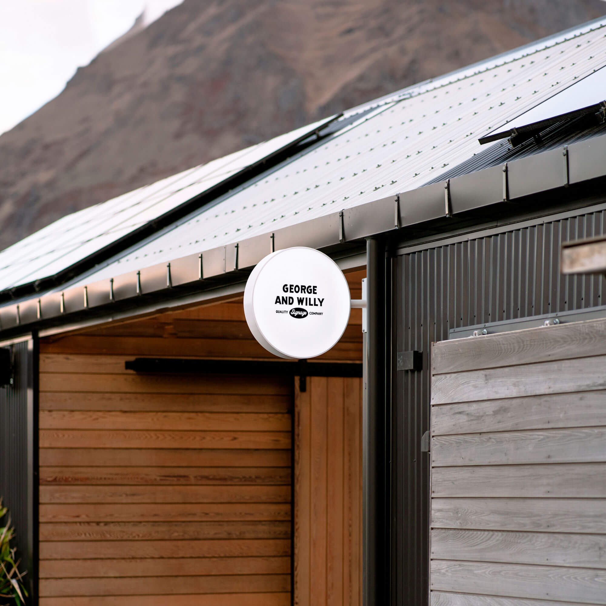
Be careful of doing stuff just because it appears that it should be that way, or that's the way it's always been done. Consider why it's been done like that, what other options there are and what is most suitable for you. An example of this is the classic A-Frame Sign. Streets are often flooded with the same A-Frame Sign or Sandwich Board. We designed our A-Frame Sign to be a cut above the rest offering an individual look that commands attention even in the busiest of market places. Consider this for your cafe design with the details of your menu, your restrooms, your counter. Something that is unique, is memorable.

Our A-Frame Sign
Simplicity is your friend.
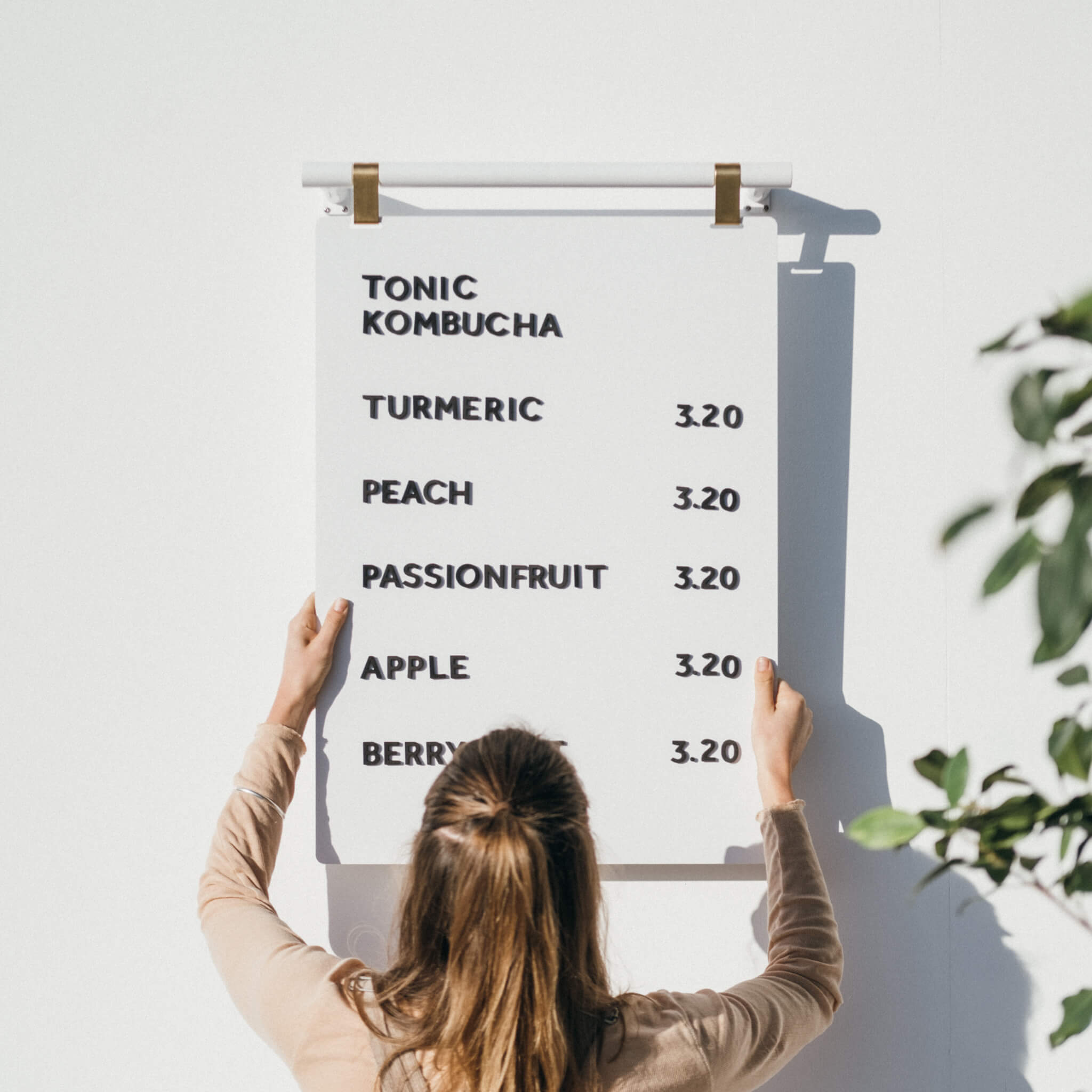
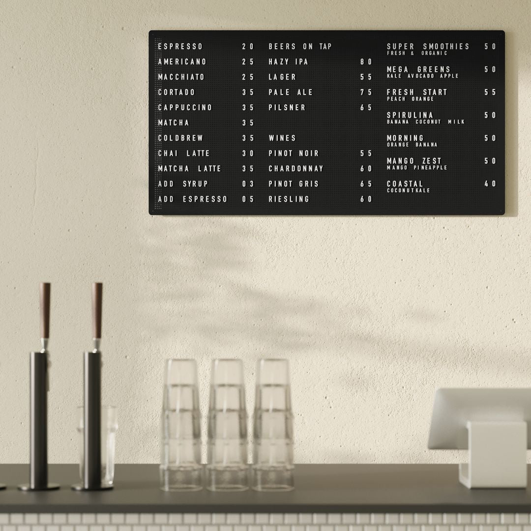
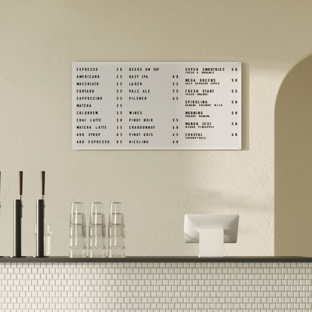
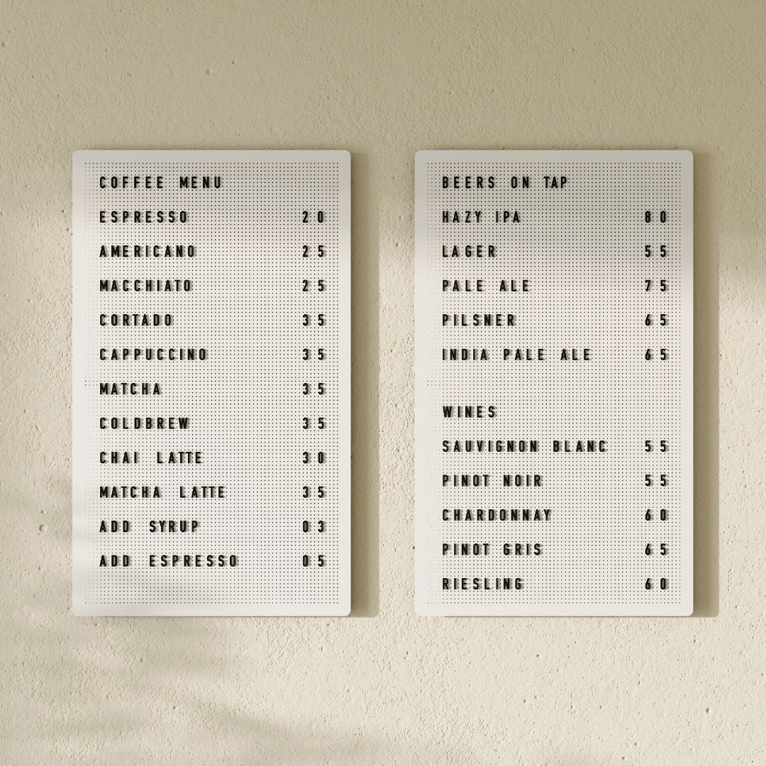
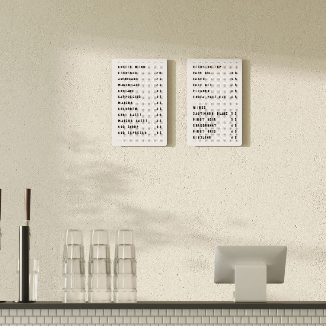
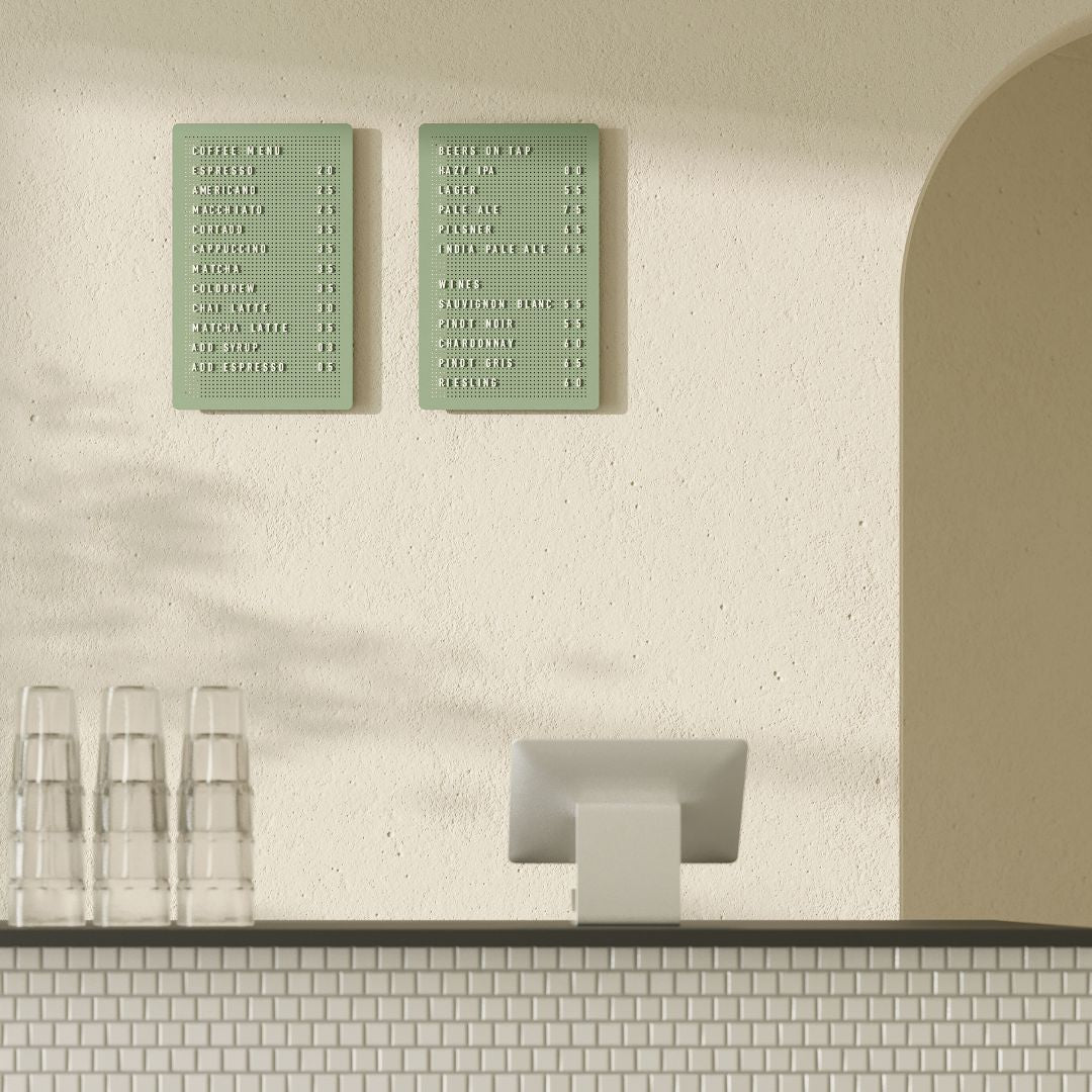
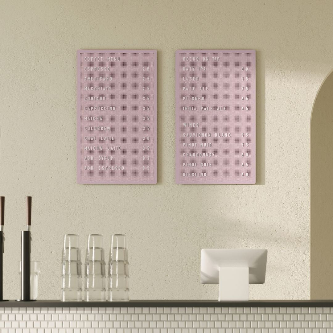
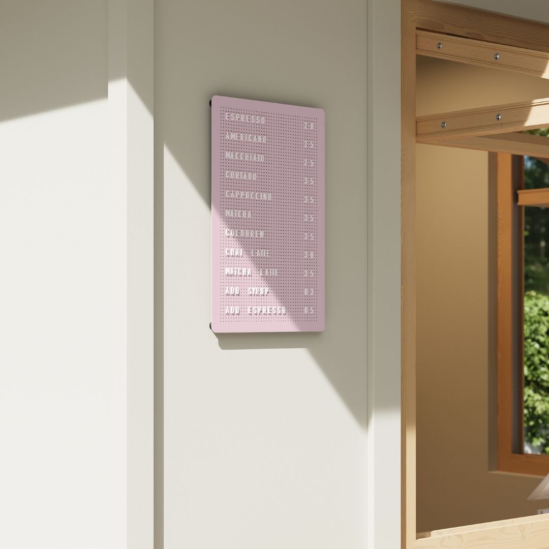
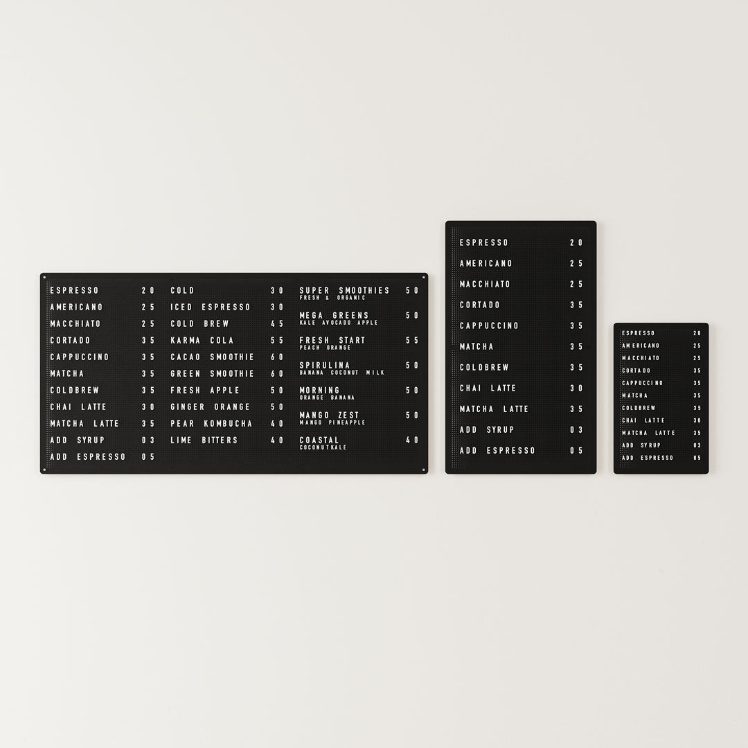
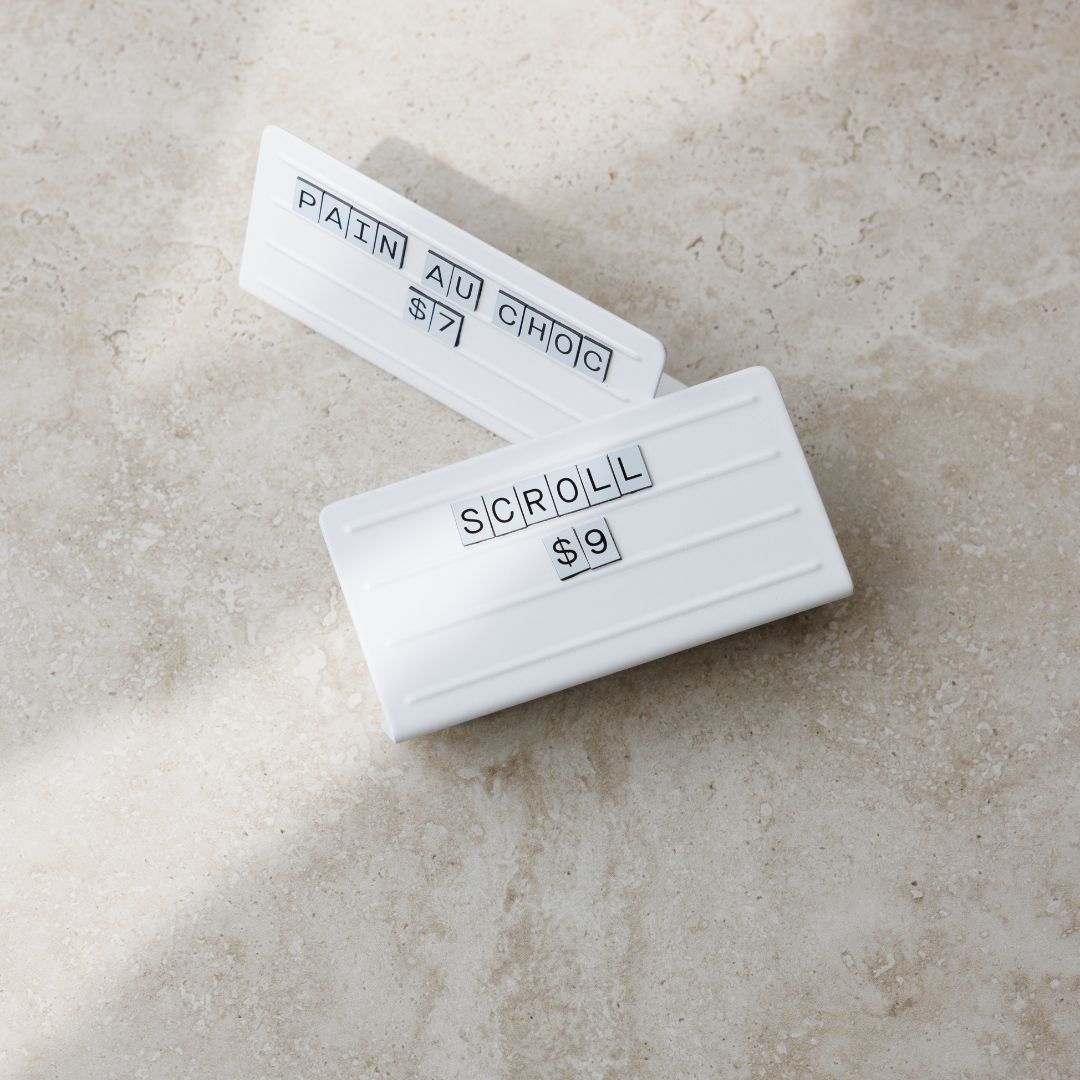
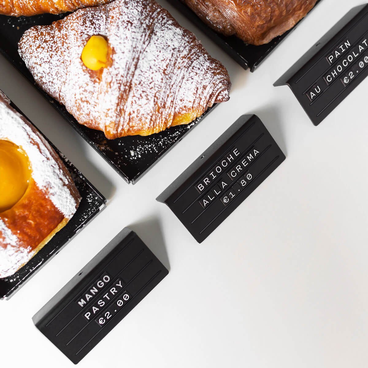
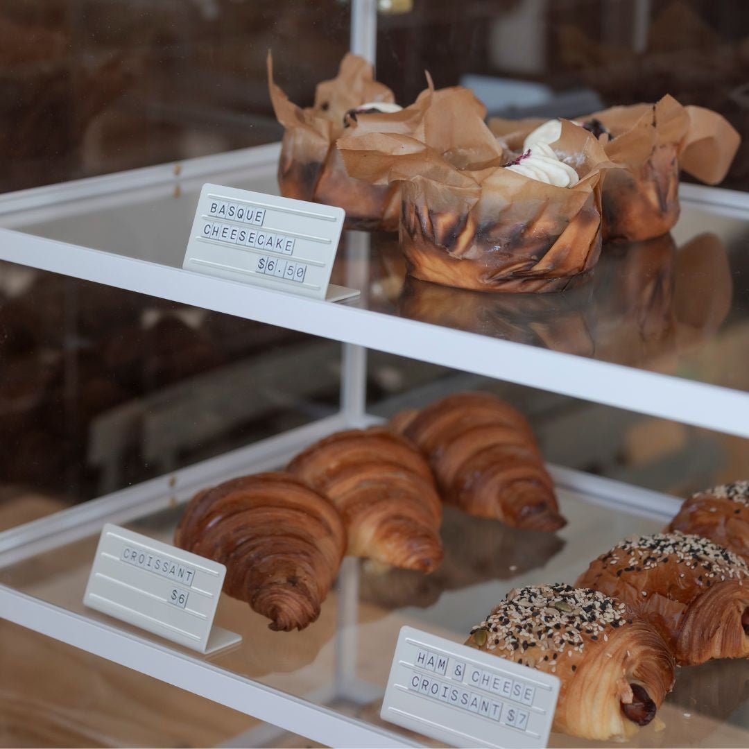
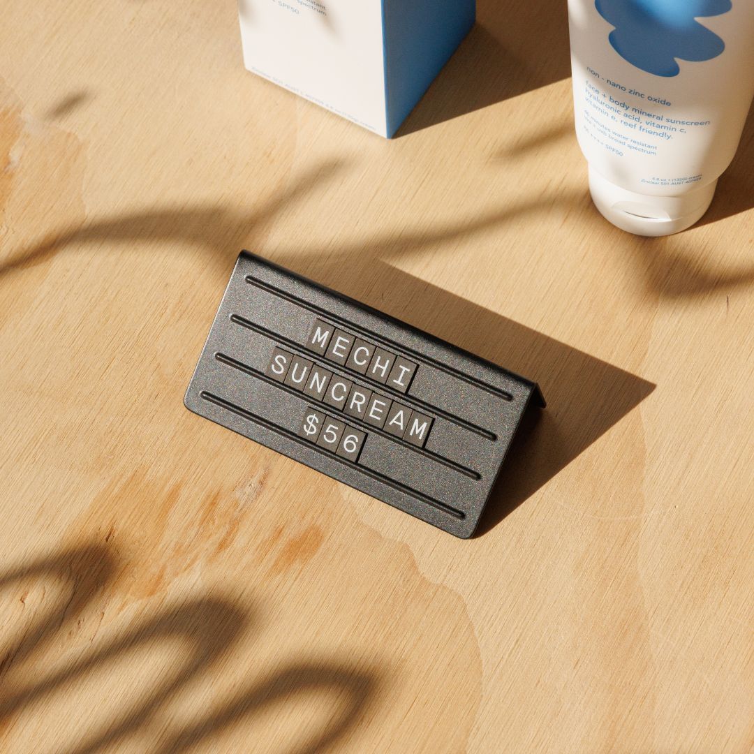
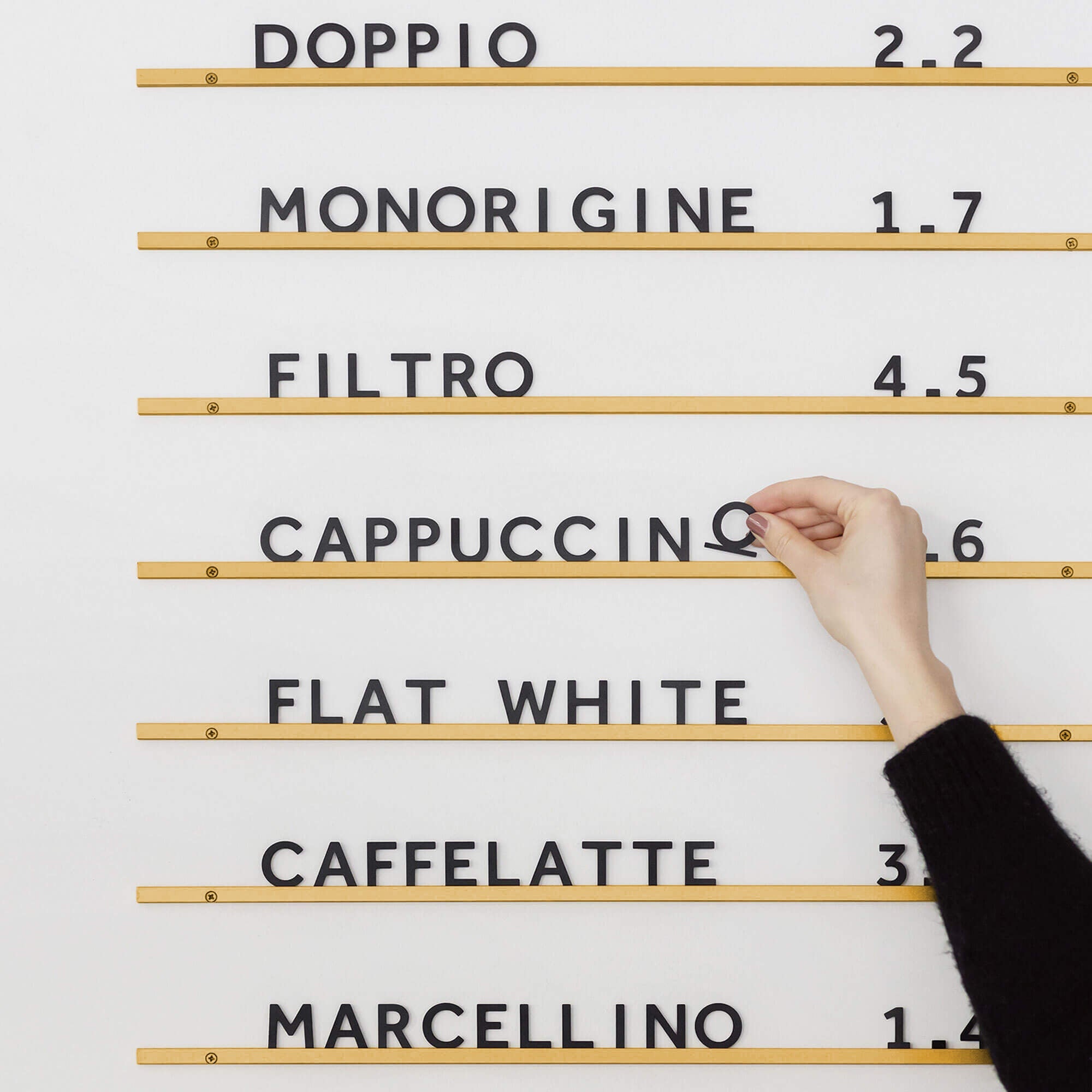
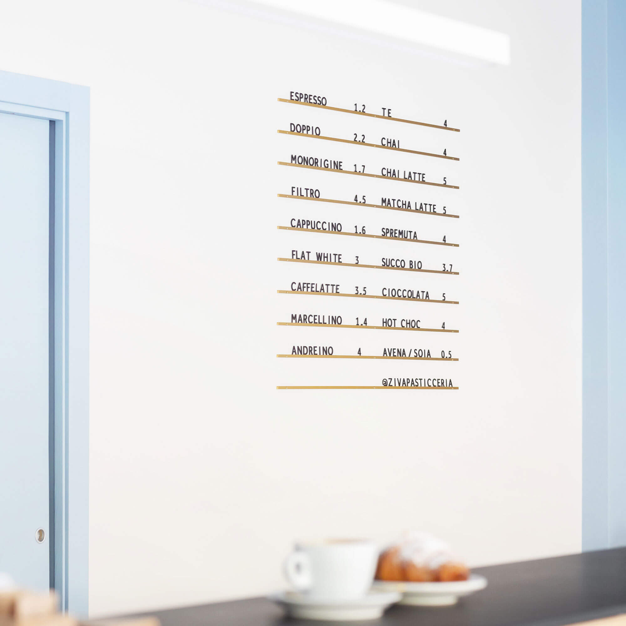
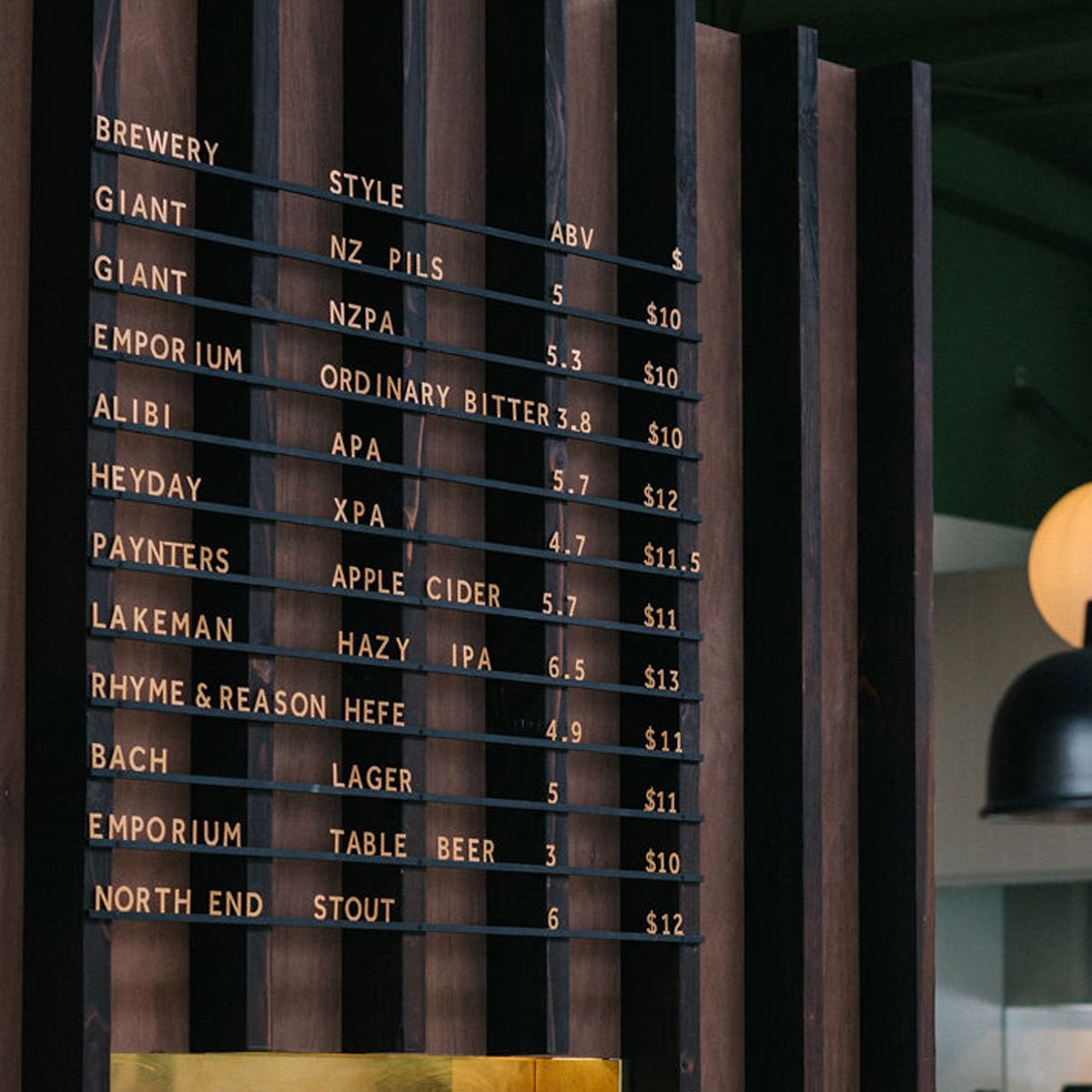
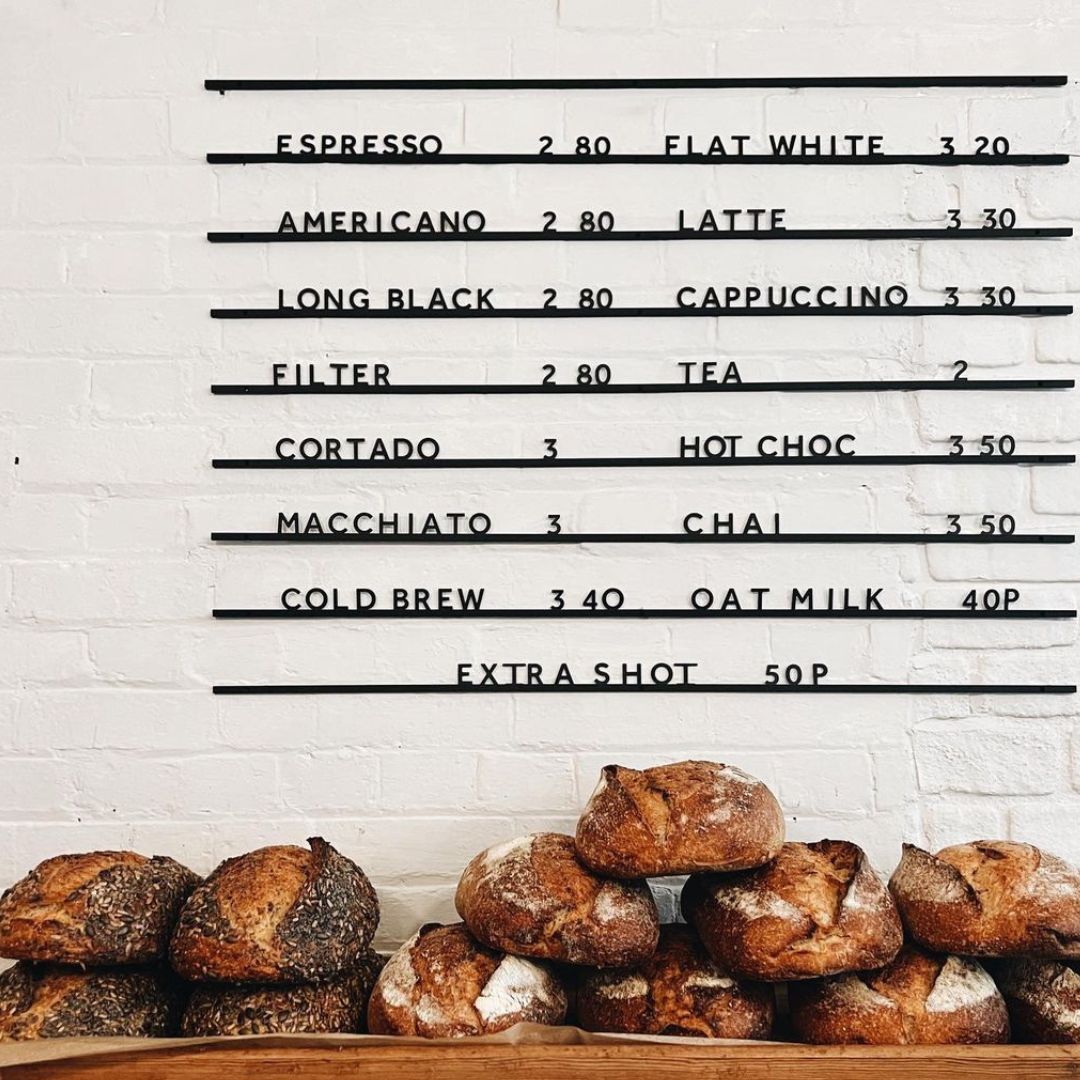
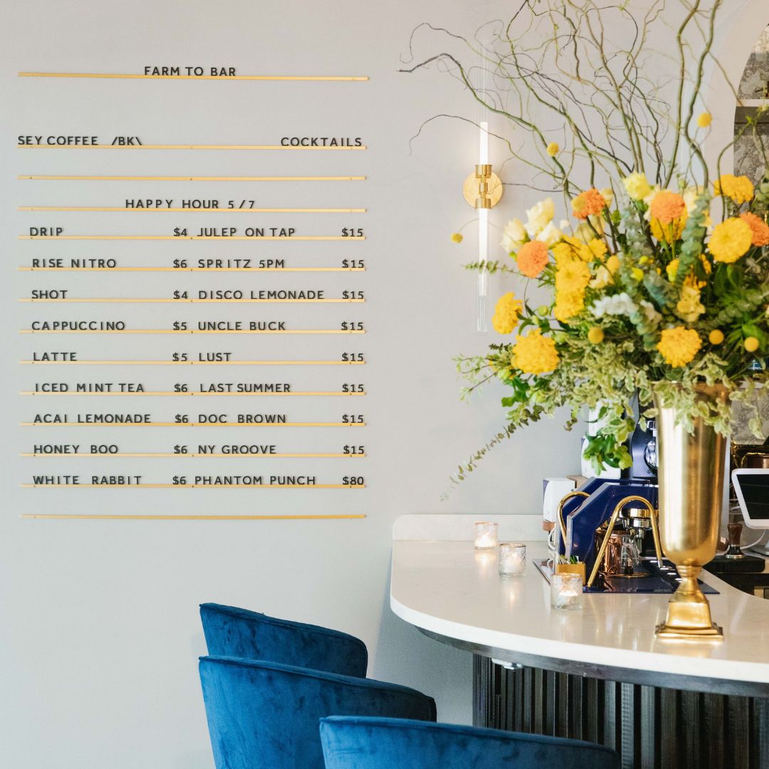
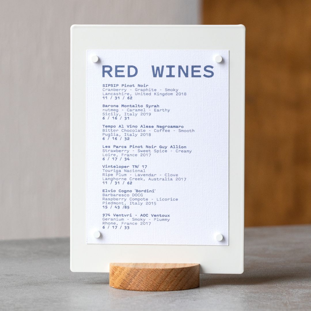
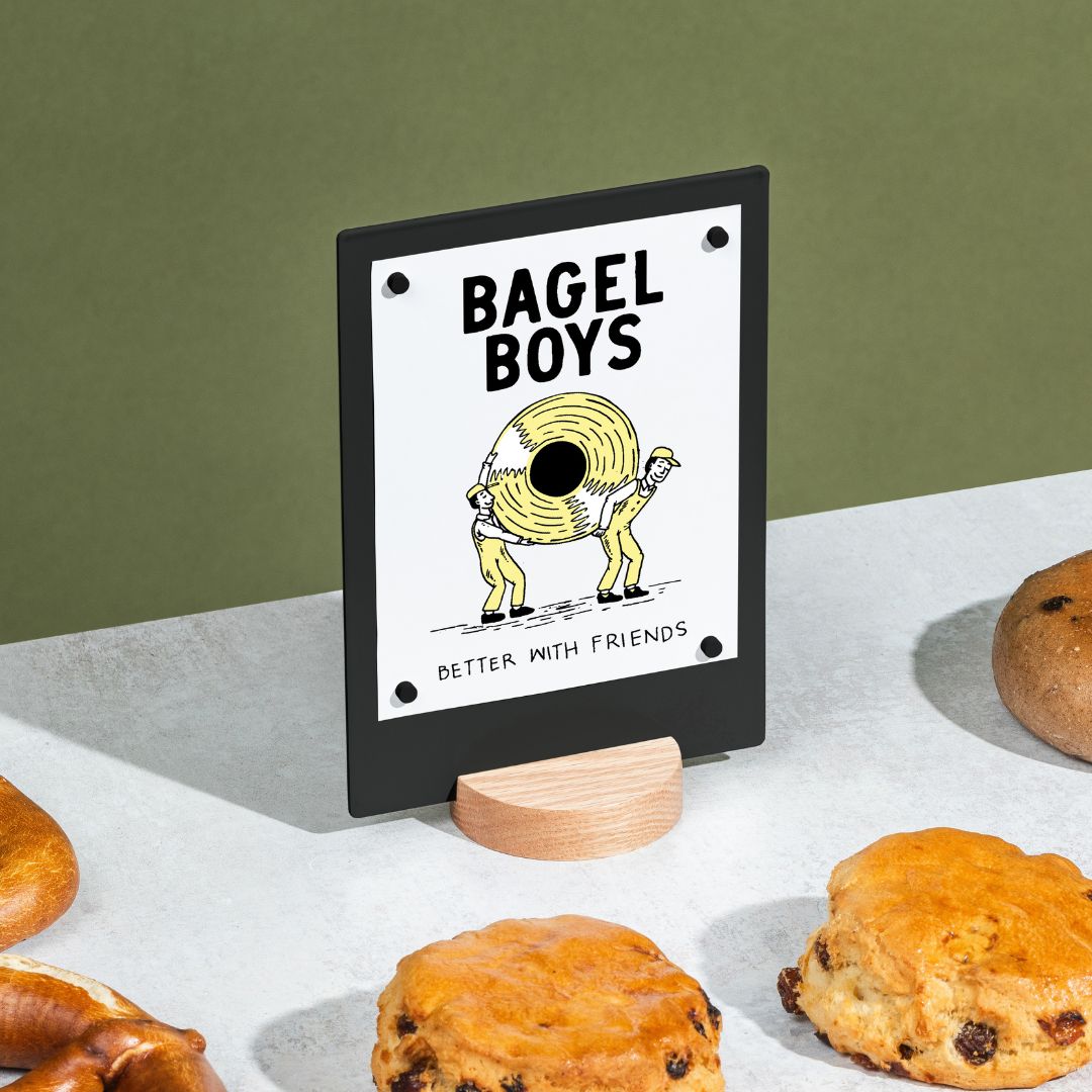
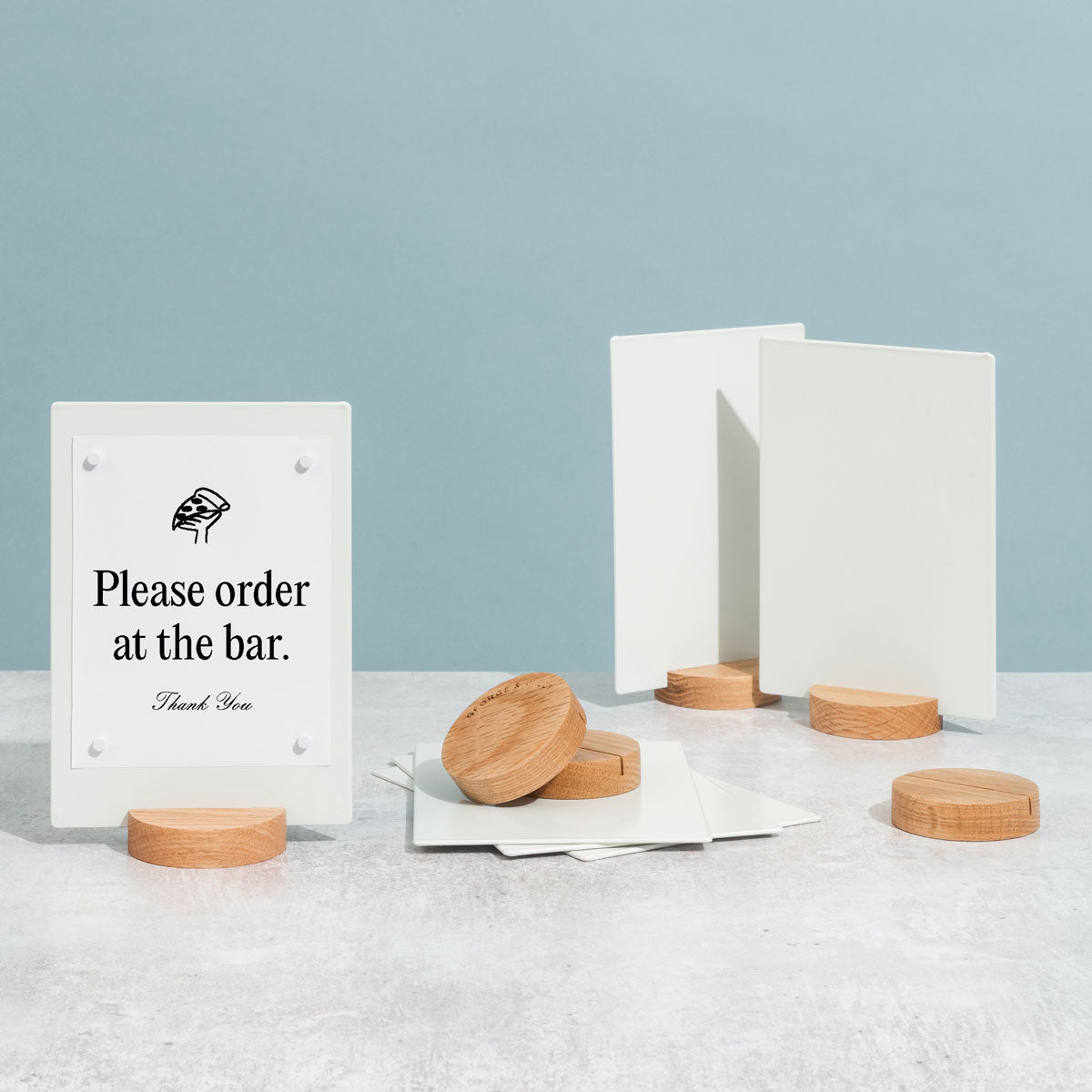
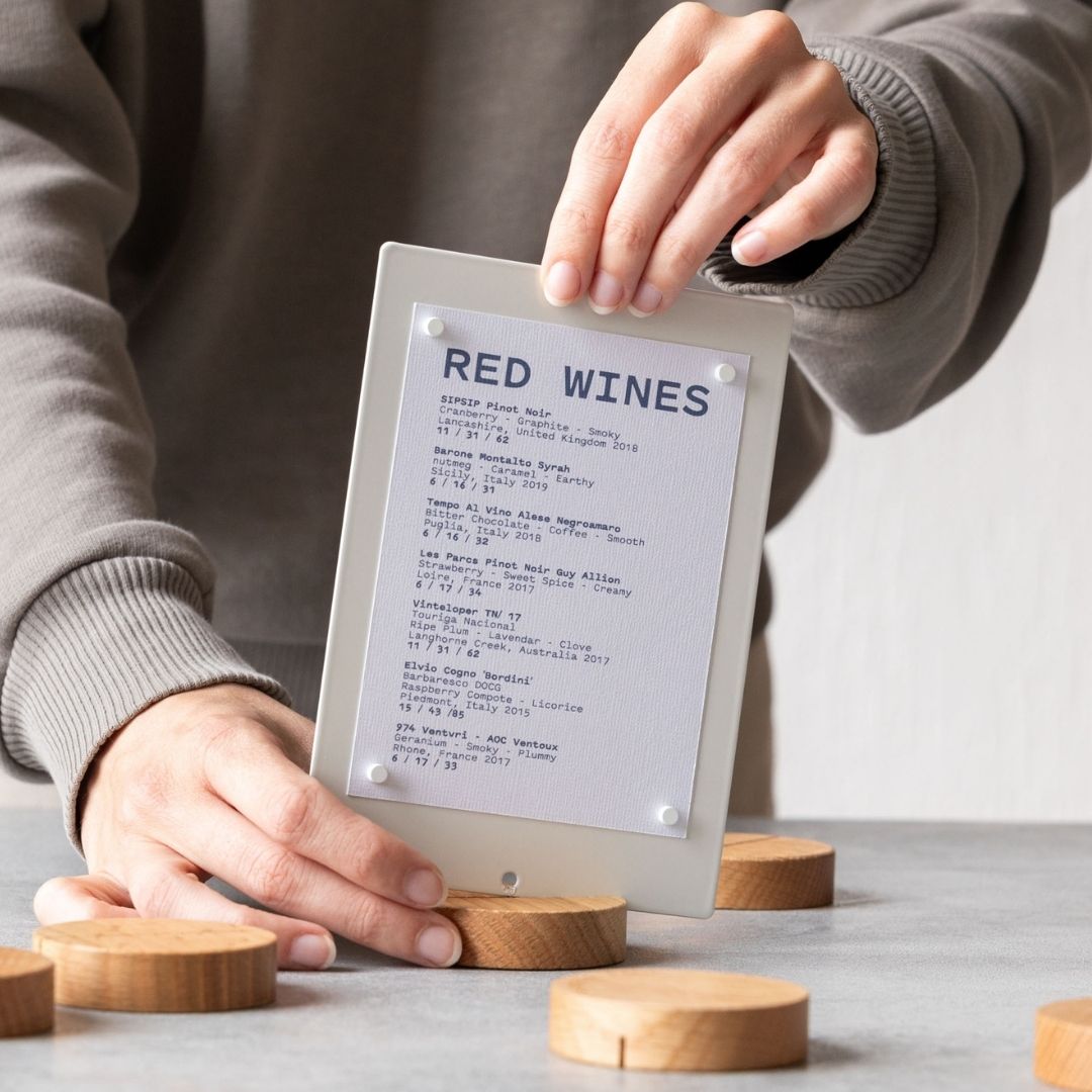
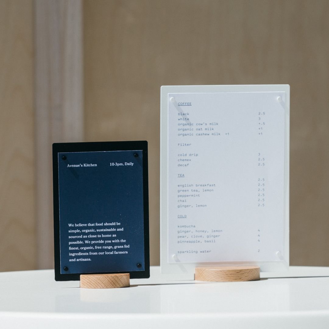
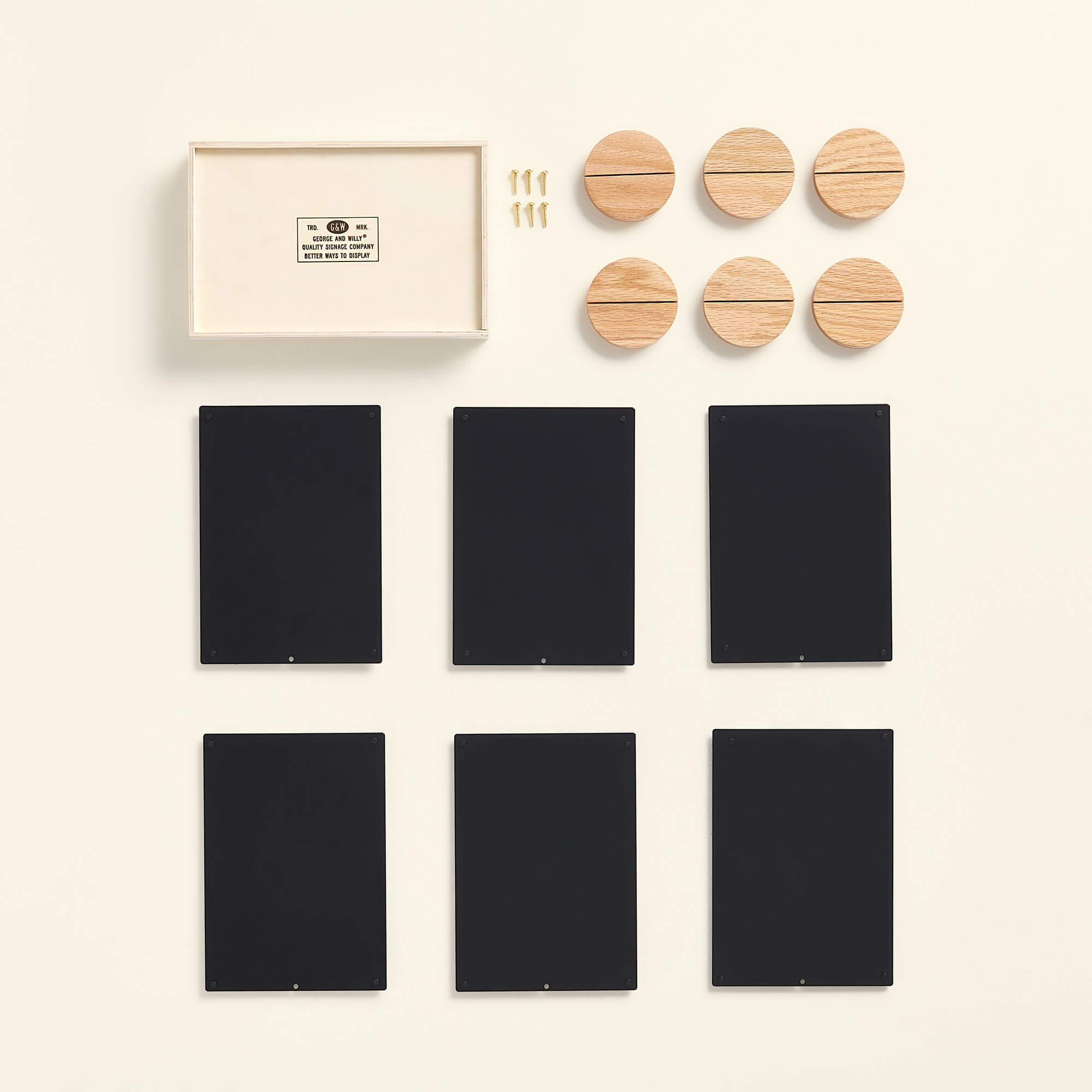
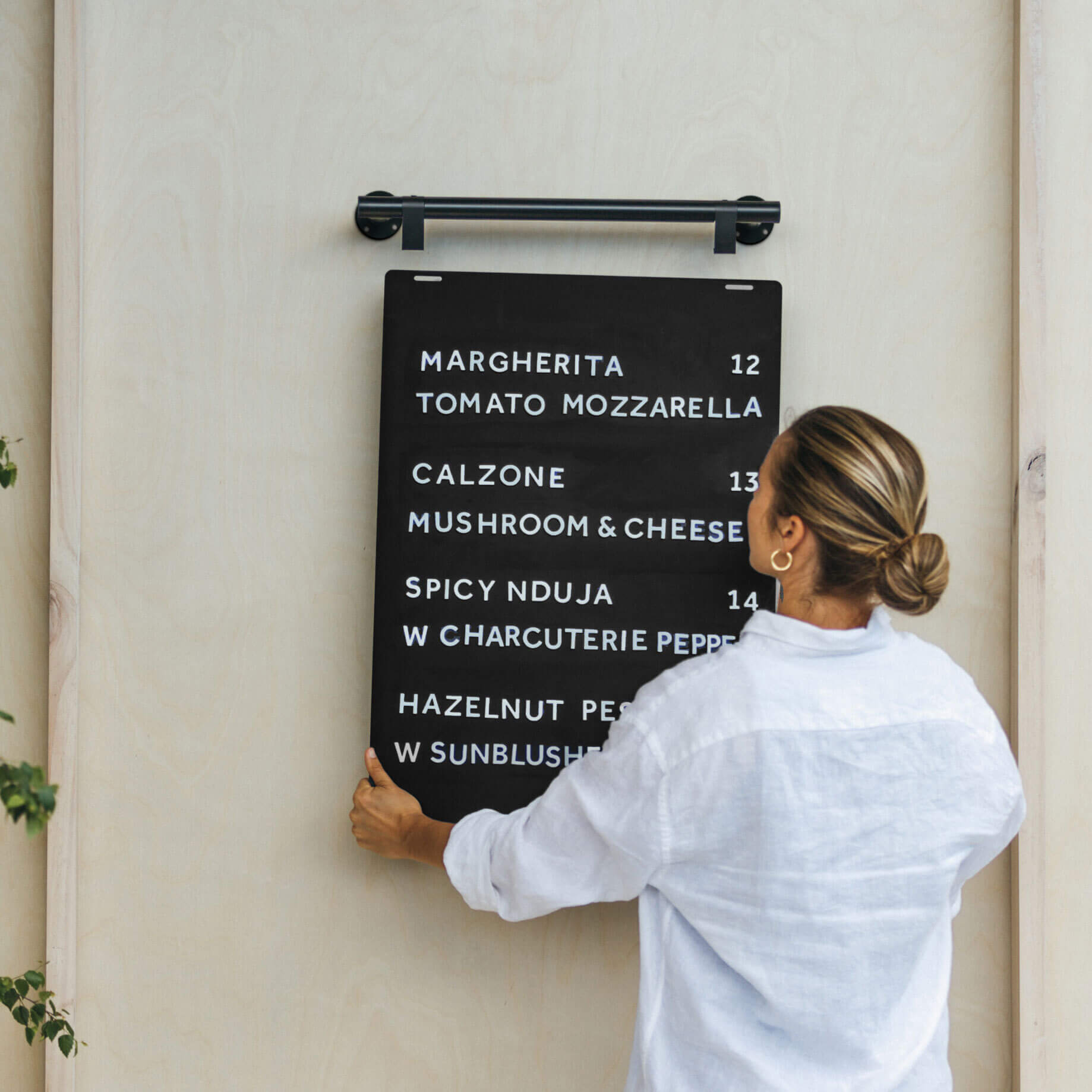
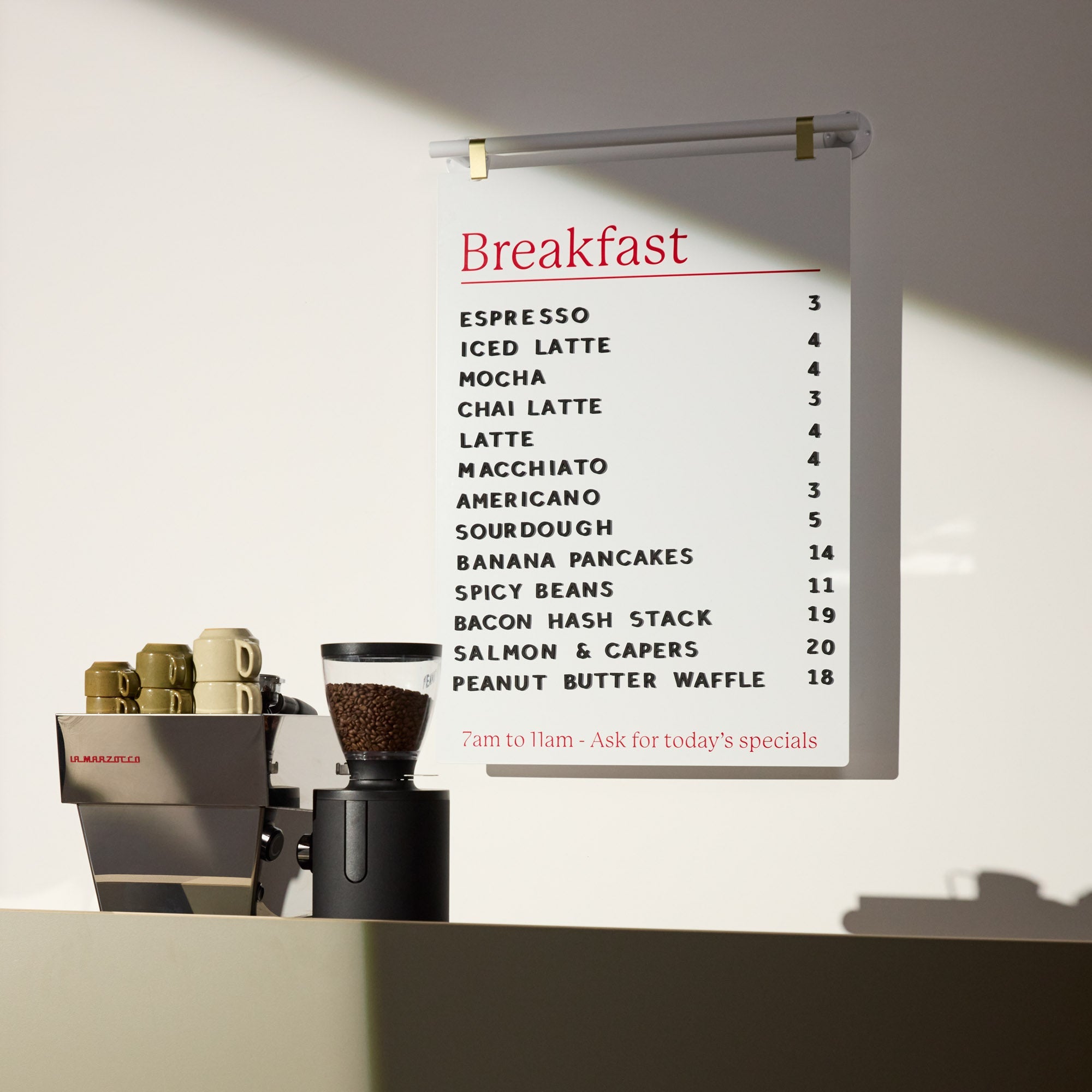
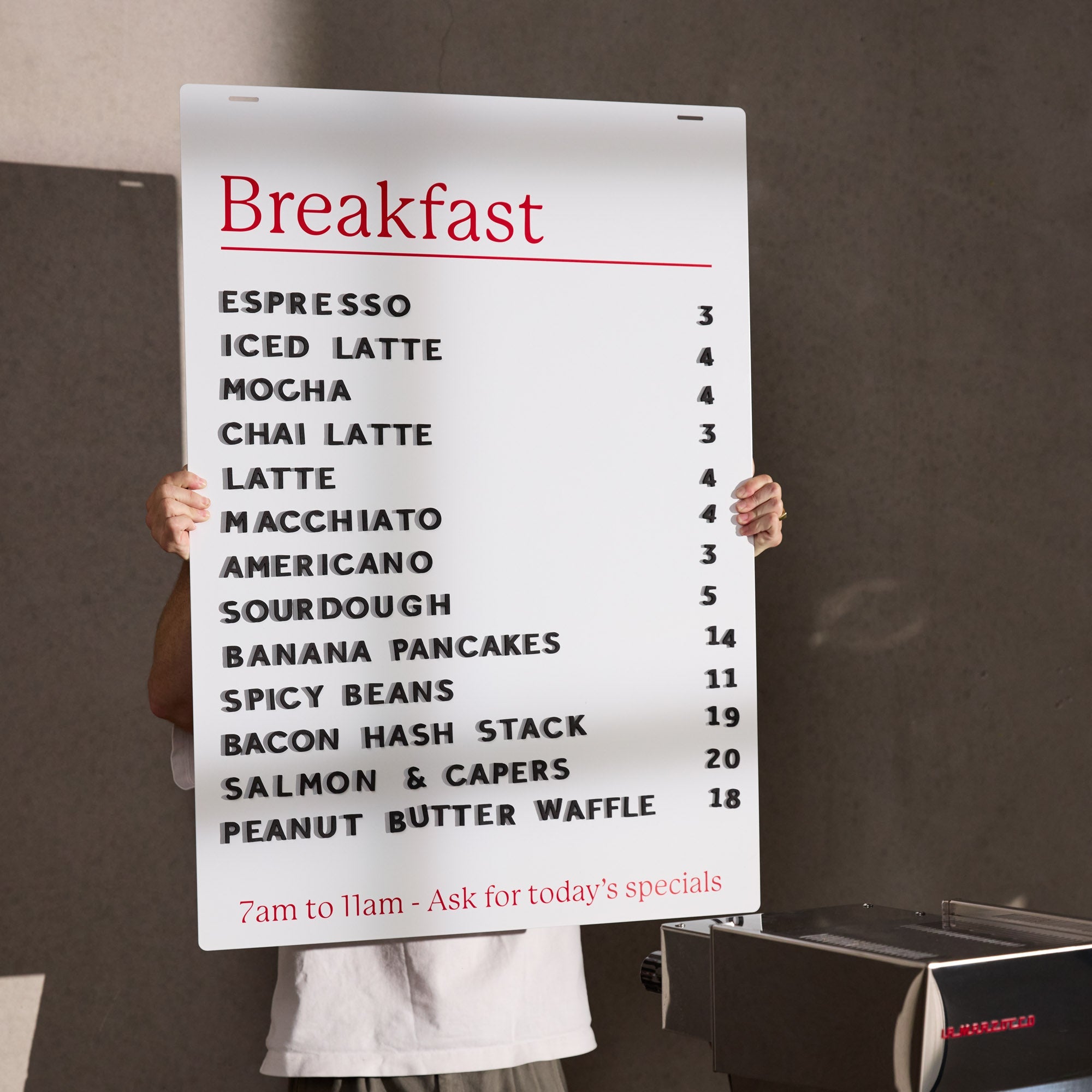
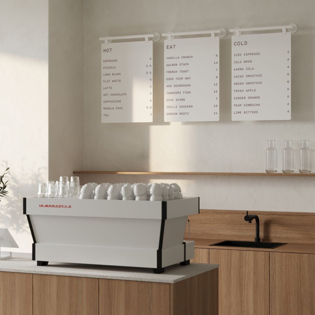
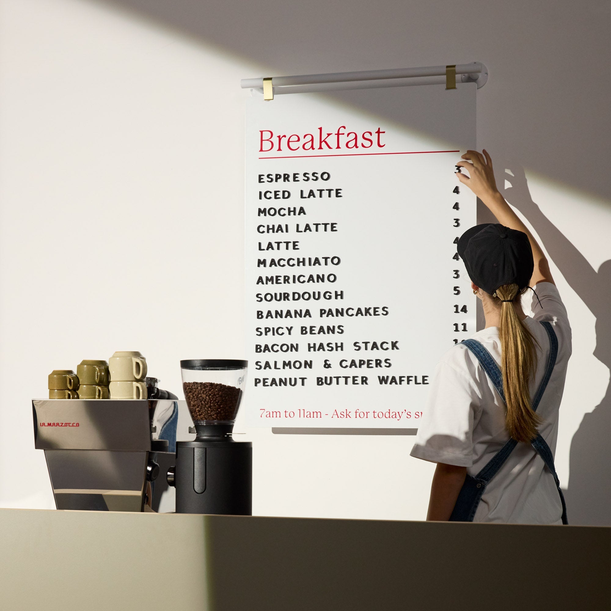
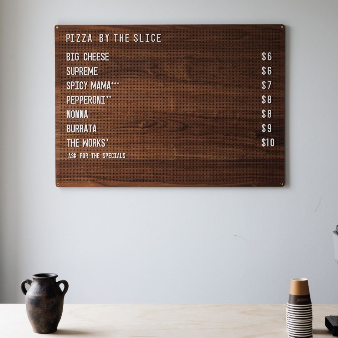
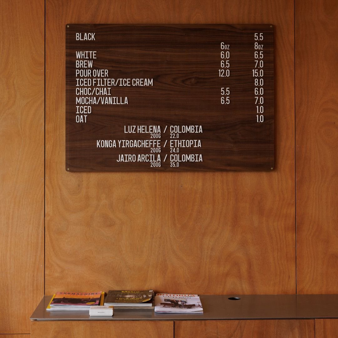
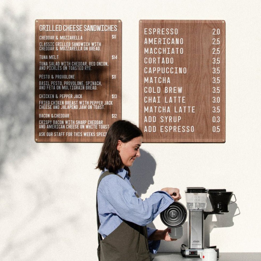
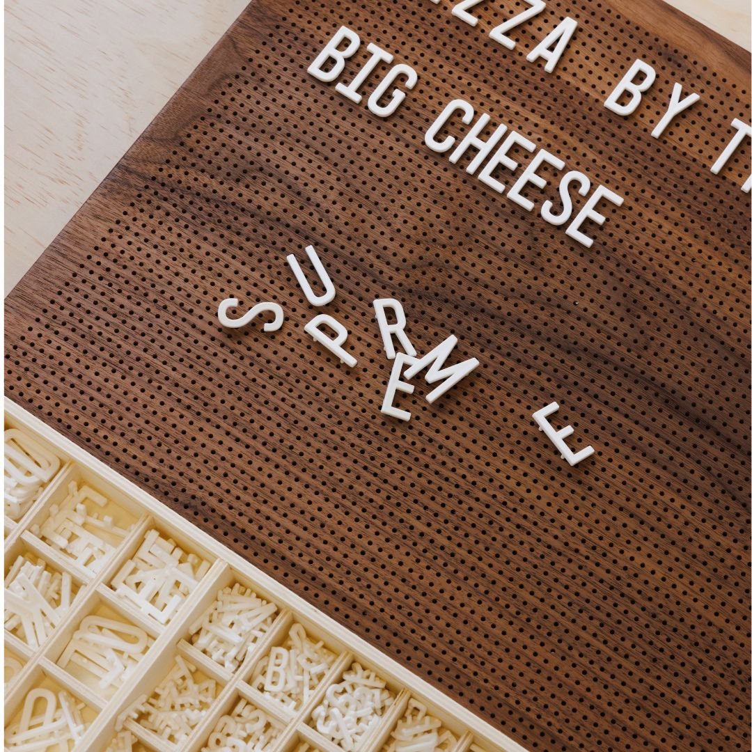
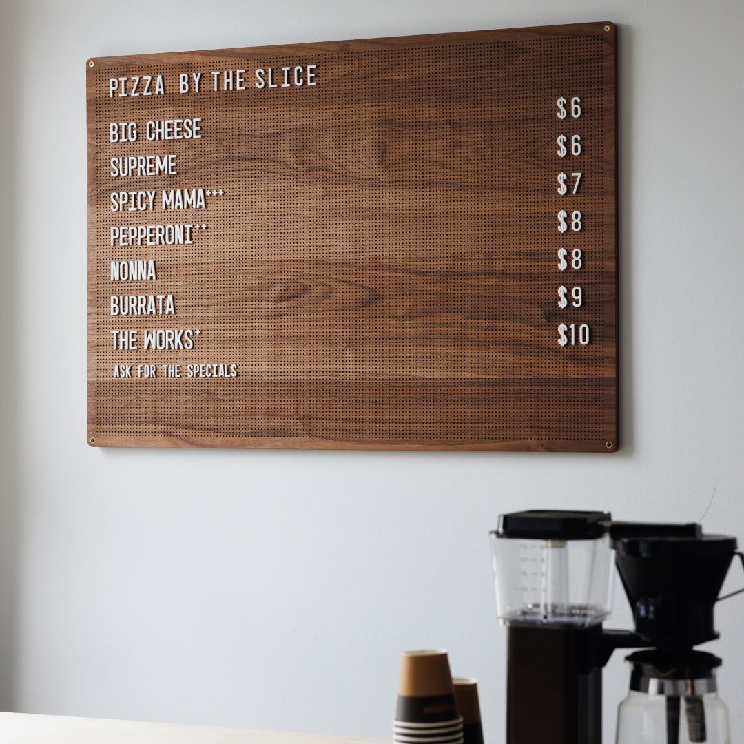
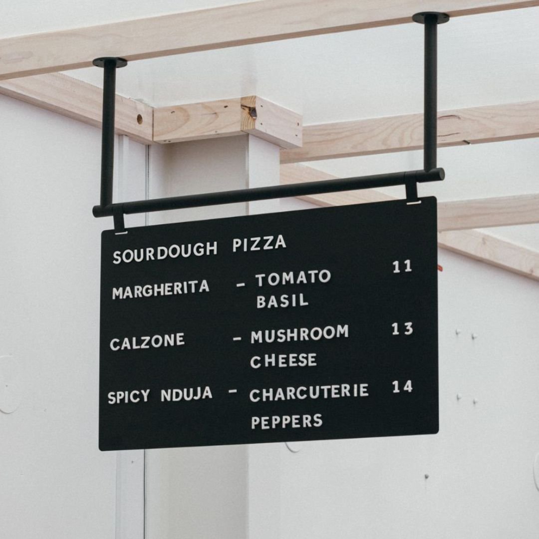
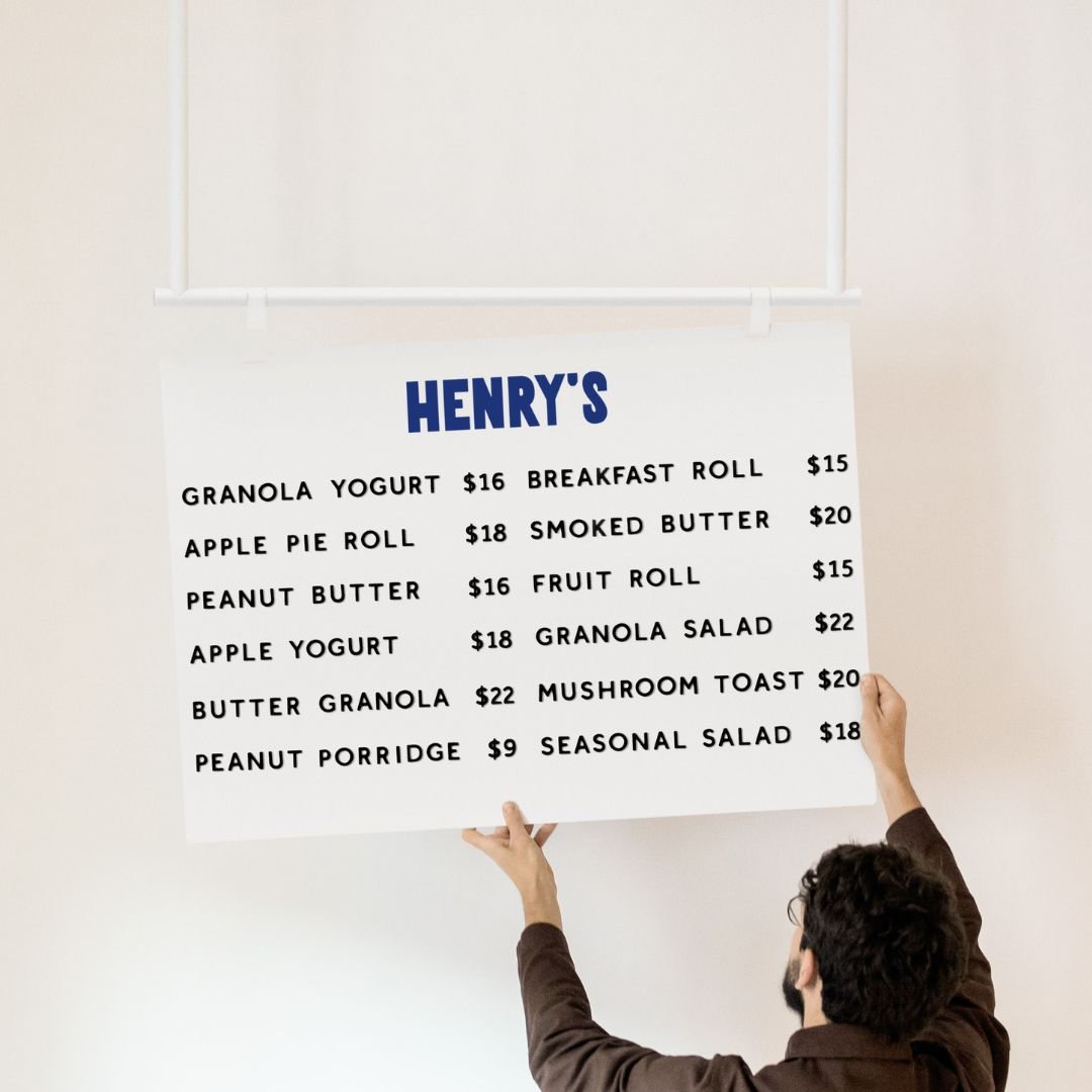
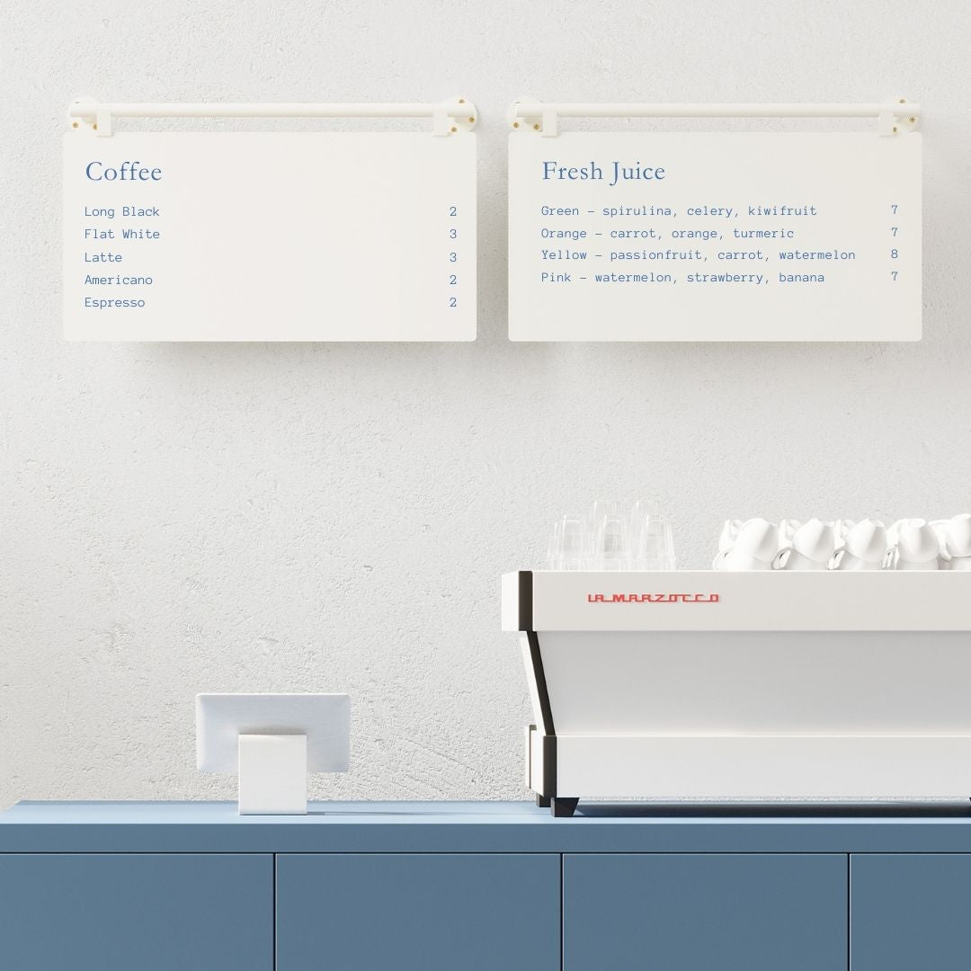
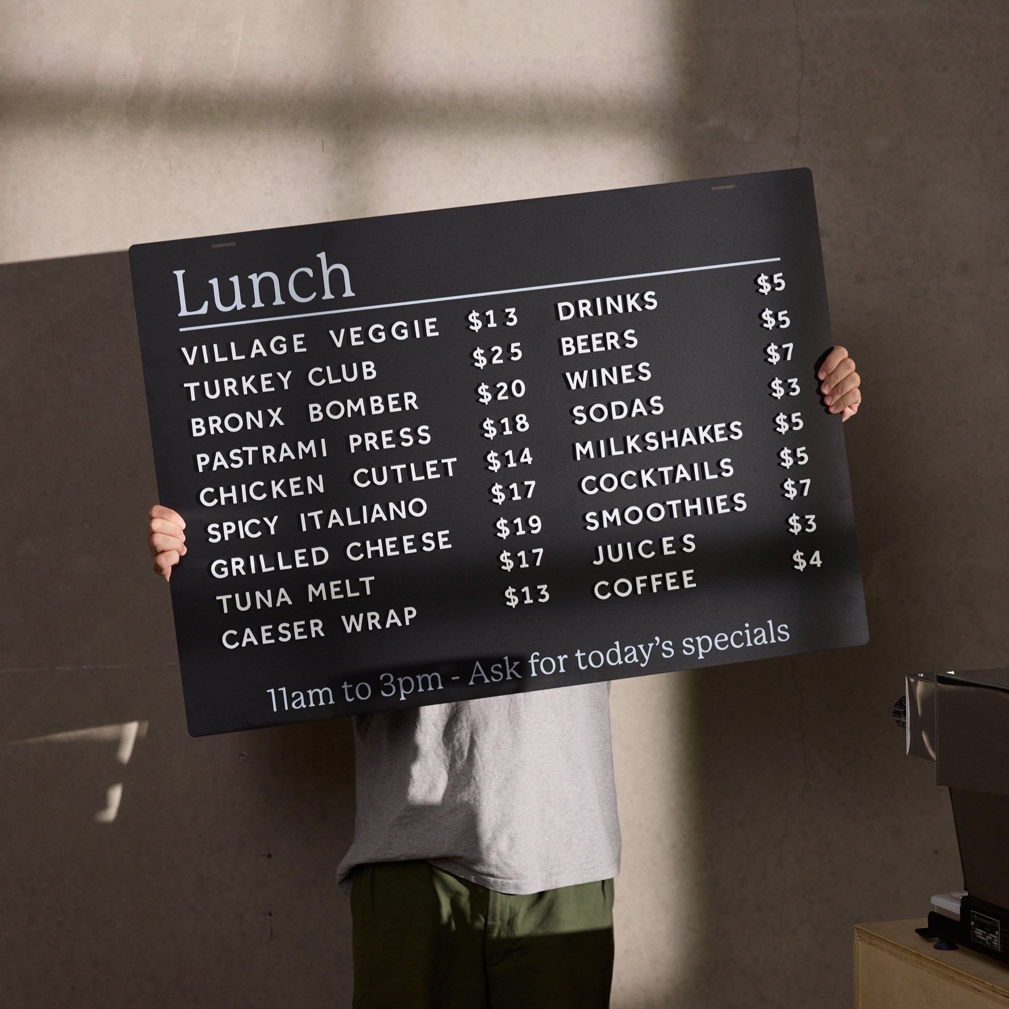
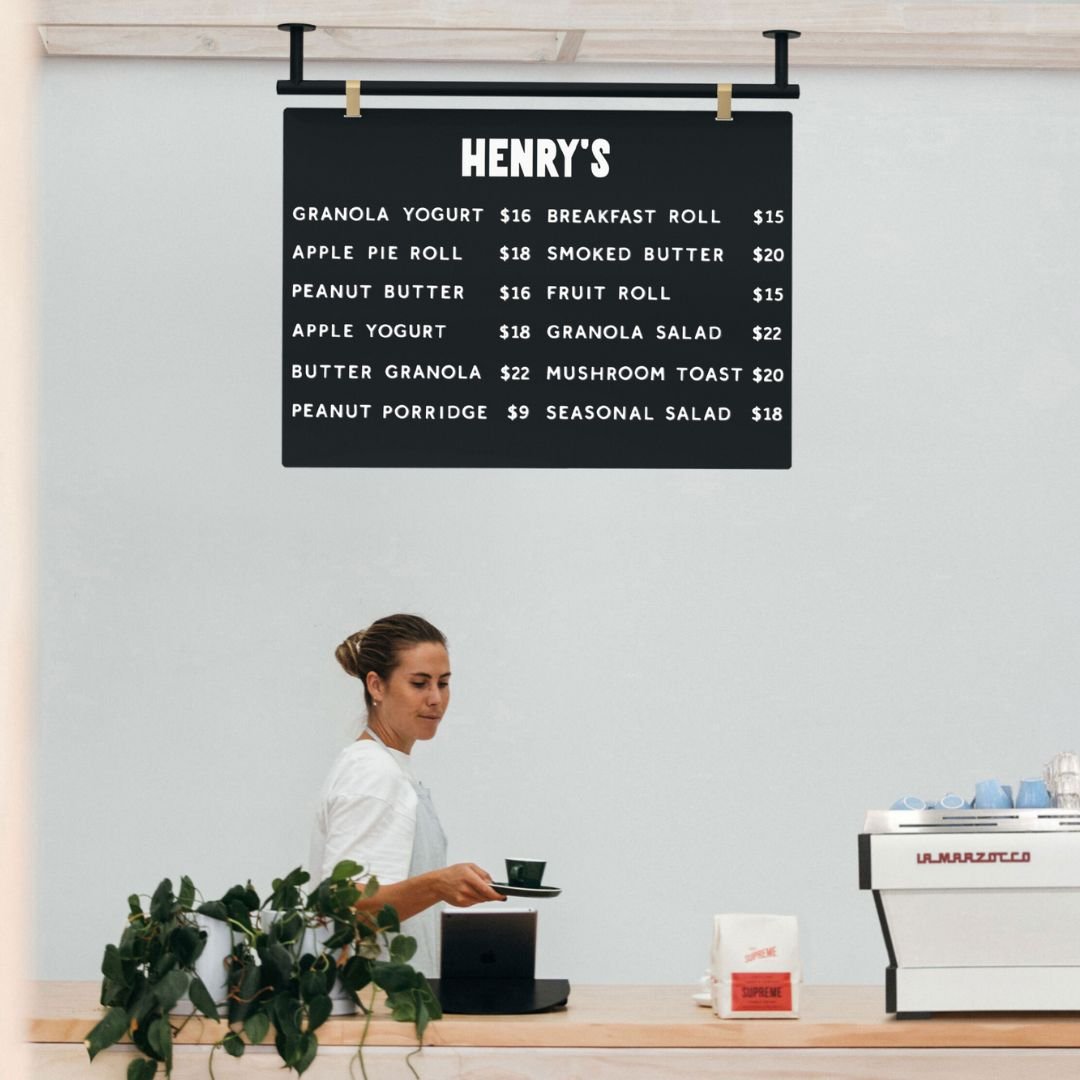
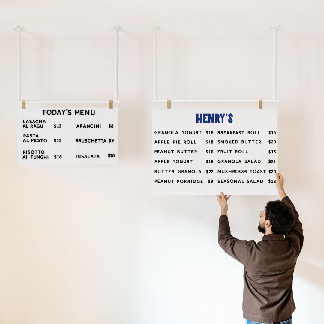
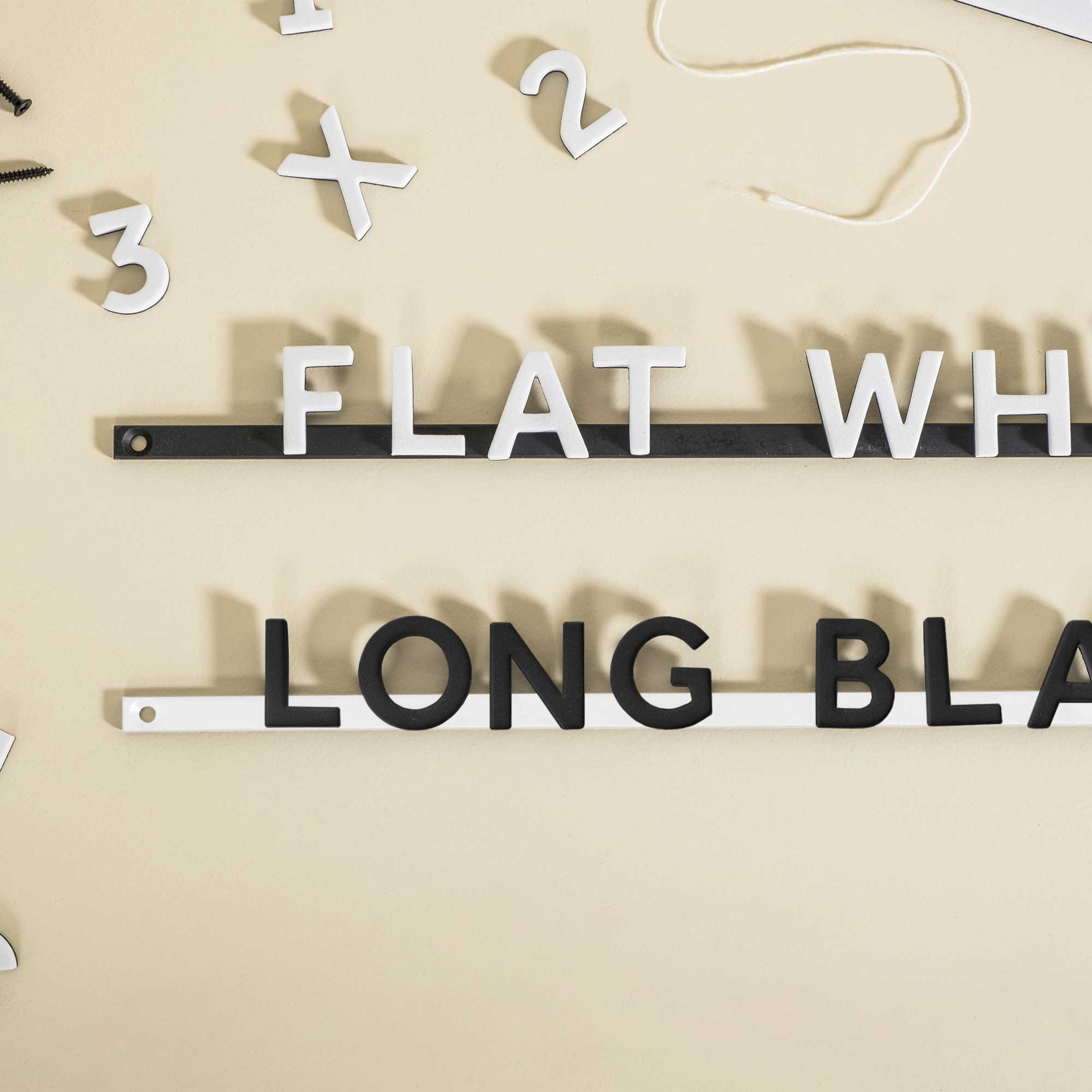
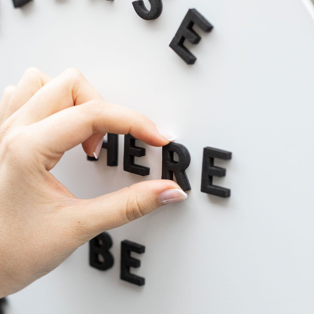
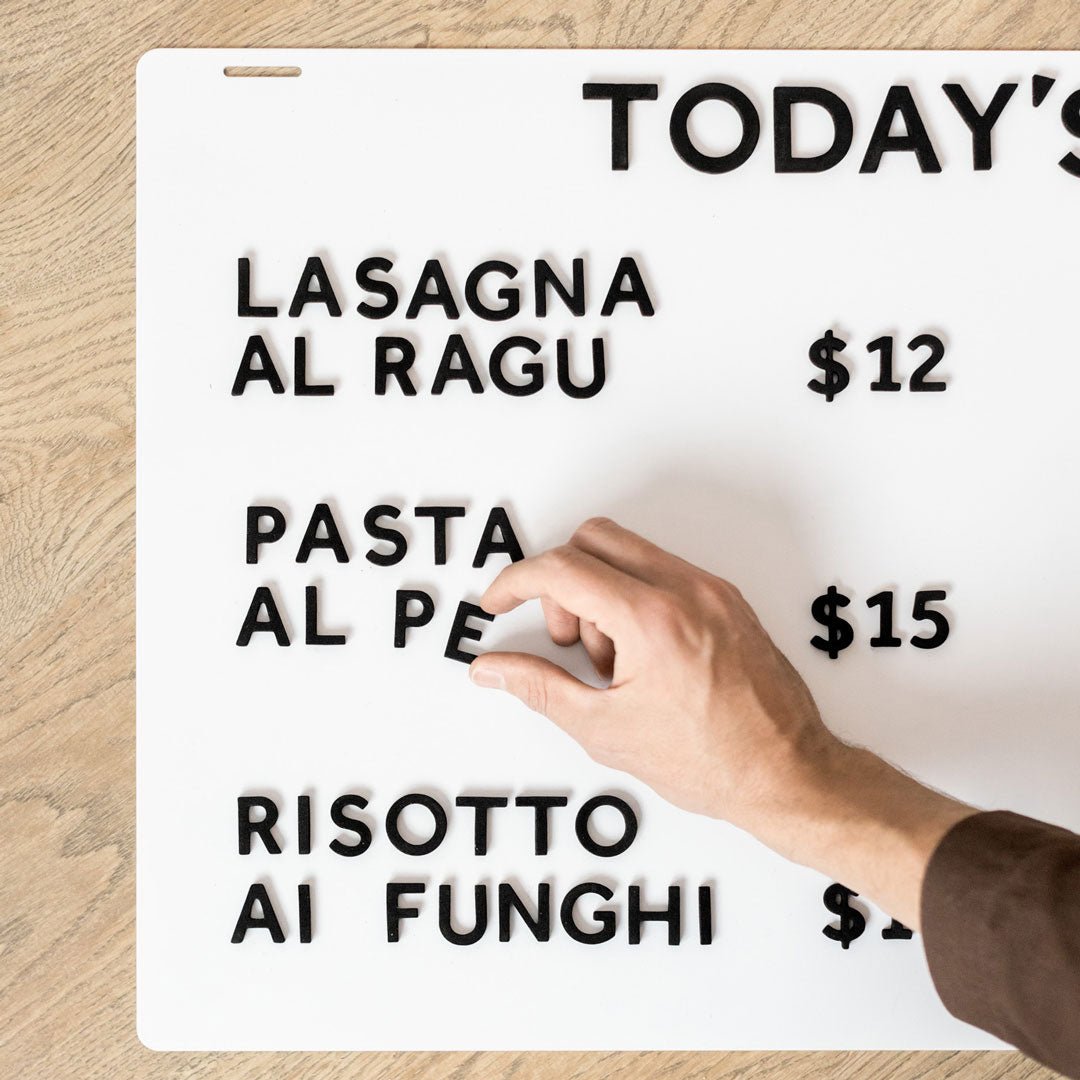
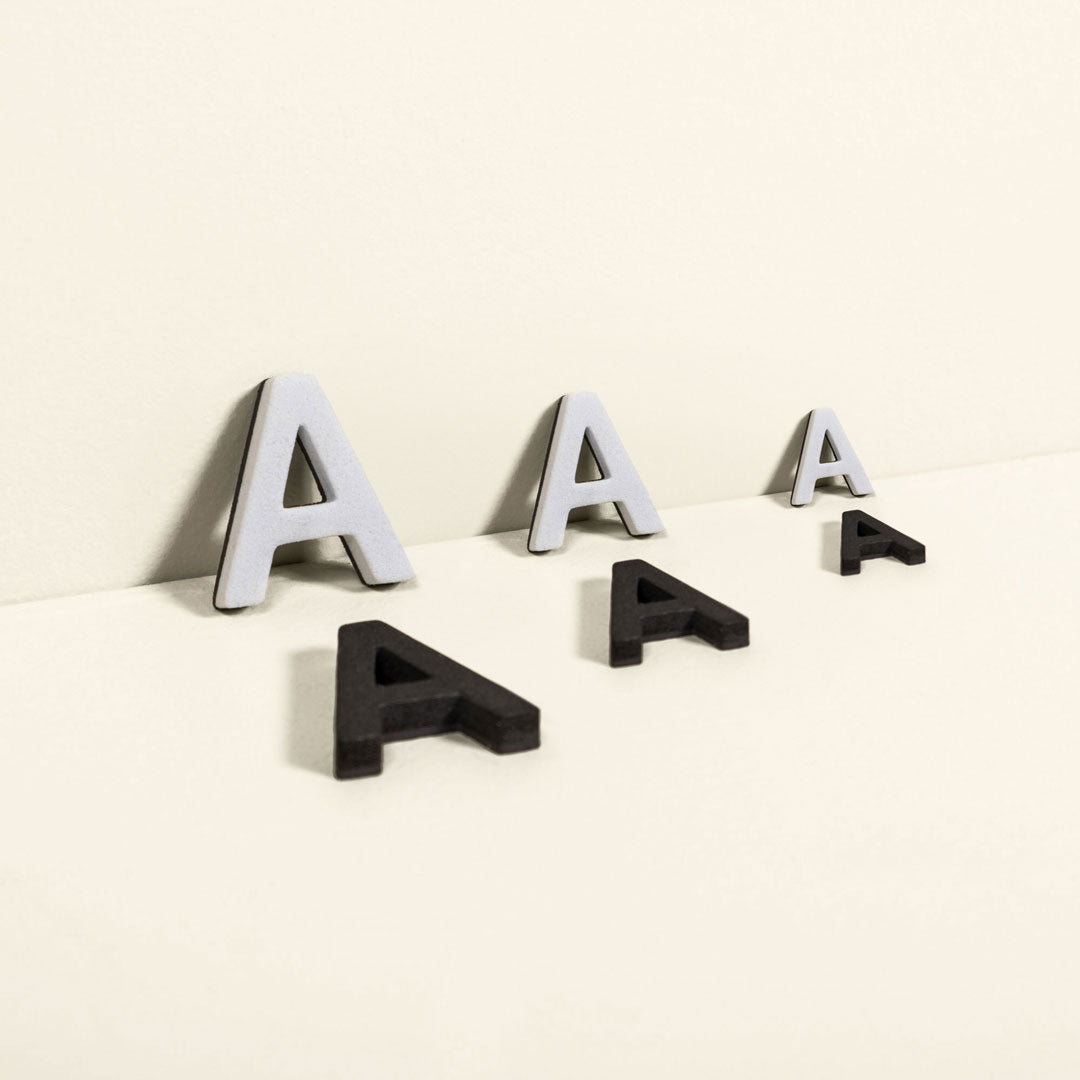
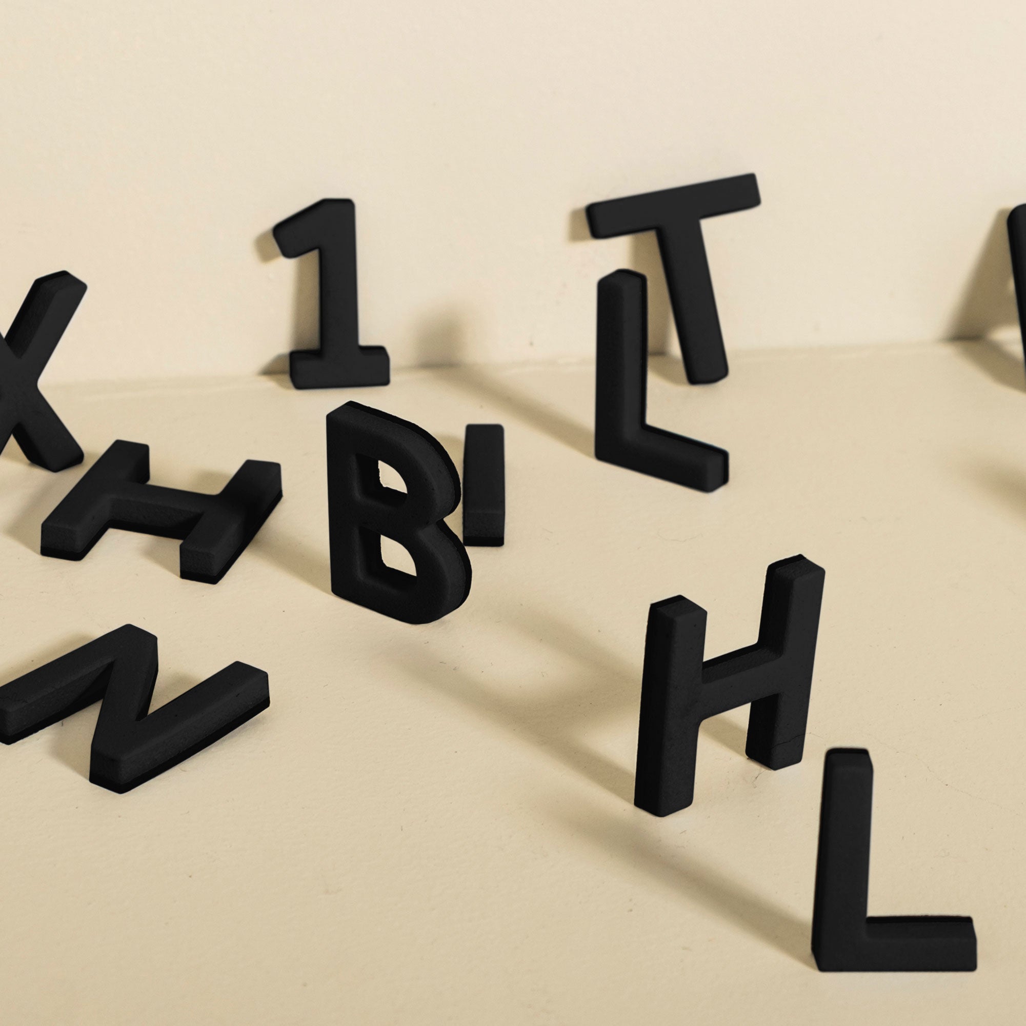
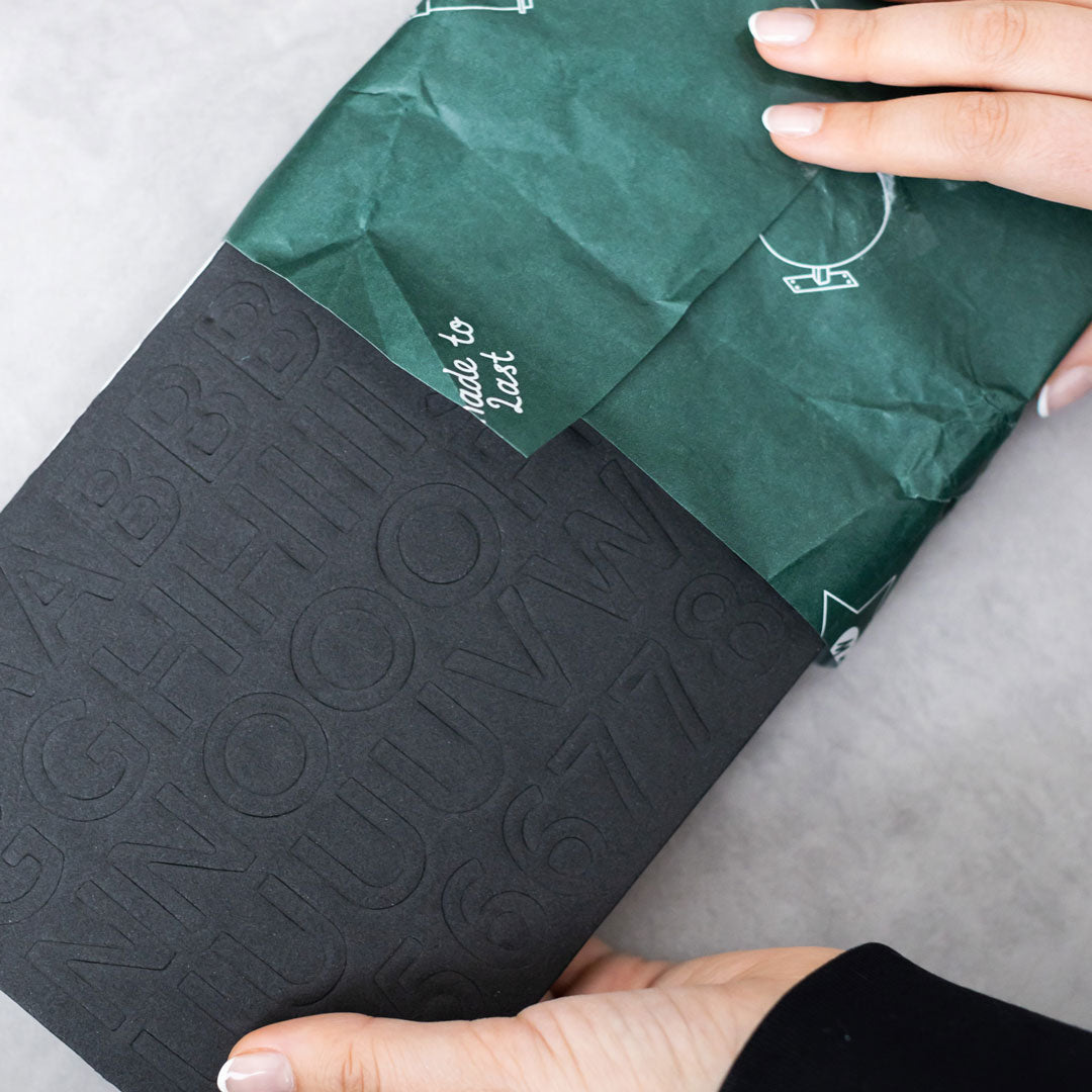
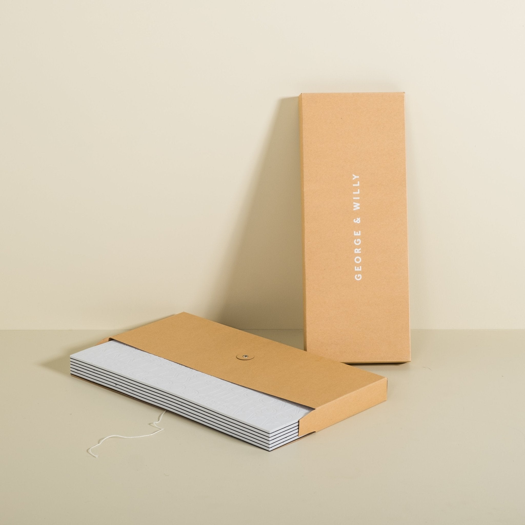
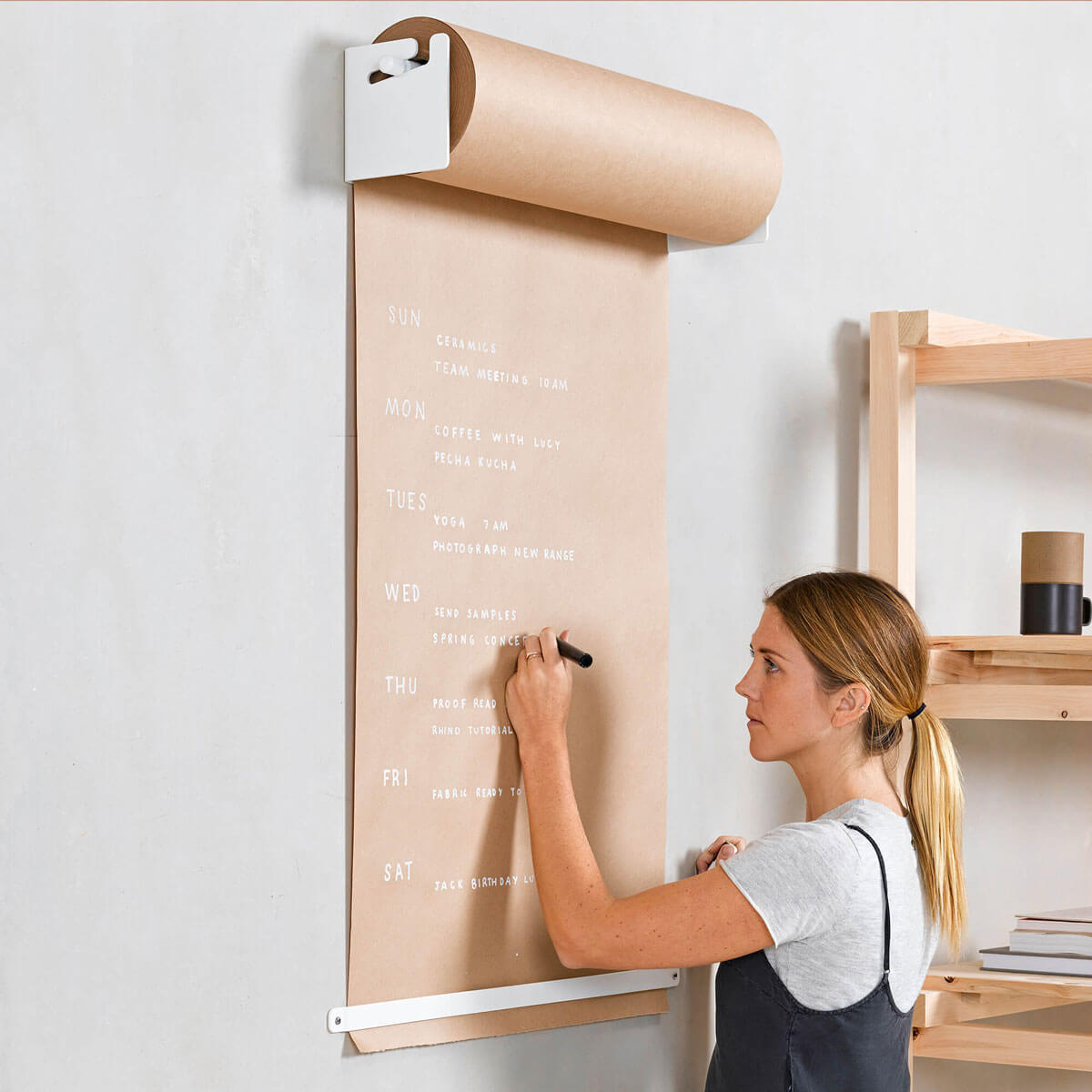
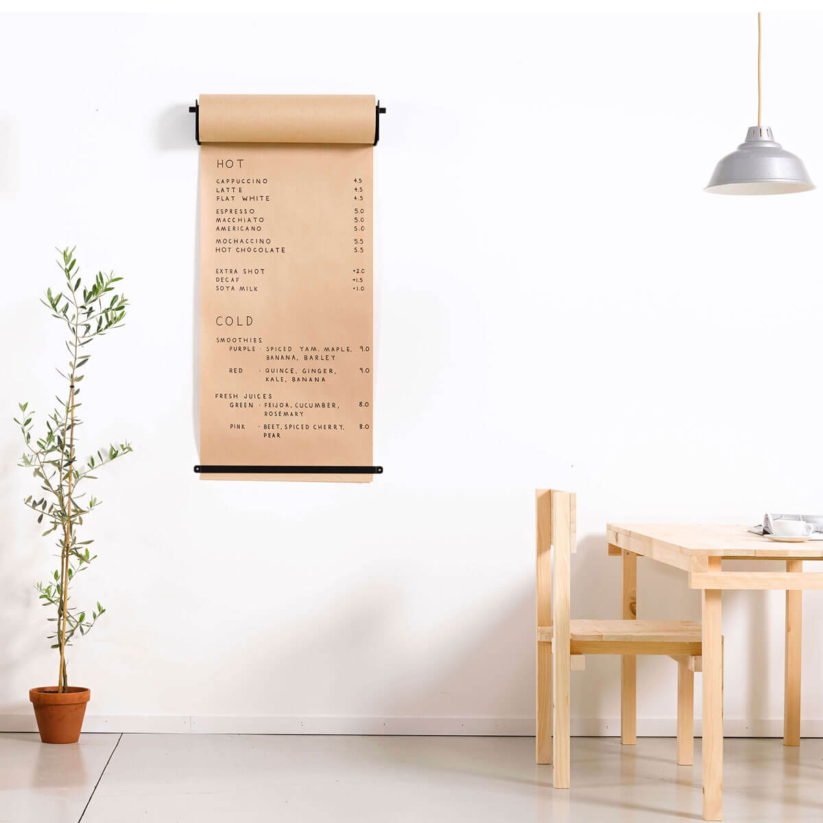
Good cafe design is both functional and pleasing to the eye. Function and aesthetics should be equal and complementary. A good way to achieve great function and great aesthetic is to keep things simple. It's been said many times and for good reason. Keep it simple. Simple and basic are different. Simple things are still heavily considered. Its often easier to think that adding more will improve something but as the saying goes “Perfection is achieved not when there is nothing more to add, but when there is nothing left to take away” - Antoine de Saint-Exupery. This can be applied in many facets of your cafe design. Consider your menu. We have many menu options such as the Magnetic Menu Board, Park Letter Board and Atelier Letters that are based around this principle. It can be easier to make things simpler and focus your time on improving the details.

The clean and simple Magnetic Menu Board
Paradox of Choice
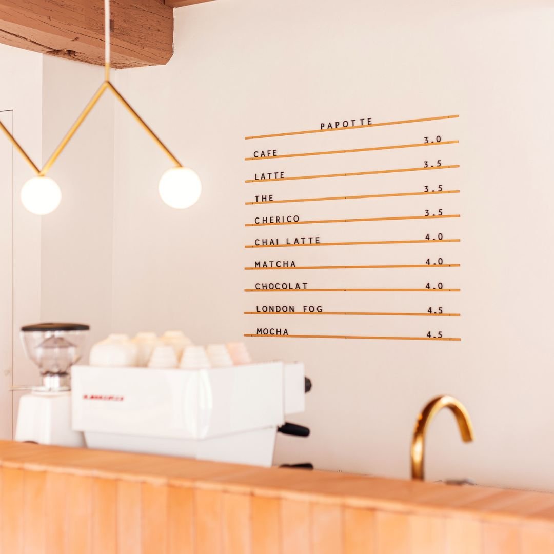
An interesting example of simplicity is the number of items on your menu. Some people believe having a massive menu is beneficial to the customer. In fact, this actually gives the customer choice anxiety, where they find it hard to make a decision. A man by the name of Barry Schwartz wrote a book on this called the Paradox of Choice - Why Less is More. Schwartz argues that eliminating consumer choices can greatly reduce anxiety for shoppers and the same goes for menus. For your cafe design, focus on having a small selection of very well thought out and executed items instead of a large list of poorly throughout and executed items.
Make it easy to read
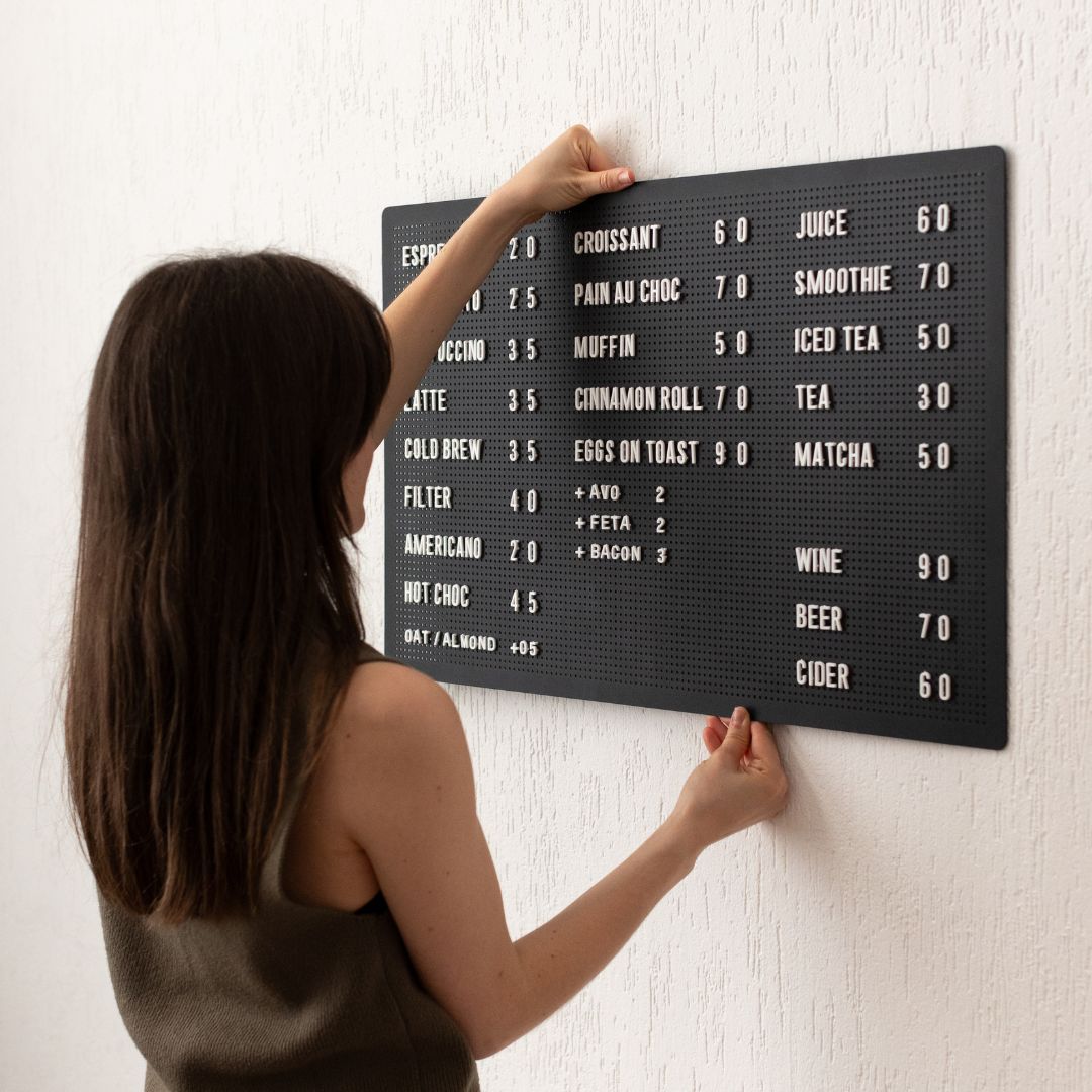
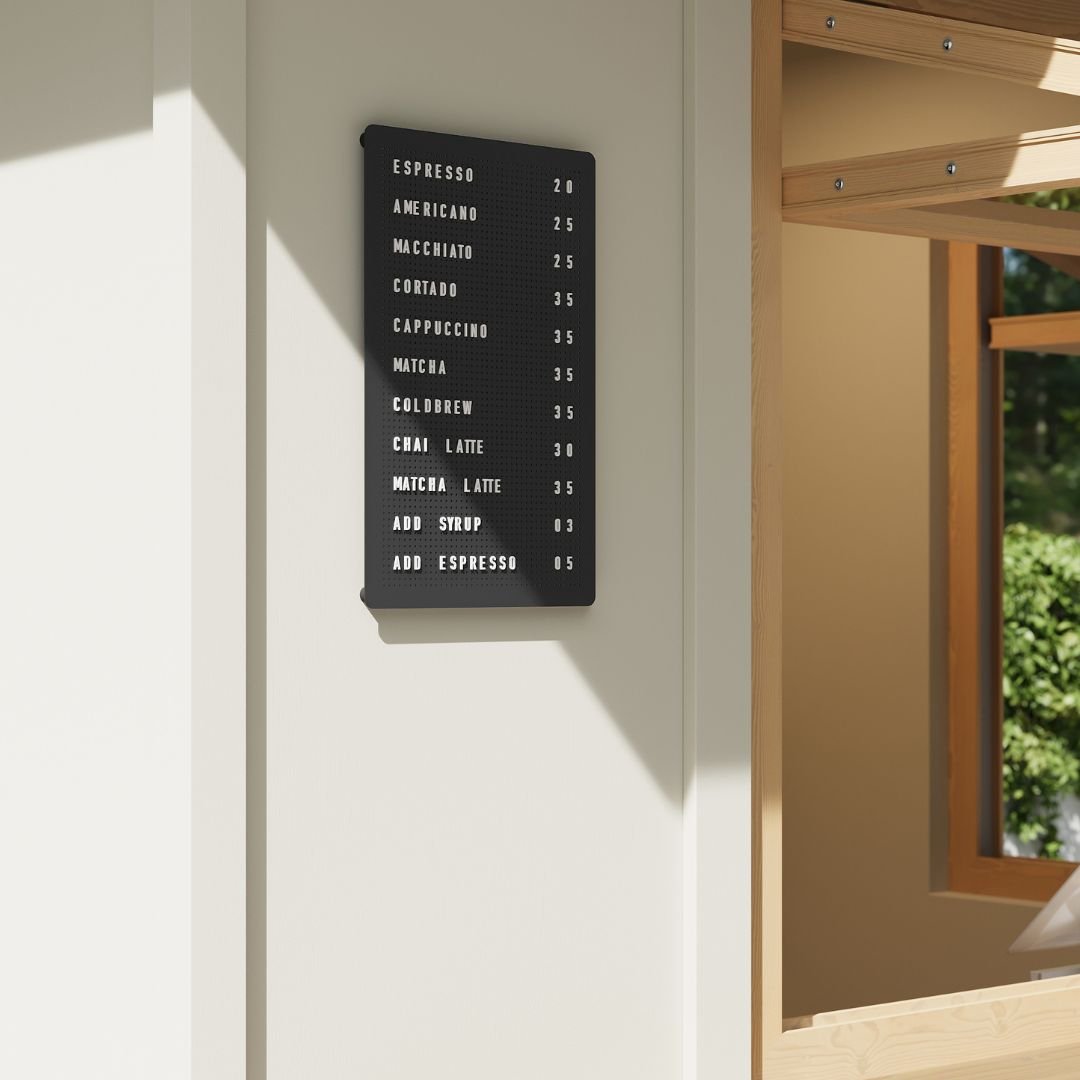
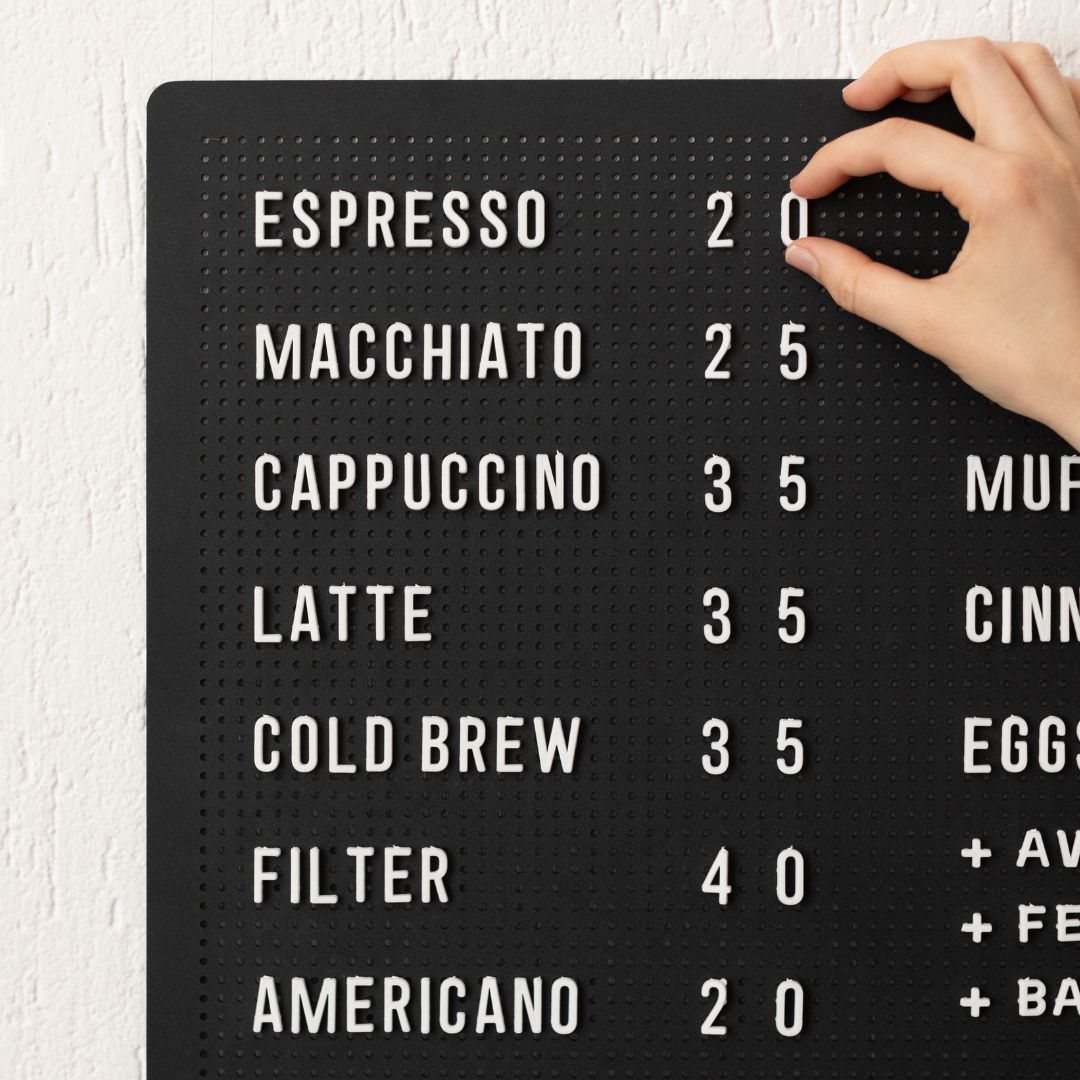
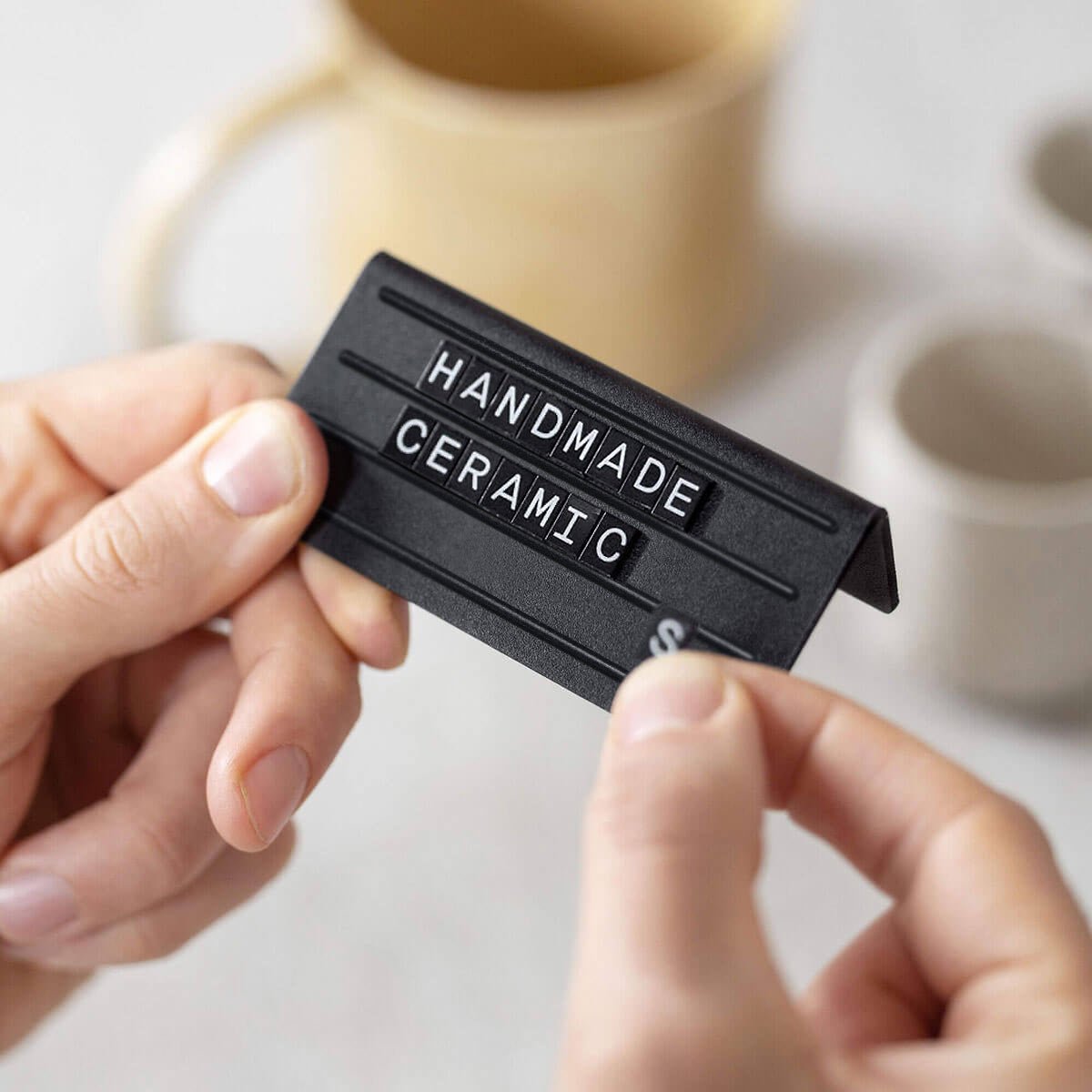
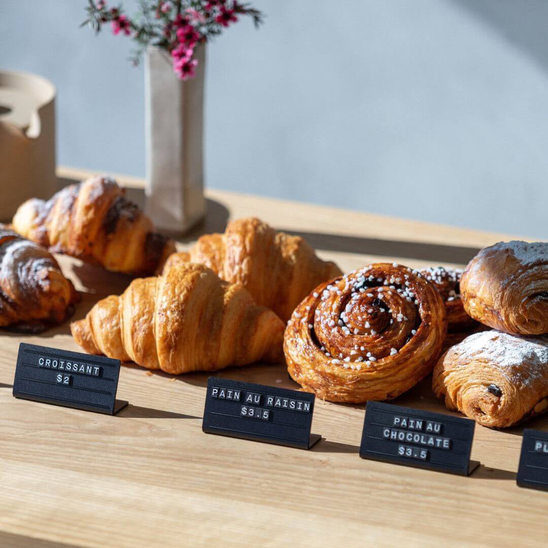
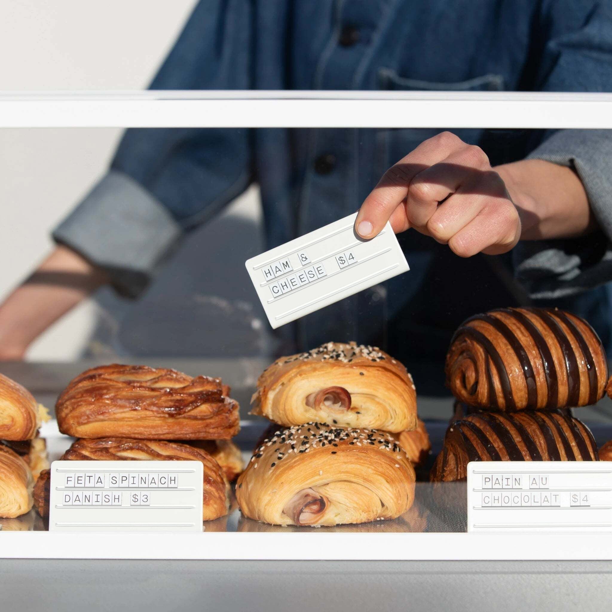
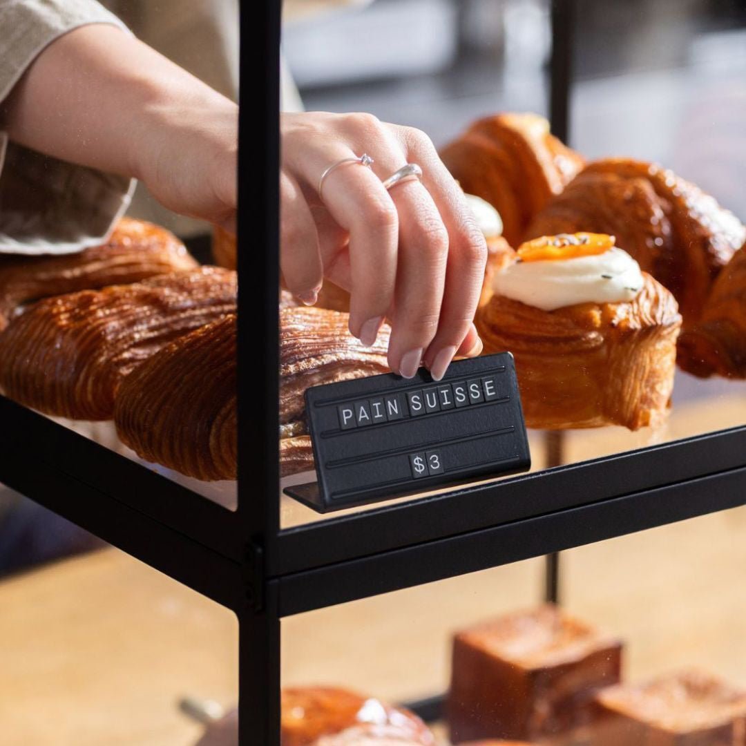
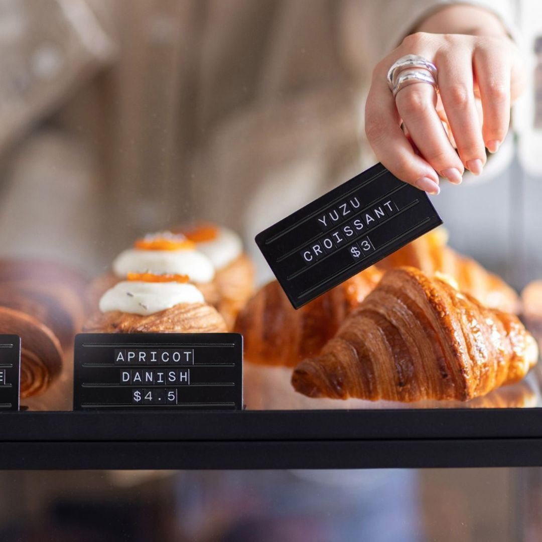
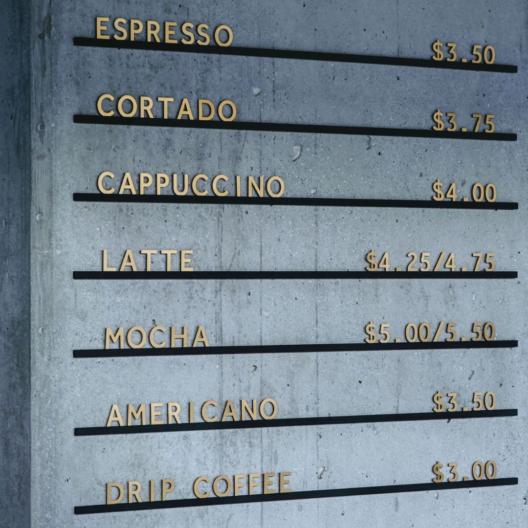
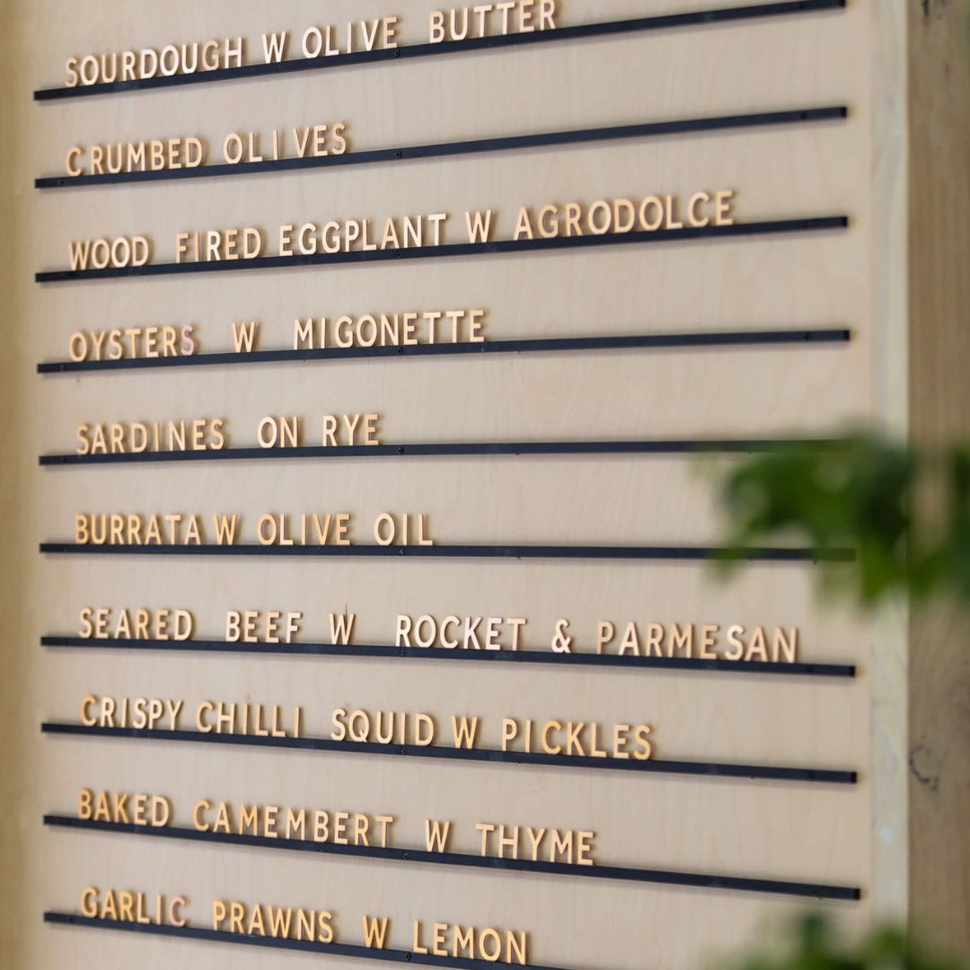
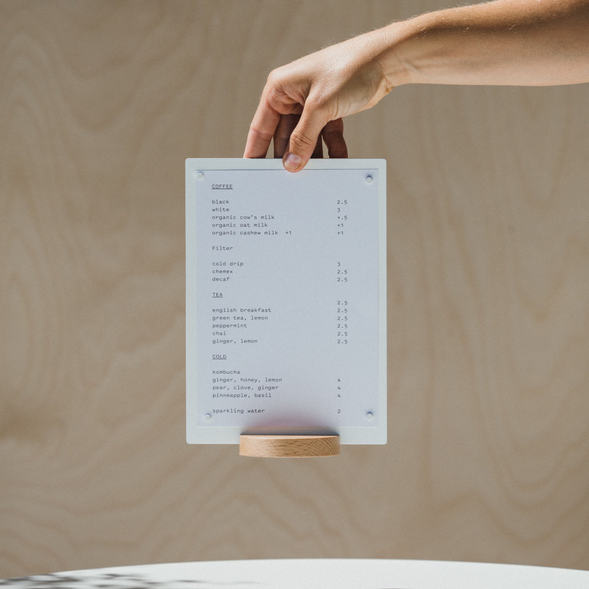
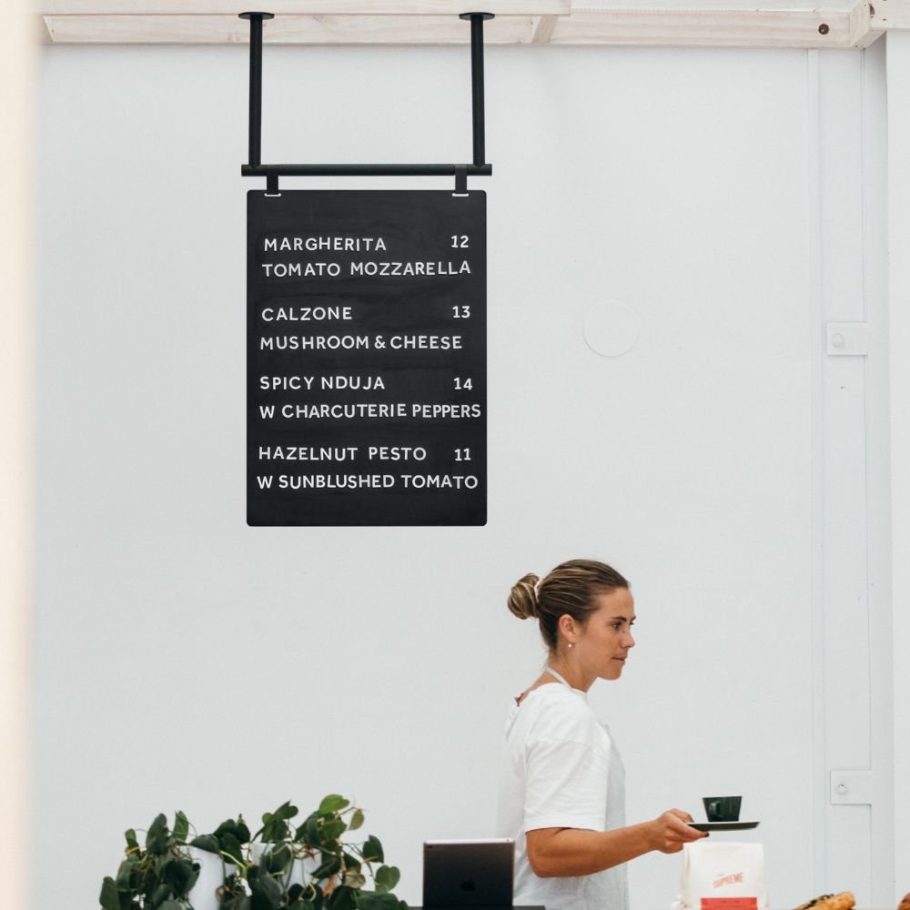
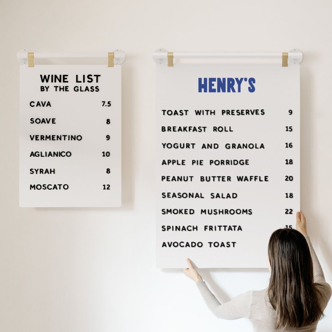
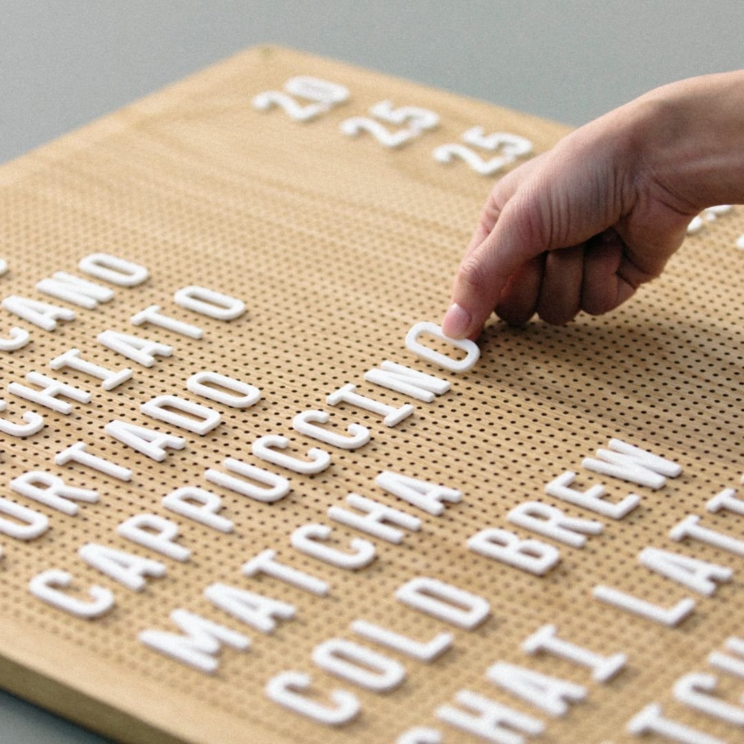
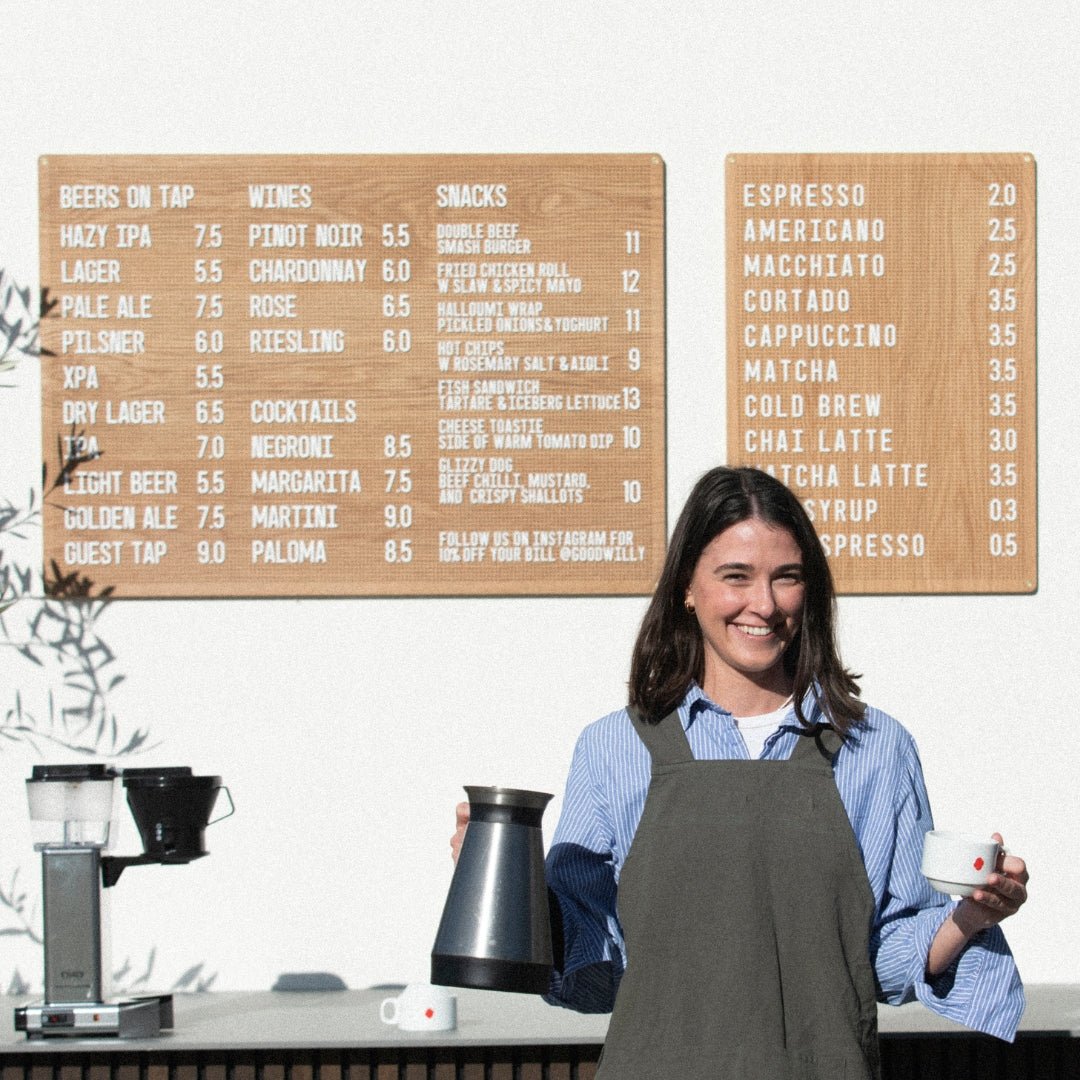
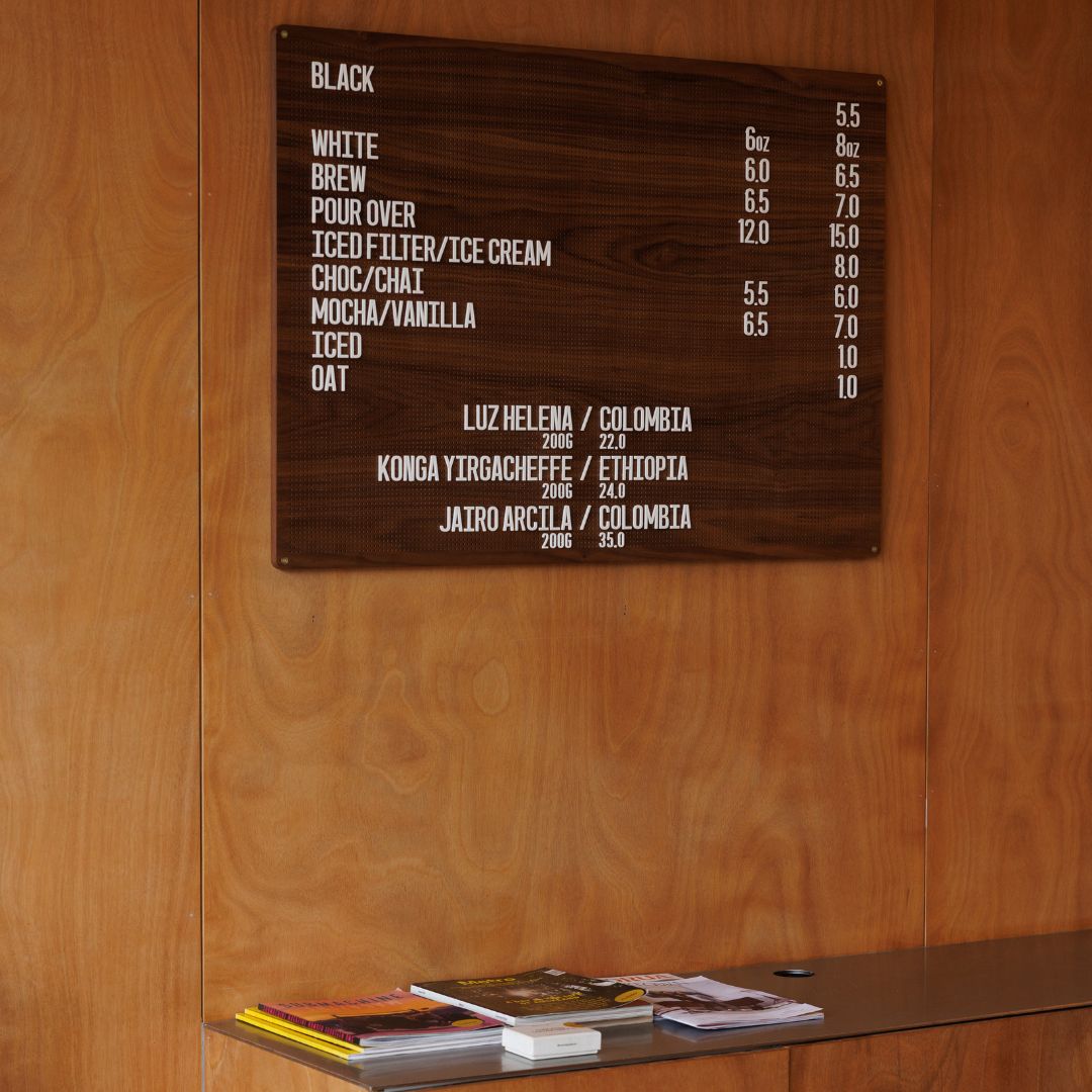
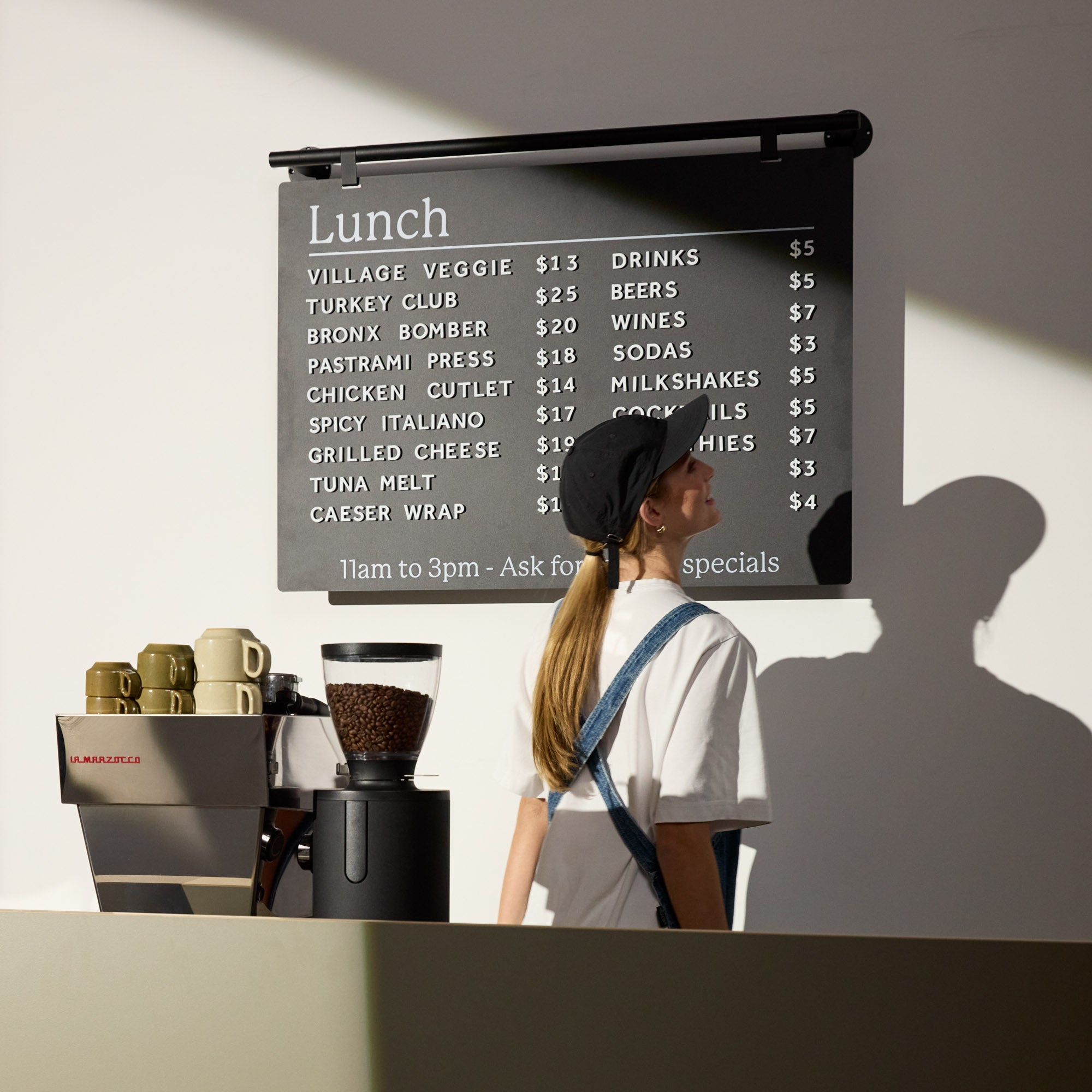
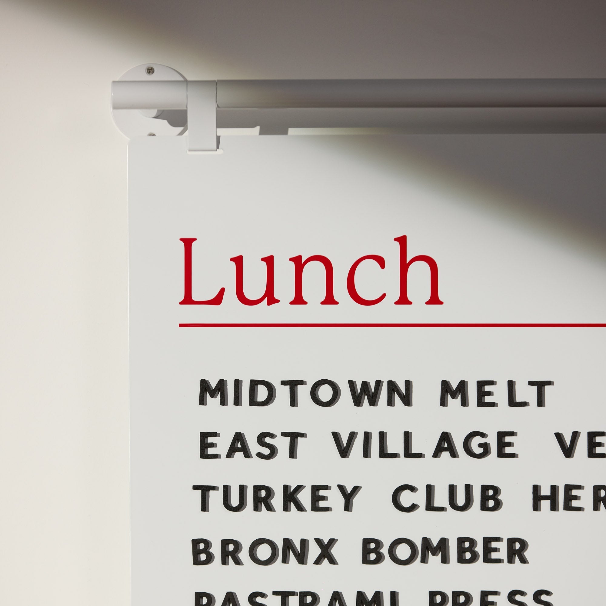
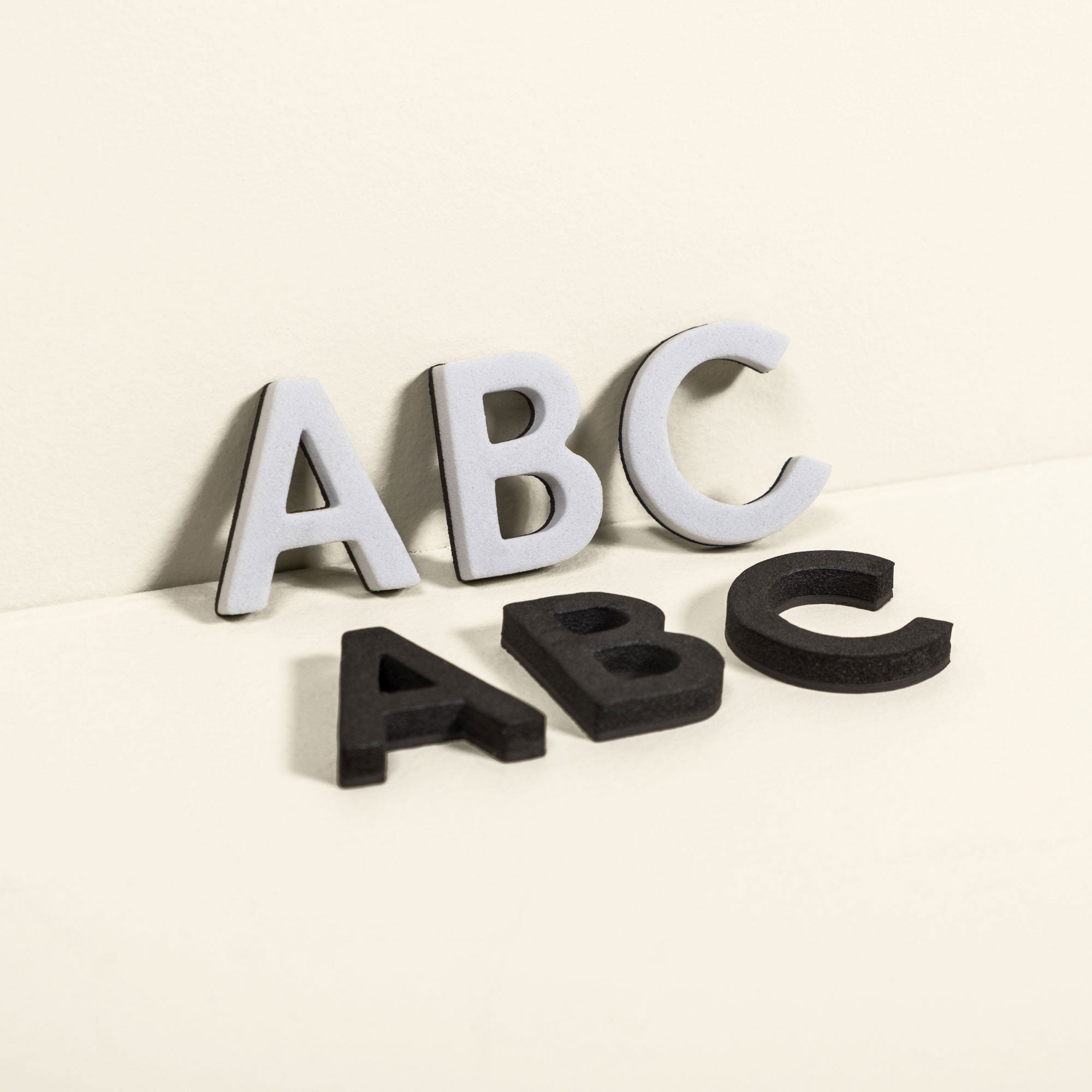
Not only the contents of your menu matters but also how you display it. Stay away from excess information and hard to read fonts. We spend a lot of time scrutinizing the details of our menus from letter size to the font to how it can be used, resulting in simple and easy to read options. Have a look here for some options that may be perfect for your cafe design. We have also done another blog all about menu design here.

The easy to read Atelier Letter Board
Touchpoints
Consider all touchpoints for your cafe design. Touchpoints are any interactions that might alter the way that your customer feels about your cafe. It includes encounters where there is no physical interaction, such as your online presence. Basically touchpoints can be anything from your Instagram to your loyalty cards, to your water glasses to your outdoor sign. All touchpoints add up to the overall feeling of your customer. Often the smallest detail in your cafe design can leave the most lasting impression. Once again, put yourself in the customer's shoes and consider every detail of your cafe design.
Competition is healthy
Know what the competition is doing. As the old saying goes, keep your friends closer and your enemies closer. You don't have to try and beat the competition in every facet but instead know your differentiating properties and use them to your advantage. You may be in the same industry, serving similar items but this doesn't necessarily mean you have the same customers. Figure out your customer's specific wants and needs and adjust your cafe design to suit. This will allow you to differentiate your cafe design from the competition.
At the end of the day, just remember you are designing for people. If your cafe design keeps the people happy, you have succeeded. Don't forgot to have a look at our cafe design blog post centered specifically around small cafe design also.


