Dining out has become a lifestyle and way of life for many people. Not because we can't make a good coffee in the comfort of our own kitchen, but because it is a central part of our modern social lives. Whether you're meeting your friend for an overdue catch up at the tapas bar down the street, or discussing business with a colleague over a flat white, cafe culture, menu design, and eating out is one of the most competitive industries that we engage in regularly. Your menu design is an art in itself, and as much a part of the experience of your eatery as the food you serve.

It's the small details and touchpoints, such as your menu card design, that all build on each other to influence the overall dining experience of your visitors. Ultimately these are what bump you up to first-pick when your customers are racking their brains for a place to meet, greet and dine.


Cocktail Bar, Isabel in Denver USA menus in leather cases.
A sticky, dog-eared menu design that offers 100 different items to choose from will leave your cafe customers unimpressed, overwhelmed, and running for the hills. It is for this reason, we have compiled 5 things to always consider for your restaurant menu design to help make the service experience of your restaurant visitors the best it can possibly be.

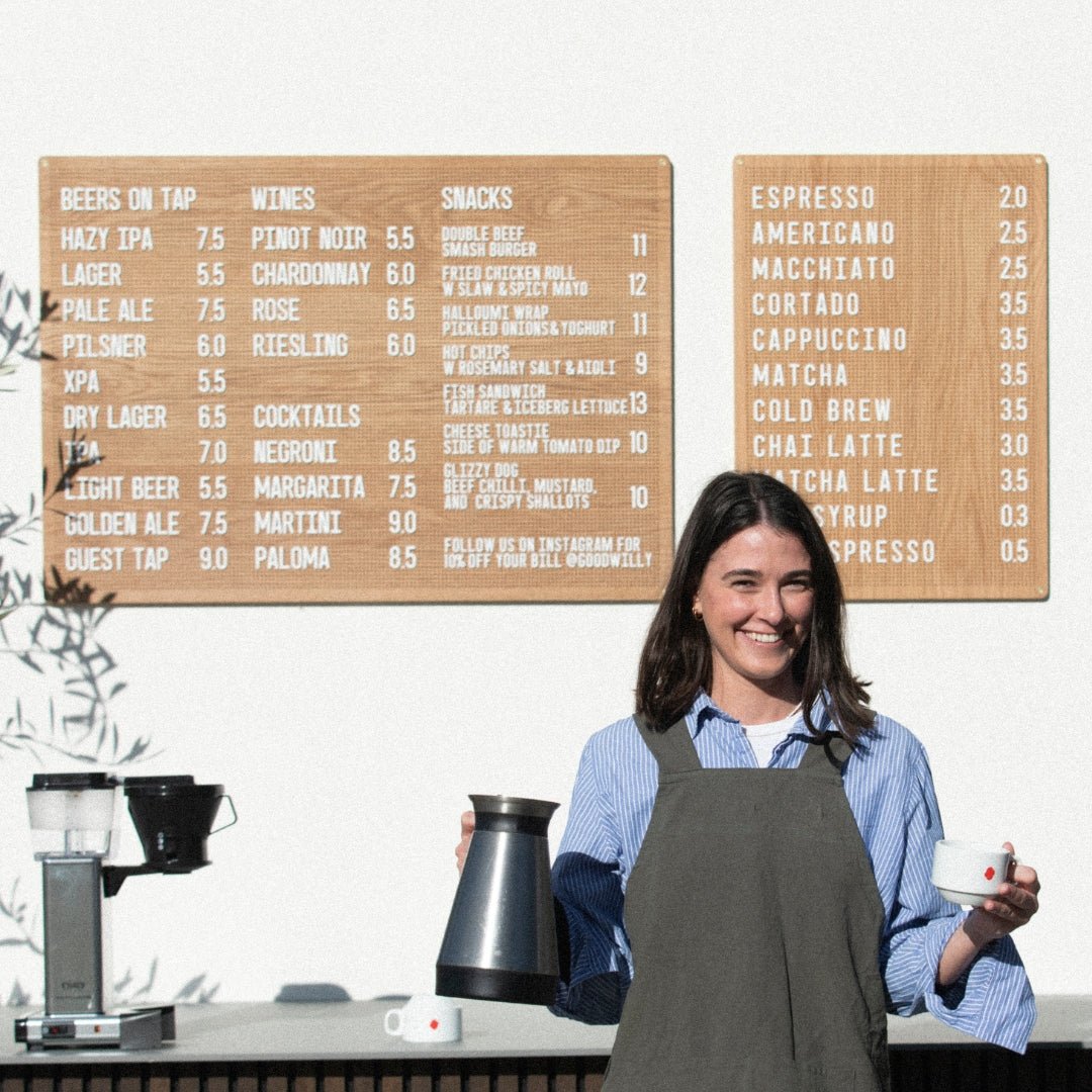
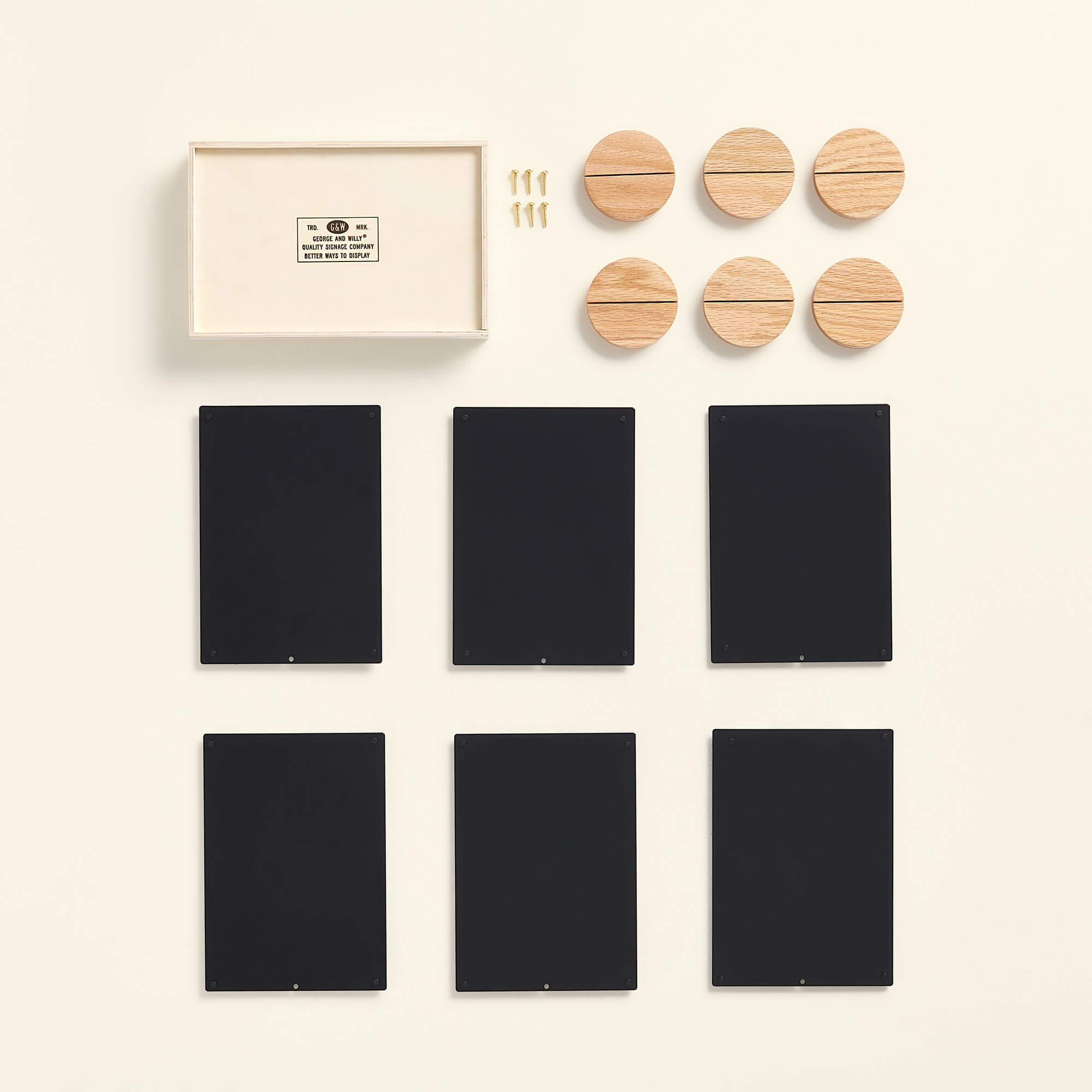
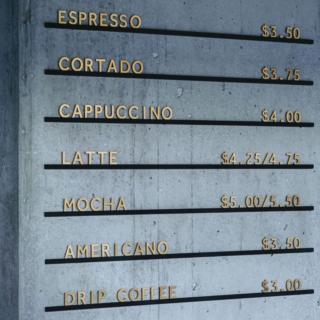
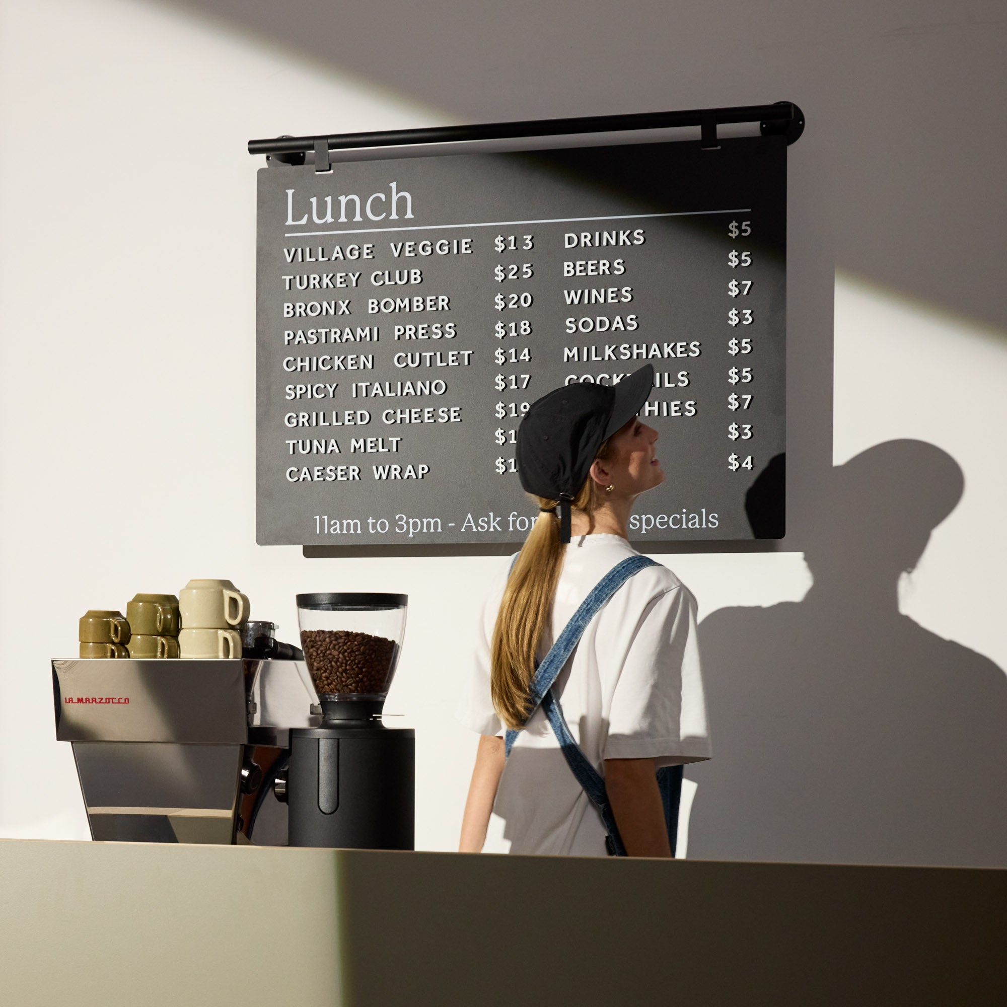
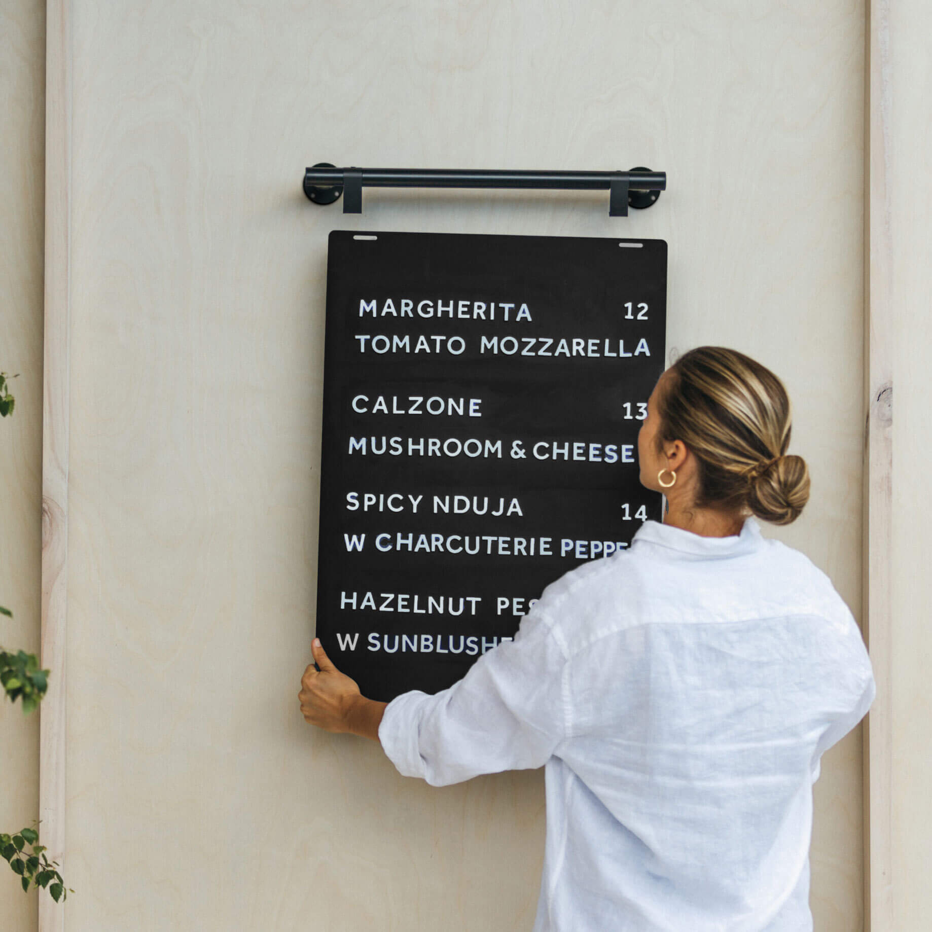
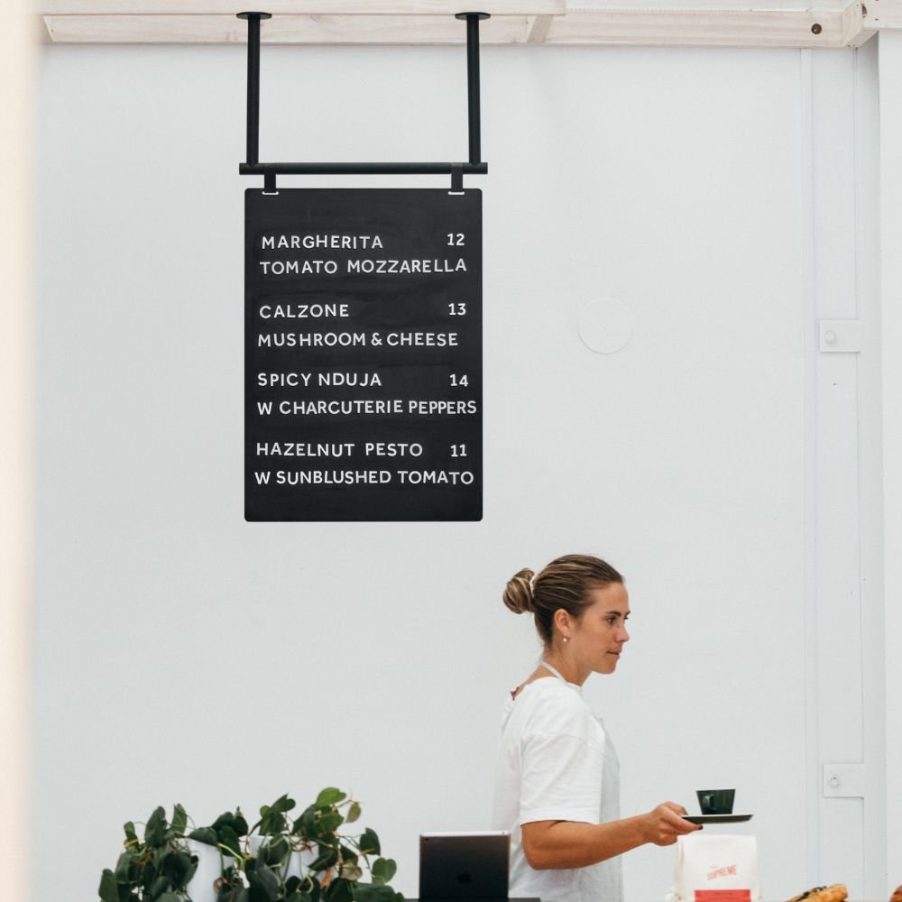
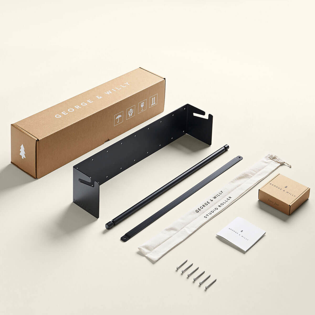
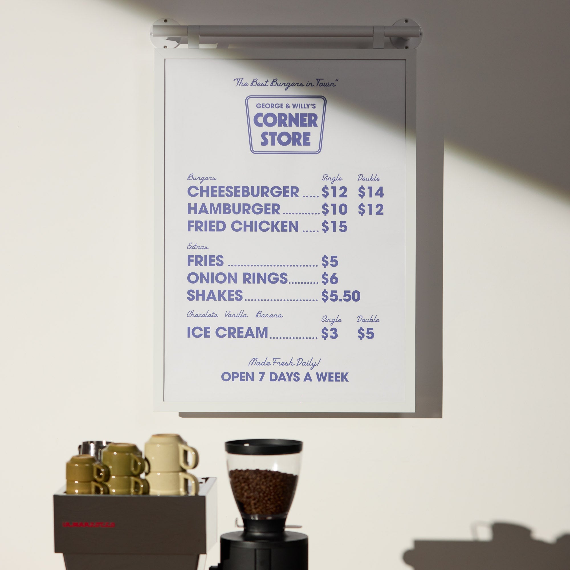
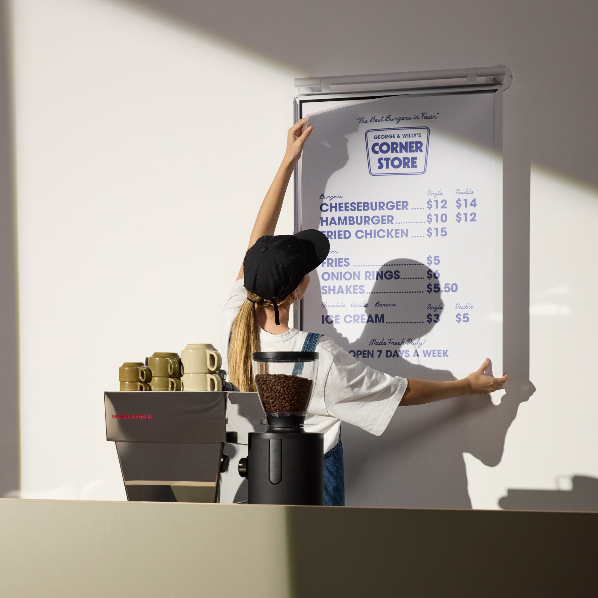
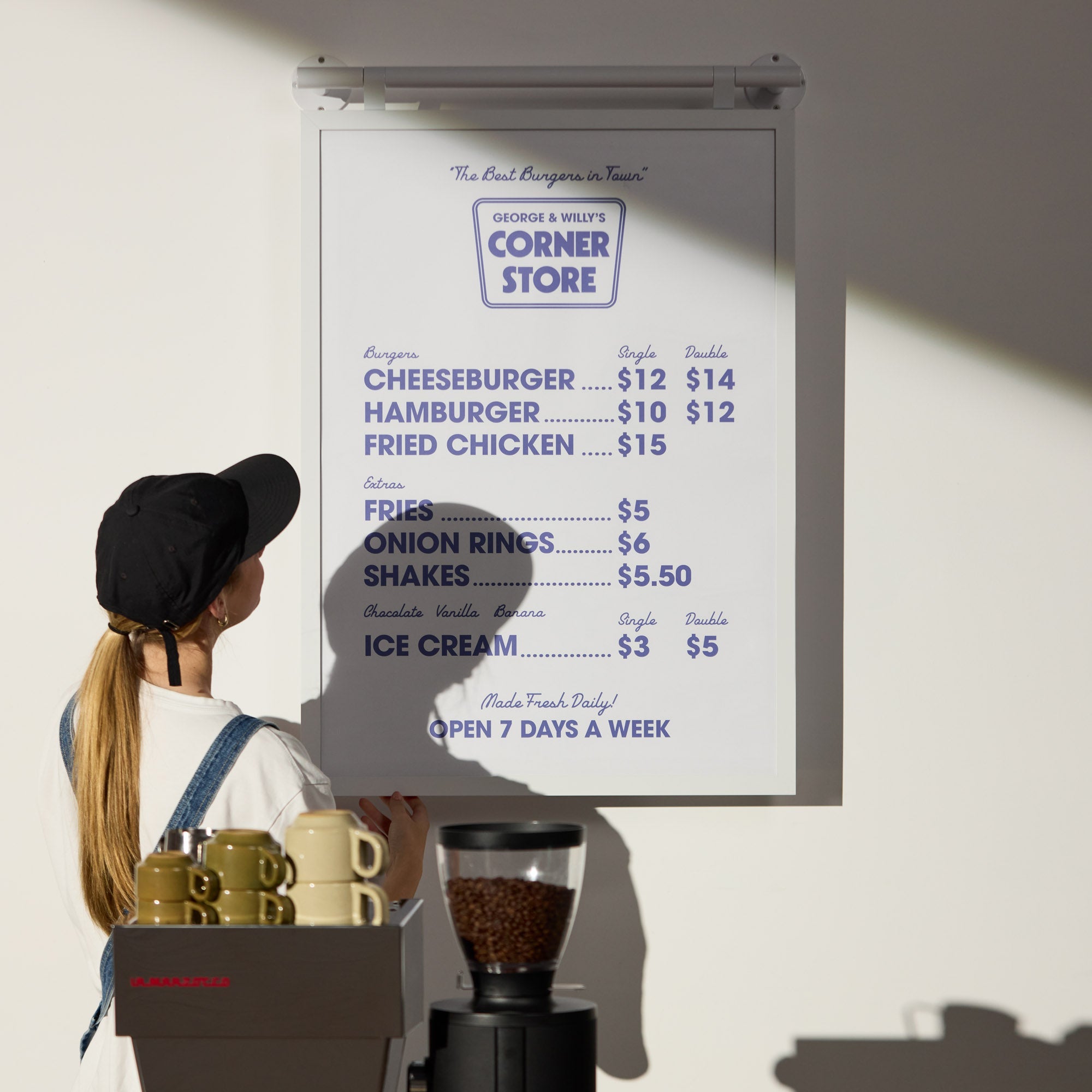
George & Willy Market Chalkboard
Four things to consider for your menu card design.
Menu design & Presentation
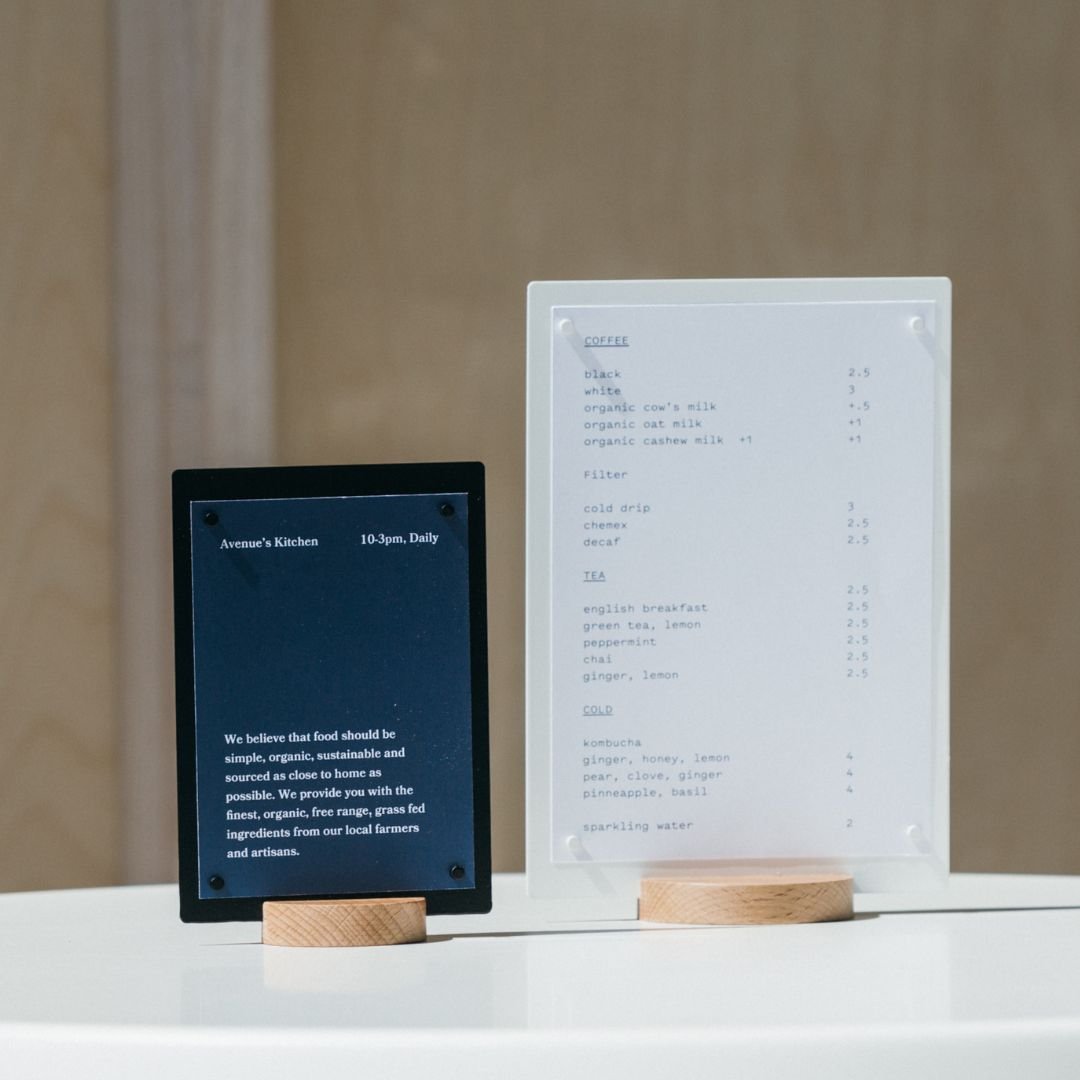
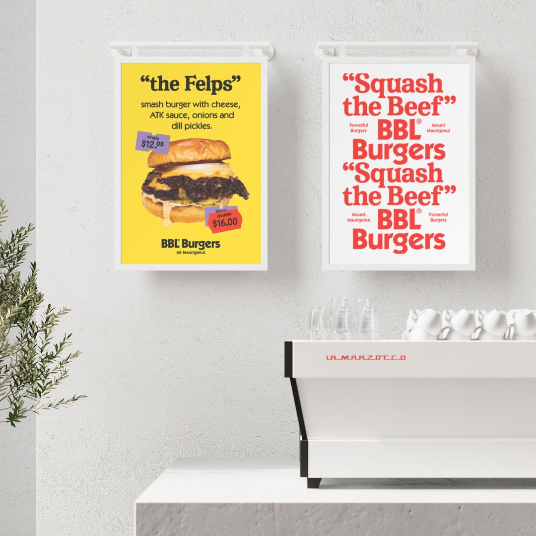
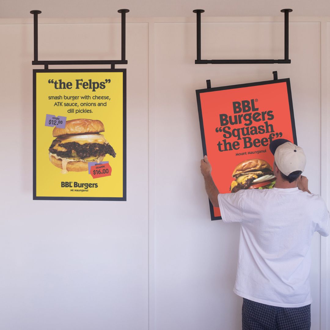
Are you a specialty coffee house that strictly offers caffeinated beverages? Or a local bakery selling hot-plate sourdough sandwiches with a line out the door? The presentation of your menu design needs to be consistent with the overall tone of your space and brand but also a point of difference from your competitors.


The Public House MI, USA offers a quarterly menu that rotates with the seasons.
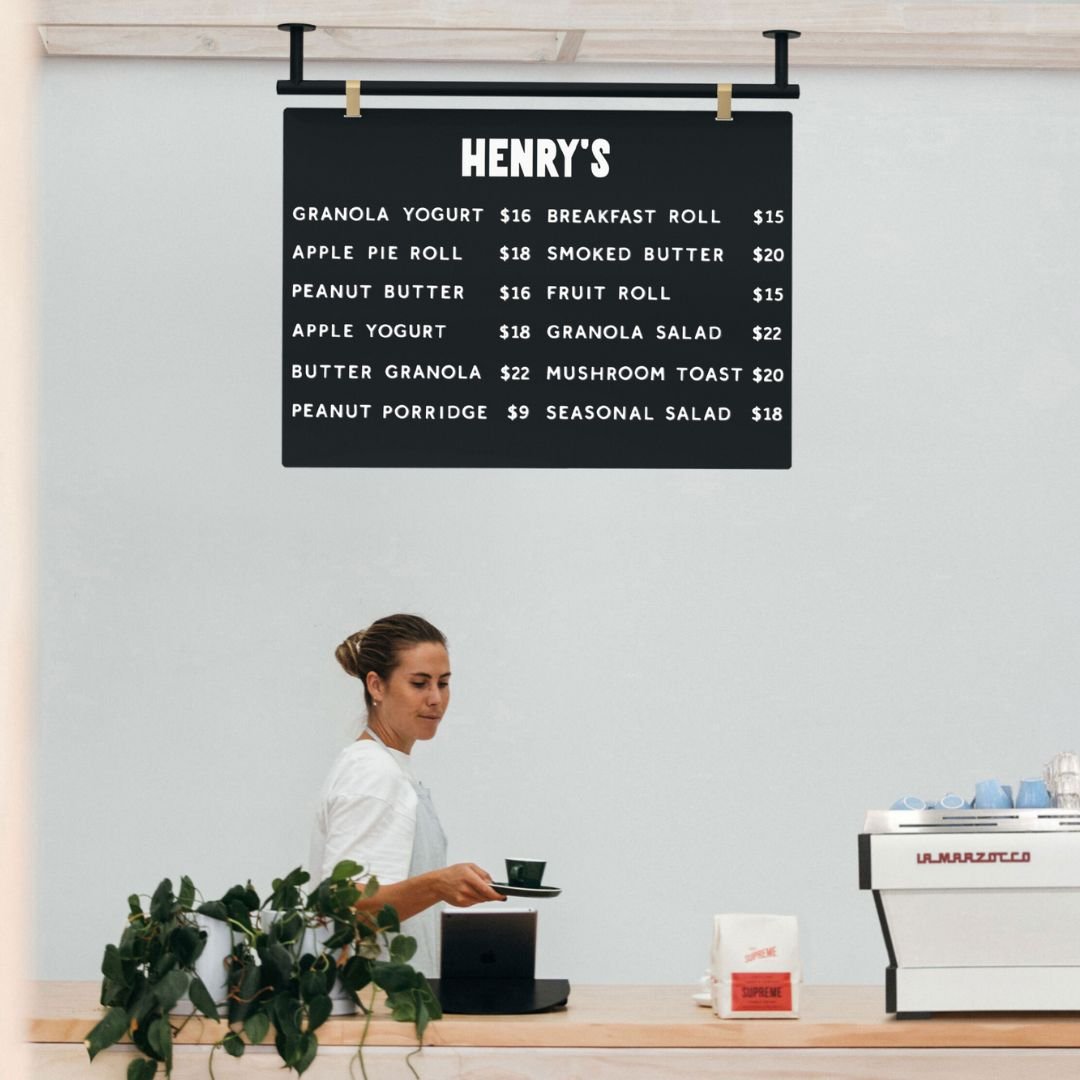
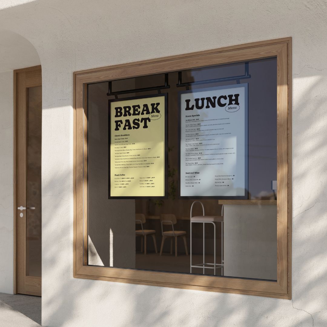
Do customers simply grab the menu card design from a box on the counter, or are the menu cards hung by leather handles from butcher hooks below the subway tiles of your open kitchen? Do you have a set of 10 seasonal dishes or flavors that you advertise above the counter?

Kultura in Varna, Bulgaria cocktail bar has embossed leather handles to hang from brass hooks in the industrial-inspired interior.

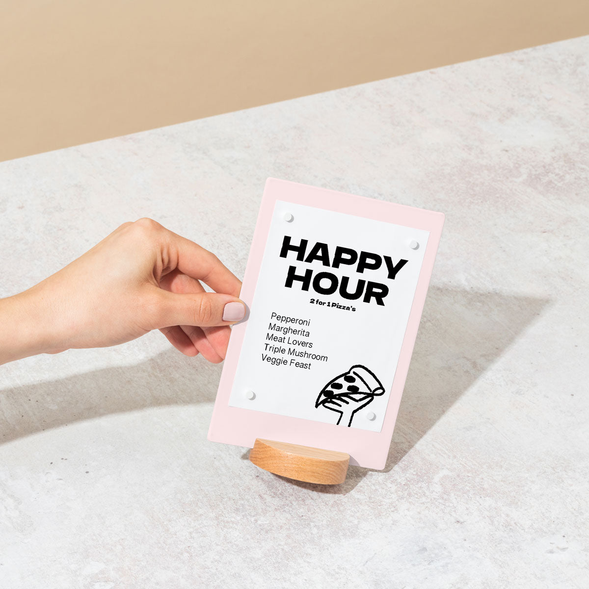
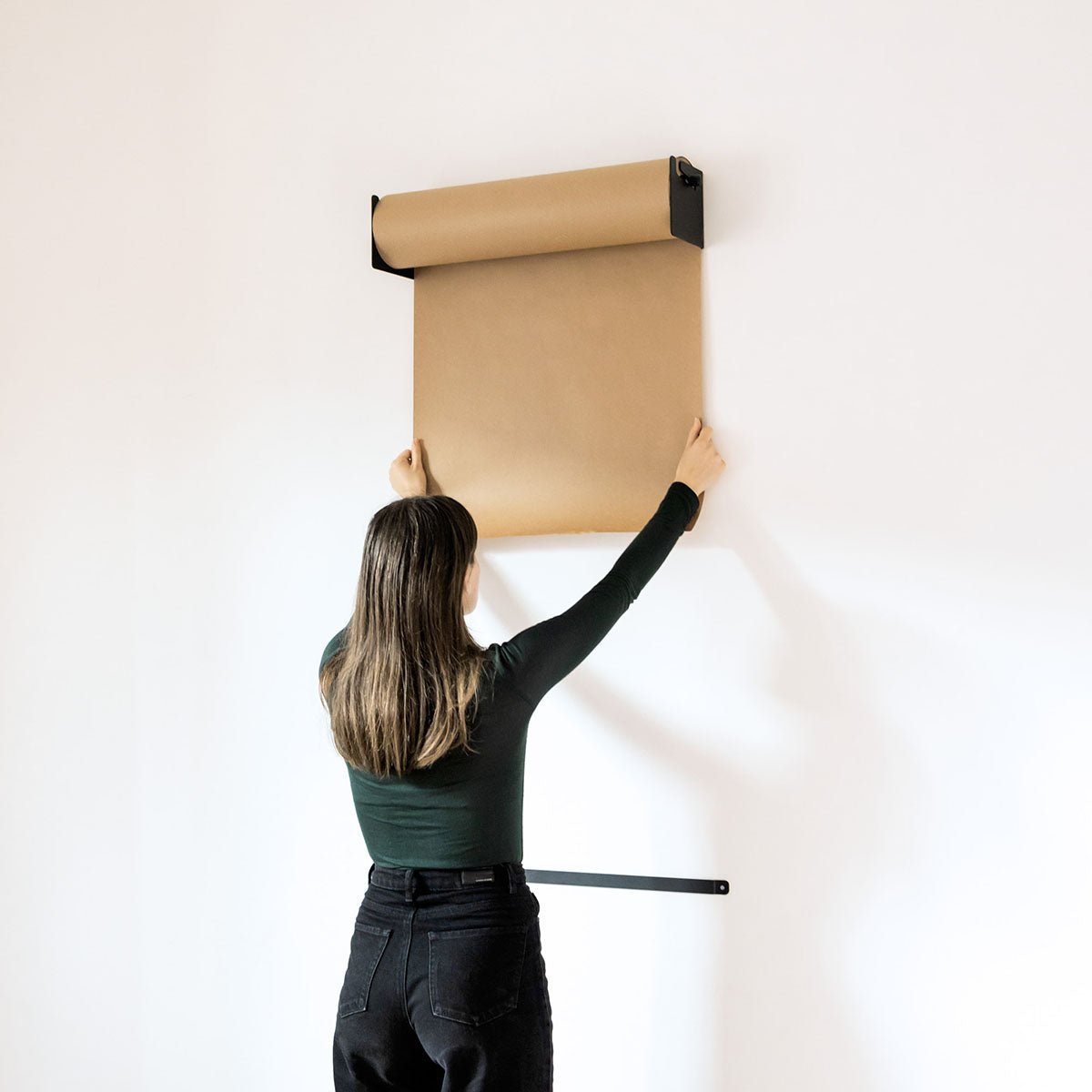
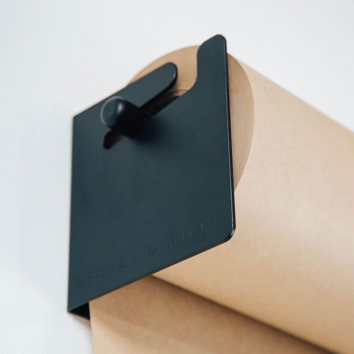
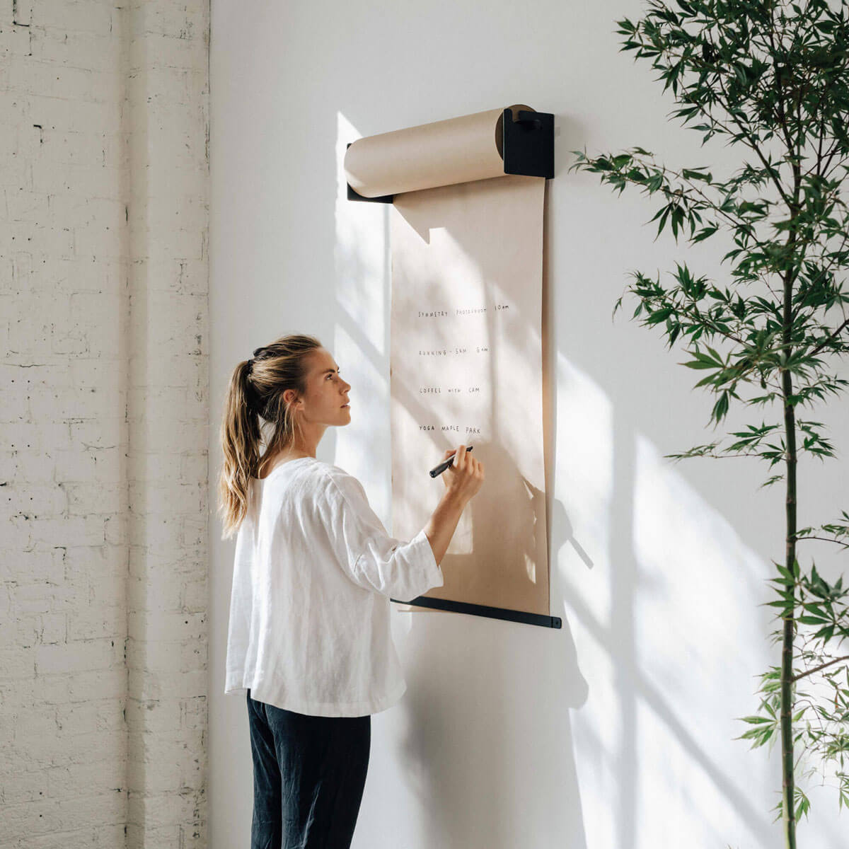
George and Willy Menu Design for Seasonal and rotating flavors
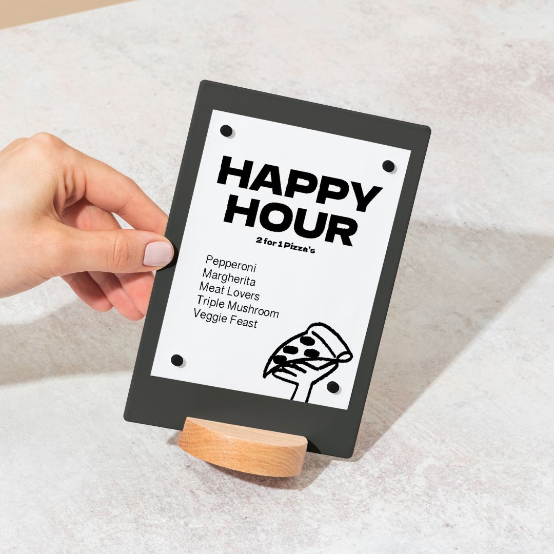
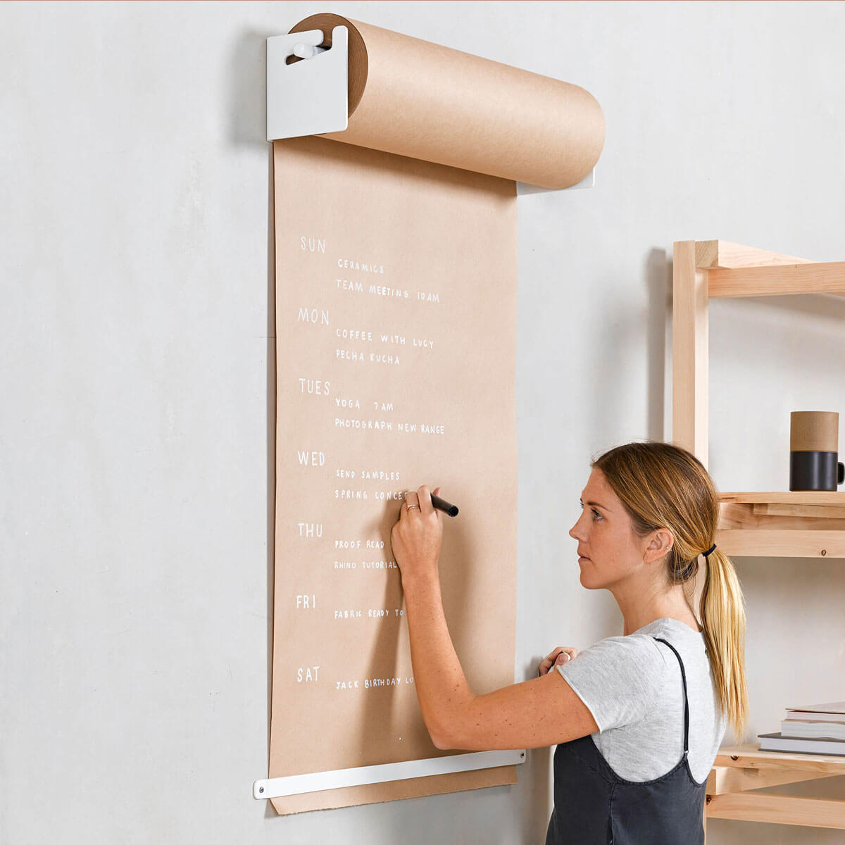
It is vital that the presentation of your menu design compliments the overall feel of your space. We love interactive restaurant menu design such as the one below, designed by Eszter Laki for a dim sum bar in Budapest, guests manually fill in their own menus when ordering. Adding novel details through the presentation of your restaurant menu design is a noteworthy way to stand out from the crowd and make you a must-stop shop for local cafe-goers and out of town visitors alike.

Write-on menu design by Eszter Laki
Menu Design Tone of voice
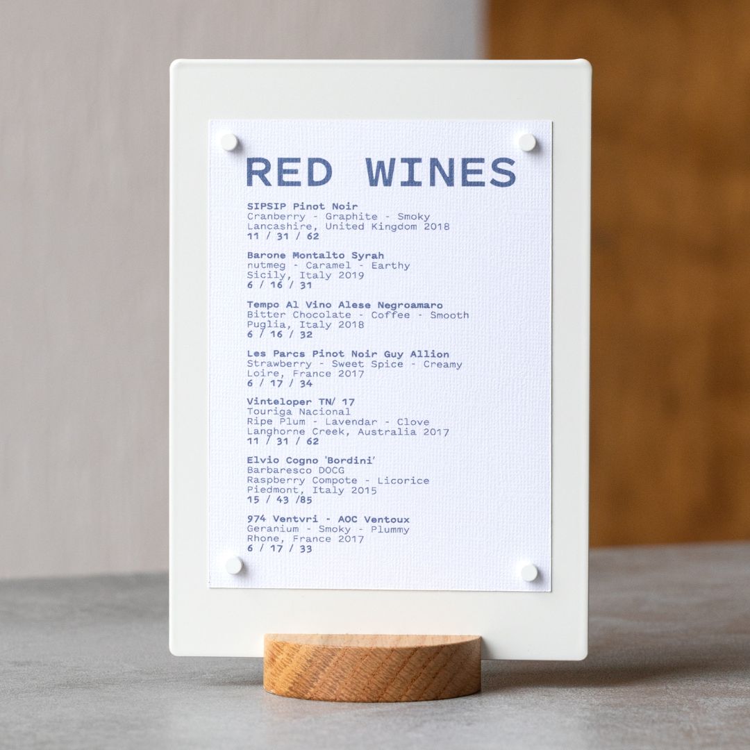
The tone of voice you use in your menu design is the personification of your food & space. Are you slinging burgers to the cheap and cheerful patrons of your wider neighborhood with newsprint menus, or are you specializing in a more romantic dining experience with leather-bound menu design? The descriptions on your menu card design are there to sell to your chosen target market. We recommend getting to know them - What kind of music do they listen to, what cars do they drive, where do they like to shop for clothes? By aligning the food you sell and the type of copywriting that you will use throughout your menu design, customers will have a better chance of understanding your cafe, restaurant, or bar and getting behind and supporting it.

Smith, Toronto Canada. Menu Design
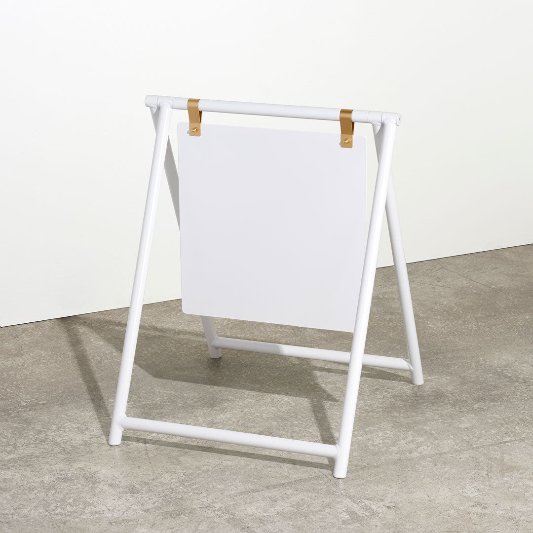
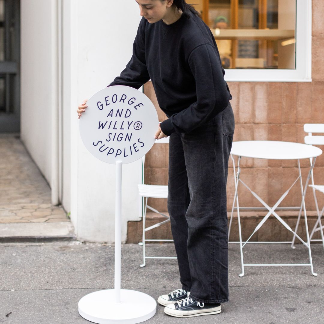
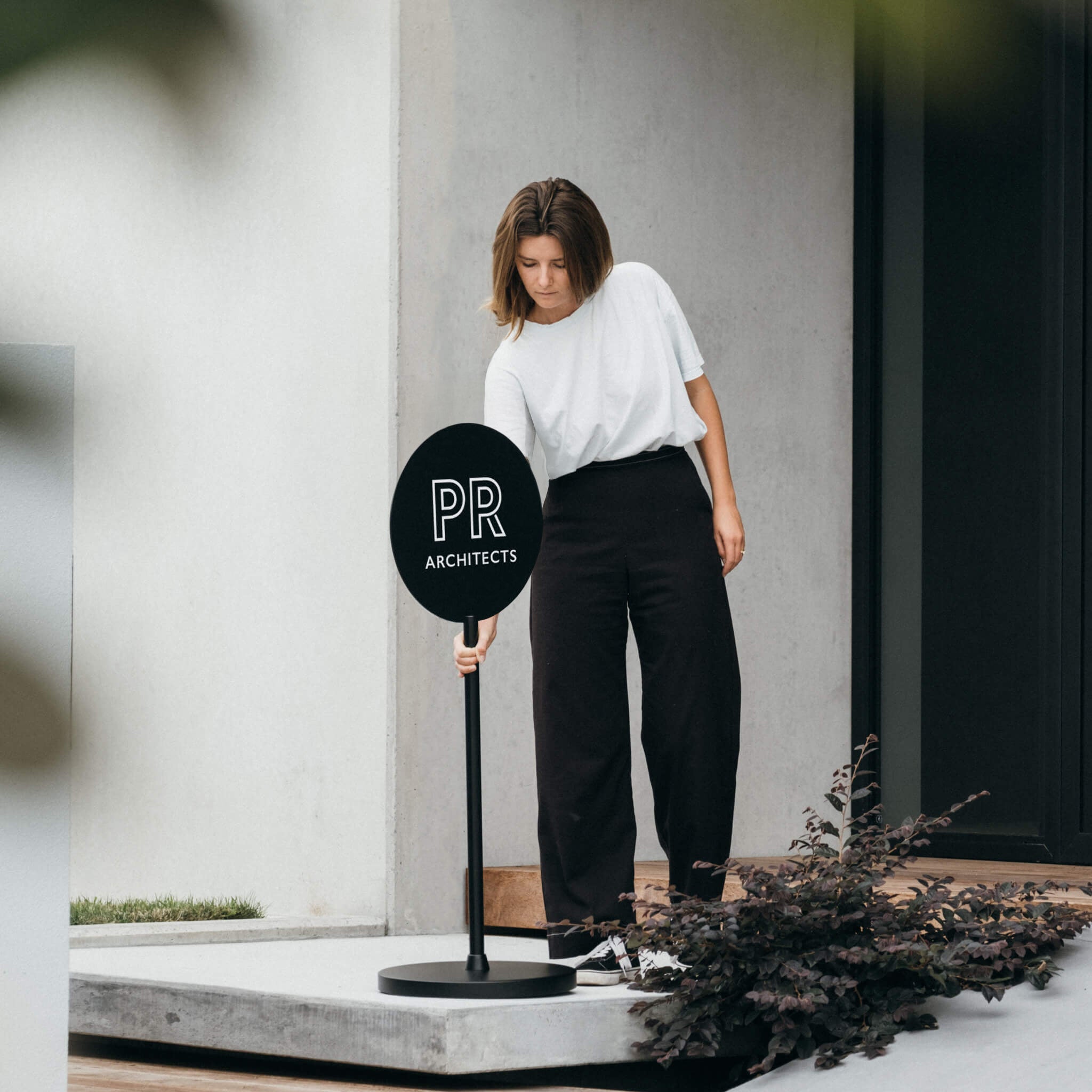
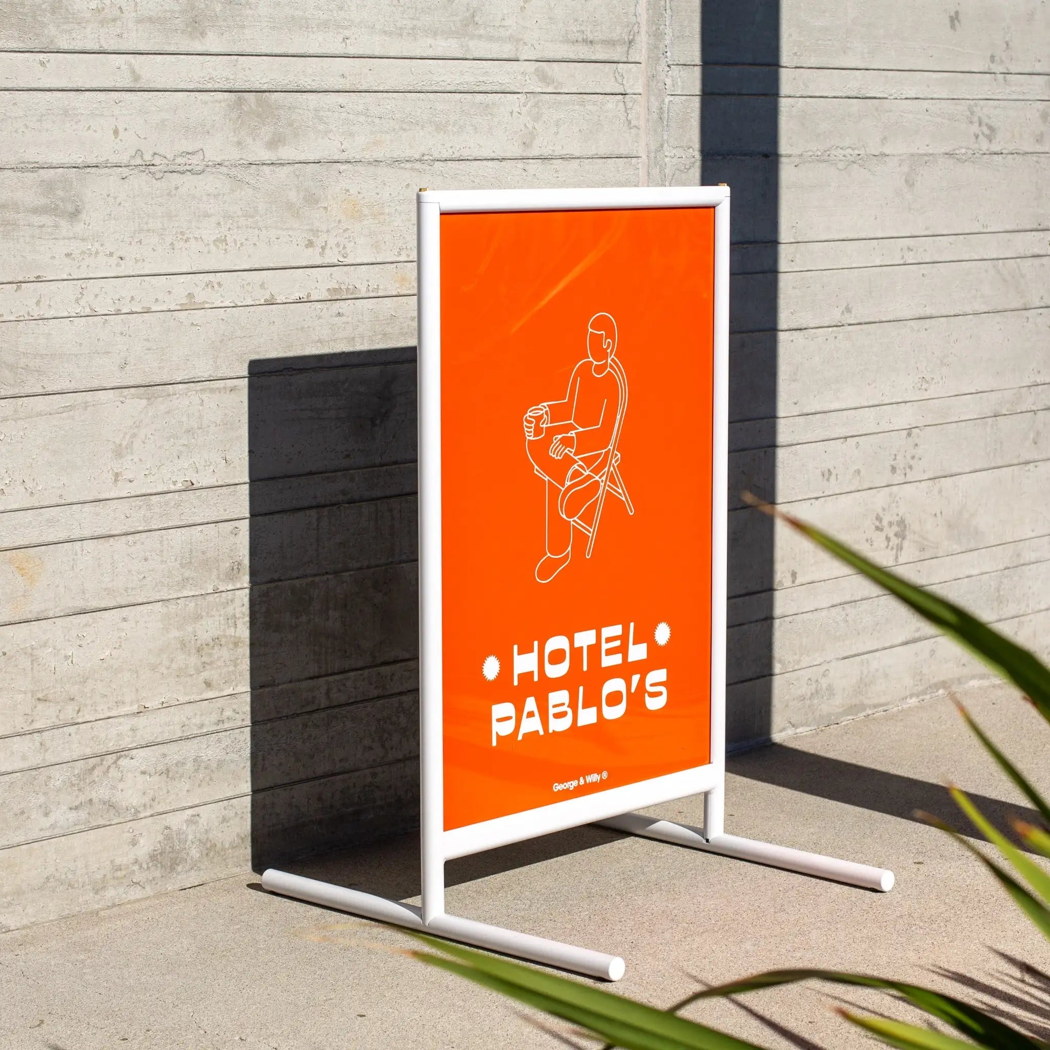
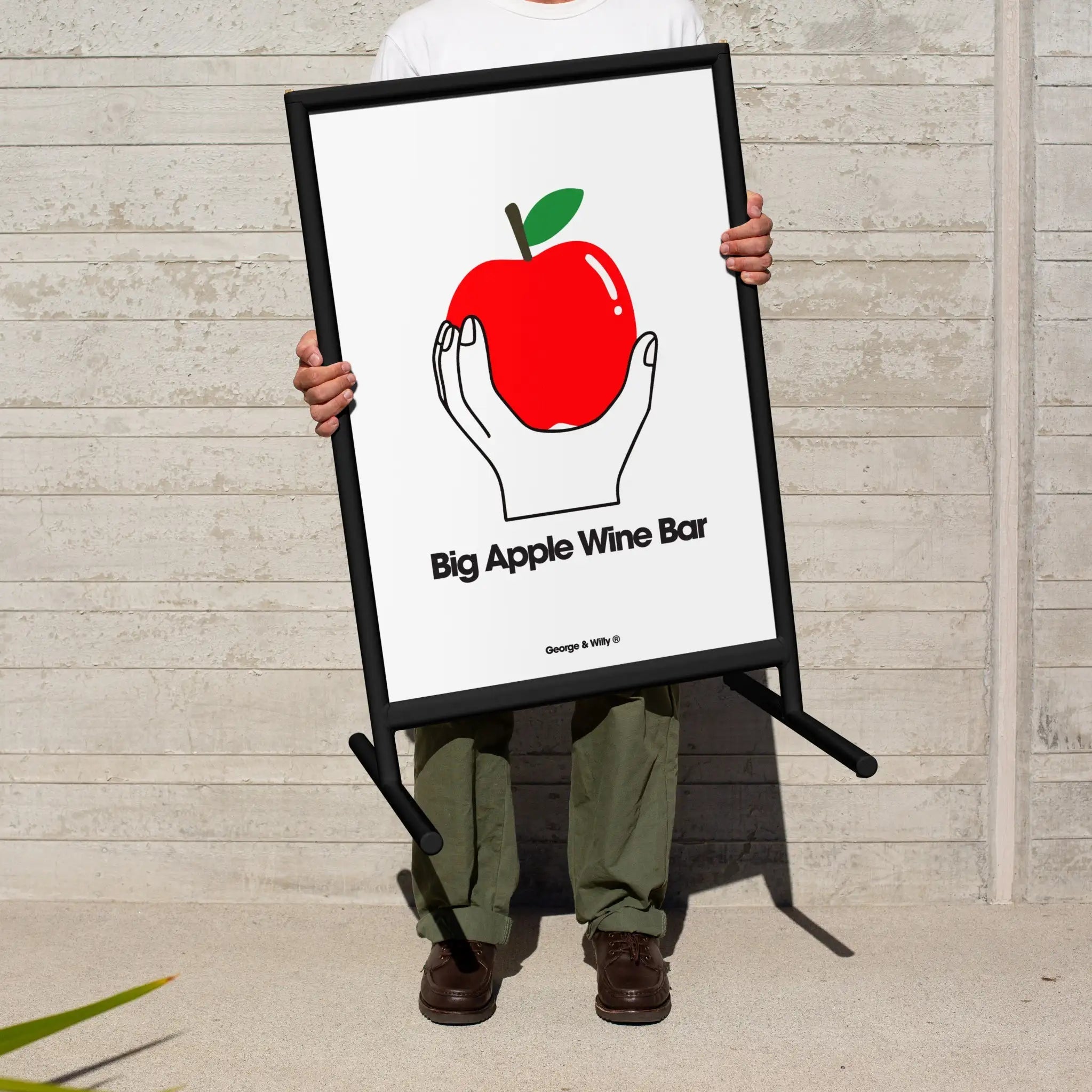
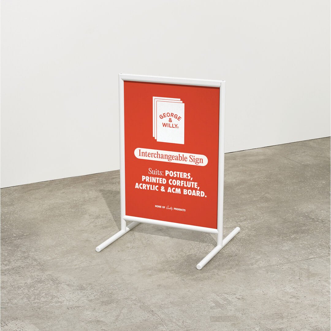
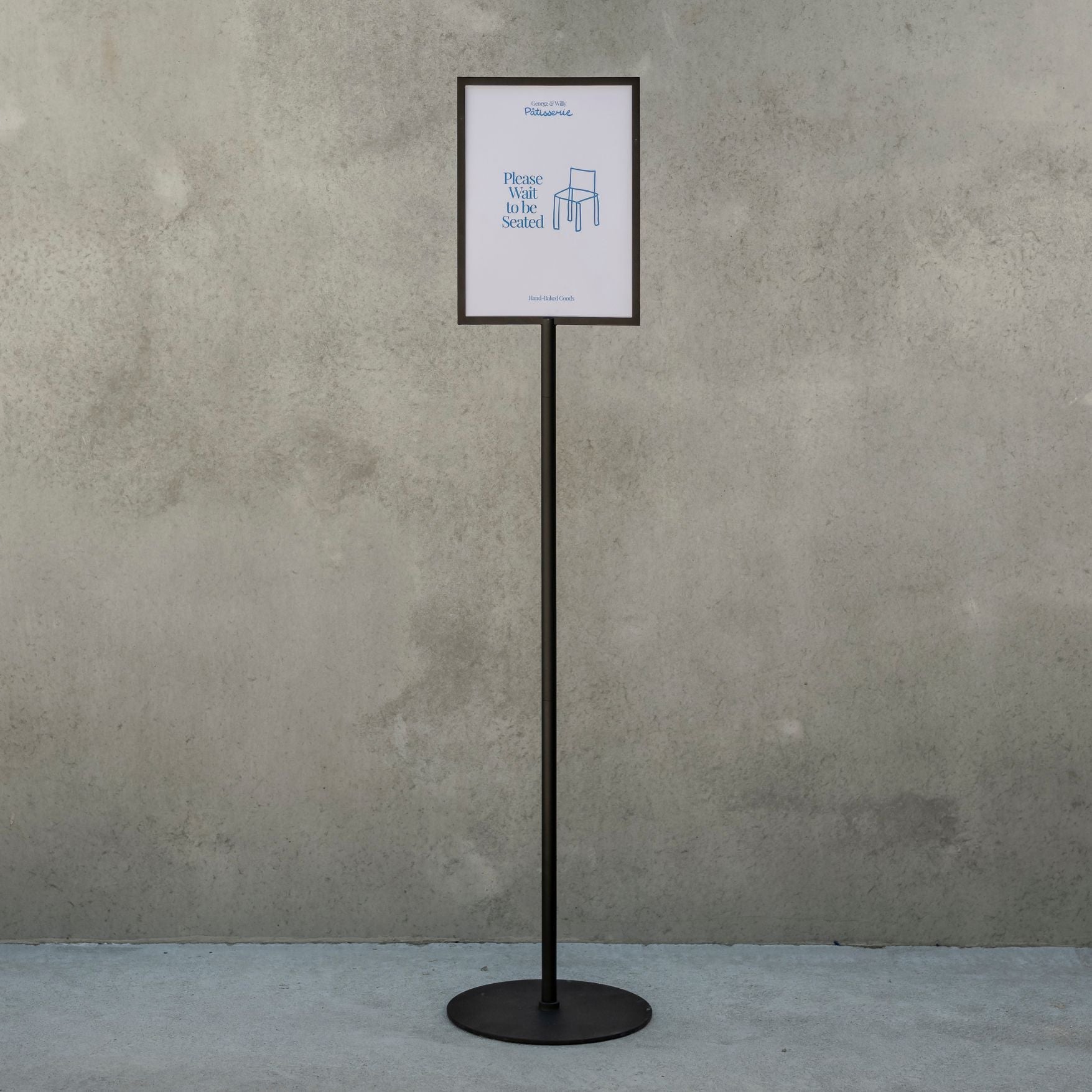
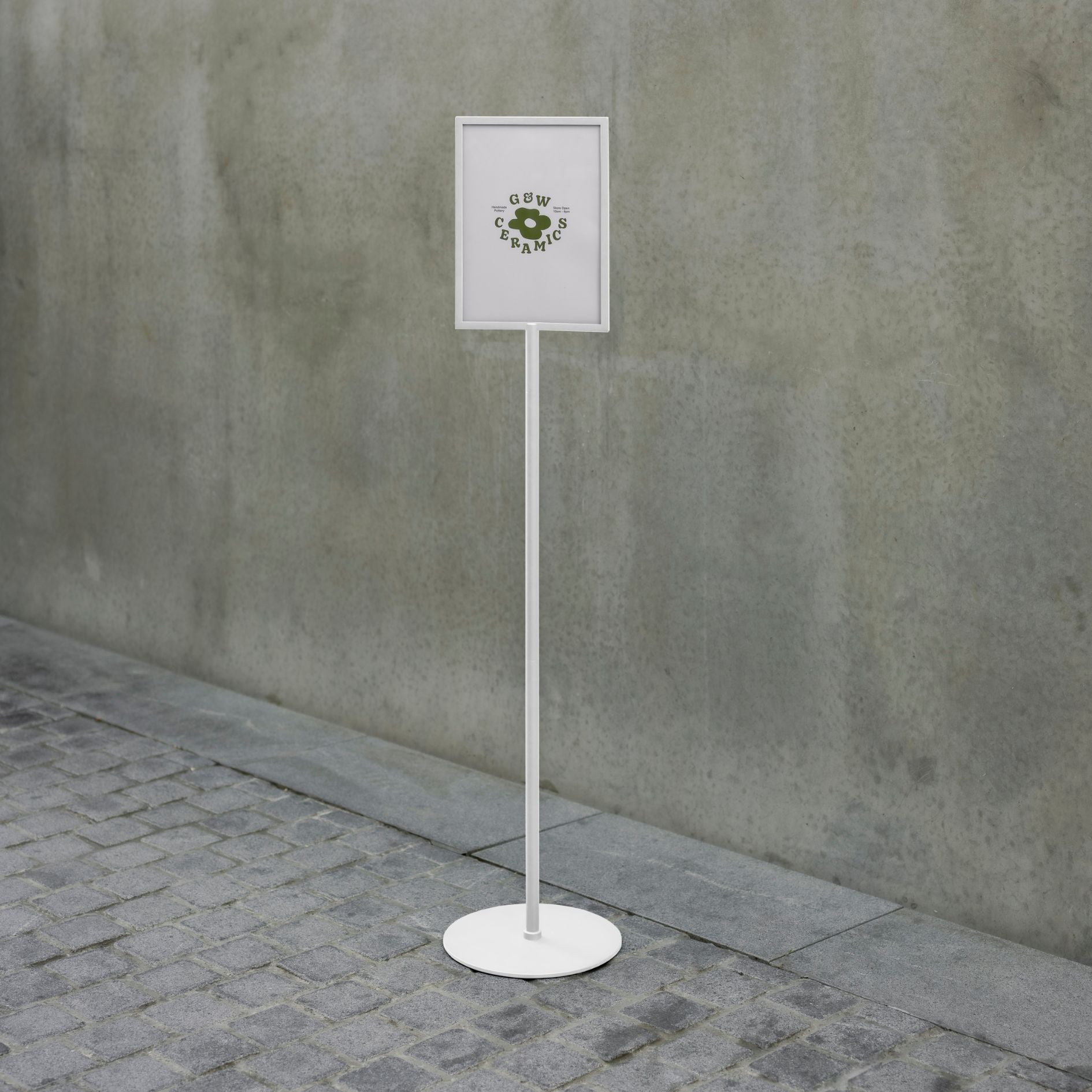
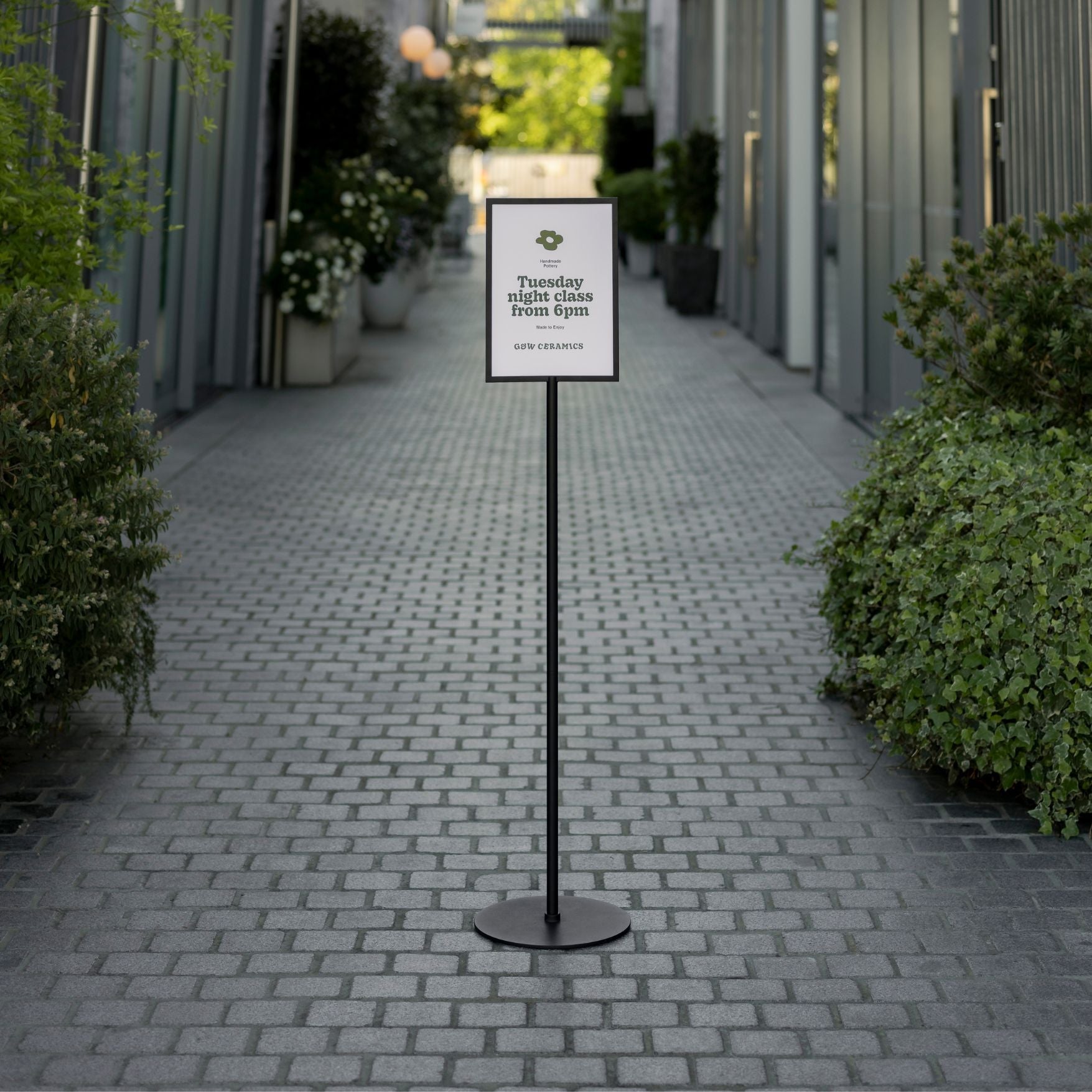
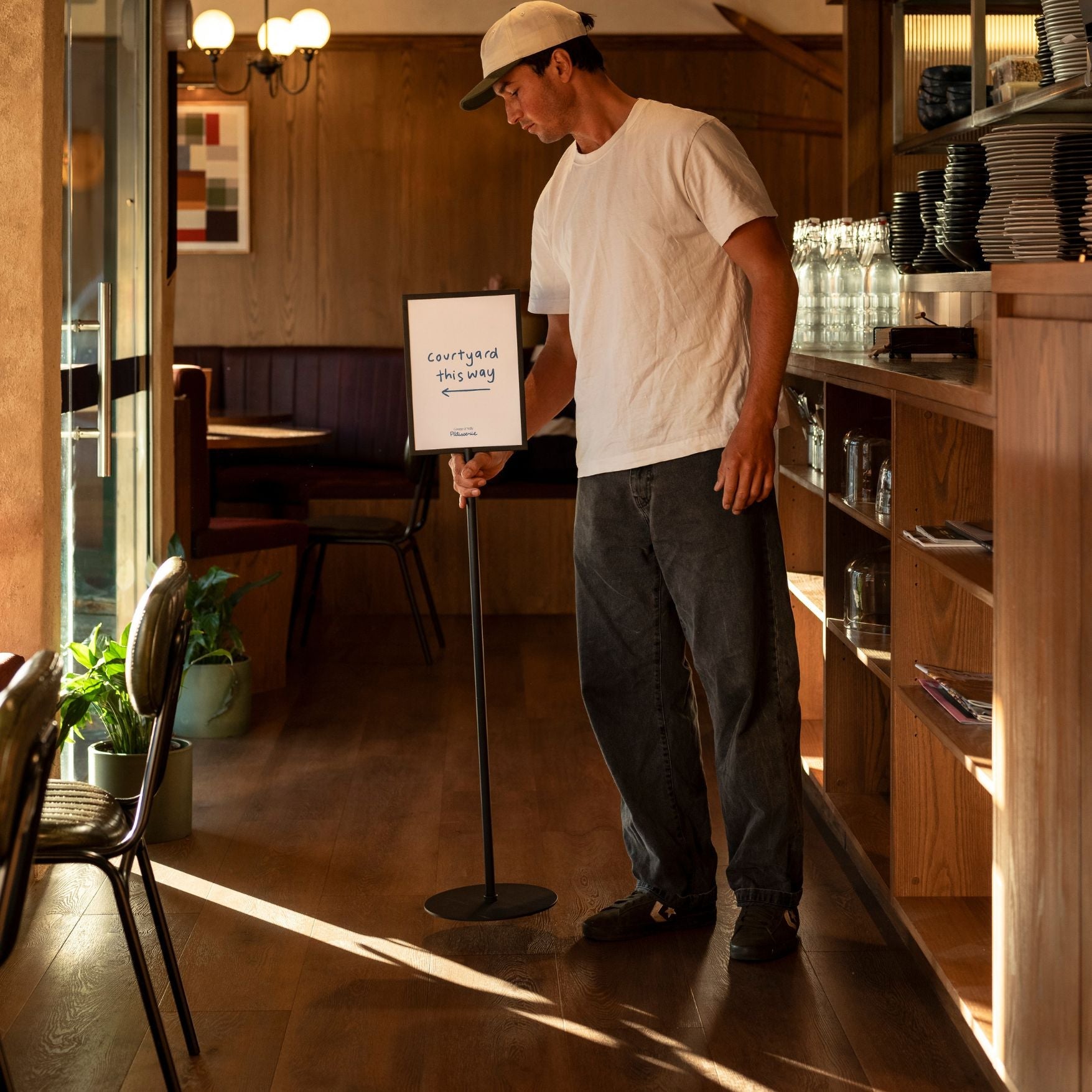
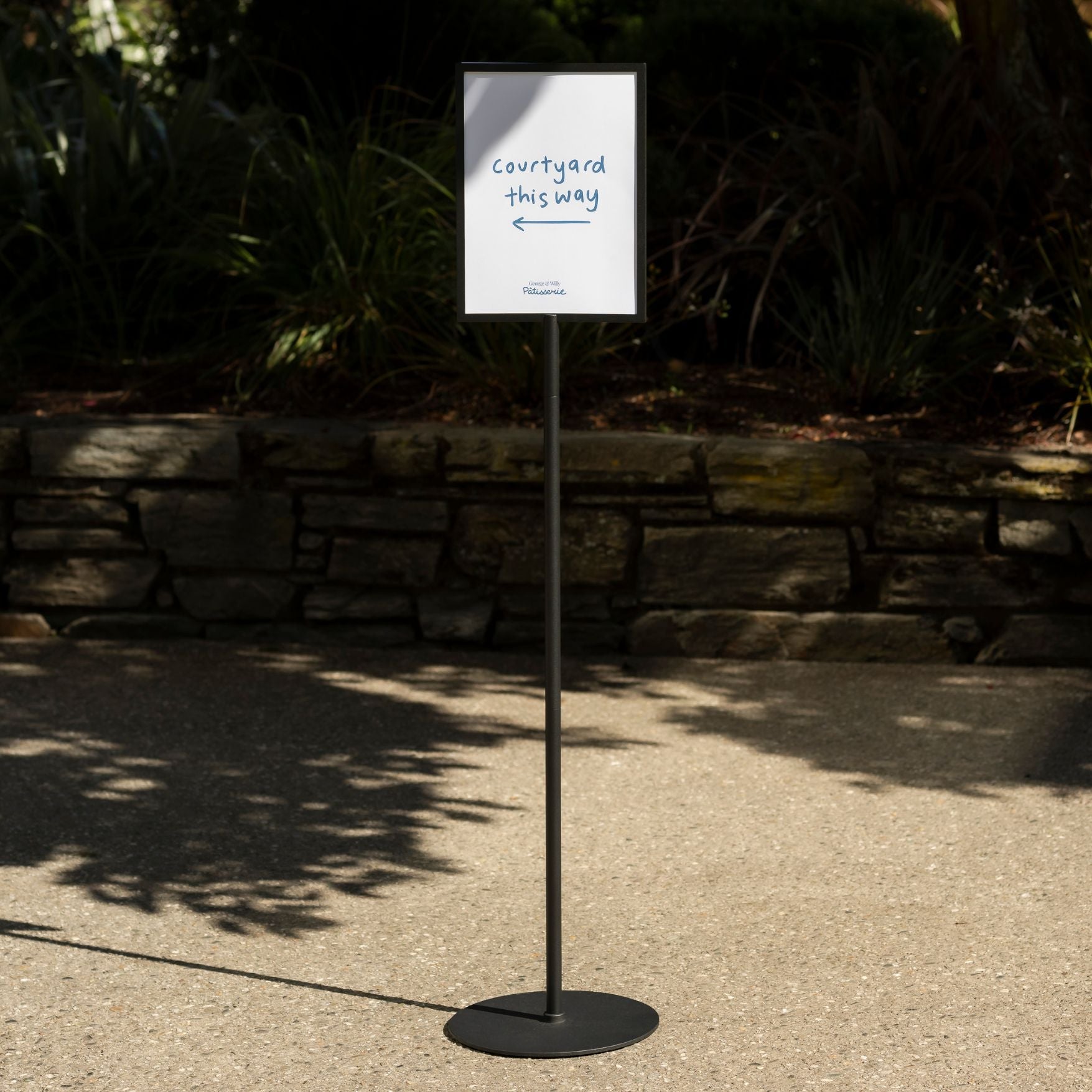
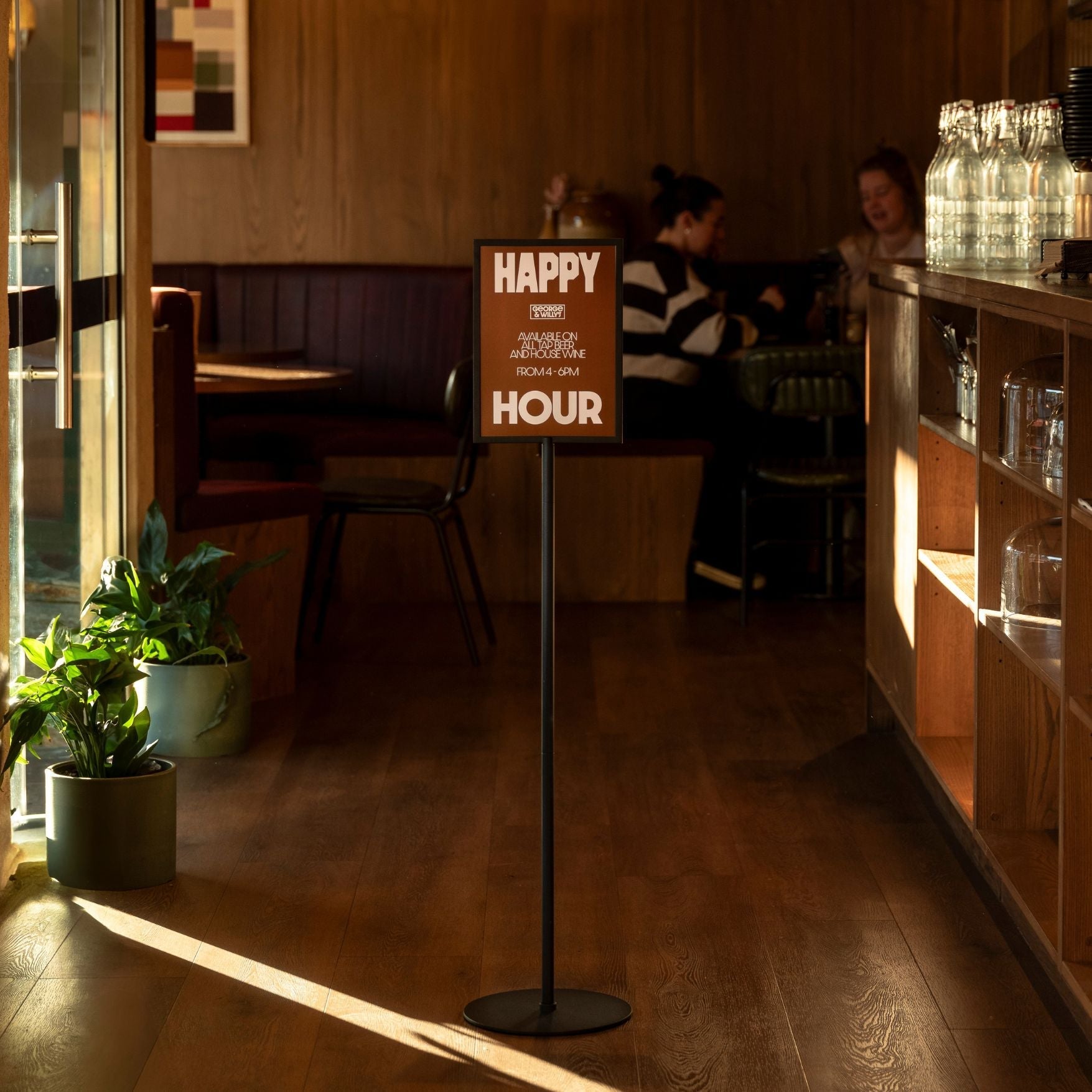
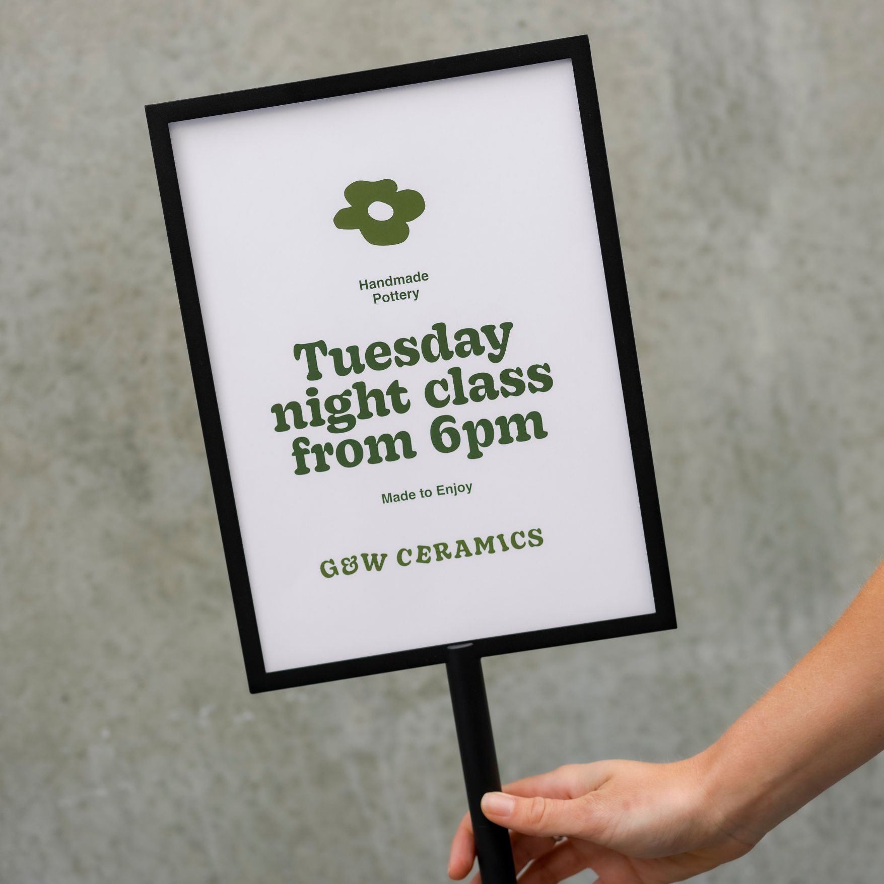
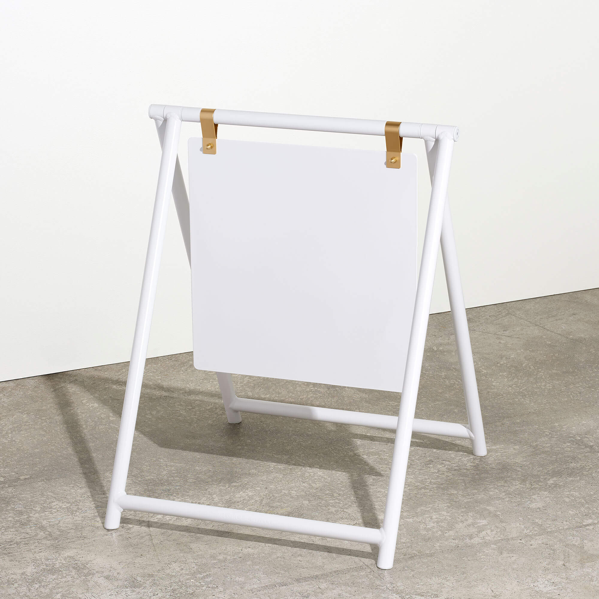
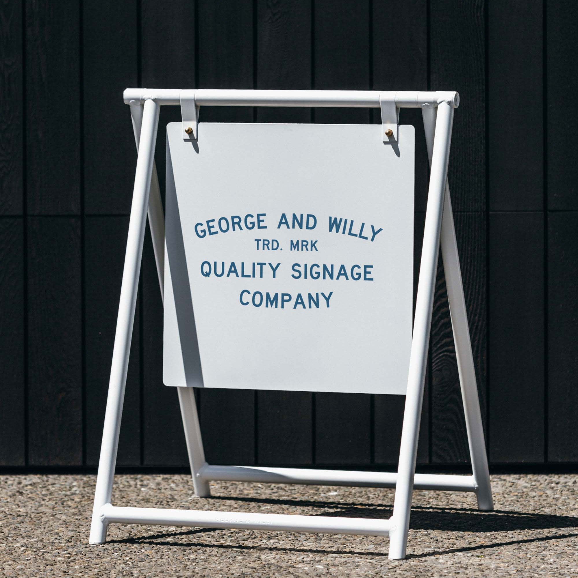
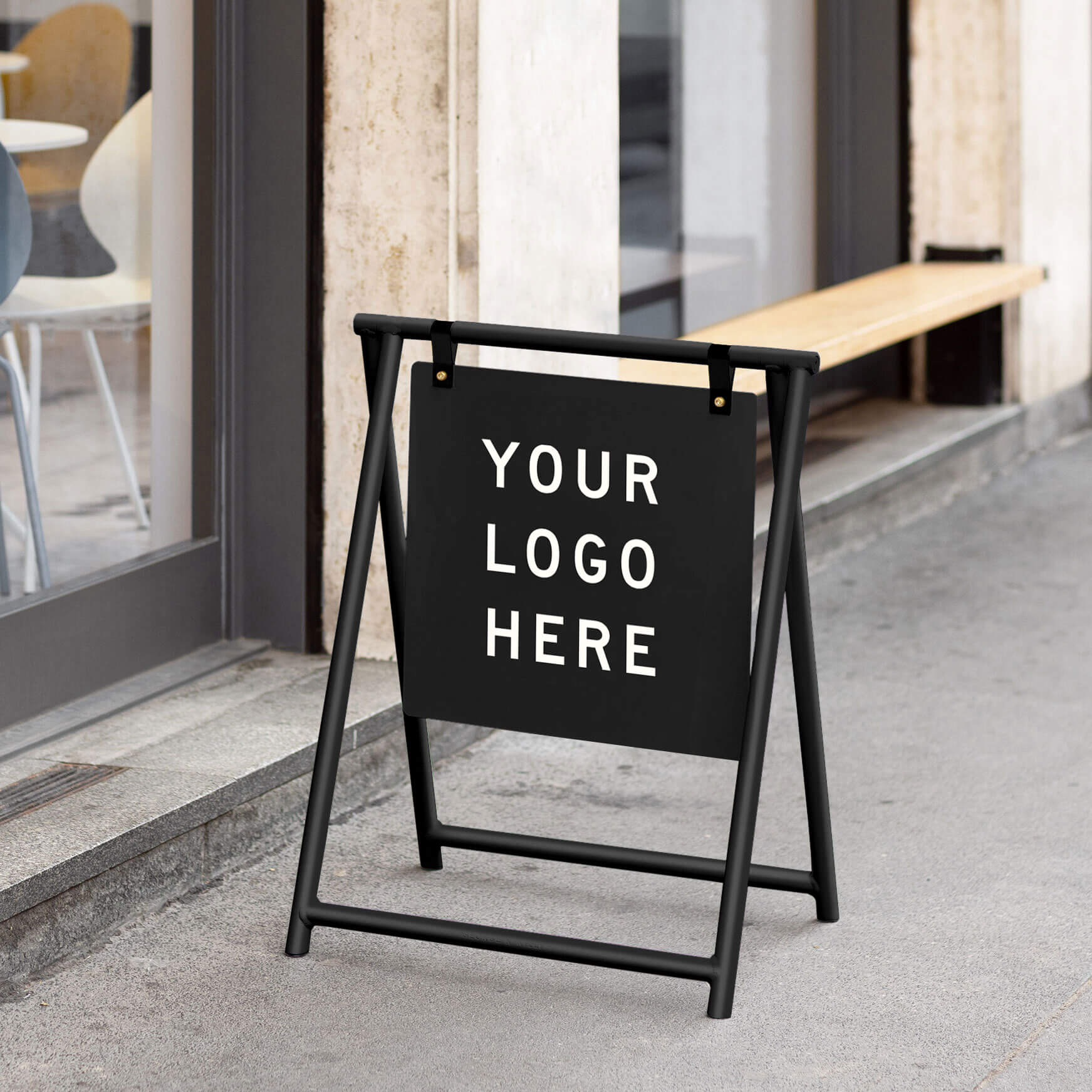
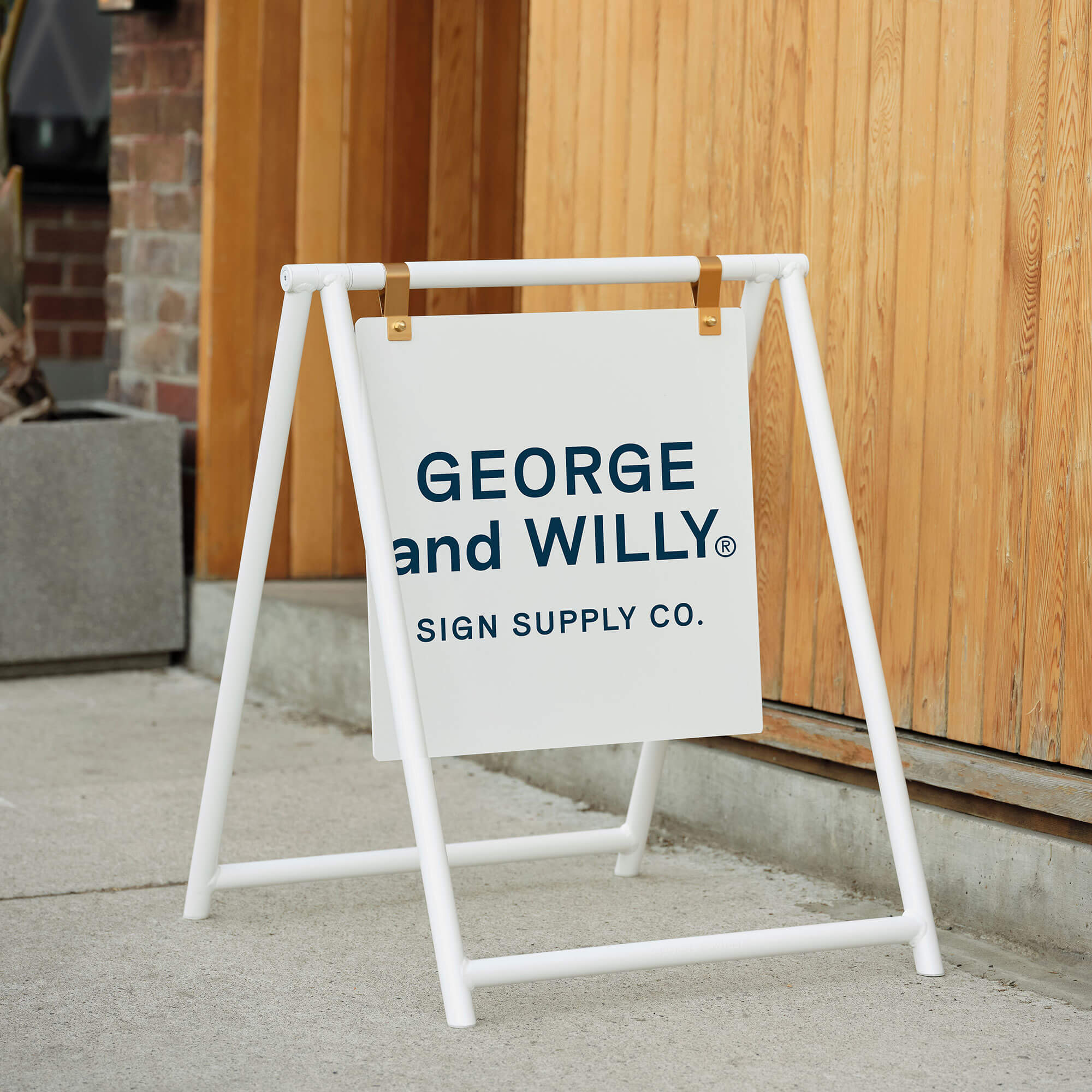
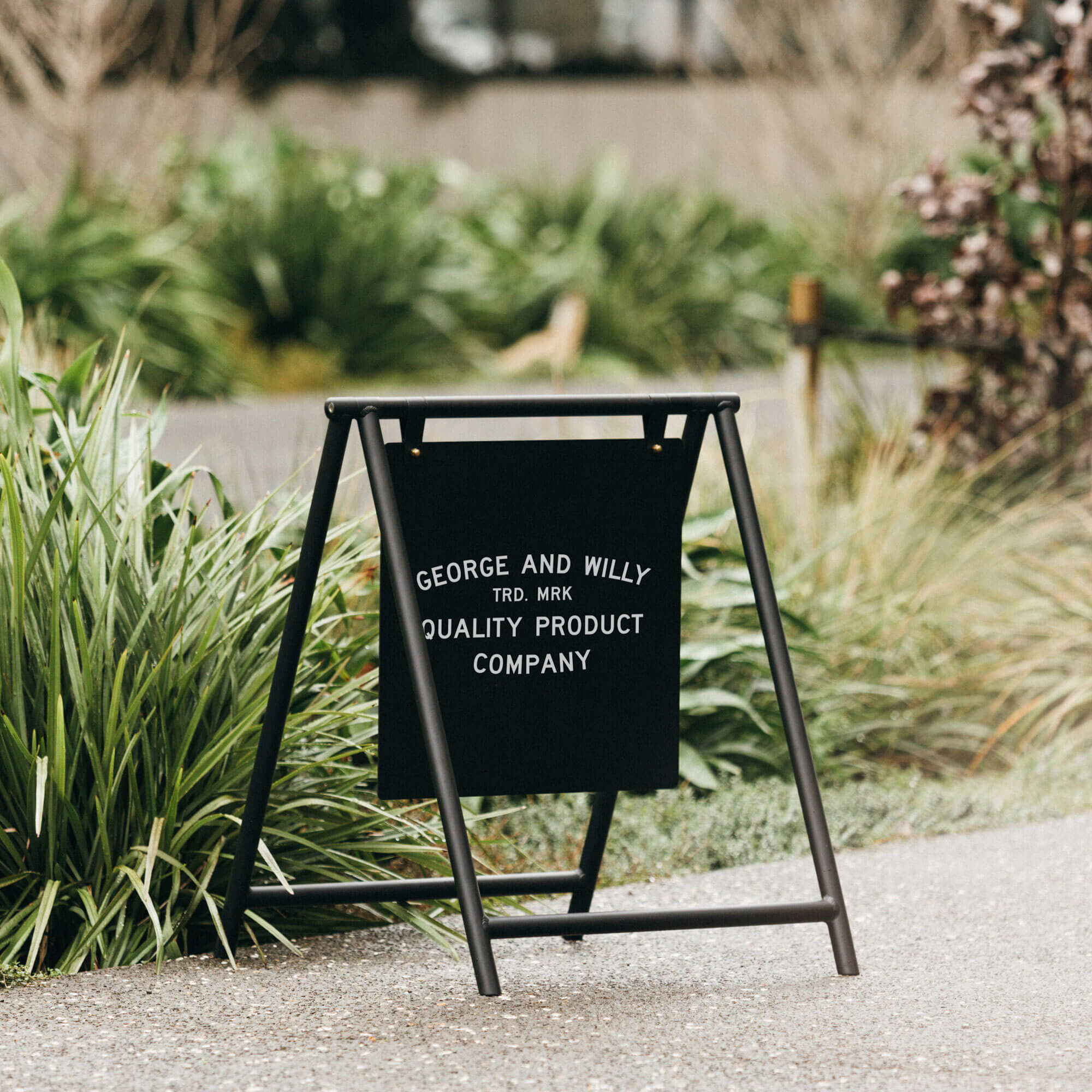
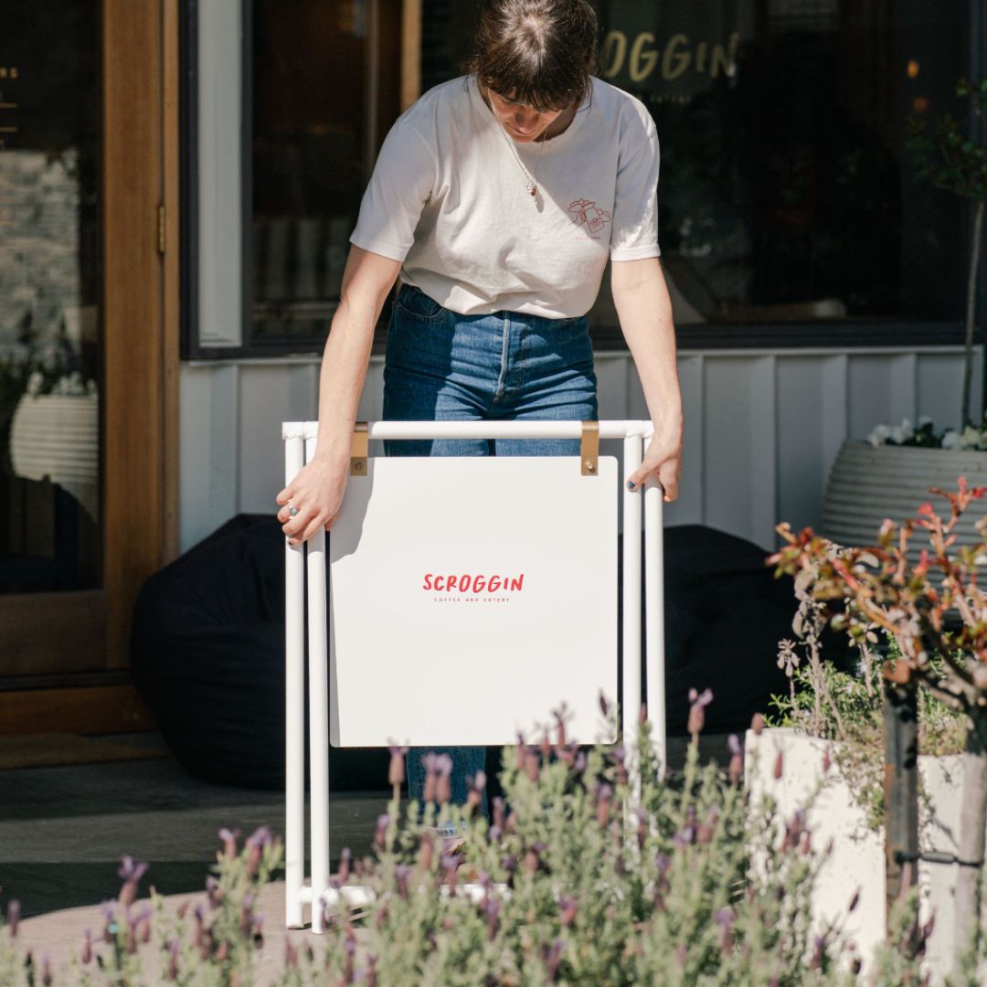
At the end of the day, we all want to be seen in places that are consistent with who we are! Make sure the tone of voice in your menu design speaks to your target market. A great way of grabbing the attention of potential guests is through footpath messaging and sandwich boards, combine that with a concise tone of voice and you will be hard to miss by your ideal customer. Take a look at a few considerations for A-frame signs here.

Oficio in Lisbon, Portugal presents its menus in official manila folders

Oficio in Lisbon, Portugal manila envelope contents.
Menu Design Colour
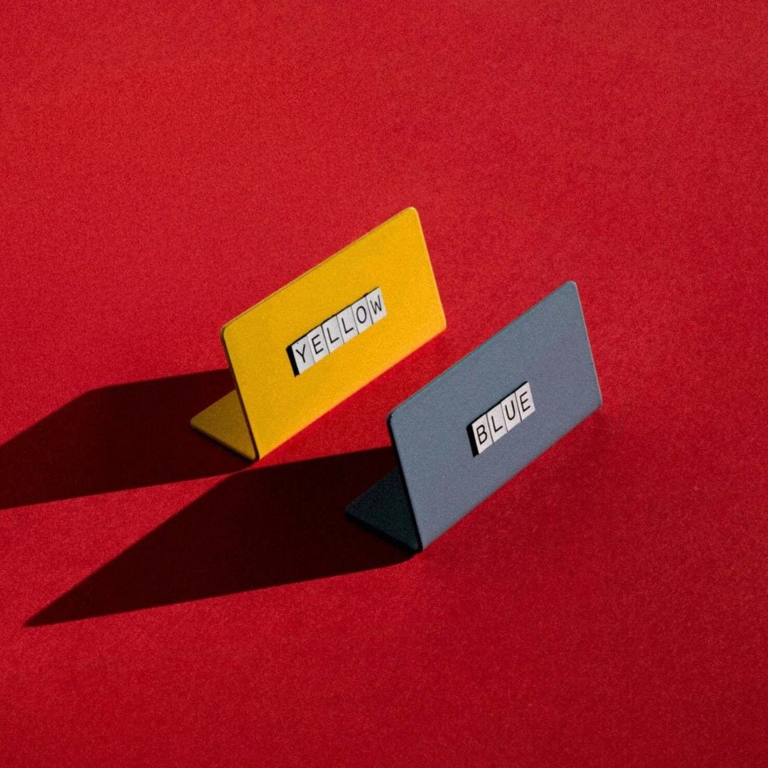
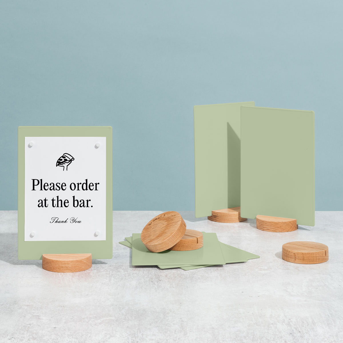
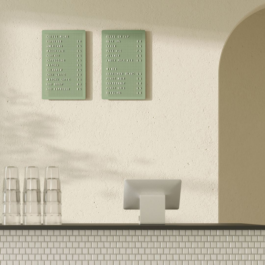
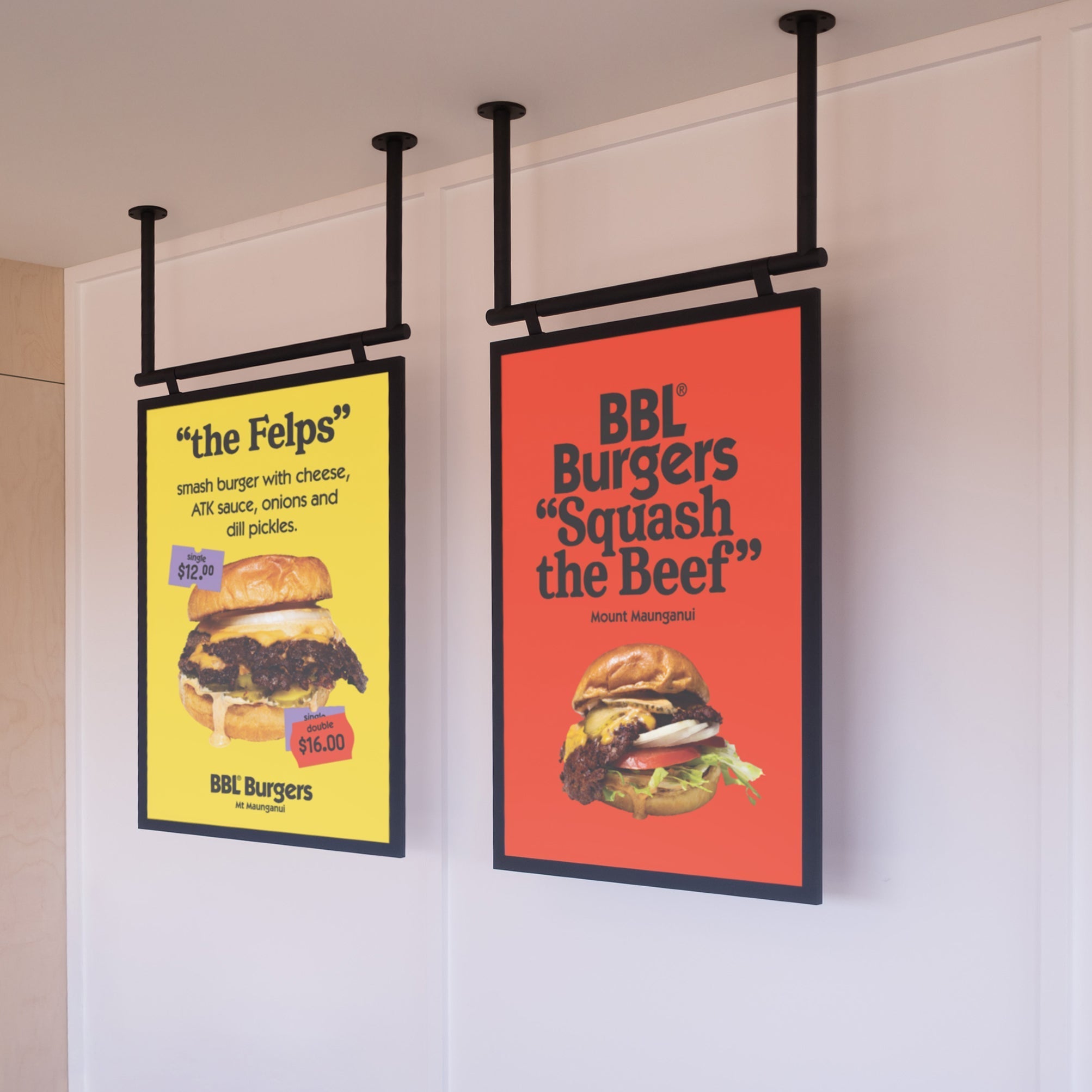
Colour can trigger emotional and subconscious feelings towards food when used in menu design. The colors that you choose for your restaurant menu design will affect the way that your customers perceive the food you serve. For example, by using green in your menu design, it will imply that your food is fresh and picked from the garden today. Red or yellow is an eye-grabber that pulls in the diner's attention and can trigger your appetite - this is successful and most commonly seen in fast-food menu design and branding. We recommend using colors only where it is relevant and if it flows the rest of your interior and branding to draw attention where you want it. Make sure that the colors that you are using throughout your menu card design also match your logo and street signs so that your space will still flow. Take a look at our guide to restaurant logos here.

Eugene's Canteen in Ohio, USA draws on nostalgia with the use of army green & brass clips that are inspired by veterans' field journals.
Menu Design Layout & Choice
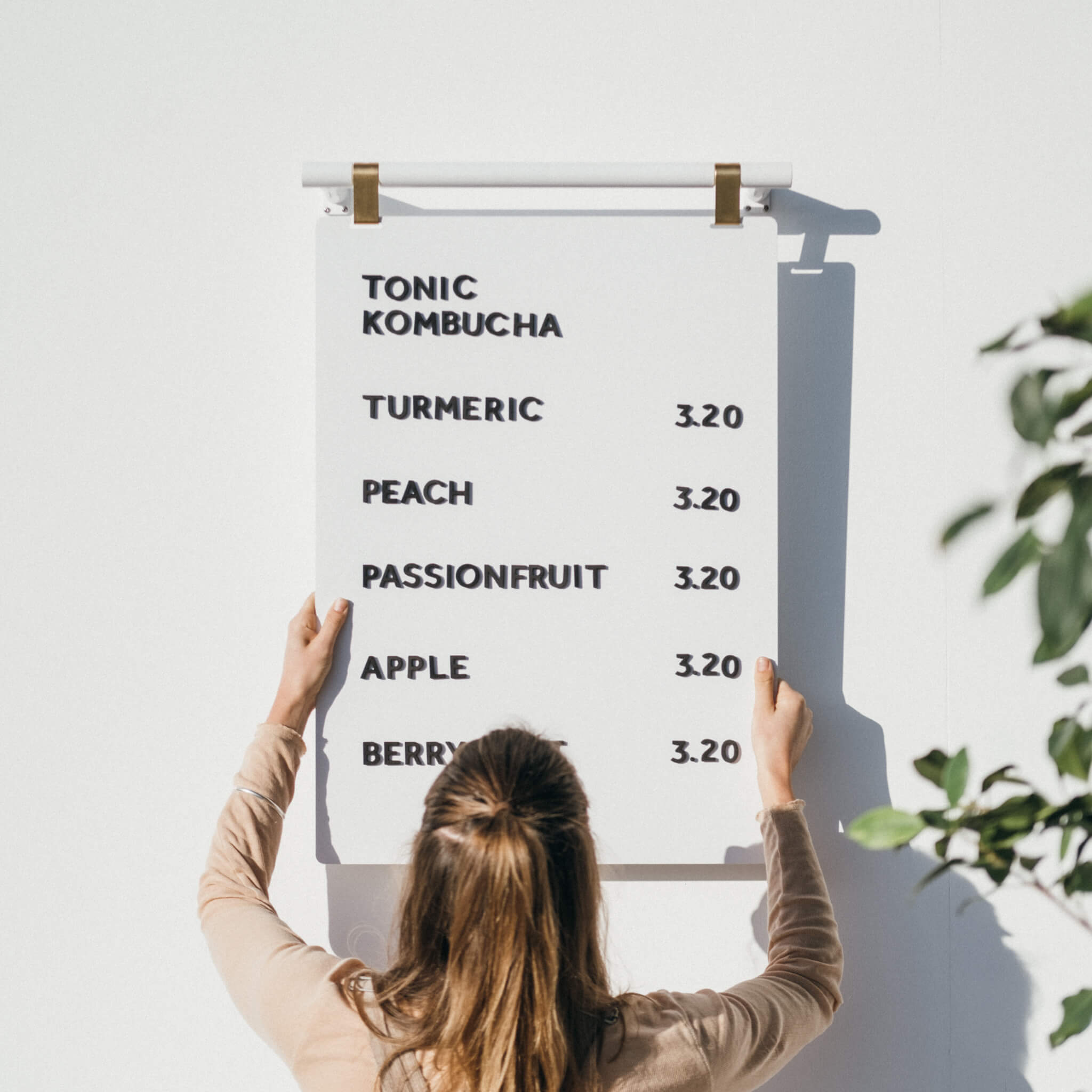
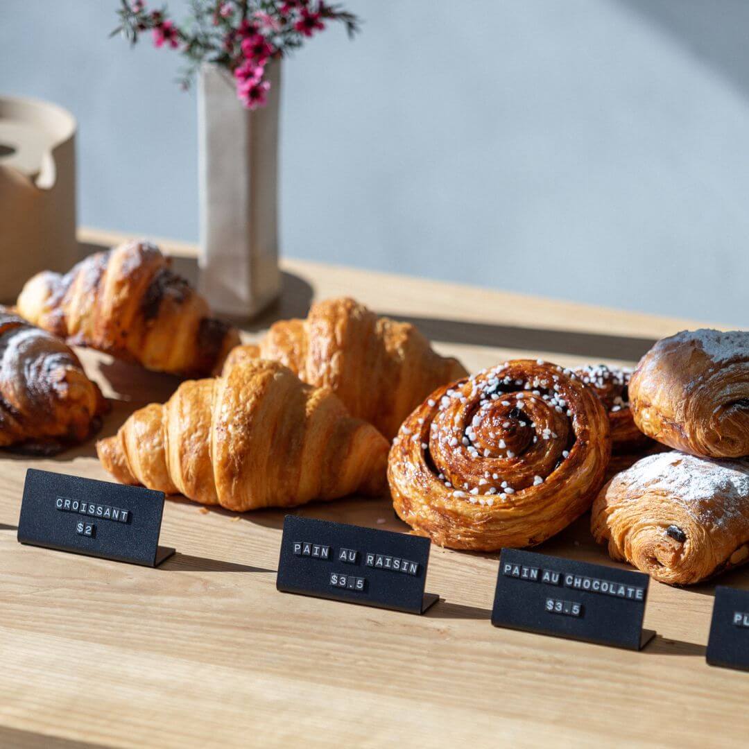
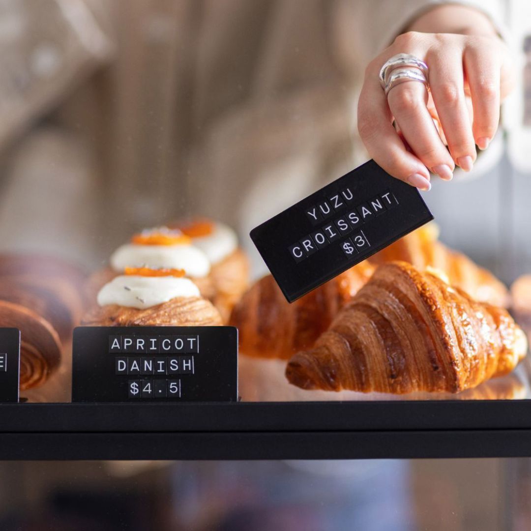
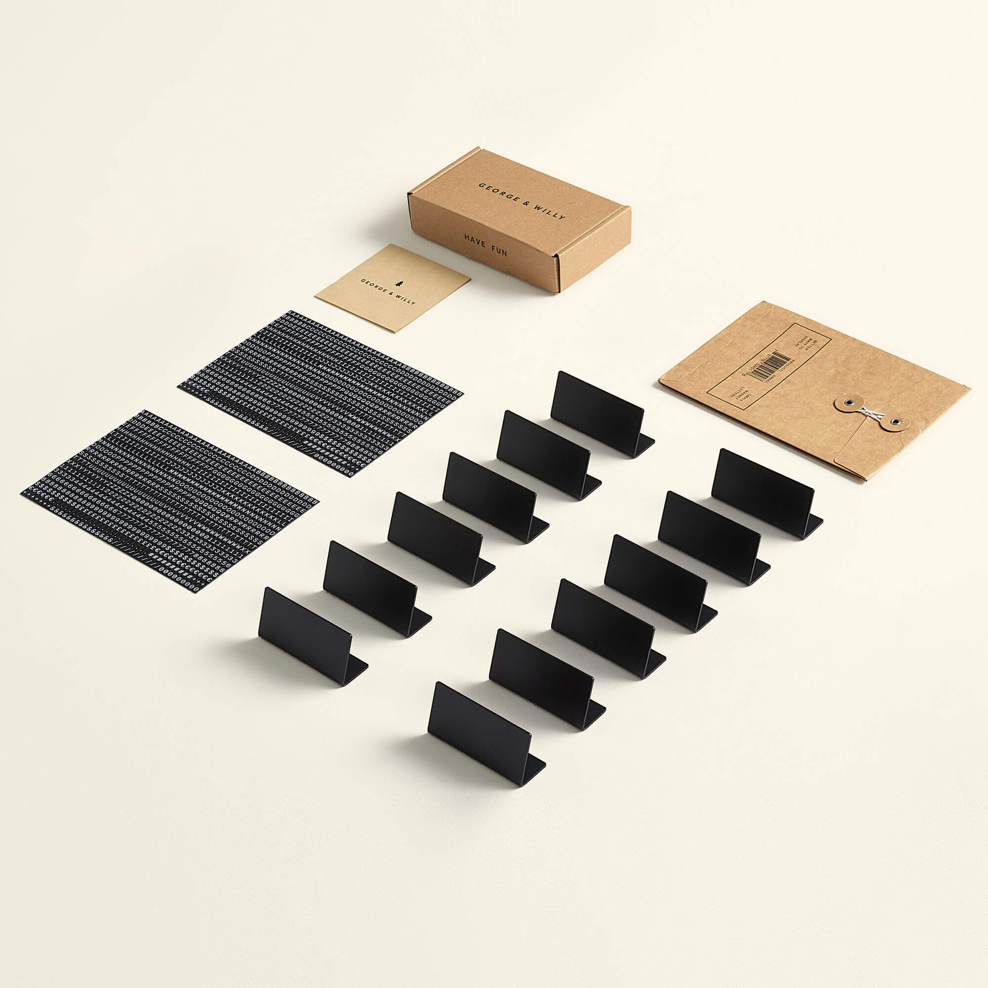
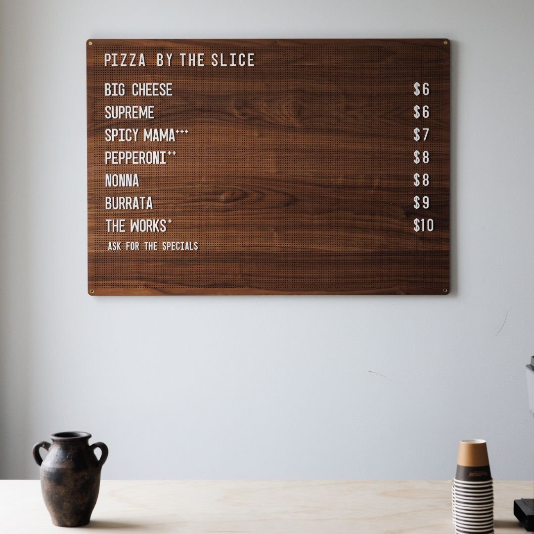
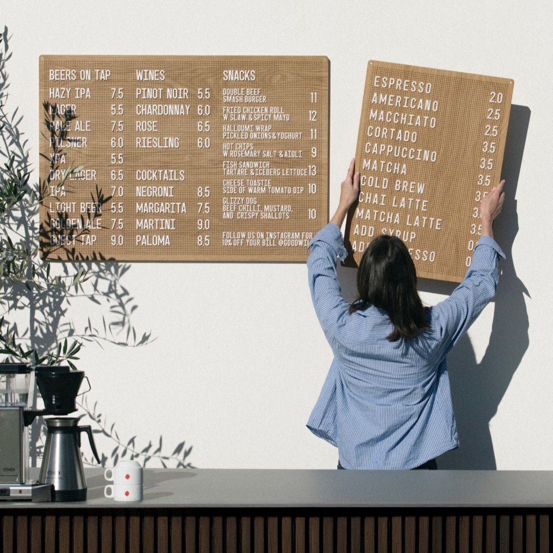
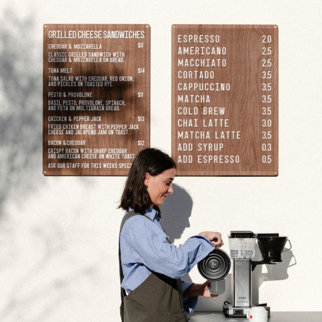
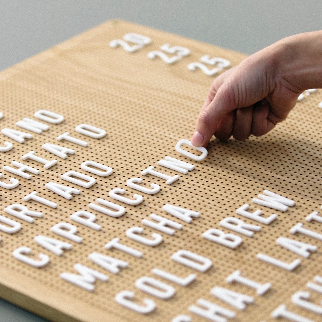
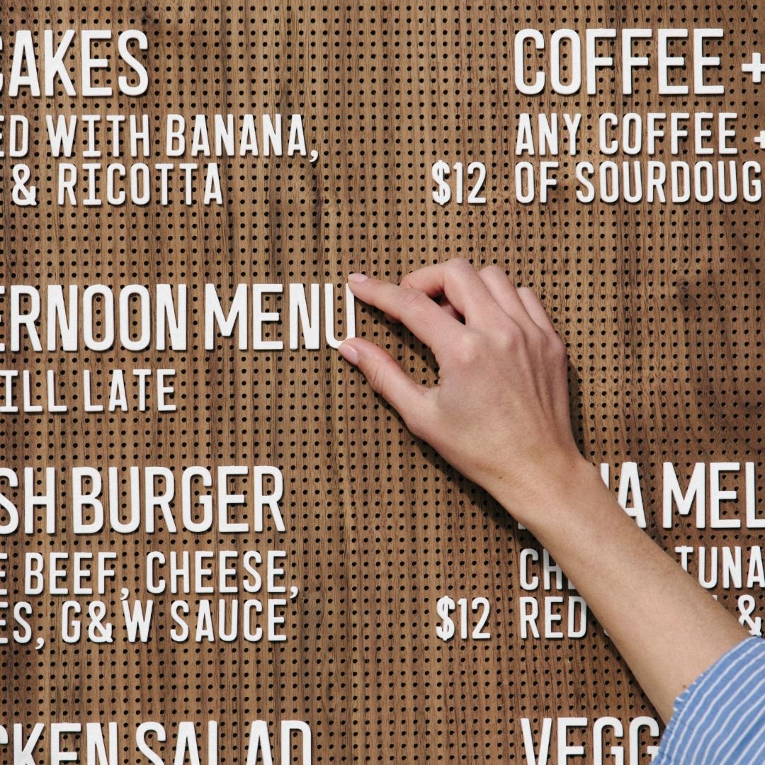
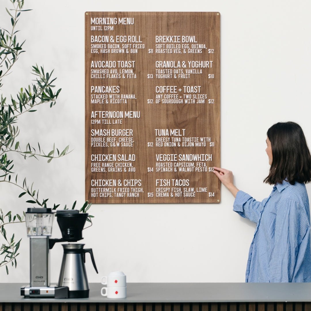
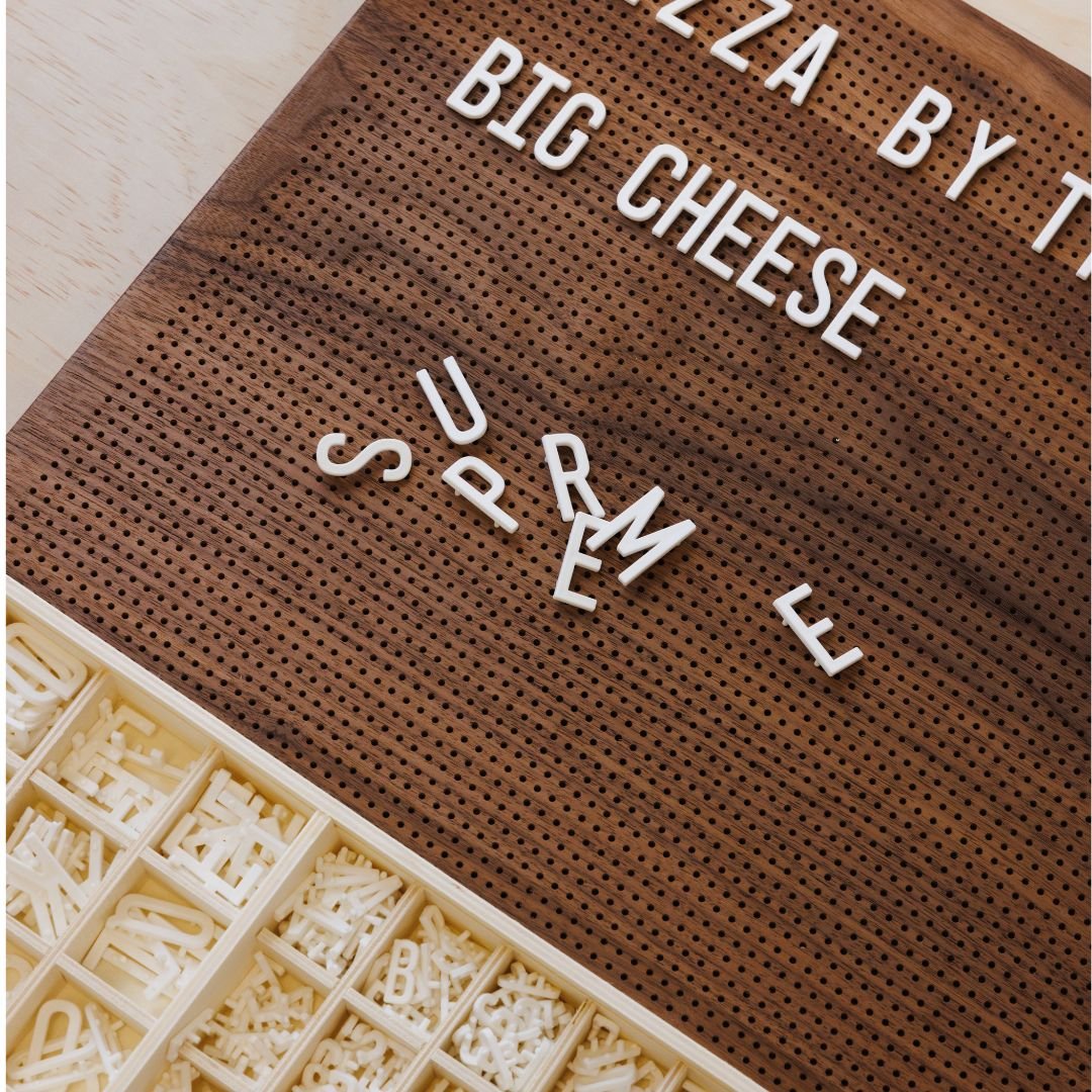
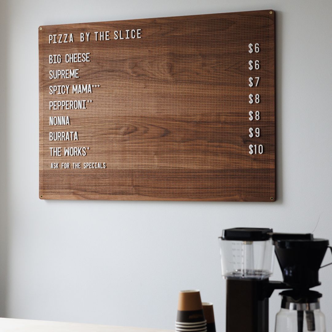
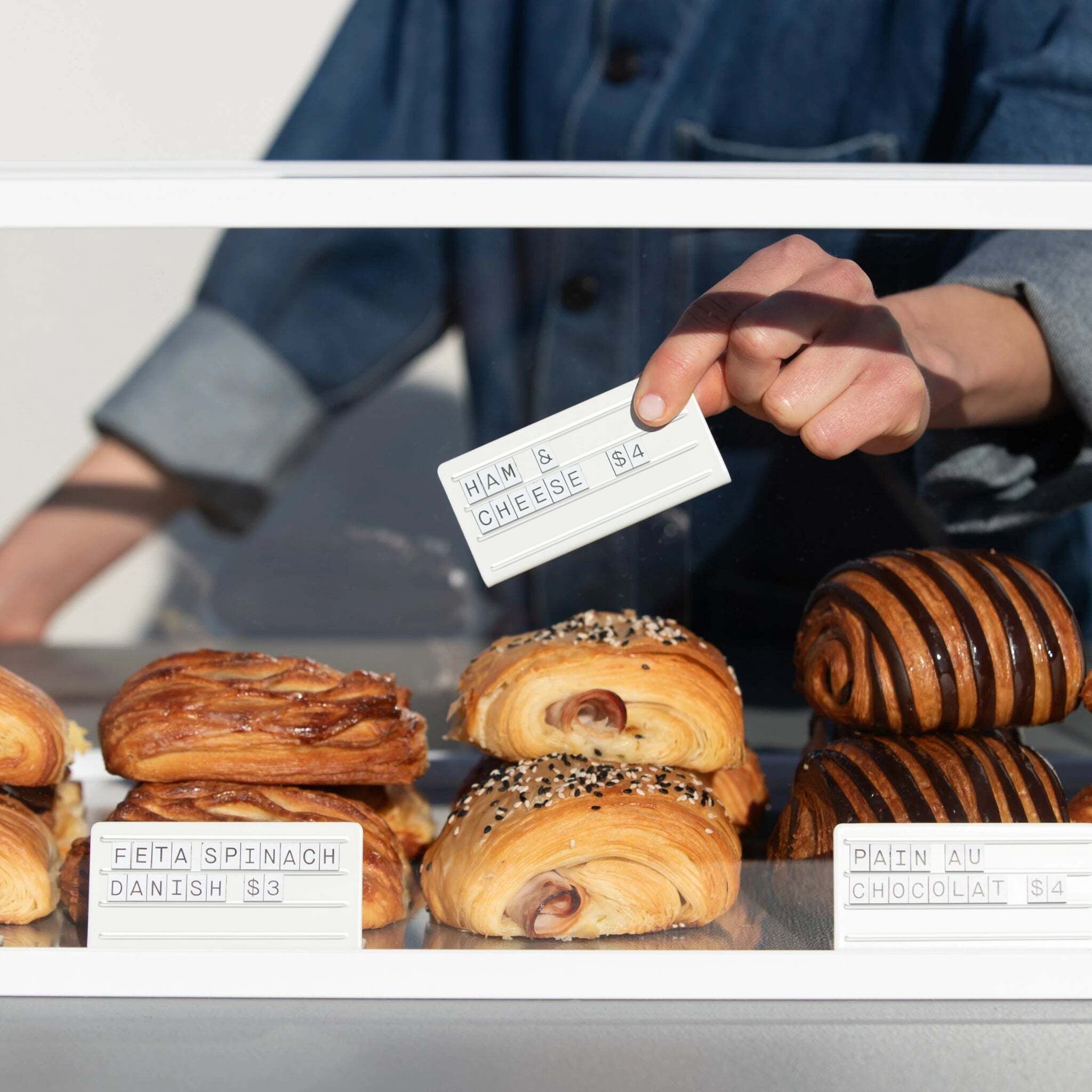
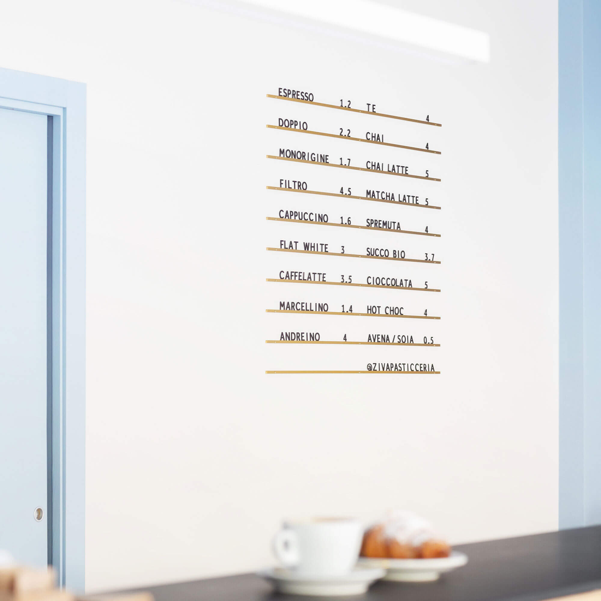
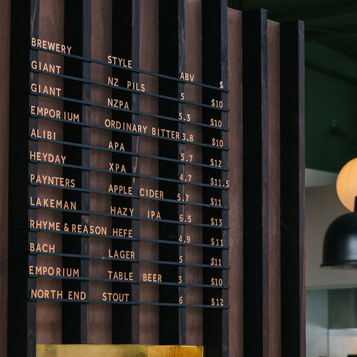
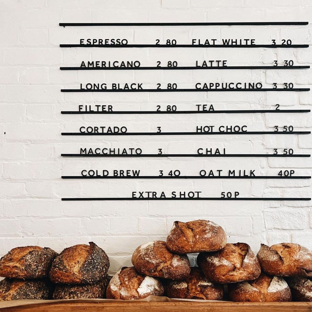
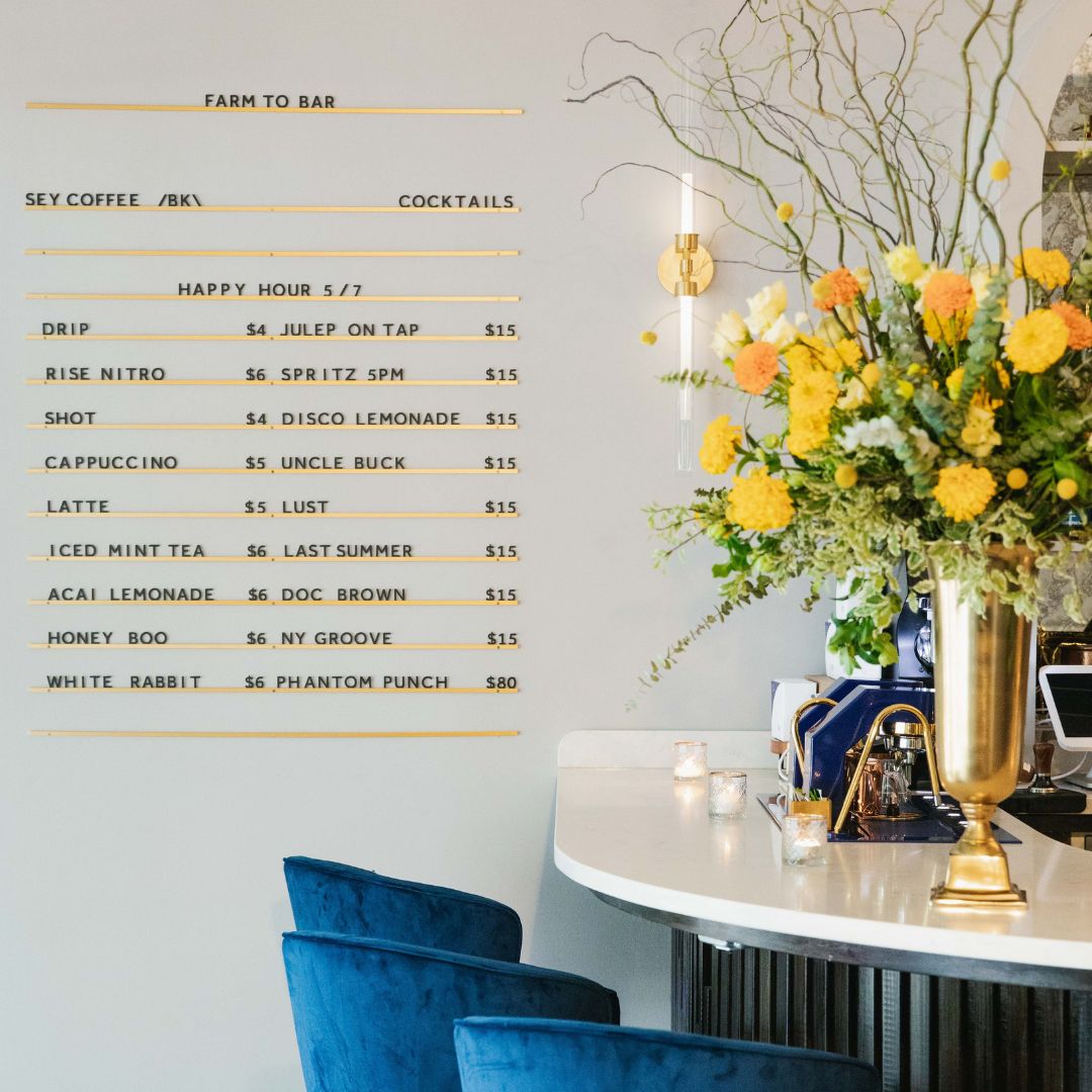
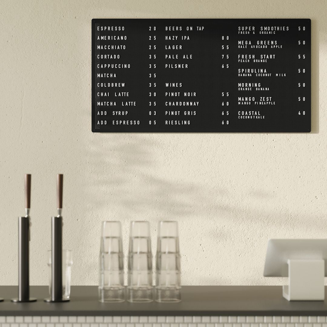
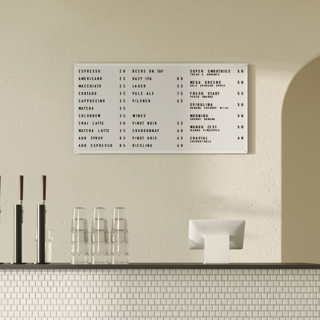
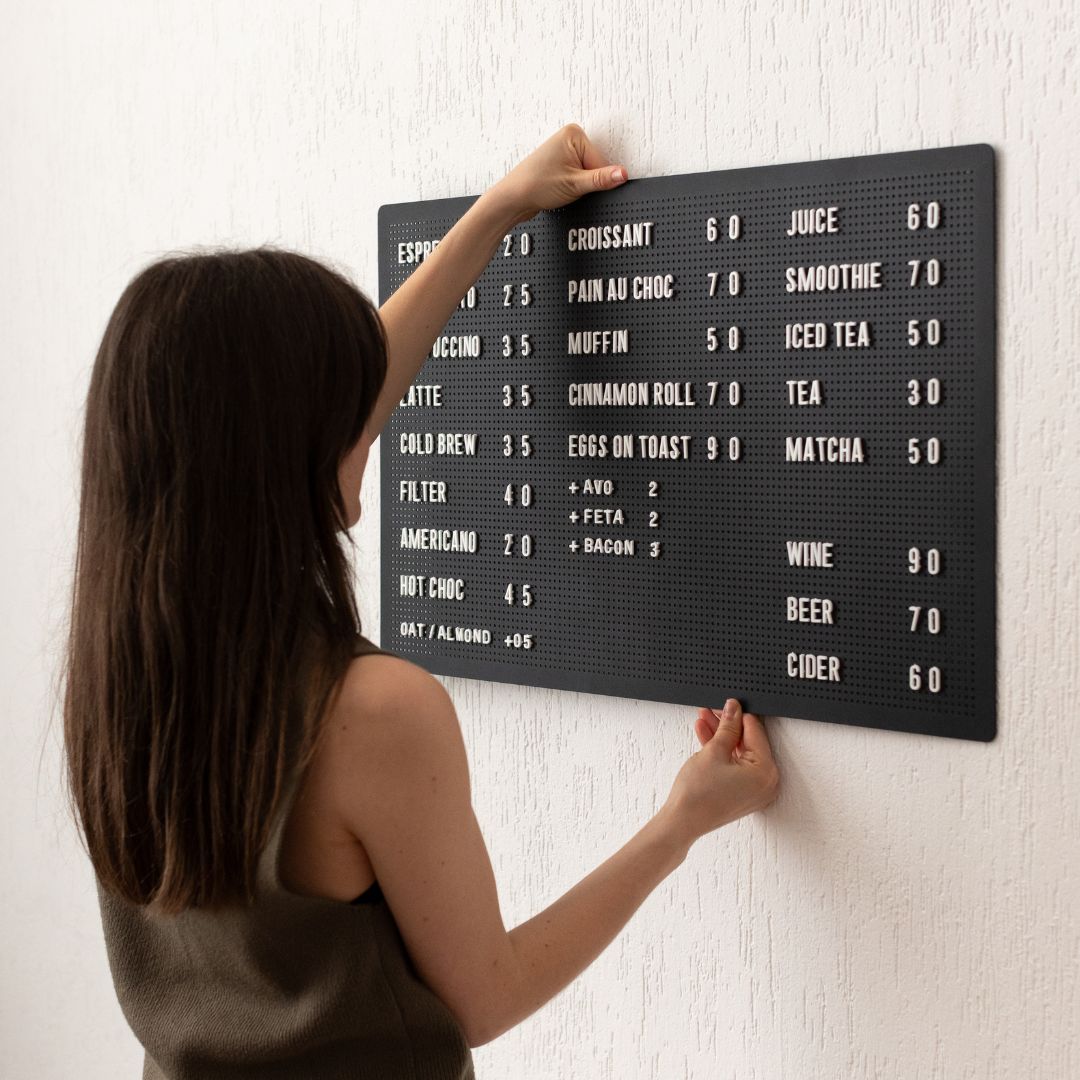
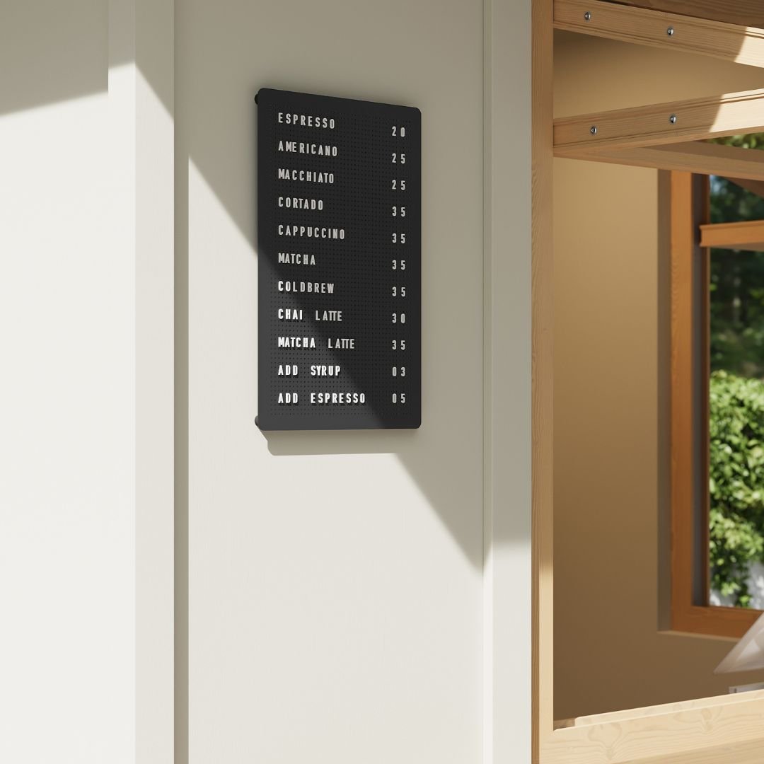
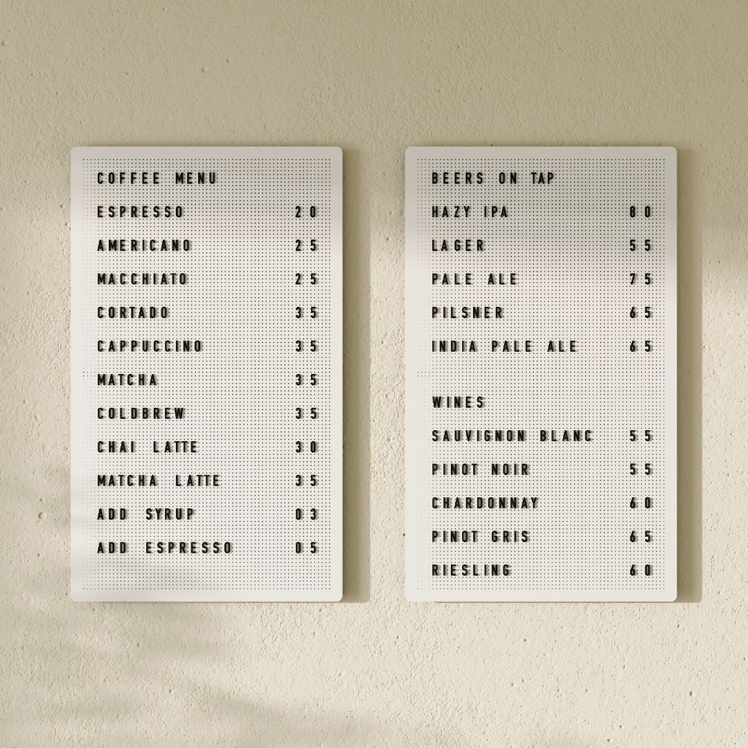
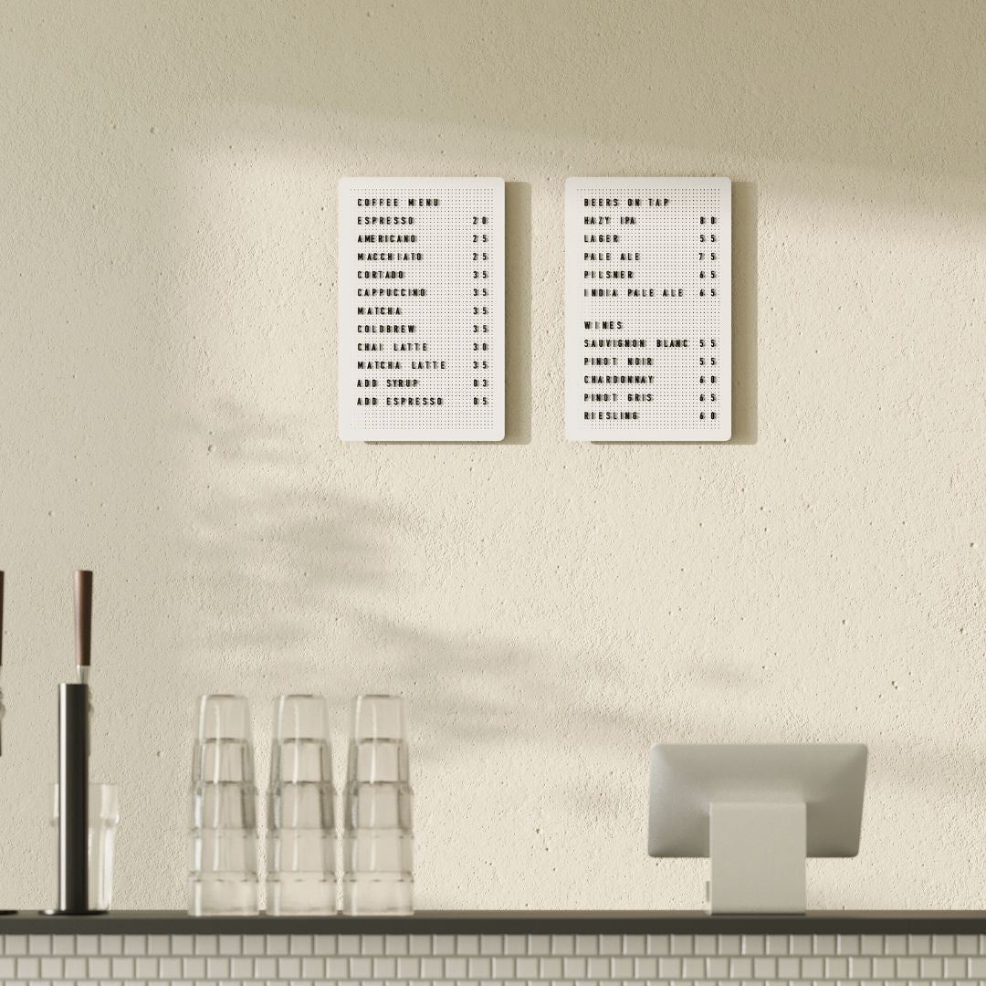
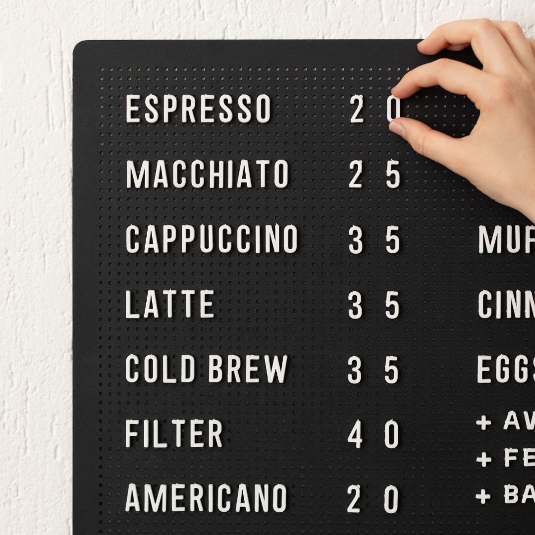
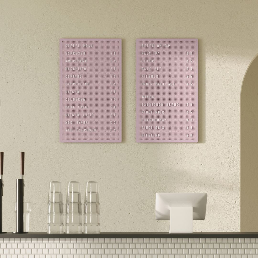
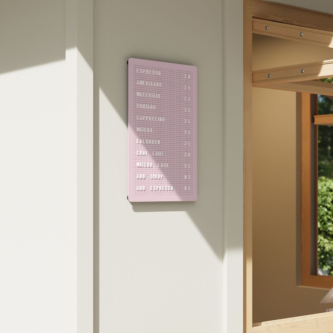
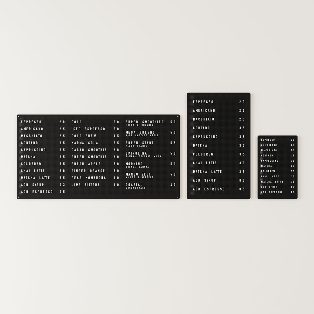
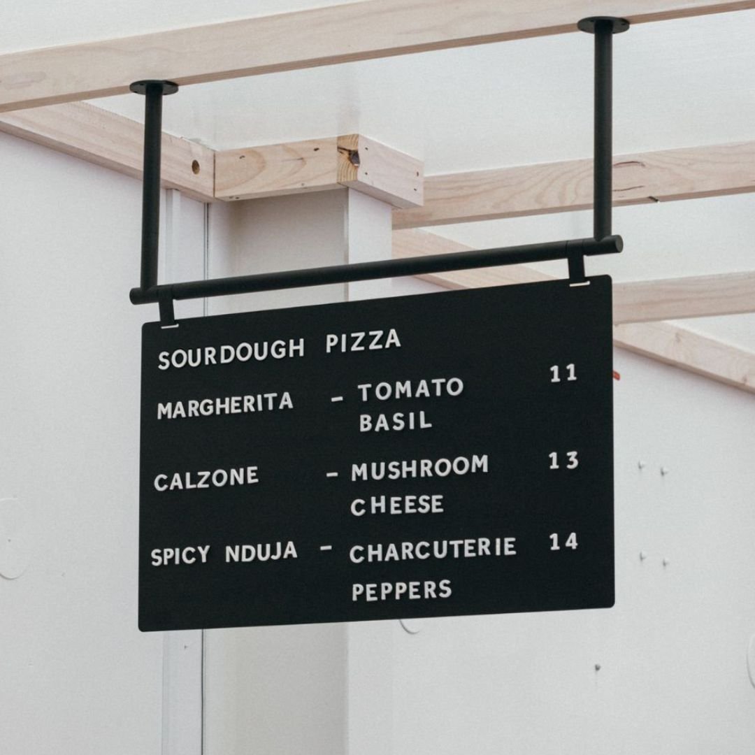
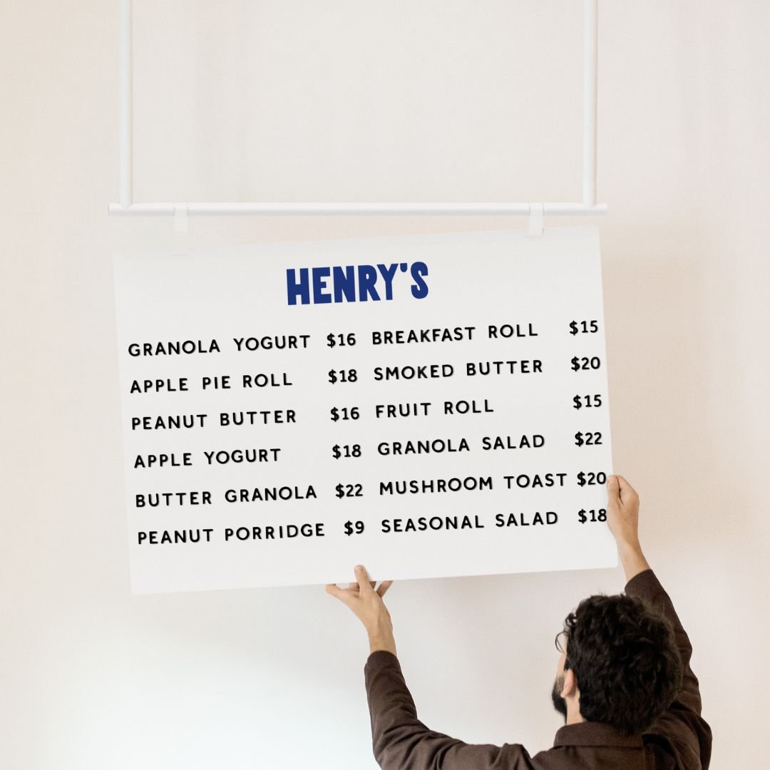
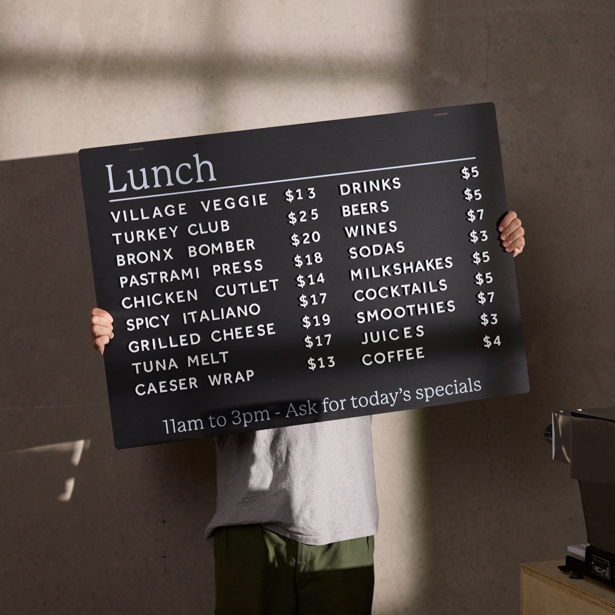
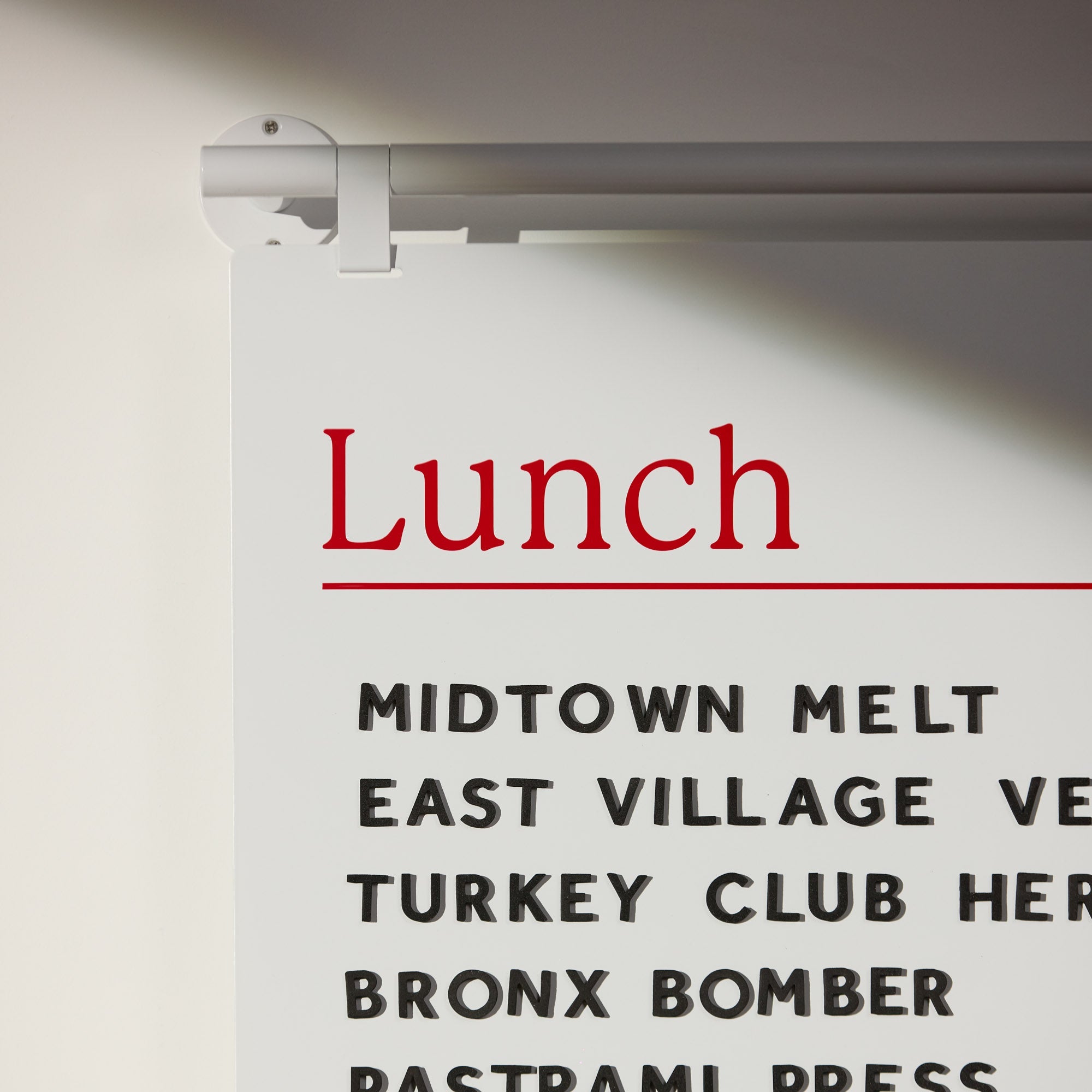
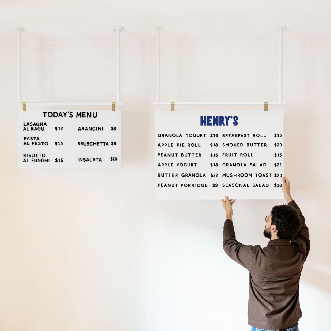
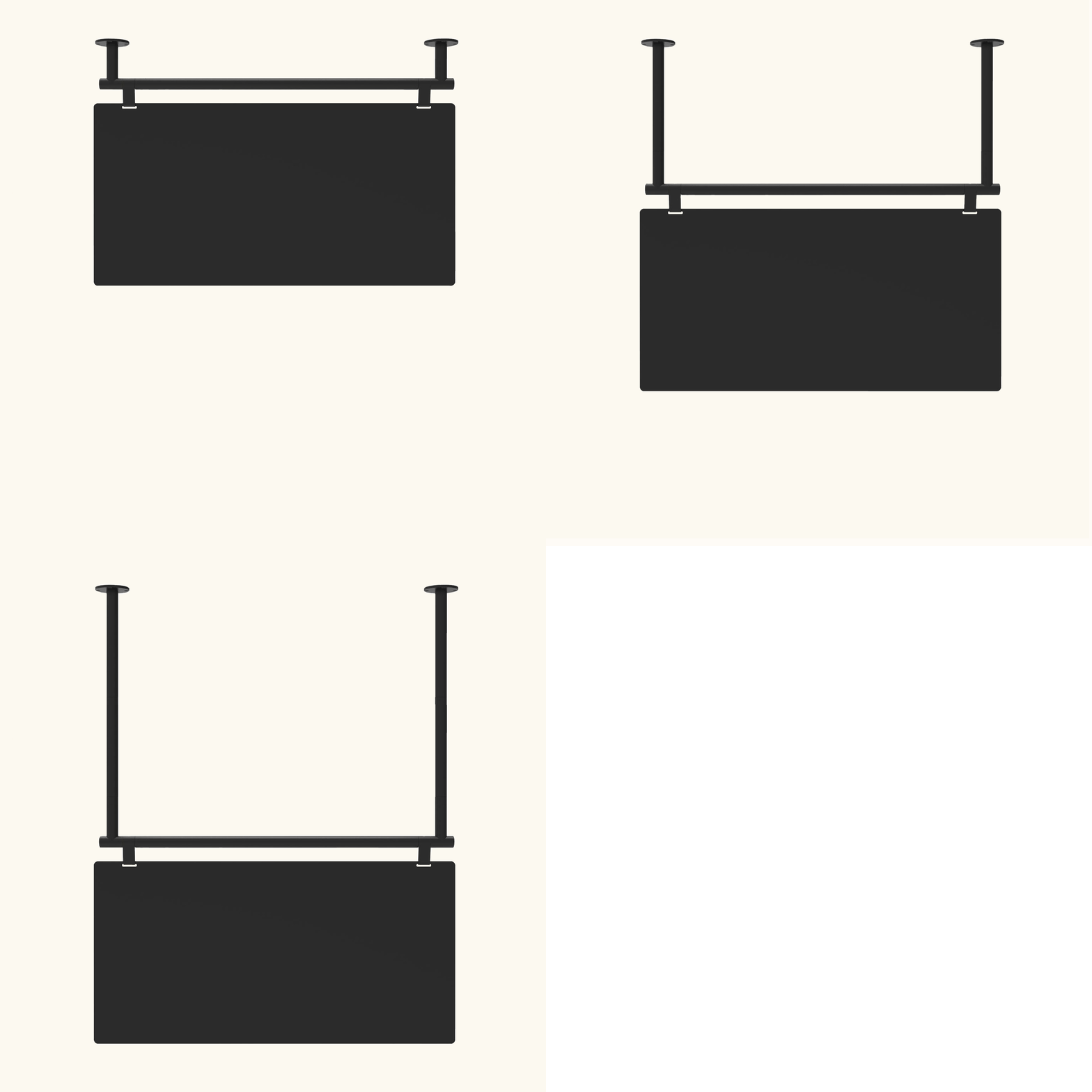
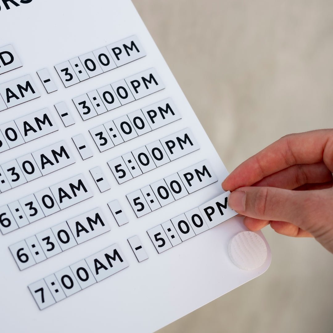
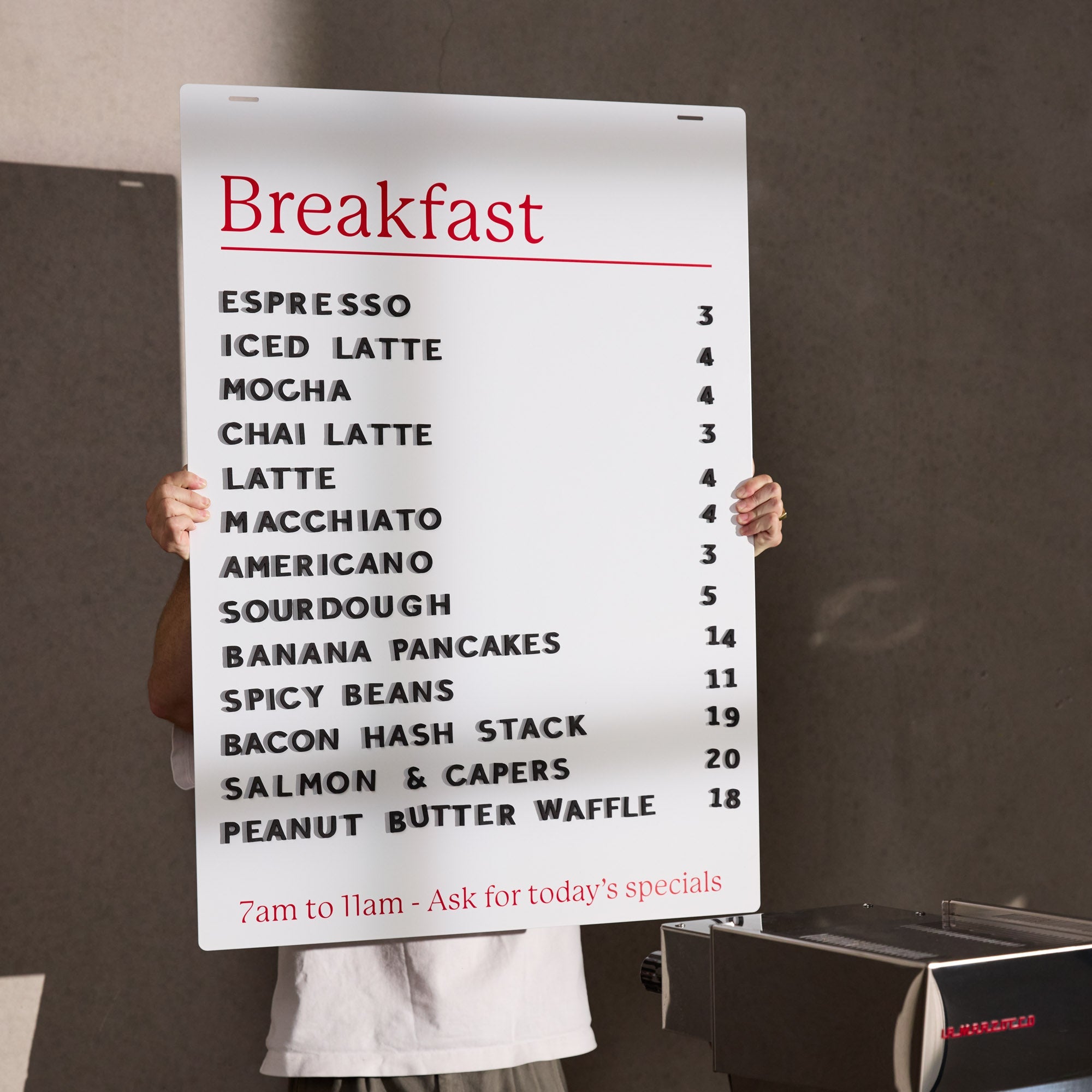
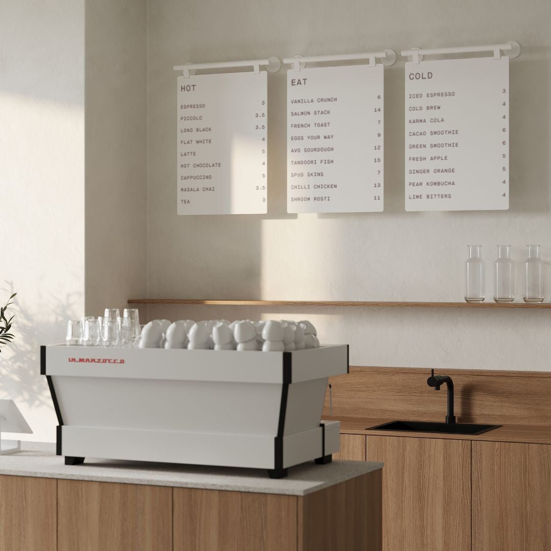
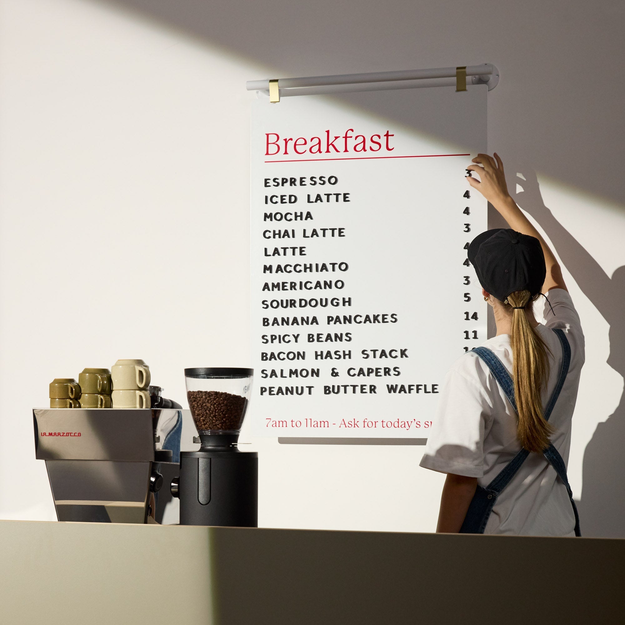
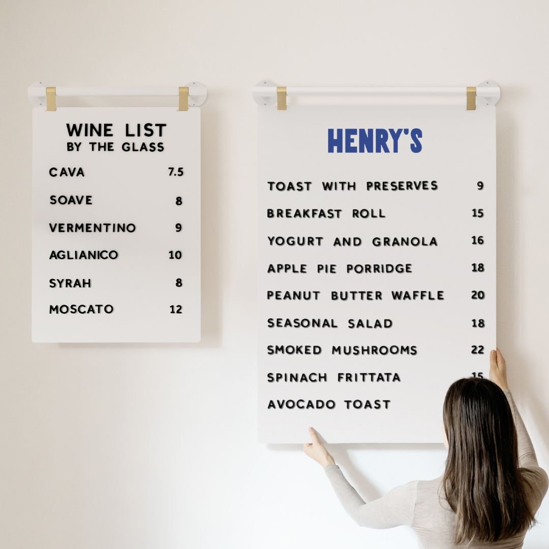
Ever recall feeling flustered and rushed trying to pick from the 20 flavors of one dish on a menu card? This is what is referred to as the “paradox of choice”. It’s where the more options there are on a restaurant menu the more anxious we feel trying to choose. The goal is short and sweet. Something for everyone, but only just! If the only thing that comes to mind from your customers about your menu card design is “spoilt for choice,” your menu design might be slightly too busy. We like to send out our letter boards with standard sizing such as 10 rails, we believe that this avoids the ability to over-crowd your ordering and confuse your customers.

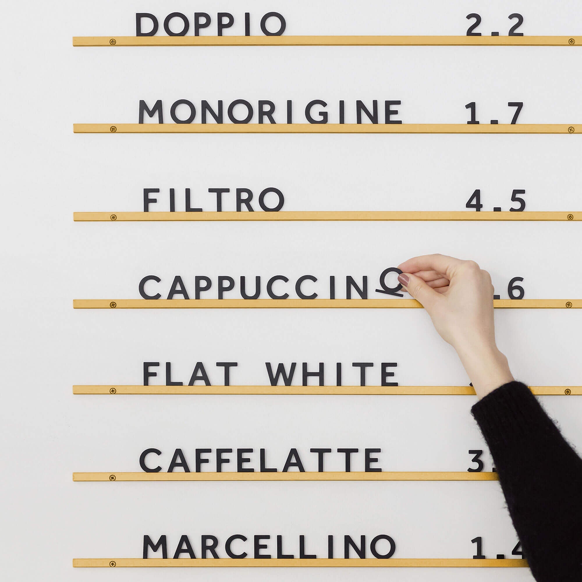
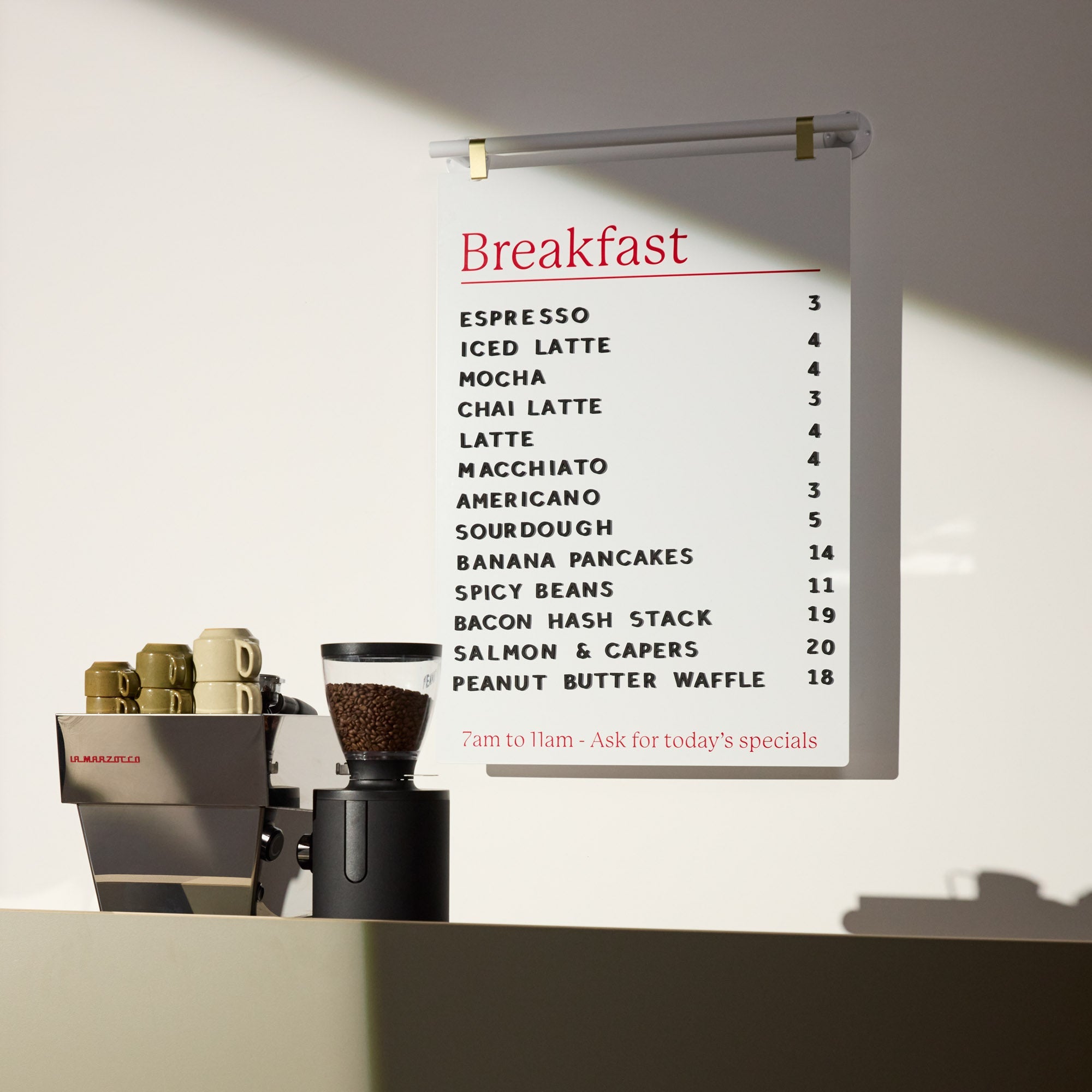
George & Willy Magnetic Menu Board
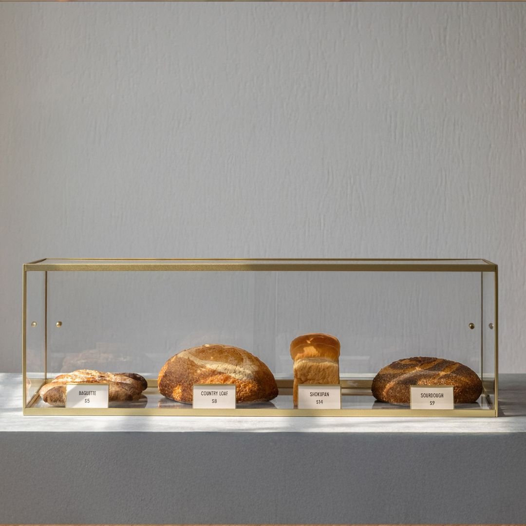
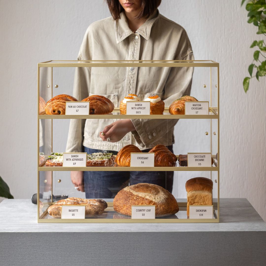
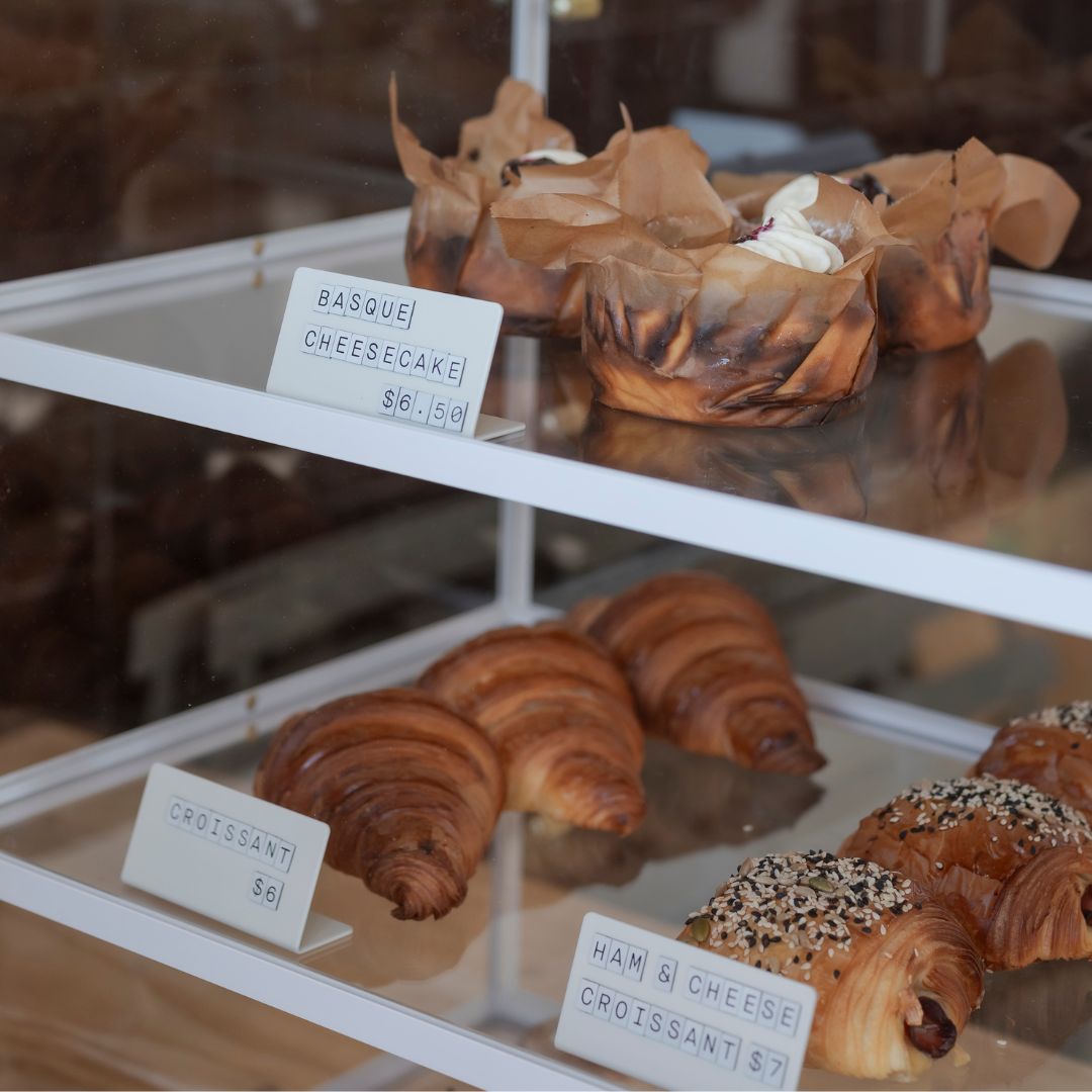
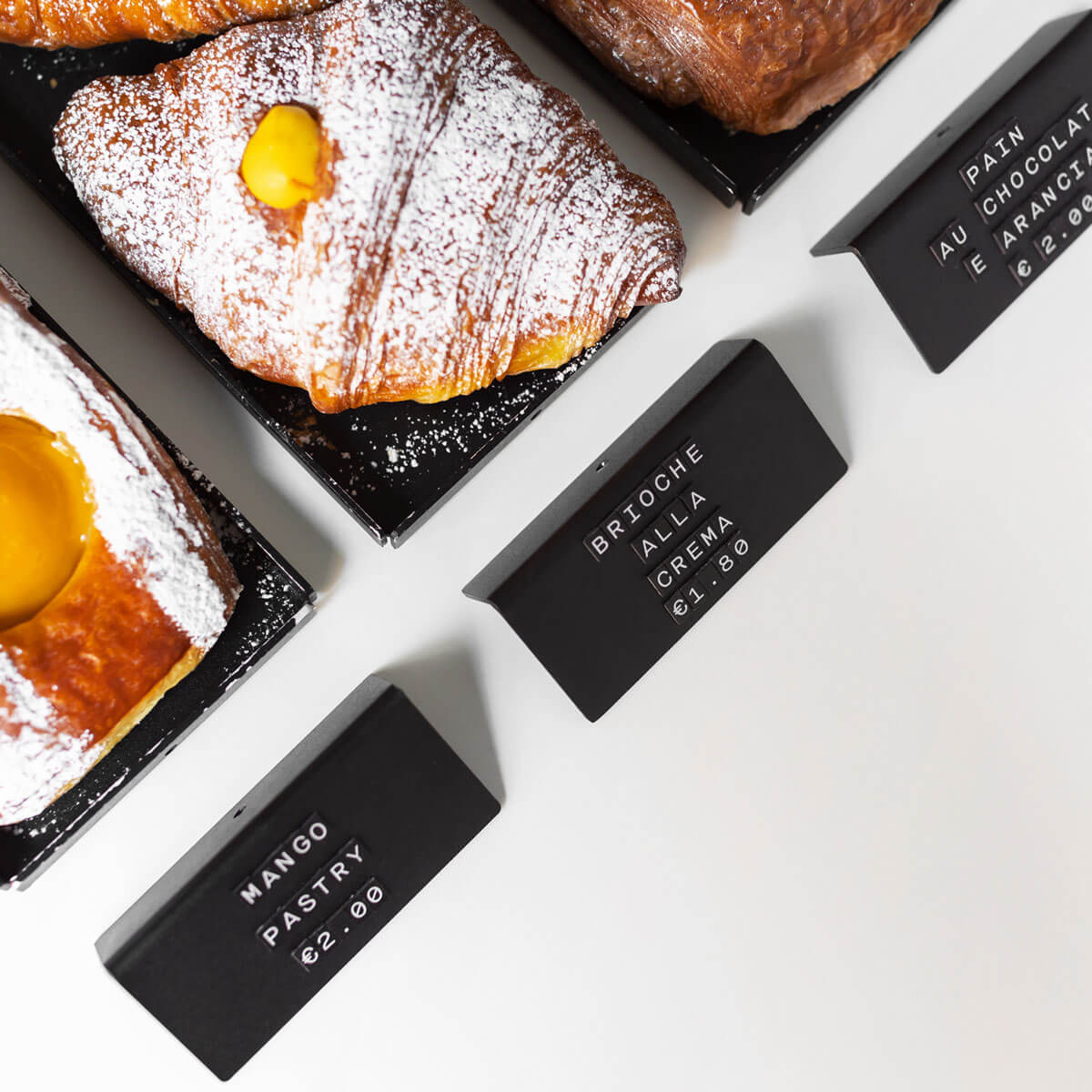
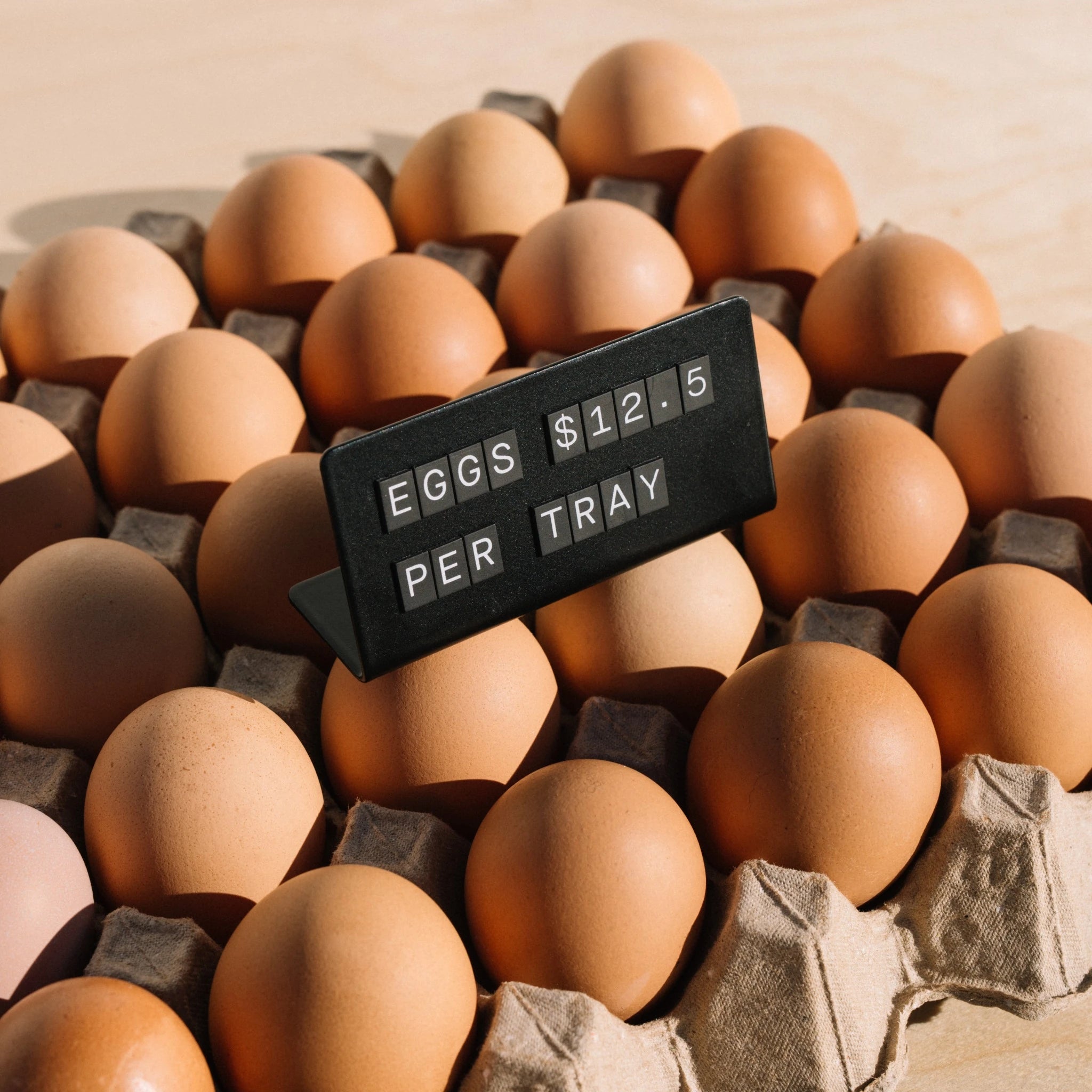
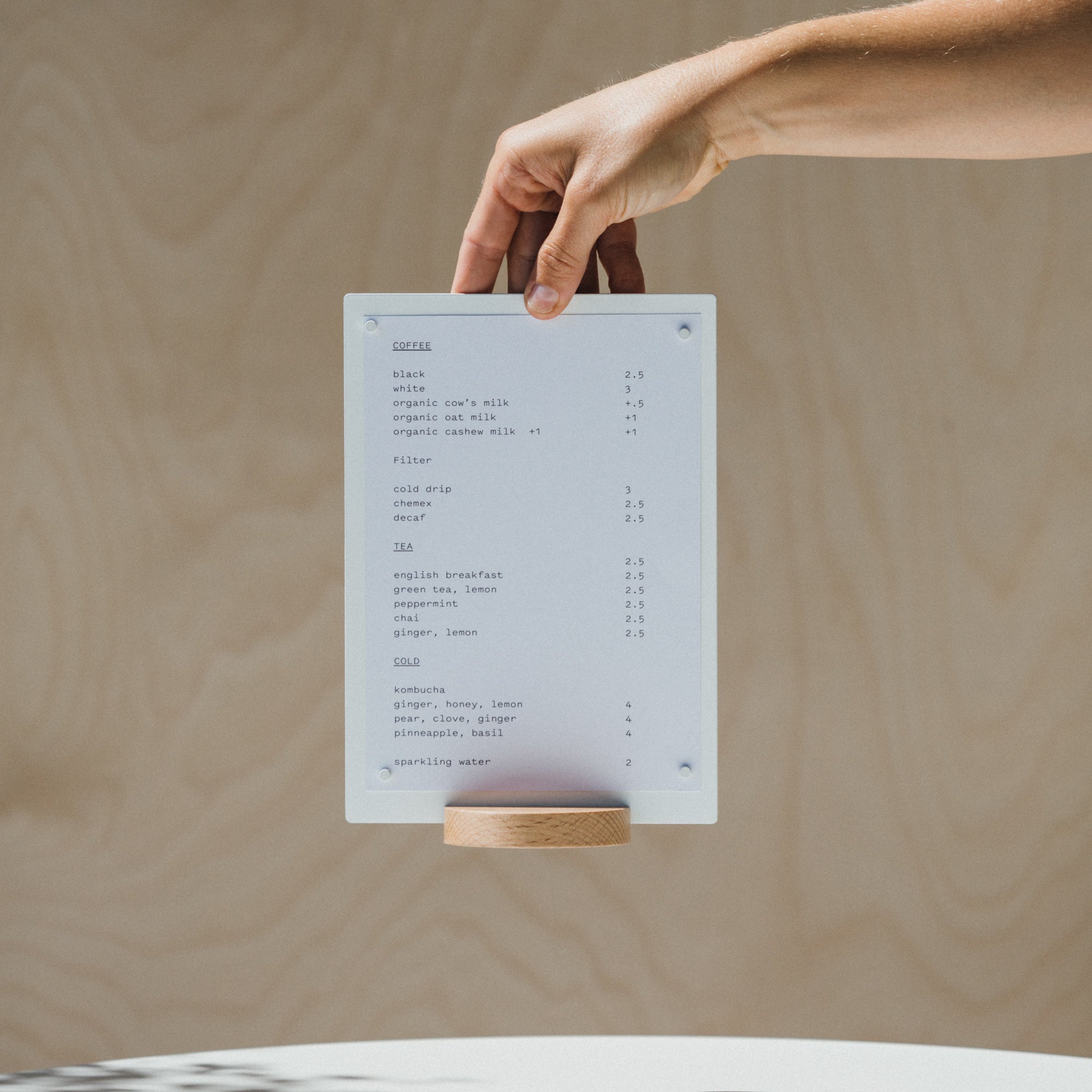
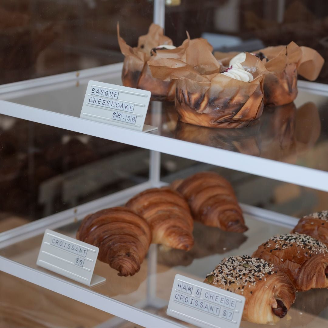
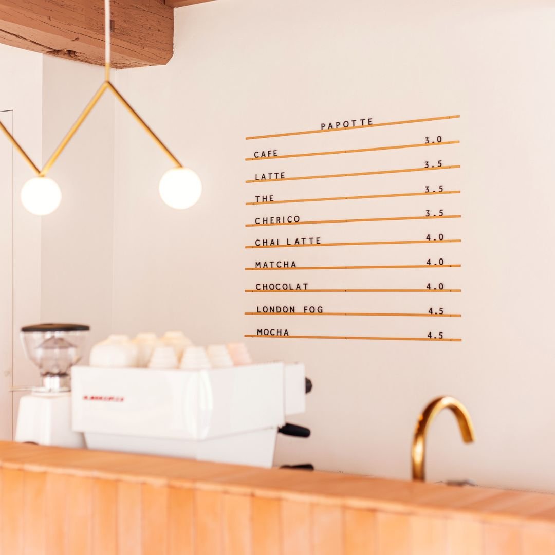
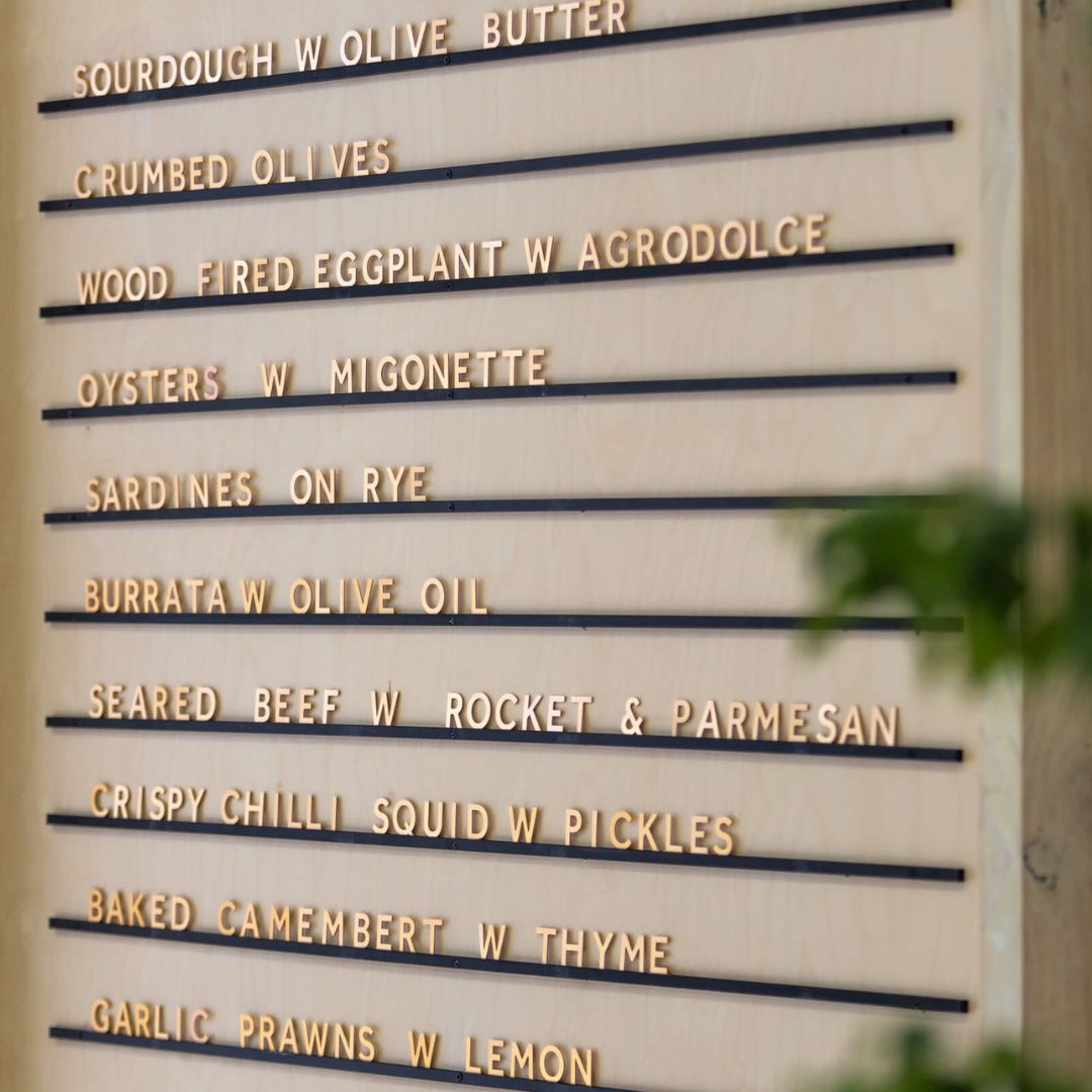
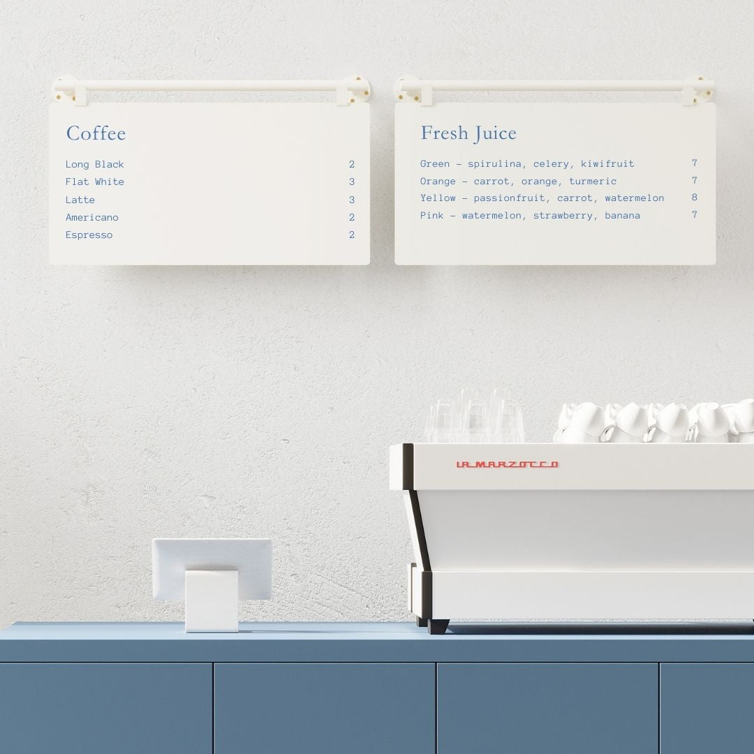
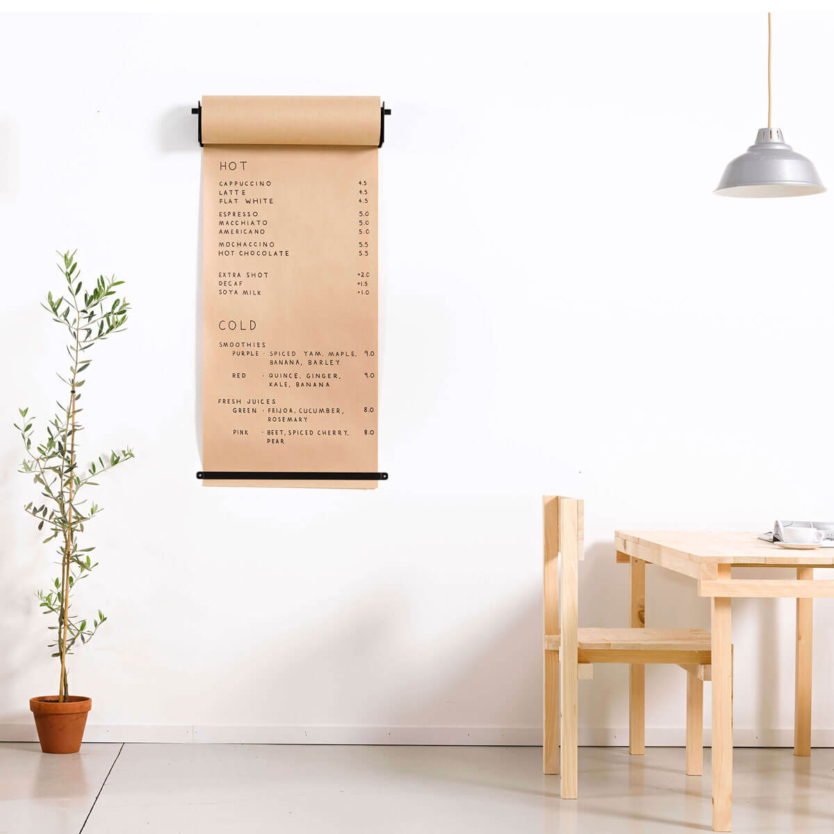
The next tip is to remove the use of dollar signs, this removes the perceived value of a meal, and more often than not, guests will be more inclined to spend a bit more on your dishes.

Park Letterboard without prices shown will encourage customers to spend more.


